
Wall Art Guide, Wall Art Tutoriels
Living Room Islamic Wall Art: Muslim Faith Main Space Decor
Oct
So I’ve been working with Islamic wall art in living rooms for like three years now and honestly it’s one of those things where people get SO stressed about placement and what’s appropriate and I’m just gonna tell you what actually works.
The Calligraphy Pieces Everyone Asks About
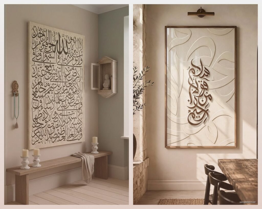
Okay so first thing – Arabic calligraphy is probably what you’re looking at right? The classic Ayat al-Kursi or Bismillah pieces. I did this whole comparison last month when my client canceled and I literally spent two hours looking at different styles because there’s like… so many variations.
The thing nobody tells you is that the style matters way more than the size initially. You’ve got Thuluth script which is super elegant and flowing, Kufic which is more geometric and modern-looking, and Diwani which is crazy ornate. For living rooms I usually push people toward Thuluth or Kufic because they read better from across the room. My neighbor has this massive Diwani piece and honestly unless you’re standing right in front of it you can’t really appreciate the detail.
Metal vs Canvas vs Wood
This is where people get stuck. I’ve installed probably 40+ pieces at this point and here’s what I actually see:
- Metal calligraphy (usually laser-cut steel or brass) looks INCREDIBLE but you need the right wall color. Black metal on white walls is stunning but also very high contrast – not great if you want a relaxed vibe
- Canvas prints are the most forgiving – they soften the whole thing and work with basically any furniture style
- Wood pieces (carved or laser-cut) add warmth but can look too rustic if your living room is modern
- Acrylic with LED backlighting is having a moment but like… it’s very statement-piece energy, not for everyone
I put a gold-finish metal Ayat al-Kursi in my own living room last year and it catches the afternoon light in this way that’s just *chef’s kiss* but I also have cream walls which matters.
Placement Without Making It Look Like a Hotel Lobby
Oh and another thing – everyone puts these pieces directly above the sofa centered perfectly and sometimes that works but sometimes it looks really corporate?
What I’ve been doing lately is offset placement. Put your main calligraphy piece on the wall perpendicular to your sofa, the one you actually look at when you’re sitting down. Makes it more of a focal point you engage with rather than something hovering over your head.
If you’re gonna do the above-sofa placement (which is totally fine), leave like 6-8 inches between the sofa back and the bottom of the frame. I see people hang things way too high all the time. The center of the artwork should be at eye level when you’re standing, which is roughly 57-60 inches from the floor.
The Gallery Wall Approach
Wait I forgot to mention – you can absolutely do a gallery wall with Islamic art and it doesn’t have to be matchy-matchy. I did one last month that mixed:
- A medium Bismillah in black calligraphy
- Two smaller geometric Islamic pattern prints in navy and gold
- One vintage-style mosque illustration
- A small round piece with “Alhamdulillah” in minimal typography
The trick is keeping the color palette consistent even if the styles vary. All my frames were simple black which tied everything together.
Color Schemes That Actually Work
Okay so this is gonna sound weird but the best Islamic wall art setups I’ve done weren’t the obvious gold-and-emerald-green combos everyone defaults to. Those can look amazing but they can also read very…traditional in a way that might not match your furniture.
What’s been working lately:
Monochrome modern: Black calligraphy on white or cream backgrounds. Sounds boring but it’s so versatile and you can switch up your throw pillows and curtains without everything clashing. My friend Amira did this and her living room can go from neutral to colorful depending on her mood.
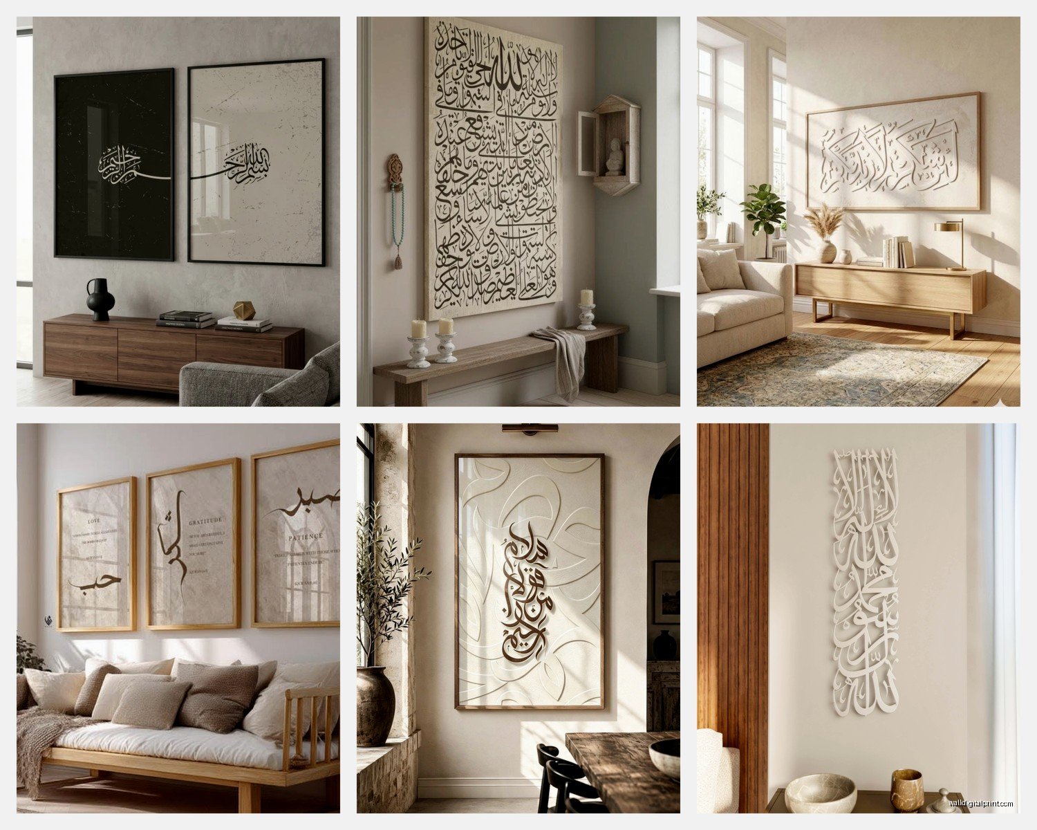
Navy and gold: More sophisticated than the emerald green situation. Navy reads as neutral enough that it doesn’t fight with your existing colors but the gold adds that traditional element.
Earthy terracottas and blacks: This is my personal favorite right now. Terracotta or rust-colored geometric patterns with black calligraphy pieces. Very warm, very welcoming, doesn’t feel stuffy.
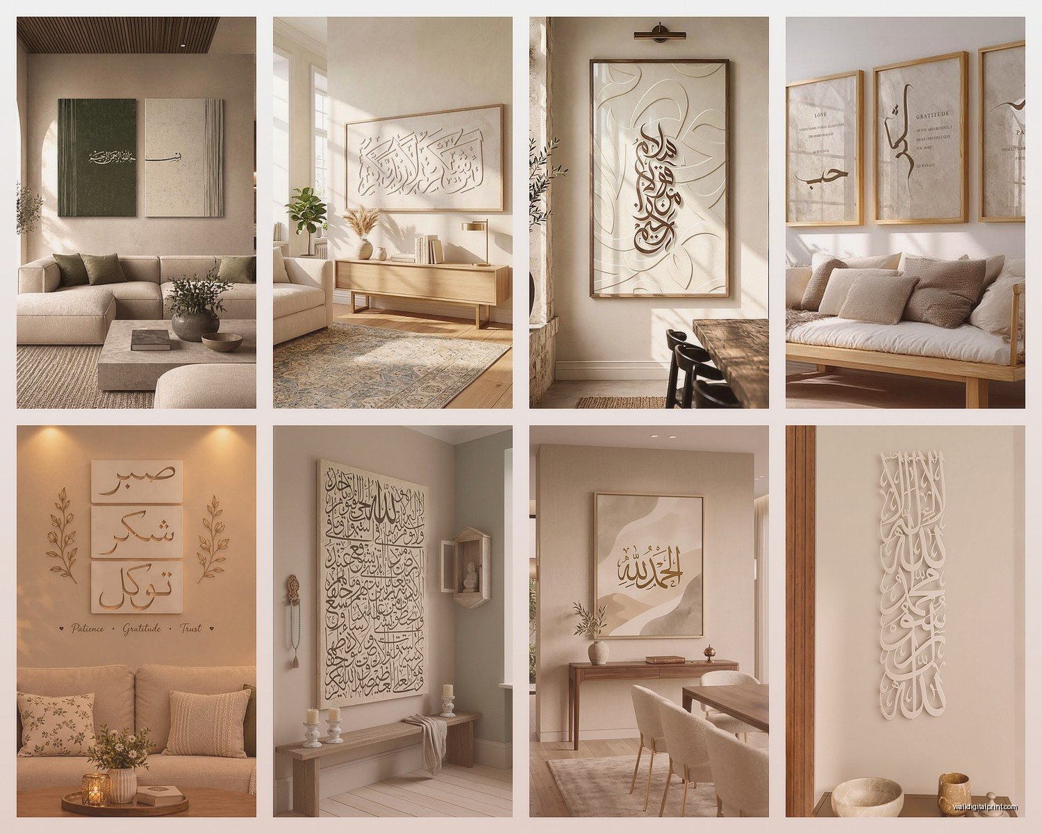
The traditional teal and gold thing works if your whole living room is already going that direction but don’t force it.
Sizing Questions People Always Get Wrong
So everyone asks “how big should it be” and I’m like…it depends on your wall situation but here’s the actual formula I use:
Your main piece should be roughly 2/3 to 3/4 the width of your sofa. So if you have an 84-inch sofa, you’re looking at artwork that’s between 56-63 inches wide. This can be one large piece or a grouping that spans that width.
I see people buy these tiny 16×20 pieces for massive walls and it just floats there looking sad. Go bigger than you think. Islamic calligraphy especially has this presence that needs space to breathe but also needs to be substantial enough to anchor the room.
Multi-Panel Sets
Those three-panel or five-panel sets are everywhere right now and okay yes they can look good but you gotta install them right. The spacing between panels should be 2-3 inches MAX. I’ve seen people space them like 6 inches apart and it loses all the impact.
Also the panels don’t all have to be the same size – I actually prefer when the middle panel is larger and the sides step down. Creates better visual flow.
What to Avoid (Learned This the Hard Way)
Don’t mix too many calligraphy styles in one room. Like you can have Ayat al-Kursi in Thuluth and a small Bismillah in Kufic but if you start adding Diwani and Nastaliq it gets chaotic. Stick to two script styles max.
Avoid super literal translations underneath the Arabic. Some pieces have the English translation printed below and it can look textbook-y. If you want translations for guests, put a small card on your coffee table or something.
Skip the overly digitized looking prints – you know the ones with like gradient gold effects and lens flares. They date quickly and honestly read kinda cheap even if they weren’t.
Oh and watch out for calligraphy errors. I hate to say this but there are SO many pieces online with mistakes in the Arabic. If you don’t read Arabic yourself, have someone check it before you buy. I had a client almost buy this gorgeous piece from Etsy and her sister pointed out the letters were connected wrong. Embarrassing.
Mixing Islamic Art with Other Decor Styles
This is where it gets fun actually. Islamic art isn’t just for “Islamic style” rooms whatever that means.
With minimalist/Scandinavian: Simple black line calligraphy on white backgrounds. Keep it unframed or use thin black frames. The geometric patterns in Islamic art actually complement minimalist design really well because both emphasize clean lines.
With boho: Go for the more ornate pieces, mixed metals, add some geometric patterns in warm colors. Layer it with your macrame and plants. It works because both styles embrace pattern and texture.
With contemporary/modern: This is my wheelhouse. Large-scale abstract interpretations of calligraphy, metal cutouts, acrylic pieces. Keep the palette limited – two colors max plus metallics.
With traditional/classic: Ornate frames, rich colors like burgundy and gold, pair with velvet furniture. This is the most straightforward pairing tbh.
I’m watching this design show while writing this and they just did a whole segment on mixing cultural art and it’s exactly what I’m talking about – don’t be afraid to mix your Islamic pieces with contemporary art or family photos or whatever.
The Geometric Pattern Thing
Okay separate from calligraphy – Islamic geometric patterns are having such a moment right now. Those intricate star patterns and tessellations work amazing as accent pieces.
I did a living room two months ago where we used a large Ayat al-Kursi as the main piece above the sofa, then flanked the TV wall with two matching geometric pattern pieces in the same color scheme. Created this nice balance where the calligraphy was the star but the geometric pieces added visual interest without competing.
You can also do geometric patterns as:
- Decorative screens or room dividers
- Floating shelves backed with patterned panels
- Framed textile pieces (vintage mosque curtains or prayer rugs make stunning wall art)
- 3D wall panels – these add actual dimension and shadow play
Lighting Considerations Nobody Mentions
This is important – where’s your light coming from? I learned this after installing this beautiful piece that had a glass frame and the glare from the window made it basically invisible during daytime.
If you have windows directly across from your wall, avoid glossy finishes and glass frames. Go for matte canvas or unglazed frames.
If your living room is kinda dark, this is actually perfect for LED-backlit pieces or metallic finishes that reflect lamplight. I have this brass Bismillah that looks totally different at night when the floor lamp hits it.
Consider adding picture lights or directional spotlights for larger pieces. Makes them feel more gallery-quality and you can adjust the ambiance.
Budget Breakdown From Someone Who’s Bought Too Many
Real talk about pricing because it’s all over the place:
Under $50: You’re looking at basic canvas prints, small frames, mass-produced stuff from Amazon or Wayfair. They’re fine for starting out or if you’re renting. Quality is hit or miss – read reviews about colors being accurate.
$50-150: Better quality prints, some hand-finished details, nicer frames. This is the sweet spot for most people honestly. Etsy has tons of options here from individual artists.
$150-400: Hand-painted calligraphy, quality metal work, custom sizing. This is where you get pieces that feel special and unique.
$400+: Original artwork, high-end metal fabrication, commissioned pieces. Only worth it if this is your forever home or you’re really passionate about supporting specific artists.
I’ve bought from every price range and honestly some of my favorite pieces were like $80 from a small shop on Etsy. The $500 commissioned piece is gorgeous but the impact per dollar isn’t necessarily better.
Where to Actually Buy This Stuff
Everyone asks me this. My go-to sources:
Etsy for unique handmade pieces – search “Islamic calligraphy wall art” and filter by your color scheme. Read the reviews obsessively. Check if the seller is actually Muslim because sometimes you get…questionable interpretations from people who don’t understand what they’re creating.
Amazon for basic affordable options – good if you need something quick or you’re testing out a style before committing to something pricier.
Local Islamic bookstores or cultural centers often have art sections and the quality is usually vetted properly.
Instagram artists – SO many talented calligraphers selling directly. Search hashtags like #islamiccalligraphy or #islamicwallart. You can often commission custom pieces for reasonable prices.
The Practical Stuff About Installation
Okay installation tips because I’ve definitely put holes in the wrong spots before:
Use a level. Like actually use one. Your eye will lie to you and you’ll end up with slightly crooked calligraphy which is somehow more noticeable than crooked regular art.
For heavy metal pieces, you need proper wall anchors. Those cheap plastic ones that come with frames aren’t gonna cut it. Get toggle bolts or molly bolts depending on your wall type.
Paper template method: trace your frame on paper, tape it to the wall, mark your nail holes through the paper, then remove the paper and install. Saves so many extra holes.
If you’re doing a multi-piece arrangement, lay everything out on the floor first and take a photo. Then measure the spacing and transfer those exact measurements to the wall. I use painter’s tape to mark positions before committing to nails.
Mixing Quranic Verses with Everyday Spaces
Some people worry about having Quranic verses in a living room where there’s TV watching and casual hanging out. I’ve had this conversation a dozen times and honestly it depends on your personal comfort level.
Generally speaking, treating the verses with respect is what matters – hanging them thoughtfully in clean spaces, not in bathrooms or anywhere inappropriate. The living room is usually totally fine since it’s where you gather with family and guests.
If you’re concerned, stick to phrases like Bismillah, Alhamdulillah, Subhanallah, or Masha’Allah which are remembrances rather than full Quranic verses. Or go with geometric patterns that have Islamic significance without actual text.
Seasonal Switching (Yes Really)
This might sound extra but I’ve started suggesting people have a “rotation” especially if they’re into decor. Keep your main statement piece year-round but switch out smaller accent pieces.
Ramadan obviously gets special pieces – I have clients who bring out specific artwork just for that month. But you can also rotate based on color schemes or just when you’re bored. Islamic art is so varied that you can completely change the vibe of your living room by swapping pieces.
I keep three sets and honestly my cat knocked one over last week which forced a rotation I wasn’t planning but it worked out.
Custom Pieces vs Ready-Made
If you want something specific – like a particular verse in a particular style – commissioning is the way. I worked with this calligrapher on Instagram who did a custom piece combining my client’s wedding date in Arabic numerals with “Masha’Allah” and it was stunning.
Custom usually means:
- 2-4 week turnaround minimum
- Higher cost but you get exactly what you want
- Can match your exact color scheme
- Specify the script style, size, color, everything
Ready-made is obviously faster and cheaper but you’re working within what exists. Which is fine – there’s tons of beautiful ready-made options.
Color Matching Your Existing Living Room
Okay so you’ve already got furniture and a color scheme. How do you add Islamic art without it looking random?
Pull colors from what you already have. If you’ve got grey couches and blue accents, look for pieces that incorporate those blues. The calligraphy can be black or navy, the background could be grey or cream.
Metallic finishes work as neutrals – gold, silver, copper, bronze all act as accent colors that complement rather than compete. This is why metallic calligraphy is so popular, it’s basically failsafe.
If your living room is very colorful, consider going monochrome with your Islamic art so it grounds the space instead of adding more color chaos.
Frames Matter More Than You Think
I cannot stress this enough – the frame changes everything. That $30 print can look expensive in a nice frame, and that $200 piece can look cheap in a bad frame.
For modern spaces: thin black metal frames or frameless mounting
For traditional spaces: ornate gold or dark wood frames with detail
For transitional spaces: simple wood frames in walnut or oak
Floating frames (where there’s space between the art and frame edge) look really good with calligraphy because they create this shadow depth that’s cool.
Dealing with Different Wall Colors
White walls – literally anything works, you lucky person. Go bold with colors or keep it minimal with black and white.
Grey walls – metallics look amazing here, also black calligraphy pops nicely. Avoid muddy colors.
Beige/cream walls – warm metallics like gold and copper, rich colors like burgundy or emerald, or keep it tonal with more cream and taupe.
Colored walls – this is trickier. Pull the calligraphy color from elsewhere in the room so it feels intentional. Or go monochrome in black/white to contrast.
I did a living room with deep teal walls once and we used copper metallic calligraphy with black geometric patterns and it was *stunning* but very specific.
The 99 Names and How to Display Them
Those sets with all 99 names of Allah – people either love them or find them overwhelming. If you’re gonna do it, you need serious wall space. I’m talking an entire wall, minimum 10 feet wide.
Better option for normal-sized living rooms: choose 3-9 of the names that resonate with you personally and display those as a curated collection. Looks more intentional and less like you’re trying to fill space.
You can also get those circular designs where all 99 names spiral around in one piece – more manageable size-wise but you gotta be close to read individual names.
Mixing Representational Art
Some people want mosque illustrations or arabesque patterns alongside calligraphy. This works but keep the styles cohesive.
If your calligraphy is very modern and minimal, don’t pair it with super ornate traditional mosque paintings. The clash will be jarring.
I like doing one main calligraphy piece and then supporting it with abstract geometric patterns or subtle arabesque designs in coordinating colors. Creates layers without competition.
Kids and Pets Considerations
Real life stuff – if you have young kids, maybe don’t put your expensive original calligraphy at grabbing height. I learned this when my client’s toddler decided the gold leaf needed “help” with his markers.
Acrylic or metal pieces are more durable than canvas for high-traffic living rooms. Canvas can get bumped and dented, especially the stretched canvas types.
If you have cats (mine is currently trying to sit on my keyboard), avoid anything with dangling elements or pieces that extend far from the wall. They will become toys.
Lighting the Pieces Properly
Natural light is beautiful but can fade artwork over time, especially prints. If you have a wall that gets direct sun, either use UV-protective glass in your frames or accept that you might need to replace prints eventually.
Artificial lighting – I
