Wall Art Guide, Wall Art Tutoriels
Cherry Blossom Wall Art: Japanese Sakura Spring Flower
Oct
So I’ve been obsessing over cherry blossom wall art lately because honestly, it started when a client asked me to style her living room and she was dead set on this Japanese spring vibe. I ended up going down this massive rabbit hole and now my Pinterest board is like 90% sakura prints.
Picking the Right Style Without Making Your Space Look Like a Sushi Restaurant
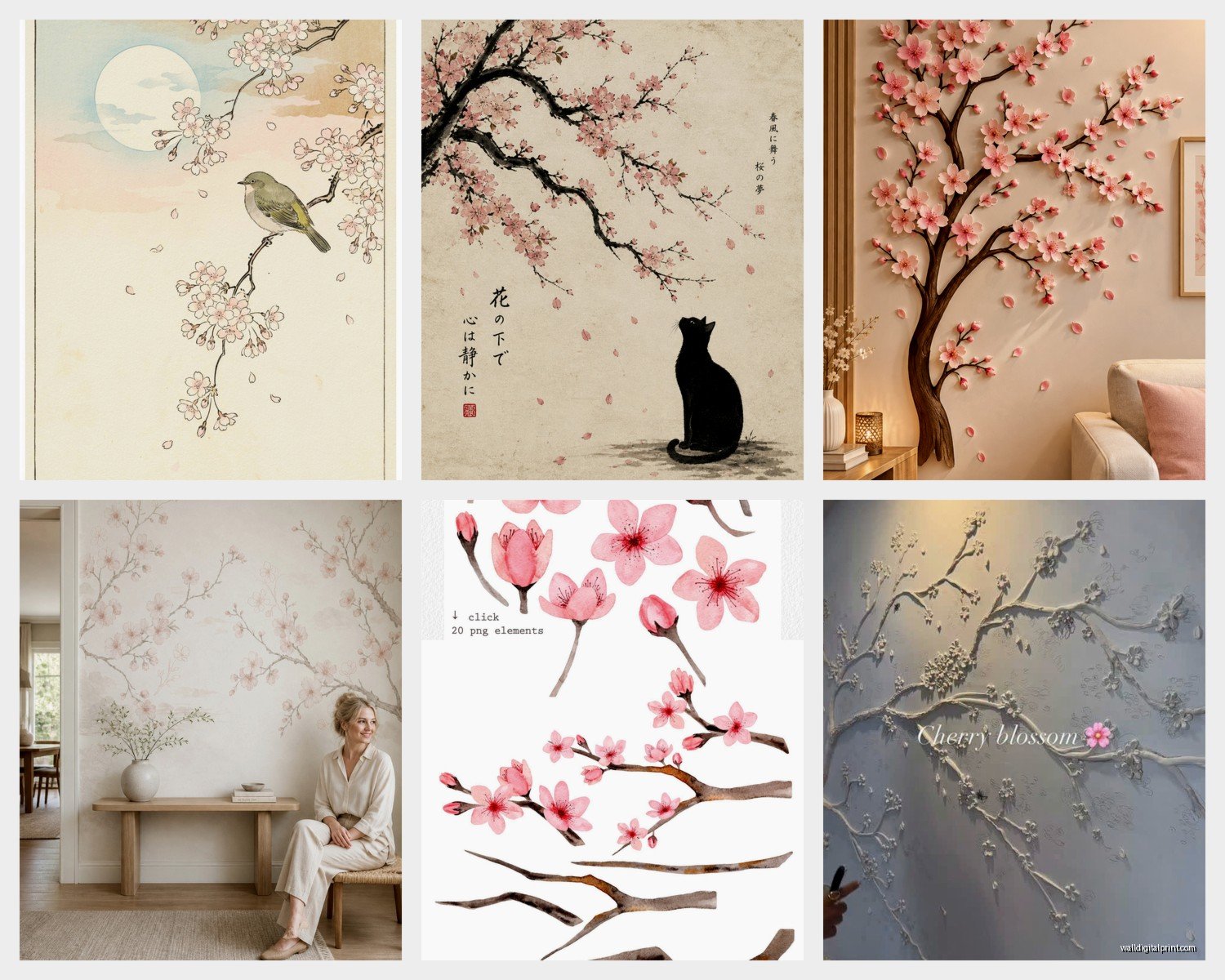
Okay so first thing – there’s traditional Japanese art styles and then there’s like…modern interpretations that can go either way. The traditional stuff, you’re looking at woodblock prints (ukiyo-e style), ink paintings, or those gorgeous watercolor pieces. I actually got this vintage-style print from an Etsy seller last month and it’s the Hiroshige-inspired one with the branch extending across the frame, super minimalist background. Cost me about $45 but looks way more expensive framed.
The modern versions can be anything from abstract pink splatters to photography to those kinda generic canvas prints you see everywhere. Not gonna lie, some of the mass-produced ones look cheap in person even if the online photos are pretty. I learned this the hard way with a three-panel set I ordered for a staging project – the colors were weirdly neon pink instead of that soft blush tone.
What Actually Works in Different Rooms
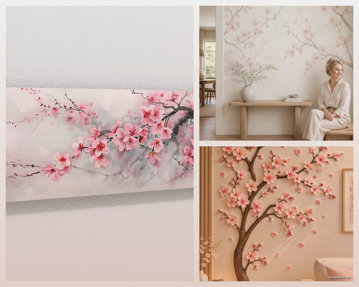
Living room – you want something that makes a statement but isn’t overwhelming. I usually go for either one large piece (like 36×48 inches) or a diptych situation. The branch-across-canvas thing works really well here because it draws the eye horizontally and makes the room feel wider.
Bedroom – softer, more muted pieces work better because you don’t want that intense visual stimulation when you’re trying to sleep. Watercolor styles or those really delicate ink drawings are perfect. My sister has this pale pink and grey cherry blossom print above her bed and it’s so calming. She got it from Society6 I think?
Bathroom – wait this is gonna sound weird but cherry blossoms actually work amazing in bathrooms. The whole spa aesthetic thing. Just make sure you get something that can handle humidity or frame it properly with sealed backing.
Size and Placement Because This is Where Everyone Messes Up
The biggest mistake I see is people buying art that’s too small. Like you’ve got this huge blank wall and then there’s this tiny 16×20 print floating in the middle looking lost. Cherry blossom art especially needs to breathe and have presence.
General rule I follow – your art should take up about 2/3 to 3/4 of the furniture width below it. So if your sofa is 84 inches, you’re looking at roughly 56-63 inches of art width. You can do this with one piece or a gallery wall arrangement.
Height-wise, center of the artwork should be at eye level, which is usually 57-60 inches from the floor. But honestly I adjust this based on the room and furniture. If you’ve got a low-slung modern sofa, sometimes going a bit lower looks better.
Oh and another thing – corner placements. I’ve been doing this thing lately where I put a tall vertical cherry blossom print in empty corners with a floor plant next to it. Creates this whole moment in dead space that would otherwise just be…dead space.
Framing Options That Won’t Break the Bank
So framing is where costs can spiral real fast. Custom framing is gorgeous but you’re easily looking at $200-400 for a decent sized piece. I’ve found some workarounds that look just as good.
Framebridge is my go-to for online custom framing – way cheaper than local shops, usually around $80-150 depending on size. They have this really nice natural wood frame that works perfectly with cherry blossom art. The light oak one especially.
IKEA frames get a bad rap but their RIBBA and HOVSTA lines are actually solid for the price. The black RIBBA frames give cherry blossom prints a really clean modern look. I use them all the time for client projects and nobody’s ever called me out on it being IKEA.
For traditional Japanese prints, I really love floating frames or the shadowbox effect. Creates depth and makes the art feel more precious. Michael’s usually has sales on these – wait for the 50% off coupons.
The Matting Debate
White mats are classic and they work, but hear me out – cream or light grey mats can look so much better with cherry blossoms. The stark white sometimes creates too much contrast and makes the pink tones look washed out. I did a side-by-side comparison when my client canceled last Tuesday and I spent an hour at the frame shop comparing options…the cream mat won by a mile.
Also double matting adds like $30-40 but elevates the whole thing significantly. Inner mat in a soft pink or even a subtle gold can be really beautiful.
Where to Actually Buy This Stuff
Okay so I’ve ordered from probably two dozen different places at this point. Here’s what’s actually worth it:
Etsy – best for unique prints and vintage reproductions. Search for “Japanese woodblock cherry blossom” or “sakura watercolor print.” Lots of instant downloads too if you want to print locally. I’ve had good luck with sellers who offer multiple size options as digital files. Usually $8-15 for a digital file you can print yourself at Costco or a local print shop for cheap.
Society6 – the quality is consistent which I appreciate. They print on demand so there’s tons of artist options. The framed prints come ready to hang which is convenient. Prices are mid-range, like $40-120 depending on size.
Minted – more expensive but the quality is really good. They have art consultants you can chat with which is helpful if you’re unsure. Their limited edition stuff is actually limited which makes it feel more special.
Artfully Walls – if you’ve got budget to play with. Curated collection, everything looks high-end. I used them for a luxury condo staging last year.
Local Asian art stores or museum shops – don’t sleep on these. I found this incredible reproduction of a Koson print at a Japanese cultural center gift shop for $35. Museum shops often have really good quality prints of pieces from their collections.
DIY and Print-Your-Own Situations
If you’re crafty or just want to save money, printing your own is totally doable. I do this pretty regularly for client projects where we need custom sizes.
Download a high-resolution file from Etsy or a public domain source (lots of vintage Japanese prints are public domain now – check the Met Museum or Library of Congress websites). You need at least 300 DPI for good print quality.
For printing – Costco Photo Center is shockingly good and cheap. An 20×30 print is like $8. The paper quality isn’t archival or anything but for a bedroom or office it’s perfect. Staples and FedEx Office also do decent prints.
Local print shops can do fancier papers. I use a place near me that prints on fine art paper and it’s about $45 for a 24×36, which is still way cheaper than buying pre-printed art at that size.
Canvas Prints vs Paper Prints
Canvas is trending but honestly for cherry blossom art I usually prefer paper. The texture of canvas can interfere with delicate line work and soft watercolor effects. Plus paper in a nice frame just looks more refined to me.
But if you’re going for that casual modern vibe, a canvas gallery wrap (where the image wraps around the sides) can look really clean. Just make sure the image quality is high enough that you’re not seeing pixelation.
Color Coordination Without Overthinking It
Cherry blossoms are usually pink and brown/black branches, so they’re actually pretty easy to work with. They pair well with:
- Neutral grays and whites (classic minimal look)
- Navy or deep blue (creates nice contrast, very Japanese aesthetic)
- Sage green or eucalyptus tones (brings in that nature vibe)
- Warm woods and natural materials
- Black accents for drama
What I try to avoid is too much competing pink in the room. Like if you’ve got pink throw pillows and pink curtains and pink cherry blossom art, it’s gonna read very teenage bedroom. Instead, pull out the other colors – the browns, the subtle greens in the branches, the sky tones in the background.
My cat just knocked over my coffee, hang on…
Okay back. So yeah, I usually do cherry blossom art as the main pink element in a room and keep everything else neutral or in complementary colors.
Mixing Cherry Blossom Art with Other Pieces
You don’t have to do a whole sakura-themed wall. Actually mixing one cherry blossom piece with other art can look really sophisticated. I did a gallery wall recently that had a vintage cherry blossom print, some black and white photography, and a few abstract pieces in the same color palette. Looked way more curated than matchy-matchy.
The key is finding a common thread – could be the frame style, the color palette, or even just the overall vibe. Cherry blossoms work surprisingly well with modern abstract art if the colors coordinate.
Seasonal Rotation Thing I Started Doing
This might be extra but I’ve started rotating art seasonally for some clients and it’s actually really fun. Cherry blossoms go up in spring obviously, but I also keep them up through summer sometimes because they’re light and airy. Then we might swap to something warmer for fall.
If you’re gonna do this, invest in good picture hanging strips (Command strips for lighter pieces, proper picture rail for heavier stuff). Makes swapping way easier than putting new holes in the wall every time.
Storage for Rotated Art
Get those flat storage bags or keep pieces in their original packaging. Store flat under a bed or in a closet. Don’t lean them against walls long-term because they can warp, especially canvas pieces.
Lighting Makes Such a Difference
Okay so this is something people forget about but lighting can make or break your cherry blossom art. Natural light is obviously ideal but it can also fade prints over time, so keep them out of direct sun if possible.
I love using picture lights for special pieces – those little lights that mount above the frame. Creates a gallery effect and makes the art the focal point, especially at night. Battery-operated ones are like $25 on Amazon and work fine for most situations.
Track lighting or adjustable spotlights are good if you’ve got a whole wall of art. Just angle them to avoid glare on the glass.
The Authenticity Question
Some people get really hung up on whether their cherry blossom art is “authentic” Japanese art. Here’s my take – unless you’re spending serious money on actual antique prints or supporting contemporary Japanese artists, most of what we’re buying is Western interpretations of Japanese aesthetics anyway. And that’s fine.
If authenticity matters to you, look for reproductions of actual Japanese artists (Hokusai, Hiroshige, Ohara Koson), or buy from contemporary Japanese artists on platforms like Saatchi Art or directly from galleries.
But also don’t stress about it too much. If you love a piece and it makes you happy when you look at it, that’s what matters. I’ve got a totally Westernized watercolor cherry blossom print in my office and I love it even though it’s probably not what you’d find in Tokyo.
Quick Troubleshooting Stuff
Print looks different than online – this happens constantly. Monitors display colors differently. If you’re ordering online, read reviews about color accuracy. Some sellers offer free returns which gives you an out if the colors are way off.
Frame doesn’t fit the print – always check dimensions carefully. Standard frame sizes are 16×20, 18×24, 24×36, etc. Custom sizes cost more to frame.
Art feels too small once hung – go bigger next time, but in the meantime you can create a gallery wall around it with smaller complementary pieces.
Looks too busy with your wallpaper or wall color – cherry blossom art really needs some visual breathing room. Works best on solid colored walls. If you’ve got busy wallpaper, maybe try a different wall or consider repainting.
The thing about cherry blossom art is it’s pretty forgiving and versatile. It works in modern spaces, traditional spaces, minimalist spaces…you just gotta pick the right style and scale for your specific room. Start with one piece you really love and build from there rather than trying to do a whole coordinated thing right away.