Wall Art Guide, Wall Art Tutoriels
Matisse Wall Art: Cut-Outs Modern Master Reproductions
Oct
So I’ve been completely obsessed with Matisse cut-outs lately and honestly it started because a client wanted something “colorful but not childish” for her living room and I was like, okay here we go. Spent way too much time going down this rabbit hole but now I actually know what’s worth buying and what’s just overpriced poster garbage.
The Real Difference Between Print Types
Okay so first thing – not all reproductions are created equal and this is gonna sound weird but the paper quality matters SO much more than I thought. I bought three different versions of “The Snail” to test this out (my partner thought I’d lost it) and the differences were insane.
Giclée prints are what you want if you’re spending actual money. They use archival inks that won’t fade into sad pastel versions of themselves in like two years. I have one from Art.com that’s been up for three years now and it still looks exactly the same. The cheaper offset lithograph prints? My client had one that got sun exposure for maybe six months and the blues were already looking greenish.
Museum-quality reproductions run between $150-400 depending on size. The MoMA store does really good ones but they’re pricey. I found this site called iCanvas that does giclée prints for way less, around $80-120, and honestly the quality is pretty comparable. Just make sure it says “giclée” or “archival pigment print” in the description.
Framing Makes or Breaks the Whole Thing
This is where everyone messes up including me the first time. Matisse cut-outs have such clean lines and bold colors that the wrong frame just kills the vibe entirely.
I’ve tried basically every frame style at this point and here’s what actually works:
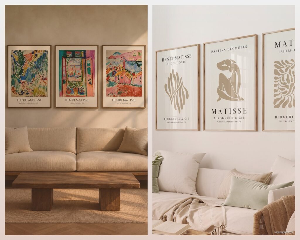
- Simple wooden frames in light oak or maple – keeps it modern without competing with the art
- White or black gallery frames with a mat – classic but you gotta get the mat color right
- Floating frames for canvas prints – makes the colors pop off the wall
- No frame at all if it’s on canvas – controversial but sometimes it works
The mat thing is tricky. White mats are safe but can feel a bit sterile. I did a cream-colored mat for “Blue Nude II” and it warmed up the whole piece without being obvious about it. Just don’t do colored mats that try to match the artwork because it always looks cheap and dated.
Oh and another thing – standard frame sizes are your friend. If you buy a print in a weird size like 19×26 or something, you’re gonna pay like $200 for custom framing. Stick to 16×20, 18×24, 24×36 and you can find ready-made frames everywhere for way less.
Which Cut-Outs Actually Work in Real Homes
Not all Matisse cut-outs translate well to wall art and I learned this the hard way. Some are too busy, some lose their impact when they’re not massive, some just feel wrong outside a museum context.
The ones I keep coming back to:
Blue Nude II – This is like the gateway Matisse. Works in basically any room that needs a bold focal point. I’ve used it in bedrooms, living rooms, even a really modern bathroom once. The blue is intense but somehow still calming?
The Snail – Better for larger spaces because it needs room to breathe. Tried it in a small apartment once and it overwhelmed everything. But in a room with high ceilings or a big empty wall? Perfect.
Icarus – The one with the falling figure against the black background with yellow stars. This one’s tricky because the black background can feel heavy but when it works it REALLY works. Best in rooms with lots of natural light.
The Parakeet and the Mermaid – Huge and complicated but absolutely stunning if you have the wall space. Not gonna lie this one’s expensive to get in a decent size.
Wait I forgot to mention – size matters way more than you think. A little 11×14 print of “The Snail” just looks sad. These cut-outs were meant to be BIG. I usually don’t go smaller than 24×36 for the main pieces. You can do smaller sizes if you’re doing a gallery wall with multiple prints but as standalone art, bigger is better.
Where to Actually Buy Them
Okay so funny story, I once spent $300 on a “limited edition” print from a gallery that I later found on Etsy for $45. Same exact print. So yeah, shop around.
Places I actually buy from now:
MoMA Design Store – Expensive but the quality is guaranteed. Good if you want to be absolutely sure you’re getting museum-quality reproduction. They have sales sometimes, sign up for emails.
iCanvas – My secret weapon honestly. Good quality giclée prints, lots of size options, often have 40% off sales. The framing options are decent too.
Art.com – Huge selection, quality varies but their “premium” level is solid. Custom sizing available which is clutch sometimes.
Society6 – More affordable, print quality is good for the price. I use these for clients with tighter budgets. Just stick to their premium prints not the standard ones.
Etsy – Hit or miss but you can find some really good deals. Look for sellers who specify giclée or archival prints. Read reviews obsessively before buying.
Avoid Amazon for art prints unless it’s through a known brand’s storefront. I got burned with a “canvas print” that was literally just poster paper glued to cardboard. My dog knocked it over and it dented like a cereal box.
The Gallery Wall Approach
If one big Matisse piece feels too expensive or too bold, gallery walls are the move. I did this in my own apartment actually – got five smaller cut-out prints in different sizes and arranged them on one wall.
The trick is keeping a consistent element. Either frame them all the same way or use the same mat color or stick to cut-outs from the same period. Mixing random Matisse pieces with different frame styles just looks chaotic not curated.
Spacing is crucial too. I use 2-3 inches between frames usually. Lay everything out on the floor first and take a photo so you remember the arrangement when you’re up on the ladder. Learned that one the hard way after rearranging the same four pieces like six times because I forgot what looked good.
Color Coordination Without Being Matchy-Matchy
This is gonna sound obvious but the colors in Matisse cut-outs are BOLD and you gotta think about your room colors. I made the mistake of putting “Blue Nude II” in a room with navy walls and it just disappeared. The contrast wasn’t enough.
Best backgrounds for Matisse prints:
- White or off-white walls – lets the colors sing
- Light gray – modern and doesn’t compete
- Pale blush or cream – warms everything up nicely
- Bold colored walls if you’re brave – but pick a color that’s NOT in the artwork
I saw this amazing setup once where someone put “Icarus” with its black background on a deep terracotta wall and it was stunning. The yellow stars just popped. But you gotta commit to bold choices like that.
Lighting Your Matisse Prints
Picture lights are your best friend here but they can get expensive. I use battery-operated LED picture lights from Amazon (like $30) for clients who don’t want to deal with wiring. They work great and you can’t tell they’re battery-powered.
Natural light is obviously gorgeous but watch out for direct sunlight. Even with archival inks, prolonged sun exposure will fade colors eventually. I use UV-protective glass for pieces that get afternoon sun. Costs more upfront but worth it.
Track lighting or adjustable spotlights work too if you’re doing a gallery wall situation. Just angle them so there’s no glare on the glass.
The Canvas vs. Paper Debate
Okay so this is personal preference but I have opinions. Canvas prints of Matisse cut-outs can look amazing because the texture adds depth but they can also look cheap if the quality isn’t there. The colors need to be really saturated for canvas to work.
Paper prints feel more authentic to me because the original cut-outs were paper. Plus you get crisper lines and more accurate colors usually. But they require framing which adds cost and effort.
I use canvas for casual spaces like bedrooms or home offices. Paper prints with proper framing for main living areas or anywhere you want it to feel more elevated.
Common Mistakes I See Constantly
Hanging art too high. The center of the piece should be at eye level which is like 57-60 inches from the floor. I see so many Matisse prints hung way up near the ceiling and it’s just wrong.
Buying prints that are too small. I mentioned this before but seriously, these cut-outs lose their impact when they’re tiny. Go bigger than you think you need.
Cheap frames on expensive prints or vice versa. Balance the investment. If you spent $200 on a museum-quality print, don’t put it in a $15 plastic frame from Target. If you bought a $40 print, maybe you don’t need the $300 custom frame.
Not considering the room’s vibe. Matisse cut-outs are playful and bold. They can work in minimalist spaces but they need room to be the statement. In a room that’s already busy with patterns and colors, they’ll just add to the chaos.
Oh wait I should mention – there are some really good DIY framing tutorials on YouTube if you wanna save money. I framed three prints myself last month while watching that new Netflix show about the chef (so good btw) and it wasn’t that hard. Just need a miter saw or box cutter, some patience, and frame molding from the hardware store.
Caring for Your Prints Long-Term
Dust the frames regularly but gently. Microfiber cloths are best. Don’t use glass cleaner directly on the frame – spray the cloth instead so you don’t get moisture seeping under the glass.
If you have paper prints, check them yearly for any signs of fading or damage. Humidity is the enemy so avoid hanging in bathrooms or kitchens unless they’re really well-ventilated.
Canvas prints can be dusted with a soft brush. Don’t touch the canvas surface with your fingers because oils from your skin can damage it over time.
Keep the original packaging if you can. Makes moving or storing so much easier. I kept all my boxes and my partner complains they take up closet space but whatever, I was right when we moved last year.
The whole Matisse cut-out thing is honestly so accessible now compared to like five years ago. You can get really good reproductions without spending a fortune if you know where to look and what to avoid. Just do your research on print quality, don’t cheap out on framing, and trust your gut on what actually works in your space.