Wall Art Guide, Wall Art Tutoriels
Marilyn Monroe Wall Art: Hollywood Icon Glamour Vintage
Oct
So I’ve been obsessing over Marilyn Monroe wall art lately and honestly it started because this client wanted to do a whole vintage Hollywood thing in her powder room and I went down this rabbit hole that lasted like three weeks. Let me tell you what I actually figured out because there’s SO much bad advice out there.
Finding Pieces That Don’t Look Cheap
First thing—and I cannot stress this enough—the quality difference between a $15 print from Amazon and a proper canvas or framed piece is massive. I ordered both to compare (my partner was like “why do we have five Marilyn prints in the hallway” and honestly valid question) but the cheap ones have this weird pixelated thing happening when you get close.
The sweet spot I found is around $45-$80 for a decent quality canvas print. You want to look for listings that specifically mention “museum quality” or “giclée printing” which sounds pretentious but it actually means something. The ink doesn’t fade as fast and the colors stay true. I’ve got one in my office that’s been there two years and it still looks exactly the same.
Size Actually Matters More Than You Think
Okay so here’s where I messed up initially. I bought this gorgeous print of Marilyn in that famous white dress pose, but I got it in 16×20 thinking it would look substantial. It looked like a postage stamp on my client’s wall. We ended up going with 30×40 and THAT’s when it became a statement piece.
For bedroom spaces I’d say go 24×36 minimum unless you’re doing a gallery wall situation. Living rooms or entryways can handle 40×60 or even bigger if you’ve got the wall space. My general rule is measure your wall space and take up about two-thirds to three-quarters of it.
The Different Styles You’ll See Everywhere
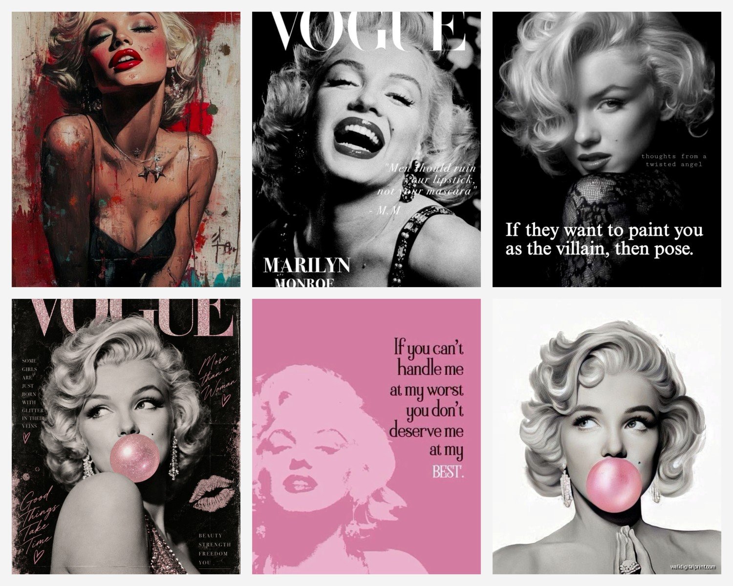
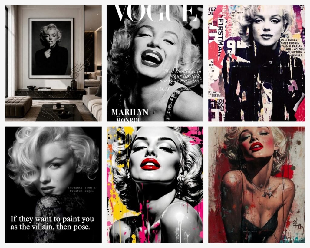
There’s basically four main categories of Marilyn art and they give totally different vibes:
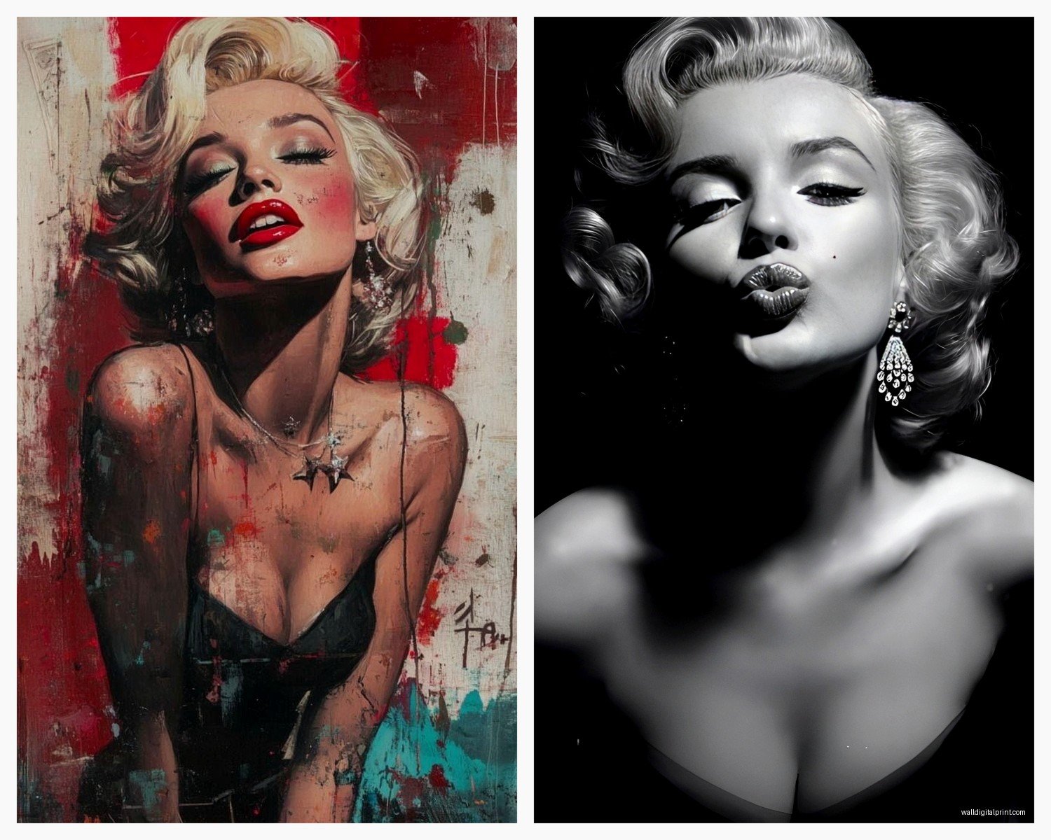
- Black and white photography prints – classic, timeless, works with literally any decor style
- Pop art style with bright colors – very Andy Warhol, super fun but harder to style around
- Vintage movie poster reproductions – these are my favorite honestly, they have this authentic retro feel
- Mixed media or abstract interpretations – hit or miss, some look amazing and some look like someone’s first Photoshop experiment
The black and white stuff is foolproof. I’ve never seen it look bad in a space. The colorful pop art versions though… you gotta commit to that aesthetic in the whole room or it looks random.
Where to Actually Buy Them
Etsy is gonna be your best friend here. I found this seller who does custom sizing on vintage poster reproductions and the quality is insane. They print on this thick matte paper that actually looks aged. Cost me about $60 for a 24×36 but it came with a certificate of authenticity which felt fancy even though it’s technically a reproduction.
Society6 has some really cool artist interpretations if you want something more unique. I got one there that’s Marilyn but done in this cool line art style – it’s in my bathroom and everyone asks about it.
AllPosters.com is hit or miss but they have TONS of options and they’re always running sales. Wait I forgot to mention – never pay full price anywhere. There’s always a coupon code if you google it or just abandon your cart and wait for the email.
Framing Makes or Breaks Everything
This is where people mess up constantly. You cannot just slap a Marilyn print in a basic black Walmart frame and expect it to look high-end. I mean you can but it won’t.
For vintage Hollywood glamour you want:
- Ornate gold or silver frames – but not too ornate or it gets tacky fast
- Simple black frames with a wide mat – super clean and lets the image be the star
- White frames if your space is more modern – creates nice contrast
I usually get my frames custom cut at a local frame shop because the sizing is always weird, but if you’re on a budget, Michaels does custom framing and they have 60% off sales like every other week. Just wait for the sale, seriously.
The mat is important too. I always do at least a 2-inch mat border, sometimes 3 inches if the print is smaller. It creates this breathing room that makes everything look more expensive and intentional.
Canvas vs Framed Print vs Metal Print
Okay so I’ve tested all three extensively because my client projects have become excuses to experiment and my spare room looks like a Marilyn Monroe shrine at this point.
Canvas prints are super popular right now and they work great for casual spaces. They have this modern gallery feel and you don’t need to frame them which saves money. But – and this is important – they can look cheap if the image quality isn’t there. Make sure you’re seeing actual photos from buyers, not just the mockup images.
Framed prints under glass are more traditional but they photograph SO much better. The glass protects everything and if you get non-glare glass (costs extra but worth it) you don’t have that reflection problem. This is what I’d do for a formal dining room or entryway.
Metal prints are having a moment and I actually love them for modern spaces. The image gets infused into the metal so it has this luminous quality. I put one in a contemporary condo renovation and it looked absolutely stunning. They’re pricier though, usually $100+ for a decent size.
Styling It In Your Actual Space
Here’s what actually works based on rooms I’ve done:
In bedrooms I like putting a large Marilyn piece above the bed as the focal point. Keep it centered and about 6-8 inches above your headboard. I did one in a client’s master bedroom with that famous “diamonds are a girl’s best friend” image and we flanked it with two small matching sconces. Simple but impactful.
Living rooms are trickier because you’re competing with the TV and other stuff. I usually put Marilyn art on a wall adjacent to the TV wall, not directly across from it. You want it to be a discovery moment, not competing for attention.
Powder rooms and bathrooms are actually perfect for vintage Hollywood glamour. The space is small so you can go bold without it overwhelming everything. I did a tiny powder room with three different Marilyn prints in matching gold frames – gallery wall style – and it became the most Instagrammed room in that house.
The Gallery Wall Approach
If you wanna do multiple pieces (which I love for a dedicated vintage Hollywood vibe) here’s my formula:
- Pick one large anchor piece – 24×36 or bigger
- Add 3-4 smaller coordinating pieces around it
- Mix frame styles but keep to one or two colors
- Include at least one non-Marilyn vintage element so it doesn’t look obsessive
I did this in my own hallway and mixed Marilyn prints with vintage movie cameras, old Hollywood postcards, and one Audrey Hepburn print just to break it up. Keeps it from feeling like a creepy shrine situation.
Oh and another thing – use a level and actually measure before you start hammering. I’ve seen so many wonky gallery walls and it drives me nuts. Lay everything out on the floor first, take a photo, then transfer those measurements to the wall. Takes an extra 20 minutes but saves you from a bunch of holes in your wall.
What To Avoid
Okay real talk – some Marilyn art is just bad. Here’s what to skip:
Those super airbrushed modern interpretations where she looks like a video game character. They’re all over Amazon and they look terrible in person. The colors are oversaturated and weird.
Anything with quotes overlaid on the image unless it’s done really well. Most of them use bad fonts and it cheapens the whole thing. There’s one that says “Imperfection is beauty” in Comic Sans and I wish I was kidding.
3D lenticular prints that change when you move. I had a client who bought one before hiring me and we had to have an awkward conversation about why it needed to go. They’re gimmicky and date your space immediately.
Really small prints in huge frames with massive mats. Some people think this looks minimalist but it just looks like you couldn’t afford a bigger print.
Lighting Your Marilyn Art
This is gonna sound extra but proper lighting makes SUCH a difference. I installed two small picture lights above a client’s large Marilyn canvas and it went from looking nice to looking like a museum piece.
If picture lights aren’t your thing, just make sure you have good ambient lighting in the room. LED strips behind the canvas create a cool floating effect if you’re into that modern vibe – my nephew has this setup in his apartment and it actually looks pretty sick.
Avoid putting Marilyn art directly across from a bright window though. The sun will fade it over time and you’ll get glare during the day. I learned this the hard way with a print in my breakfast nook that’s now noticeably lighter on one side.
Mixing Marilyn With Different Decor Styles
People think vintage Hollywood art only works with glam decor but that’s not true. I’ve successfully incorporated Marilyn pieces into:
Modern minimalist spaces – Use black and white photography in simple black frames. Keep it to one statement piece. The contrast between old Hollywood glamour and clean modern lines actually works really well.
Industrial loft vibes – Metal prints or canvas without frames. The vintage imagery plays nicely against exposed brick and metal fixtures.
Bohemian eclectic rooms – This is where you can go wild with colorful pop art versions. Mix with other vintage finds and it all works together.
Traditional/classic interiors – Ornate gold frames with museum-quality prints. This is the easiest pairing honestly.
The key is committing to the choice and styling around it intentionally. A Marilyn print just randomly stuck on a wall will look random. But if you coordinate your throw pillows, add some gold accents, maybe include other vintage elements – suddenly it’s a cohesive design choice.
Taking Care Of Your Investment
If you spent decent money on quality art, protect it. Dust the frame regularly with a microfiber cloth. If it’s under glass, use glass cleaner but spray the cloth, not the glass directly – you don’t want cleaner seeping behind the frame.
For canvas prints, you can very gently dust them with a soft brush. Don’t use any liquids on canvas unless you wanna ruin it.
Keep everything out of direct sunlight and away from humidity. My cat knocked over a plant near one of my prints once and the water damage was… not great. Learn from my mistakes.
Honestly the whole Marilyn Monroe art thing can go from classy to tacky real fast depending on execution, but if you focus on quality pieces, proper sizing, and intentional styling, it adds this timeless glamorous vibe that’s hard to achieve with other decor choices. Just maybe don’t tell guests you spent three weeks researching it like I did because that sounds slightly unhinged when you say it out loud.