Wall Art Guide, Wall Art Tutoriels
Asian Wall Art: Oriental Eastern Buddhist Zen Decor
Oct
So I’ve been down this rabbit hole for months now because honestly, Asian wall art is having such a moment and my clients keep asking about it. Like, I just finished a consultation yesterday where someone wanted their entire meditation corner redone with Buddhist-inspired pieces and I had to actually stop myself from geeking out too much.
First Things First – What Actually Works on Walls
Okay so here’s what I’ve learned the hard way. Not all Asian wall art is created equal, and you gotta know what vibe you’re actually going for. Are you doing full zen monastery? Japanese minimalist? That vibrant Tibetan temple energy? Because mixing them gets weird fast.
I made this mistake in my own living room last year. Bought this gorgeous Tibetan mandala – super colorful, intricate, all the golds and reds – and tried to pair it with a minimal ink wash painting. Looked like my wall had an identity crisis. My cat knocked over a plant while I was rearranging everything for the third time, which felt appropriate somehow.
The Main Categories You’ll Actually Encounter
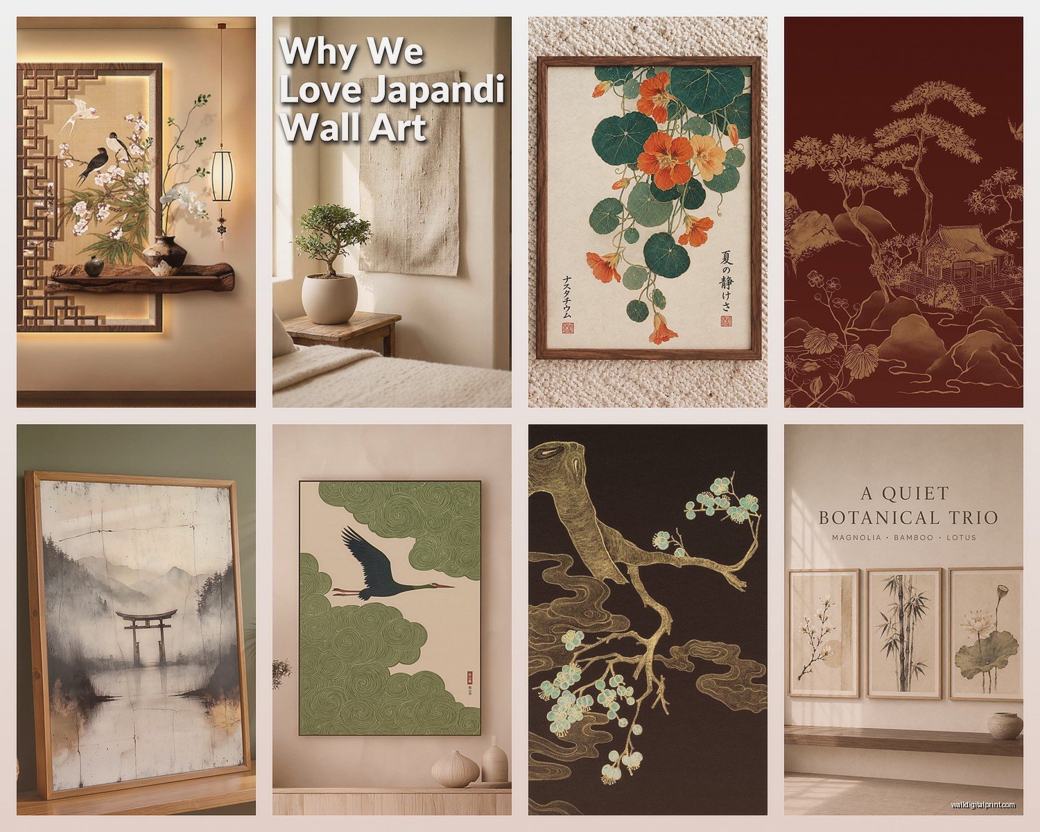
Japanese ink paintings (sumi-e) are probably the easiest starting point. They’re those black ink on white/cream backgrounds – bamboo, mountains, zen circles (enso). Super forgiving because they literally go with everything. I’ve used them in modern apartments, traditional homes, even in a client’s home office that was otherwise all Scandinavian furniture.
Buddhist thangkas are the Tibetan scroll paintings. These are INTENSE. Lots of detail, usually depicting deities or mandalas. They need space to breathe. Don’t crowd these – I learned that when I hung one too close to a bookshelf and it just looked cluttered instead of sacred.
Chinese calligraphy can be hit or miss unless you actually know what it says. Please don’t be that person who hangs “chicken soup” thinking it says “inner peace.” I always verify with my friend who’s fluent because I’ve seen some disasters at estate sales.
Zen circles (enso) are having a MAJOR moment right now. It’s literally just a circle painted in one brushstroke but somehow it works everywhere? I’ve spec’d these for minimalists, maximalists, you name it.
Size and Placement Without Overthinking It
Here’s my actual formula that I use. For a wall that’s like 8-10 feet wide, you want your main piece to be at least 2/3 the width of your furniture below it. So if you’ve got a 6-foot couch, aim for a 4-foot wide piece or a gallery arrangement that spans that.
But also – and this is gonna sound weird but – sometimes breaking that rule creates the best moments. I hung a tiny 12×12 inch enso on a huge empty wall in my own bedroom and people always comment on it. The negative space IS the art in zen philosophy, right?
Height Stuff That Actually Matters
Center of the artwork at 57-60 inches from the floor. This is the museum standard and it just works. I measure to the center of the piece, mark it, then measure up from there to where the nail goes based on the hanging hardware.
Oh and another thing – if you’re hanging above furniture, leave 6-8 inches between the furniture top and the bottom of the frame. Closer looks cramped, further looks disconnected.
What to Actually Buy and Where
Okay so you asked which ones to actually buy. I’ve tested SO many sources at this point.
For prints and affordable options: Society6 has some really beautiful Asian-inspired designs. Not authentic antiques obviously, but if you want that aesthetic without dropping serious cash, I’ve ordered from there multiple times. The quality is consistent. Just avoid anything that looks too commercial or has weird English translations mixed in.
Etsy is hit or miss. You’ll find actual artists doing traditional ink paintings, which is cool, but you gotta dig through a lot of dropshipped stuff. Look for shops that show the actual creation process in their photos. I found this artist in California doing gorgeous modern sumi-e work – bought three pieces and they’re still up in my hallway two years later.
For the real deal: If you want authentic vintage pieces, estate sales in areas with large Asian populations are goldmines. I’ve found incredible scrolls for under $100 that would cost thousands in galleries. Just make sure you know how to spot condition issues – tears, water damage, fading.
There’s also this site called 1stDibs but honestly it’s gonna be expensive. Like, investment-level expensive. I only point clients there if they’re serious collectors.
Reproduction Quality Levels
Not all prints are equal and this matters more than you’d think.
Canvas prints of Buddhist art can look cheap real fast. The texture doesn’t match the subject matter. I’d skip these unless you’re doing a really casual space.
Giclée prints on textured paper or silk – now we’re talking. These actually capture the brushstroke quality. Frame them behind glass with a mat and they look legit.
Actual hand-painted reproductions exist and they’re worth it if you find a good artist. There’s a whole community of artists who recreate thangkas and traditional paintings. Price range is usually $200-800 depending on size.
Framing Without Making It Look Like a Poster
This is where people mess up constantly. Asian art needs specific framing considerations.
For scrolls – don’t frame them in regular frames unless you want to ruin the whole vibe. They’re meant to hang as scrolls with the wooden dowels top and bottom. You can find mounting kits online. I use museum putty on the top dowel to keep it stable on the wall.
For prints and paintings – simple frames work best. Black, natural wood, or even no frame with just a float mount. I’m obsessed with those thin black metal frames right now for zen circles and ink paintings. They disappear and let the art do its thing.
Matting matters. White or off-white mats for most pieces. I go with at least 3-inch mats, sometimes 4 inches for smaller pieces. Creates that breathing room that’s essential to the aesthetic.
Creating an Actual Zen Corner or Feature Wall
So you mentioned wanting to do like a whole meditation area? Here’s what’s actually worked for my clients and in my own space.
Pick one statement piece first. This is your anchor. Maybe it’s a large Buddha painting or a dramatic enso. Everything else supports this.
Add symmetry if you’re going traditional. Two matching scrolls flanking a central piece is very classical Asian design. Or go full asymmetrical if you’re doing Japanese wabi-sabi vibes – that embraces imperfection anyway.
Layer in 3D elements. Wall art alone can feel flat. I add floating shelves with small Buddha statues, incense holders, a tiny ikebana arrangement. This creates depth and makes the wall feel intentional.
Lighting That Doesn’t Suck
Ugh lighting is so important here. You don’t want harsh overhead light washing out subtle ink work.
Picture lights are one option – those little brass or bronze fixtures that mount above the frame. Very traditional, works great for scrolls.
I’m more into using adjustable wall sconces on either side of a major piece, or even just a well-placed floor lamp that casts light upward. Creates drama without being obvious about it.
Natural light is tricky. Direct sunlight will fade your art over time, especially prints and watercolors. If your wall gets sun, use UV-protective glass in your frames or hang pieces on adjacent walls.
Mixing Asian Art with Your Existing Stuff
You probably don’t have an empty room to work with, right? Here’s how to integrate this without redecorating everything.
Asian art actually plays nice with mid-century modern furniture. The clean lines and wood tones complement each other. I’ve done this combo like a dozen times.
It also works with bohemian spaces – but you gotta be careful not to tip into cultural appropriation territory or that “I went to Thailand once” vibe. Keep it respectful and intentional, not just decorative exoticism.
Scandinavian minimalism and Japanese zen art are basically cousins. Natural materials, negative space, functionality. Easy pairing.
Where it gets weird is with really ornate traditional Western styles. Like, your gilded baroque mirror might not vibe with a zen circle. Might! But probably not.
Color Coordination Without Overthinking
If you’re doing traditional ink paintings, you’ve got black, white, grays. Easy to work with any color palette.
Thangkas and Tibetan art bring in golds, reds, blues, greens – really saturated stuff. Pull one or two of those colors into your room through pillows, throws, or other accessories. Don’t try to match everything; just create little color echoes.
I did a client’s dining room last month where we hung this gorgeous red and gold thangka, then added rust-colored linen napkins and some gold candlesticks. Tied it together without being matchy-matchy.
Caring for This Stuff
Okay so maintenance. Silk scrolls and antique pieces are delicate. Dust them gently with a soft brush – I use a clean makeup brush honestly. Never spray cleaners directly on them.
Framed pieces behind glass, just clean the glass like normal. Easy.
If you have actual antique scrolls, they shouldn’t be displayed year-round. Traditional practice is to rotate them seasonally, which also keeps you from getting bored. I have like five scrolls and swap them out every few months.
Humidity is the enemy. Don’t hang valuable pieces in bathrooms or anywhere with major temperature fluctuations.
Avoiding Cultural Appropriation While Still Decorating
This is important and honestly something I think about a lot in my work. There’s a difference between appreciating Asian art and treating it like a trend.
Do your research. Understand what you’re hanging. A thangka isn’t just pretty colors – it’s a sacred meditation tool in Tibetan Buddhism. Hang it respectfully, not in a bathroom or somewhere it’ll be disrespected.
Support actual Asian artists when possible. Not just companies mass-producing “oriental vibes.”
If you’re not Buddhist, maybe skip the actual Buddha heads as decor. There’s plenty of Buddhist-inspired art that doesn’t involve sacred imagery. Zen circles, nature scenes, calligraphy of secular concepts.
When clients ask me about this, I usually steer them toward either authentic vintage pieces (appreciating the craftsmanship and history) or contemporary Asian artists doing modern interpretations. Both feel more genuine than buying random “Asian aesthetic” stuff from big box stores.
Budget Breakdown for Different Approaches
Since you asked what to actually buy, here’s what different budget levels get you:
Under $100: Quality prints from Etsy or Society6, simple frames from IKEA or Target, maybe one small original ink painting from a student artist
$100-500: Larger giclée prints, custom framing, hand-painted reproduction scrolls, vintage pieces from estate sales
$500-2000: Original art from established artists, authentic antique scrolls in good condition, museum-quality reproductions, custom silk mounting
Above $2000: Serious collector territory, gallery pieces, rare antiques, commissioned work from master artists
I spend most of my client budgets in that middle range honestly. You get real quality without it being an investment piece.
Common Mistakes I See Constantly
Hanging too many pieces too close together. Asian aesthetics are about space and breath. Resist the gallery wall urge.
Choosing pieces just because they “look Asian” without any cohesive theme. Random Buddha head plus anime print plus Chinese takeout menu aesthetic = no.
Ignoring scale. A tiny piece on a huge wall doesn’t create minimalism, it creates awkwardness.
Mixing too many regional styles. Pick Japanese OR Chinese OR Tibetan as your main influence, then maybe add subtle nods to others.
Forgetting that lighting exists. Art in the dark is just shapes on walls.
wait I forgot to mention – never hang Asian art in direct line with your front door if you’re trying to follow feng shui principles. Apparently the energy flows straight out? I had a client who was very specific about this and honestly, even if you don’t believe in feng shui, it’s just good design to create a journey through the space rather than putting the focal point right at the entrance.
My dog just knocked over my water bottle while I’m typing this but anyway – the main thing is to start with one piece you genuinely connect with, not just something that looks cool on Pinterest. I see so many people buy art because it fits an aesthetic they’re forcing, and it always feels empty. The best spaces I’ve designed are where the client actually cares about the art itself, knows what the symbols mean, has some connection to it beyond “looks zen.”