Wall Art Guide, Wall Art Tutoriels
Coral Wall Art: Ocean Reef Pink Orange Sea Life Decor
Oct
So I’ve been obsessing over coral wall art lately because this client wanted a whole coastal vibe without going full nautical nightmare, you know? And honestly it sent me down this rabbit hole of ocean reef decor that I’m gonna share because I’ve tested way too much of this stuff.
Finding the Right Coral Pieces Without Looking Like a Beach Gift Shop
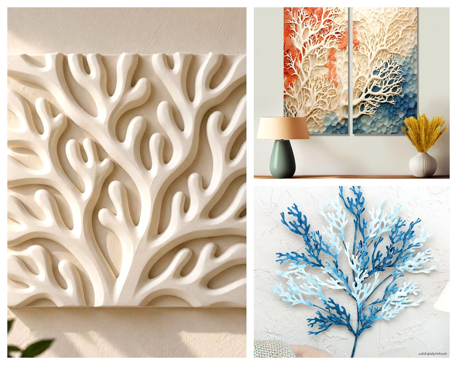
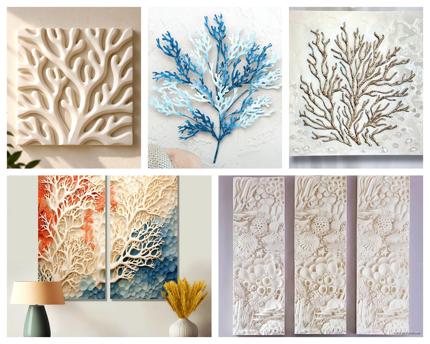
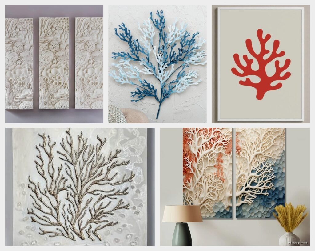
Okay so first thing – coral wall art comes in like a million varieties and most of it is terrible. You’ve got your actual preserved coral (which is usually illegal now thank god), resin replicas, metal sculptures, prints, and then the painted canvas stuff. I spent three weeks comparing options for that project and here’s what actually works.
The metal coral sculptures are honestly my favorite if you’re going for sophisticated. They come in those matte gold finishes or the more modern black iron looks. I found this set of three from a vendor I work with – they’re like 18 inches each, different coral branch shapes, and they don’t scream “I LOVE THE BEACH” which is key. You mount them with those heavy duty picture hangers because they’re heavier than they look. Learned that the hard way when one fell at 2am and scared my cat so bad she didn’t come out for hours.
The pink and orange combo you’re asking about – that’s tricky because it can go twee really fast. What works is keeping the coral imagery more abstract or scientific looking rather than cartoon-y. I use a lot of vintage style botanical prints that show coral specimens like old scientific illustrations. They come in these gorgeous muted coral pinks and burnt oranges that feel elevated.
Mixing Colors Without Creating Chaos
Here’s where people mess up constantly. They see “coral decor” and buy everything in bright orange and hot pink and suddenly their room looks like a Lilly Pulitzer store exploded. Not cute.
What I do is pick ONE main coral piece in a saturated color – maybe a big canvas with actual bright coral reef photography or a bold orange metal sculpture. Then everything else is toned way down. Think blush pinks, peachy tones, maybe some cream with just hints of coral. The supporting pieces should be in neutrals with coral accents.
Oh and another thing – the blues you pair with coral shades matter SO much. Avoid that bright turquoise Caribbean blue unless you’re actually trying to look like a beach resort. Instead go for deeper ocean blues, navy, or even teal. I did a whole living room where we used coral pink art against this moody blue-gray wall and it was *chef’s kiss*.
Where to Actually Buy This Stuff
Gonna be real with you, Etsy has been my main source lately. There are shops that sell digital prints of vintage coral specimens that you can download and print at your local print shop for like $30 versus buying the framed version for $200. I always size them at 16×20 or 24×36 depending on the wall space.
For physical pieces, West Elm has those resin coral sculptures that are pretty good quality. Not cheap but they look expensive which matters. I bought the white resin fan coral for my own place and it’s held up for two years without yellowing.
Target surprisingly has decent coral canvas prints sometimes in their Opalhouse line. They rotate stock though so you gotta catch them when they have the good stuff. I grabbed a three-piece set last spring that was soft watercolor coral branches and I’ve used them in two different client homes.
HomeGoods is hit or miss – mostly miss if we’re being honest – but occasionally you’ll find a really unique carved wood coral piece or a good quality metal one. You just have to dig through all the “Live Laugh Love” signs to find them.
The DIY Route If You’re Crafty
Wait I forgot to mention – you can totally make your own coral art if you’ve got a free weekend. I did this for a powder room project where the budget was tight.
Bought white resin coral pieces from a craft store (the kind people put in aquariums), spray painted them in a matte coral pink and matte gold, then mounted them on painted canvas boards in a shadow box arrangement. Total cost was maybe $45 for three pieces that looked like they cost $300 each. The client still doesn’t know.
For painted art, you can do abstract coral reef scenes even if you’re not “artistic.” Get a canvas, paint the background in layers of blue and teal, then use a palette knife to add texture with coral pinks, oranges, and whites in organic branch shapes. It doesn’t have to be realistic – abstract actually reads better from a distance anyway.
Arranging Multiple Pieces
This is where I see people freeze up. They buy beautiful coral art and then just… stick it randomly on the wall. No.
For a gallery wall with mixed coral pieces, I always lay everything out on the floor first. Take a photo. Move stuff around. Take another photo. I literally spend an hour doing this sometimes – my client canceled last Tuesday so I spent way too long perfecting a coral gallery wall arrangement and texting options to my friend who gives zero opinions but listens anyway.
The rule I follow: keep the spacing between pieces consistent, usually 2-3 inches. Mix sizes but balance the visual weight. If you have a big bold orange piece on the left, you need something with similar visual weight on the right – doesn’t have to be the same size, just needs to balance.
For a more modern look, do a grid arrangement. Three pieces same size in a horizontal row, or a 2×2 grid of four pieces. Keep the frames identical and the spacing exact. It looks intentional and gallery-like.
Framing Makes or Breaks Everything
Okay so funny story – I once bought these gorgeous vintage coral prints and framed them in these elaborate gold baroque frames because I thought it would look elegant. It looked like a grandmother’s beach house. Not the vibe.
What actually works: simple frames. For scientific coral prints, I use thin black metal frames or natural light wood. For more colorful modern pieces, white frames keep it fresh. The chunky rustic wood frames everyone loves? Only use those if your whole space is already coastal-farmhouse hybrid, otherwise they’re too heavy.
And please – PLEASE – use real glass or acrylic, not that flimsy plastic that comes with cheap frames. It makes a massive difference in how professional it looks. I order custom acrylic from a local frame shop and yes it costs more but you can actually see the art clearly.
Styling the Wall Around Coral Art
The art is just part of it, you gotta think about what’s near it. I always add some natural texture elements – like a woven basket on a nearby shelf, some driftwood pieces, or linen curtains. It makes the coral art feel intentional rather than theme-y.
Plants help too. I’m obsessed with putting coral art near large leafy plants because it creates this weird underwater garden vibe without being literal about it. Snake plants work great, or if you have good light, a fiddle leaf fig nearby makes everything look expensive.
Lighting matters more than people think. I add picture lights above important pieces or use track lighting to highlight the coral wall. In one project we installed LED strip lighting behind a large metal coral sculpture so it glowed against the wall at night – super dramatic and my client posts photos of it constantly.
What to Avoid
Real talk – skip anything with glitter, the word “beach” in cursive, or cartoon fish. Just no.
Also those mass-produced canvas prints from furniture stores that show the same generic coral reef photo everyone has? You’ve seen them. They’re usually in a triptych format and the colors are weirdly oversaturated. Everyone has them which means you shouldn’t.
Avoid mixing too many different styles. If you’re doing scientific illustration prints, don’t throw in a realistic photograph AND an abstract painting AND a metal sculpture. Pick a lane. You can mix mediums (prints + sculptures works great) but keep the style cohesive.
Room-Specific Tips
For bathrooms, go with smaller pieces because of humidity. I use framed prints under acrylic rather than glass because it’s lighter and safer. A single coral specimen print in a simple frame above the toilet is perfect – it’s interesting without overwhelming a small space.
Living rooms can handle bigger statement pieces. I did a massive 48×36 inch abstract coral reef painting as the focal point above a sofa and built the whole room’s color scheme around the pinks and oranges in it. Sounds risky but when you commit fully it works.
Bedrooms need softer vibes so I go with blush pink coral art rather than bright orange. Multiple small pieces in a cluster above the bed or a large soft watercolor piece. Keep it calming because it’s a sleep space.
My office has this cool thing where I mounted three different sized metal coral branches vertically along one wall going from floor almost to ceiling. It’s unexpected and makes the wall feel taller. Gets compliments on every Zoom call.
Mixing Coral Art with Other Sea Life
You asked about incorporating other ocean elements – totally doable but you gotta be careful. I mix coral with subtle sea urchin shells, starfish, or sand dollar imagery. What I don’t do is throw in seahorses, dolphins, and anchors. That’s too much.
Keep the additional sea life minimal and in the same color family. If your coral art is pink and orange, add maybe one piece with a neutral-toned shell or sea fan. The coral should stay the dominant theme.
I did a client’s entryway where we had a large coral print flanked by two smaller framed pressed sea fans in shadow boxes. All in similar muted tones. It felt collected and intentional rather than themed.
Maintenance and Long-Term Care
Metal coral sculptures just need occasional dusting. I use a soft paintbrush to get in the detailed branches. Don’t use chemical cleaners – they can mess with the finish.
For framed prints, keep them out of direct sunlight or the colors will fade. I learned this the hard way with a print in a client’s sunroom that looked completely washed out after six months. Now I always mention UV-protective glass for sunny spots.
Resin coral pieces can yellow over time if they’re cheap quality. The good ones don’t but you’re gonna pay more. If you’ve got a resin piece that’s starting to look dingy, sometimes you can lightly sand it and repaint with a matte sealer but honestly it’s easier to just buy better quality upfront.
Budget Breakdown
Since you’re probably wondering about costs – you can do a whole coral art wall for under $150 if you’re strategic. Three digital prints downloaded and printed ($60), simple frames from IKEA ($45), maybe one small metal coral piece from HomeGoods ($35). That’s a complete look.
Mid-range budget around $400-600 gets you nicer frames, a couple quality resin sculptures, and maybe one original piece from a local artist.
High-end if you wanna splurge – I’ve done coral art installations that cost $2000+ with custom framing, large original paintings, and designer metal sculptures. Worth it if it’s a focal point in your main living space.
The key is mixing price points. One investment piece (expensive large painting or sculpture) combined with budget-friendly supporting pieces looks better than everything being medium-quality and medium-priced.
Anyway that’s basically everything I know about coral wall art after doing like fifteen projects with it. The main thing is don’t overthink it – pick pieces you actually like looking at, not just what seems “coastal” enough, and build from there.