Wall Art Guide, Wall Art Tutoriels
Black and White Wall Art: Monochrome Classic Contrast Designs

Nov
So I was reorganizing my studio last week and realized like half my favorite pieces are black and white, which got me thinking about how much easier it is to work with monochrome art than people think. Everyone gets so stressed about it being “too stark” or whatever but honestly it’s probably the most forgiving choice you can make.
Why Black and White Actually Works Better Than You Think
Okay so here’s the thing nobody tells you – black and white art doesn’t compete with your space, it complements it. I had this client last month who was terrified her living room would look like a lawyer’s office if she went monochrome, but once we hung these three abstract ink pieces above her sofa… the room just clicked. Her burnt orange pillows suddenly looked intentional instead of random, and that navy armchair she was gonna replace? Perfect now.
The contrast thing is real though. You need actual blacks and actual whites, not grays pretending to be contrast. I learned this the hard way when I bought this “black and white” photograph that was really just fifty shades of medium gray. Looked muddy on the wall, returned it within a week.
Types of Black and White Art That Actually Matter
Photography
This is probably where most people start and honestly it’s solid. Architectural shots work insanely well – I’ve got this image of Brutalist stairs in my hallway that people always ask about. The key is looking for strong geometric shapes or really dramatic lighting. Ansel Adams style landscapes can be gorgeous but they need space to breathe, like don’t stick them in a tiny powder room.
Street photography is hit or miss. Sometimes it feels too try-hard artsy, sometimes it’s perfect. I think it depends on whether the moment feels genuine or staged.
Line Drawings and Sketches
These are having such a moment right now and I’m here for it. One-line face drawings, continuous line nudes, botanical sketches… they add this sophisticated vibe without being heavy. My sister has three simple line art pieces in her bedroom and it’s probably the most elegant room in her apartment.
The cheap prints can look really obvious though. If you’re going budget, make sure the lines are actually crisp and the paper quality doesn’t look like it came from an office printer.
Abstract and Geometric
This is my personal favorite category because there’s so much range. You can go minimal with just black shapes on white, or intense with these chaotic splatter pieces, or structured with geometric patterns. I recently curated a collection for a tech startup office and we did all geometric black and white – it looked modern without being cold.
Oh and another thing – abstract monochrome is really forgiving if your walls aren’t perfect. That texture and movement distracts from any imperfections.
Typography and Text Art
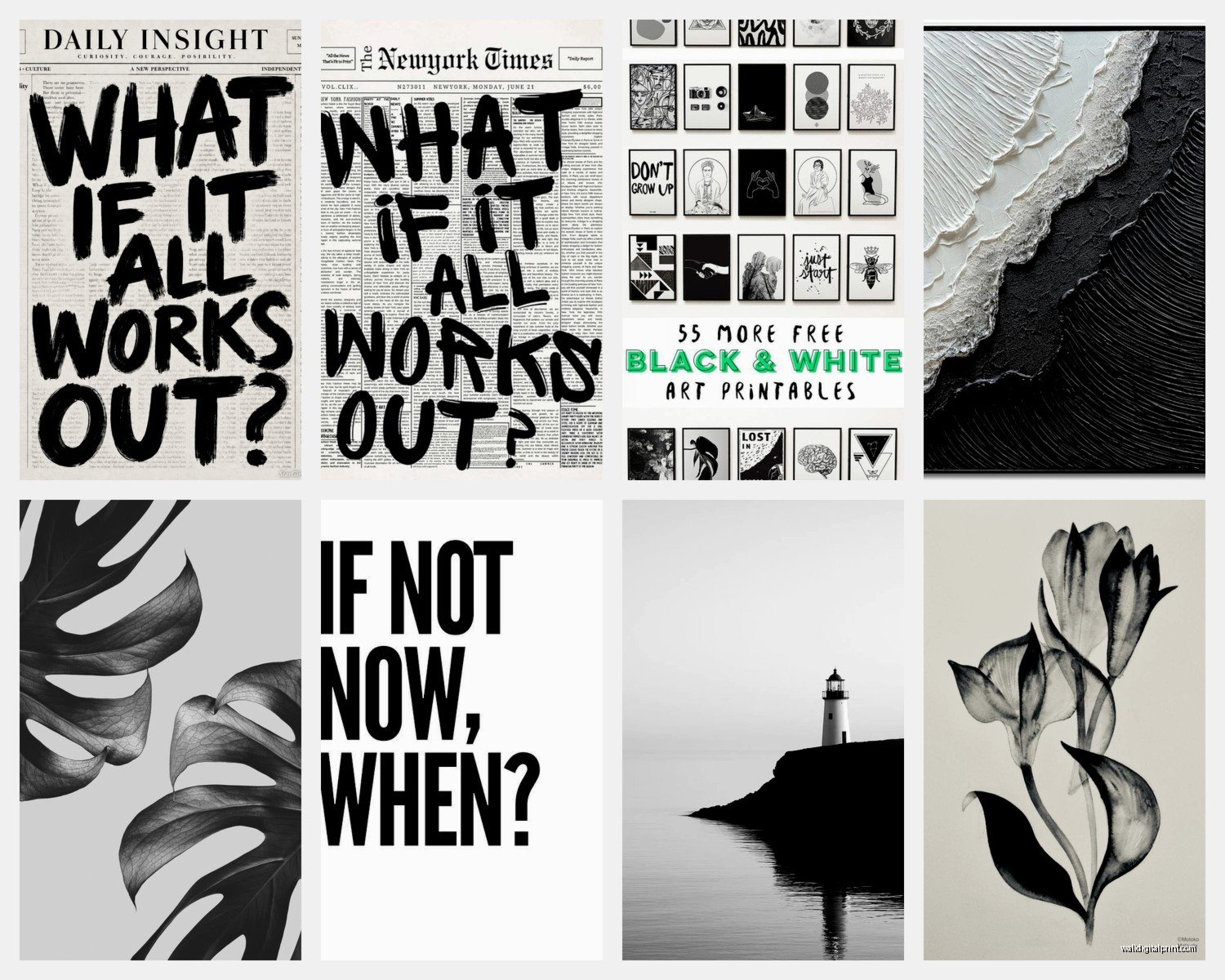
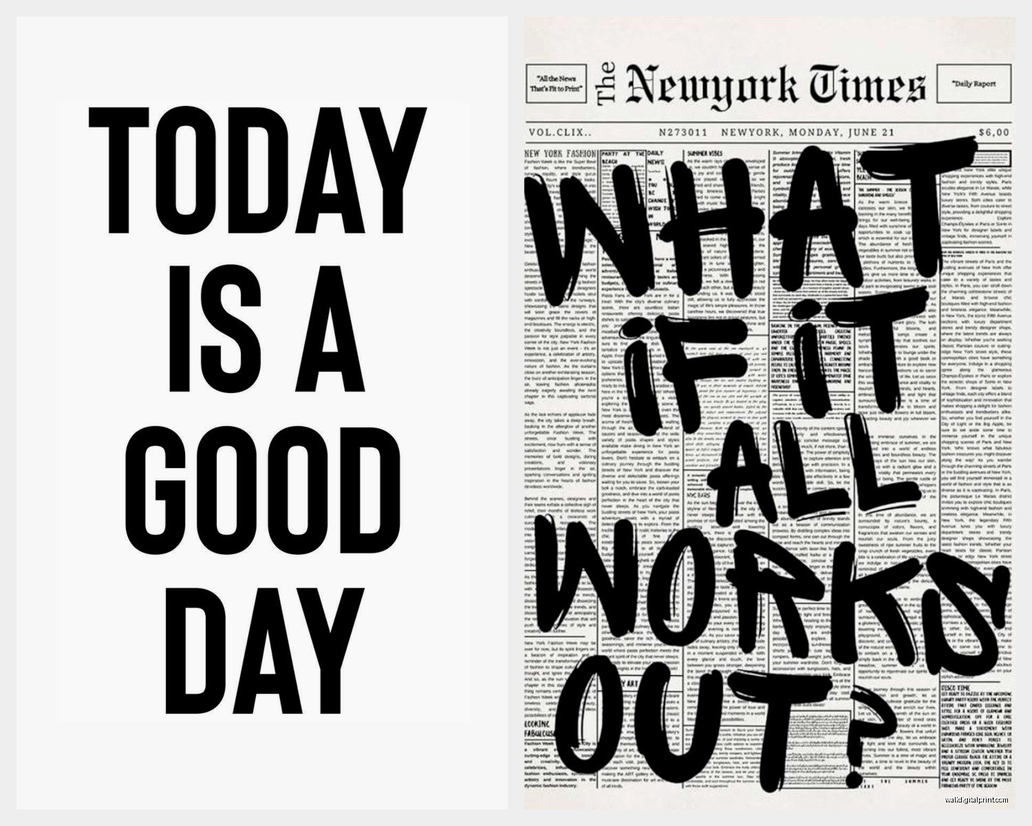
Gonna be honest, this can go cheesy fast. Like if I see one more “Live Laugh Love” in black script I might scream. BUT done right, text art is actually cool. Vintage typography, dictionary page prints, meaningful quotes in modern fonts… just please avoid the Instagram caption aesthetic unless you’re prepared to cringe at it in two years.
Size and Placement Strategy
This is where people mess up constantly. They either go too small or too big, rarely just right. Here’s what I’ve figured out through lots of trial and error:
For above a sofa or bed, your art should be roughly two-thirds to three-quarters the width of the furniture. I use painters tape to map it out first because I’ve definitely hung things, stepped back, and immediately known it was wrong.
Gallery walls are their own beast. I spent like three hours last Tuesday arranging frames on my floor before hanging anything. My cat kept sitting on the layouts which was super helpful, thanks Luna. The trick with black and white gallery walls is varying the frame styles – all matching frames can look too rigid, but all different can look chaotic. I usually do 2-3 frame styles max.
Height matters more than people think. The center of your art should be at eye level, which is roughly 57-60 inches from the floor. This is literally the standard museums use and it just works.
Single Large Statement Pieces
These are intimidating but create such impact. I’m talking like 40×60 inches or bigger. They work best in rooms with at least one empty wall – trying to fit a massive piece among shelves and windows gets cramped fast.
The advantage with monochrome for large pieces is they don’t overwhelm the space with color. I have a 48×72 abstract piece in my dining area that would be completely overpowering in color, but in black and white it’s dramatic without being loud.
Diptychs and Triptychs
Okay so funny story, I thought these were pretentious until I actually tried them. A diptych is two panels, triptych is three, and they create this really nice rhythm on a wall. The spacing between panels matters though – I keep them 2-4 inches apart usually. Too close and they look like one wonky piece, too far and they lose connection.
Frame Choices That Make or Break It
This is gonna sound weird but the frame matters almost as much as the art itself. I’ve seen gorgeous prints totally ruined by cheap frames and mediocre prints elevated by good framing.
Black frames are the obvious choice and they work great, especially for creating that gallery feel. But white or natural wood frames can actually make black and white art pop more because of the contrast. I use white frames when I want the art to feel lighter and more modern, black when I want it to feel grounded and traditional.
Matting is important too. A white mat creates breathing room and makes the art feel more valuable somehow. I usually do 2-3 inch mats for smaller pieces, up to 4 inches for larger ones.
Frameless or floating frames give this contemporary gallery vibe. I have several pieces mounted on foam board behind acrylic and they look super clean and modern. More expensive though.
Mixing Black and White with Color
Wait I forgot to mention this earlier but it’s crucial – black and white art works with literally any color scheme. Like, any. I’ve used it in rooms with bold jewel tones, soft pastels, earth tones, everything.
The trick is letting the colored elements in your room be the supporting cast while the monochrome art anchors everything. I worked on a bedroom last fall with emerald green bedding and gold accents, and we did three black and white botanical prints above the bed. The green and gold suddenly looked intentional and curated instead of random.
If you’re nervous about commitment, start with black and white art. You can change your throw pillows, paint colors, furniture… the art will still work.
Where to Actually Buy This Stuff
Budget Options
Printable art on Etsy is honestly great if you’re willing to do your own printing and framing. I’ve bought tons of digital downloads for like $5-10 and had them printed at a local print shop. The quality depends on the file resolution though – make sure it’s at least 300 DPI.
Society6 and Redbubble have decent options and they do the printing and framing for you. Quality is hit or miss but their return policies are usually good.
Target and IKEA have surprisingly nice options now. Their art has gotten so much better in the past few years.
Mid-Range
Minted, Juniper Print Shop, and Artfully Walls are my go-tos in this range. Better paper quality, more unique designs, still affordable. I probably order from Minted monthly for client projects.
West Elm and CB2 for more curated selections. Their pieces feel more designed and less mass-produced.
Investment Pieces
Original art from local galleries or artists if you want something truly unique. I follow a bunch of artists on Instagram and have commissioned several pieces. It’s more expensive but you get exactly what you want.
Saatchi Art and Artsy for online galleries with original and limited edition pieces. The markup is real but the quality is there.
Common Mistakes I See All The Time
Hanging things too high. Seriously, everyone does this. Lower than you think.
Going too matchy. Like all the same size frames in a perfect grid can look really sterile unless you’re going for that specific aesthetic.
Ignoring lighting. Black and white art needs good lighting to show the contrast. I always recommend picture lights or track lighting for gallery walls.
Choosing images that are too busy. Sometimes less is more – a simple composition often has more impact than something with a million details competing for attention.
Not considering the mood. A stark black ink splash piece has different energy than a soft charcoal portrait. Think about what vibe you want in that space.
DIY and Custom Options
I’ve been experimenting with creating my own black and white art lately and it’s easier than you’d think. You don’t need to be artistic – abstract pieces are literally just controlled chaos.
Get some black acrylic paint, white canvas or paper, and just go for it. Splatter, drip, use a palette knife, whatever. Some of my favorite pieces in my apartment are ones I made while watching TV on a random Sunday.
Photography is another DIY route. If you have a decent camera or even a good phone camera, you can shoot your own images and convert them to black and white. Architecture, nature, shadows… there’s so much potential. I converted some photos from a trip to Chicago into black and white prints and they look way more professional than the color versions did.
Custom prints with your own photos are pretty affordable now too. I use Printique and Nations Photo Lab – way better quality than drugstore printing.
Seasonal and Rotating Options
One thing I started doing last year is treating some wall art like seasonal decor. I have a few spots where I swap pieces throughout the year. Black and white makes this easy because everything coordinates.
I keep lighter, airier pieces for spring and summer – think botanical line drawings, beach photography, minimal abstracts. Fall and winter I go darker and moodier – dramatic landscapes, bold geometric patterns, heavy ink pieces.
This probably sounds extra but it keeps the space feeling fresh without having to redecorate entirely. Plus it gives me an excuse to buy more art which… my bank account isn’t thrilled about but whatever.
Caring for Your Monochrome Art
Real quick on maintenance – dust your frames regularly because it shows up way more on black frames. UV-protective glass or acrylic is worth it if you’re spending decent money on prints, especially if they’re near windows. Fading is real and it’s heartbreaking.
For unframed pieces or canvas, keep them out of direct sunlight. I learned this when a canvas print I loved got all washed out after a year near my south-facing window.
If you’re doing gallery walls, take a photo of your arrangement before hanging. Makes it way easier if you ever need to recreate it or add to it later.
Okay I think that’s everything I’ve learned from years of working with black and white art. It’s really one of those things that seems intimidating but once you start, you realize how versatile and forgiving it actually is. Just start with one piece you genuinely love and build from there.