Wall Art Guide, Wall Art Tutoriels
Kitchen Themed Wall Art: Cooking Food Culinary Designs
Nov
So I’ve been deep in the kitchen wall art rabbit hole lately because honestly half my clients want their kitchens to feel less… sterile? And I’ve tested way too many pieces at this point, but here’s what actually works.
Figuring Out What Style Actually Fits Your Space
Okay so first thing – you gotta look at what you already have going on. Like I made this mistake in my own kitchen where I bought this gorgeous vintage French bistro print and it looked completely ridiculous next to my modern stainless steel everything. My cat knocked it off the wall within a week and honestly it was a mercy killing.
The farmhouse rustic stuff works if you’ve got wood tones, open shelving, maybe some subway tile. Think wooden signs with those carved vegetable illustrations or the “gather” signs that were everywhere in 2019 but somehow still work if they’re not too cutesy. I found this etched cutting board series at a local artisan market that’s actually meant to hang on walls and the texture is incredible in person.
Modern minimalist kitchens need clean lines though. I’m talking line drawings of cooking utensils, single-color prints, maybe some abstract food photography. There’s this Etsy shop – wait let me find the name… anyway, they do these single-line illustrations of whisks and spatulas that look expensive but they’re like $25 for a digital download you can print yourself.
Size and Placement Because This Is Where Everyone Messes Up
The biggest mistake I see is people buying art that’s way too small. Your kitchen has competing visual elements – cabinets, appliances, that weird soffit thing you probably hate. You need art that can hold its own.
For the space above your dining table or breakfast nook, you want something that’s roughly two-thirds the width of the table. I learned this the hard way when I hung a 16×20 print above my client’s 6-foot farmhouse table and it looked like a postage stamp floating in space.
Over the stove or range hood? Go big or go home. I’m talking at least 24×36 inches or a gallery wall situation. But here’s the thing about gallery walls in kitchens – grease is real. I had this whole arrangement of vintage cookbook covers that looked amazing for about three months until the oil splatter became… visible. Not cute.
Oh and another thing – heat rises. Don’t put anything you actually care about directly above the stove unless it’s behind glass. Learned that one when a beautiful watercolor herb print basically warped itself into a wavy mess.
What Actually Holds Up in a Kitchen Environment
This is gonna sound weird but canvas prints are not your friend in kitchens. The humidity from cooking, steam, all of it – canvas absorbs everything and can get gross. I’ve seen mold. It’s not pretty.
Metal prints though? Game changer. There’s this company called Displate that does metal posters and they’re perfect for kitchens because you can literally wipe them down. I have a vintage espresso machine design in my coffee station area and it still looks brand new after two years of morning steam exposure.
Framed prints under glass work too but you need to make sure they’re actually sealed. I use frames with the backing properly secured, not just those little metal tabs that leave gaps. Moisture gets in there and you’ll get condensation between the glass and the print.
Acrylic prints are expensive but they’re indestructible and the colors are insane. I just installed one for a client – this gorgeous macro shot of heirloom tomatoes – and it literally looks 3D. The depth is ridiculous.
Specific Design Themes That Work
Okay so vintage food advertisements are having a moment and I’m here for it. Those old Campbell’s soup ads, French wine posters, Italian pasta packaging from the 50s. They add color and personality without being too literal. Just avoid anything too kitschy unless that’s specifically your vibe.
Botanical prints of herbs are classic for a reason. I’ve used framed rosemary, thyme, and basil illustrations in probably a dozen kitchens. They’re sophisticated, they tie into the cooking theme without screaming KITCHEN at you, and they work with basically any color scheme.
Typography prints can go either way. “But first, coffee” makes me want to scream at this point, but I found this print that just says “Fermentation Station” in beautiful letterpress style and it’s perfect for the client who’s really into sourdough and pickling. The key is finding something that feels personal, not something from the generic kitchen decor section at HomeGoods.
Food photography is tricky because it can look cheap real fast. The stuff that works best is either super artistic – like extreme close-ups of spices or macro shots of vegetables – or really high-end restaurant-style plating photos. Middle-ground food photography just looks like stock images.
The Whole Chalkboard Thing
Real talk – chalkboard walls or chalkboard art pieces only work if you’re actually gonna use them. I installed a huge chalkboard in my kitchen for grocery lists and weekly menus and I used it for exactly two weeks before it became permanent clutter I ignored. Now it’s just a black rectangle on my wall.
If you want the chalkboard look without the commitment, there are tons of prints that LOOK like chalkboard art but they’re permanent. Less guilt when you don’t change them weekly.
DIY Options That Don’t Look DIY
I’m gonna be honest, some DIY kitchen art is worth it and some is not. Framing vintage cookbook pages or recipe cards from your grandmother? Absolutely do that. It’s meaningful and looks intentional.
Trying to hand-paint “Bon Appetit” in cursive on a piece of reclaimed wood? Unless you have actual lettering skills, it’s gonna look like a Pinterest fail. I tried this during lockdown while binge-watching The Great British Baking Show and… let’s just say it’s in my garage now.
What DOES work is printing digital downloads on nice paper and framing them properly. Invest in good frames – not dollar store frames with wavy glass. I get most of mine from Michael’s when they do their 50% off sales. The black metal frames with white mats are foolproof.
You can also frame actual kitchen tools as art which sounds weird but works. I mounted a collection of vintage copper measuring cups on a piece of stained wood and it’s one of my favorite installations. Same with antique whisks or those old-school flour sifters.
Color Coordination Without Making It Boring
Your kitchen probably already has a dominant color scheme whether you planned it or not. My kitchen is white, wood, and stainless steel with these blue-gray cabinets, so I pull in art that has those colors plus a pop of something warm like terracotta or mustard yellow.
The easiest approach is picking art that has your existing colors plus one accent color. So if your kitchen is mostly white and gray, get art that’s white, gray, and maybe sage green or warm copper tones.
Monochromatic can work too – all black and white photography or illustrations. It’s safe but it can feel a bit… I dunno, corporate? I did an all black and white kitchen gallery wall for a client and we ended up adding one piece with color because it felt like a doctor’s office.
Seasonal Switching
Some people swap their kitchen art seasonally which sounds like a lot of work but it’s actually kinda fun? I have a rotation of prints – citrus themed stuff for summer, apple and pear illustrations for fall, soup and bread vibes for winter. It takes like 20 minutes to switch out and makes the space feel fresh.
Command strips are your friend here if you don’t wanna put a million holes in your walls. Just make sure you follow the instructions exactly because I definitely didn’t once and a frame crashed down at 3am and I thought someone was breaking in.
Where to Actually Buy This Stuff
Etsy is obvious but overwhelming. Search terms that work better than just “kitchen art” – try “vintage culinary print,” “food illustration botanical,” “restaurant art print,” or specific things like “french bread poster” or “coffee anatomy chart.”
Society6 and Redbubble let you buy the same designs in different formats which is clutch. You can get something as a framed print, metal print, canvas, whatever. The quality varies by product type though – their framed prints are solid, canvases are meh.
I’ve found amazing stuff at estate sales and antique markets. Old advertising prints, vintage seed packets that you can frame, European food packaging. It’s hit or miss but when you find something good it’s way more unique than anything online.
For actual photography, there’s this site called Food52 that has a shop section with really beautiful food and kitchen photography. It’s pricier but the quality is there.
Oh wait I forgot to mention – if you have a specific dietary thing or cooking style you’re into, there’s probably niche art for it. I found an entire series of prints about natural wine that my client who’s a sommelier absolutely loved. Same with fermentation charts, mushroom identification guides that double as art, vintage grain illustrations.
Making It Look Intentional Not Random
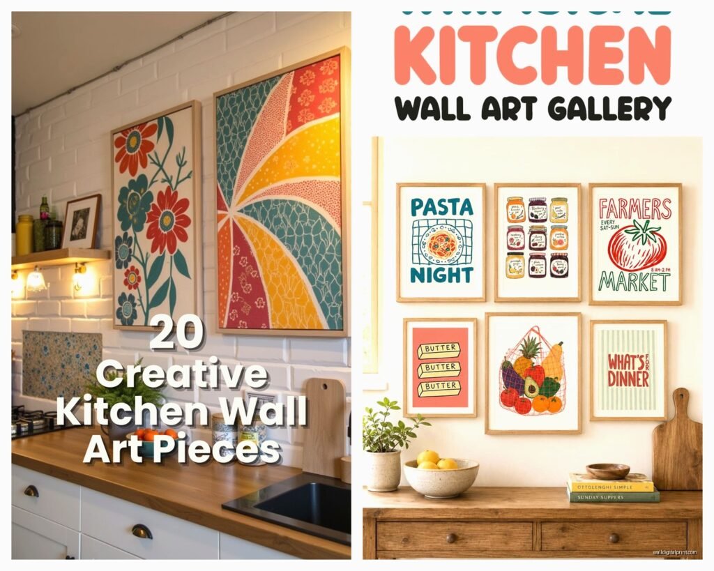
The difference between “curated gallery wall” and “I hung up random stuff” is usually just spacing and alignment. Keep consistent spacing between pieces – I use 2-3 inches usually. And line things up either by top edge, bottom edge, or center line.
Odd numbers work better than even for some reason. Three pieces or five pieces look more balanced than four. I don’t make the rules, it’s just a weird visual thing.
Mixing frame styles can work but you need a common element – all black frames in different styles, or all wood frames in different finishes, or all the same frame with different mat colors. All different everything just looks chaotic.
If you’re doing a gallery wall, lay it out on the floor first and take a photo. Then you can reference the photo while you’re hanging stuff and not end up with a lopsided mess. I use painter’s tape to mark where frames will go on the wall before committing to nails.
Lighting Matters More Than You Think
Kitchen lighting is usually pretty harsh and overhead which can create glare on glass frames. I’ve started angling frames slightly forward using those bumper things on the bottom corners – it reduces glare and also looks more intentional somehow.
If you have art in a darker corner or over a breakfast nook, consider adding a picture light. They make battery operated ones now that look legit. Makes the art feel more important and also helps with visibility.
Natural light fades prints over time so if you have a window situation, maybe don’t put your most expensive piece where sun hits it directly. UV protective glass exists but it’s pricey.
Honestly the biggest thing is just committing to something instead of leaving your walls blank because you’re overthinking it. My kitchen walls were empty for like a year because I kept waiting to find the “perfect” pieces and finally I just bought some herb prints I liked and called it done. You can always change it later, walls are not permanent situations.
Also measure twice, hang once because spackle is annoying.