Wall Art Guide, Wall Art Tutoriels
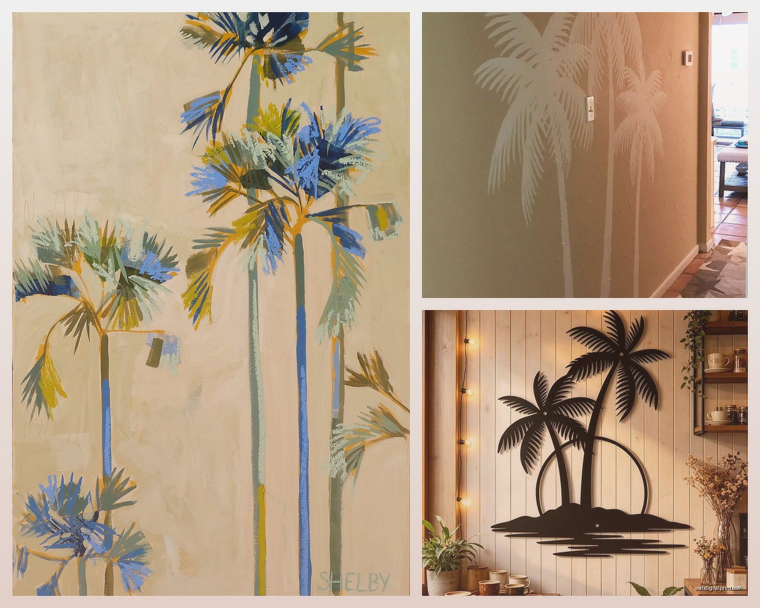
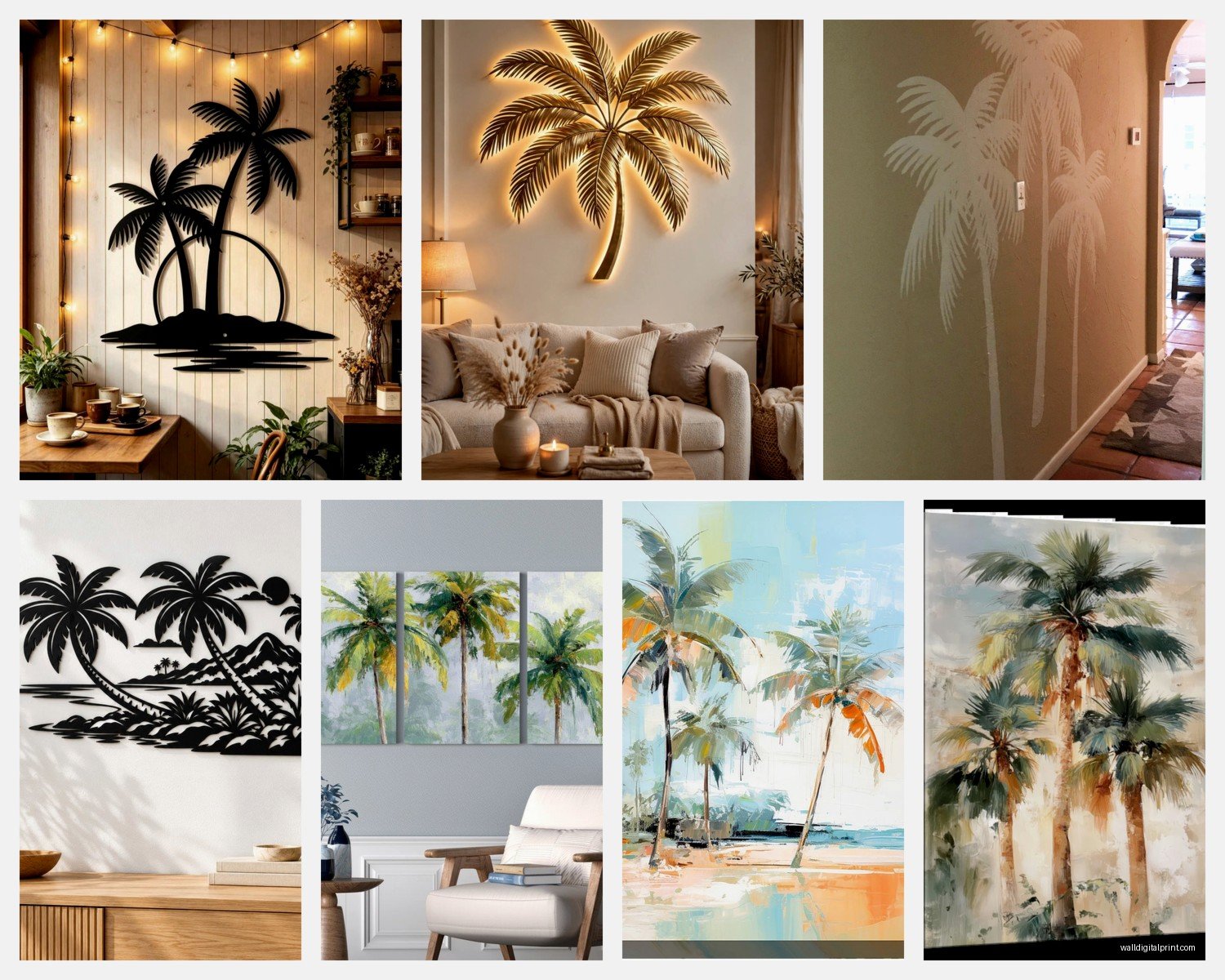
Palm Tree Wall Art: Tropical Beach Island Paradise Decor
Nov
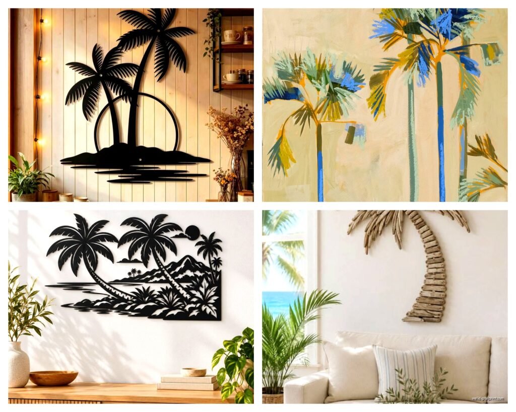
So I’ve been obsessing over palm tree wall art lately because three of my clients asked for that “vacation vibes without actually being tacky” look and honestly? It’s harder than you’d think to get right.
The actual difference between good and cringy palm tree art
Okay so the main thing is avoiding anything that looks like it came from a hotel lobby in 1987. You know what I mean – those super saturated sunset prints with the silhouette palms that are somehow both orange AND purple. My neighbor has one and every time I see it I die a little inside.
What actually works is going for either really minimalist line drawings OR super high quality photography. There’s no middle ground here. I learned this the hard way when I bought this “mid-range” canvas print for my guest room and it just looked… sad? Like it couldn’t decide if it wanted to be artistic or realistic and failed at both.
The minimalist stuff – think simple black line drawings of palm fronds or single palm tree silhouettes – works in literally any room. I put one in a client’s home office last month and it completely changed the space without making it feel like a tiki bar. Which is the goal, right?
Size matters way more than you think
This is gonna sound weird but I see people mess this up constantly. They buy these tiny little palm prints and scatter them around and it just looks confused.
Here’s what I do: one large statement piece (at least 30×40 inches) OR a set of three medium pieces arranged horizontally. That’s it. Those are your options if you want it to look intentional.
I had this whole situation last week where my client bought six different small palm prints from different sellers on Etsy and wanted me to arrange them and I was like… we gotta return some of these. Ended up keeping three, returning three, and the wall looks SO much better now.
For above a bed or sofa you need something substantial. I usually go minimum 40 inches wide. Above a console table you can get away with smaller but still – think 24×36 at least.
The gallery wall exception
Okay wait I forgot to mention – you CAN do multiple small pieces if you commit to an actual gallery wall situation. But then you need like 9-12 pieces minimum and they need to relate to each other somehow. All black and white, all the same frame style, all botanical but not ALL palms – you get the idea.
I did one in my own living room with various tropical leaves and palms mixed with some vintage botanical prints and it took me three weekends to get the arrangement right. Measured everything, made paper templates, the whole thing. Worth it though.
Materials that don’t look cheap
Canvas prints are fine but here’s the thing – they photograph better than they look in person sometimes. The texture can read as trying too hard? I dunno how to explain it better than that.
What I’ve been loving lately:
- Framed photographic prints on matte paper – super clean, modern
- Metal prints – these are amazing for palm photography because the colors pop without looking oversaturated
- Wood prints – okay hear me out, printing on actual wood planks gives this really cool organic vibe
- Acrylic prints – expensive but the depth is unreal
The canvas wrapped around wooden frames thing can work but make sure the edges are finished properly. I’ve seen too many where the image just gets cut off awkwardly at the sides.
Oh and another thing – textured wall hangings. Like woven palm frond pieces or macrame with preserved palm leaves. These add dimension that flat prints can’t and they’re having a moment right now. Just installed one in a client’s bedroom and she sends me photos of it like every other day.
Color schemes that won’t make you wanna redecorate in six months
Okay so funny story – I painted my bedroom this seafoam green color thinking it would be perfect with palm art and it looked TERRIBLE. Too matchy matchy, too theme-y, just no.
What actually works:
Neutral walls with colorful palm art – white, beige, light gray walls let the art be the statement. You can go bolder with your print choices.
Colored walls with black and white or monochrome palm art – I did a client’s powder room in this dusty terracotta color with black and white palm photography and it’s chef’s kiss.
The biggest mistake is trying to match your wall color to the art too perfectly. It ends up looking like a themed restaurant. You want contrast and balance, not coordination.
I’m personally obsessed with black and white palm photography against crisp white walls right now. It’s classic, it won’t date itself, and you can change your accent colors whenever you want without having to replace the art.
Where to actually buy this stuff
Alright so I’ve spent way too much time researching this because my cat knocked over my coffee while I was supposed to be doing client proposals and I went down a rabbit hole instead.
Etsy – best for unique digital downloads that you can print yourself at whatever size you need. Way cheaper than buying pre-made. Look for sellers with lots of reviews and high resolution files.
Society6 and Redbubble – good for finding independent artists, tons of styles, quality is decent but not amazing. The framing options are kinda limited.
Local print shops – this is actually my favorite option if you find art you love online. Download or buy the digital file and take it to a local printer. You get way better quality control and you can choose exactly the paper and finish you want.
West Elm, CB2, Anthropologie – if you want something ready to hang and don’t wanna think about it. Pricey but the quality is consistent. I use these for clients who have budget and no patience.
Framebridge – for custom framing of prints you already have. Not cheap but they do beautiful work.
Wait I forgot to mention Minted – they have really gorgeous palm photography and the framing quality is solid. I’ve ordered from them probably dozen times for various projects.
DIY framing vs pre-framed
So this depends entirely on your patience level and how many drinks you’ve had when you decide to start the project.
Pre-framed is obviously easier but you’re stuck with whatever frame style they chose. And honestly? A lot of mass-produced framed art comes with really basic frames that don’t do the art justice.
DIY framing means you can get exactly what you want but it’s more expensive than you think and kinda annoying. I spent like two hours at Michael’s last month trying to find the right frame for a palm print and almost gave up and bought wine instead.
My compromise solution: buy unframed prints and order custom frames online. Framebridge or even just Amazon has decent options. You get the custom look without having to measure and cut and deal with the glass yourself.
The IKEA hack that actually works
Okay this is gonna sound basic but IKEA RIBBA frames are actually perfect for this. They come in tons of sizes, they’re cheap, and they have that clean simple look that doesn’t compete with the art. I’ve used them in probably half my projects.
Buy your palm print, get it printed at whatever size fits the RIBBA frame, done. The 20×20 inch size is particularly good for creating a grid of palm images.
Styling the wall around your palm art
This is where people get nervous but it’s really not that complicated.
The art should be the focal point so don’t crowd it with a bunch of other stuff. I see people put palm art up and then add like floating shelves with tchotchkes and other smaller pieces around it and it just gets chaotic.
What I do instead:
- One large palm piece centered above furniture
- Maybe some simple wall sconces on either side if the wall is really big
- Real plants below or beside – this actually enhances the tropical vibe without being too much
- Keep the surface below the art relatively minimal
Oh and another thing – if you’re doing a gallery wall of palm images, use identical frames. The cohesiveness of matching frames lets you get away with different sized prints and creates visual order.
Mixing palm art with other decor styles
So you don’t have to go full tropical paradise to use palm art. That’s actually the beauty of it – it’s versatile enough to work with different aesthetics.
Modern minimalist – black and white palm photography, simple frames, clean lines. This is my go-to.
Boho – mix palm prints with macrame, rattan, natural textures. Add some preserved palm fronds in vases.
Coastal – obviously works great. Pair with blues, whites, natural wood tones. But don’t add seashells or it tips into souvenir shop territory.
Scandinavian – actually yes this works. Monochrome palm prints in light wood frames against white walls. Keep everything else simple and neutral.
I had a client who wanted to add palm art to her really traditional dining room and I was skeptical but we went with vintage botanical palm prints in ornate gold frames and it actually worked? Sometimes you just gotta try stuff.
Common mistakes I see literally all the time
Hanging it too high – the center of your art should be at eye level which is usually around 57-60 inches from the floor. Not higher. I don’t know why everyone hangs stuff too high but they do.
Choosing art that’s too small for the space – I already mentioned this but it bears repeating because it’s the most common problem.
Going too literal with the theme – if you have palm art, you don’t also need palm leaf pillows and palm print curtains and actual palm plants everywhere. Pick one or two elements max.
Buying the first thing you see – I get it, you’re excited, you wanna solve the empty wall problem. But live with it a bit. Save images you like. Look at stuff in person if you can. The right piece is worth waiting for.
Not considering your lighting – palm art looks completely different in natural light vs artificial light vs no light. Think about what time of day you’re usually in that room and what the lighting situation is.
The maintenance thing nobody talks about
Okay so this is boring but important – dust your art. Like actually dust it. Especially if it’s behind glass or acrylic. I went to a client’s house for a follow-up visit and her gorgeous palm prints were covered in dust and it just looked sad.
Microfiber cloth, quick wipe every few weeks. That’s it.
If you have canvas prints, you can gently vacuum them with a brush attachment. Sounds weird but it works.
Keep art out of direct sunlight if you can – it’ll fade over time. I learned this the hard way with a print in my kitchen that was perfect until the afternoon sun bleached it.
Budget breakdown for different scenarios
Broke but want it to look good – $50-100 total
Digital download from Etsy ($10-20), print at local print shop ($30-40), IKEA frame ($20-30). Boom.
Medium budget – $150-300
Quality print from Minted or similar ($80-150), decent framing ($70-150). Or pre-framed from West Elm when it’s on sale.
Investment piece – $400+
Original art from local artists, custom framing, large scale photography prints, metal or acrylic prints. These are statement pieces that you’ll have forever.
I usually tell clients to invest in one really good large piece rather than buying a bunch of mediocre smaller ones. Better to have one wall that looks amazing than three walls that look okay.
Alright so that’s basically everything I’ve learned from way too many hours looking at palm trees on the internet. The main thing is just pick something YOU actually like and don’t overthink it too much. Your wall, your rules.