Wall Art Guide, Wall Art Tutoriels
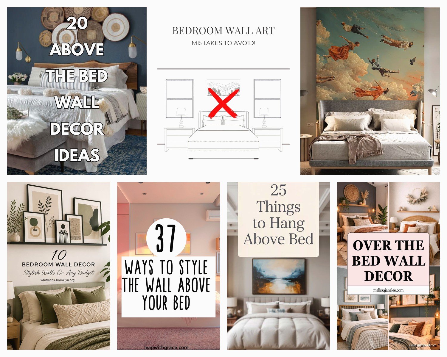
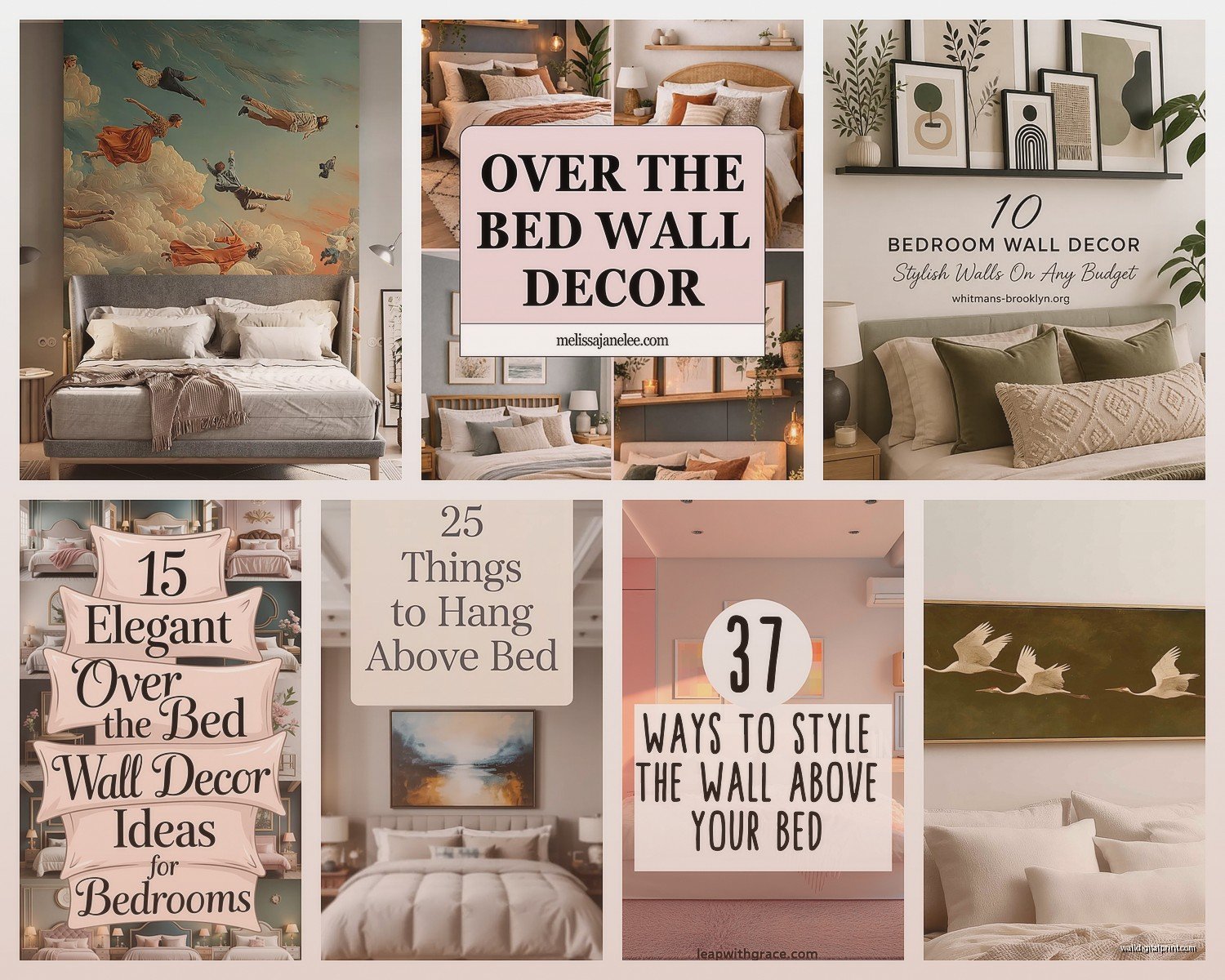
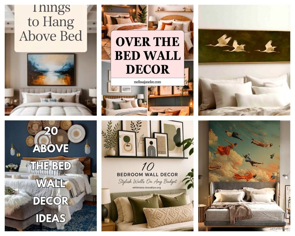
Wall Art for Bedroom Above Bed: Headboard Focal Point Guide
Nov
So I’ve been doing bedroom staging for like eight years now and the wall above the bed thing is honestly where most people completely freeze up. Last week I had a client text me at midnight asking if she should just stick with her existing blank wall because she was so overwhelmed, and like… I get it.
Here’s what actually works, not the magazine stuff that looks perfect but requires hiring someone.
The Size Thing Everyone Gets Wrong
Okay so the biggest mistake is going too small. I see this constantly. You need art that’s at least two-thirds the width of your headboard, or if you don’t have a headboard, two-thirds the width of your bed. I learned this the hard way when I hung this gorgeous abstract piece above my own bed and stood back and it just looked… sad? Like a postage stamp floating on the wall.
For a queen bed (60 inches wide), you’re looking at minimum 40 inches of art width. King bed (76 inches)? You need at least 50 inches across. And honestly I usually go bigger when I can because it just reads better from the doorway.
The height thing is weirdly specific but it matters – hang your art so the center sits about 56 to 60 inches from the floor. Not from the top of your headboard, from the actual floor. This keeps it at eye level when you’re standing, which is actually when you see it most. My cat knocked over a frame last month and when I rehung it I measured from the headboard top instead and it looked completely off for weeks before I figured out why.
Single Large Piece vs Gallery Wall
Single large pieces are so much easier to get right, I’m not gonna lie. One big canvas or framed print, centered above the bed, done. Takes ten minutes to hang if you have a level and pencil.
Gallery walls look amazing when they work but they’re fussy. I spent three hours last Thursday arranging and rearranging frames on my client’s bedroom floor before we even touched the wall. You gotta lay everything out first, I use painter’s tape on the wall to mark where frames go, and even then it’s trial and error.
If you’re going gallery wall route: keep the whole arrangement within that two-thirds width rule, and make sure the spacing between frames is consistent – I use 2 to 3 inches between each piece. Odd numbers work better visually (three pieces, five pieces, seven if you’re really ambitious).
What Actually Goes Above a Bed
This is gonna sound obvious but not everything works in a bedroom. I avoid anything too stimulating or busy because your bedroom should be whatever the opposite of chaotic is.
Abstract art in soft colors works ridiculously well. Blues, greys, blush pinks, sage greens, neutrals. I just finished a bedroom with this massive abstract piece that was basically just cream and grey brushstrokes and it completely transformed the space.
Black and white photography is another safe bet – landscapes, architectural shots, even some portrait work if it’s not too intense. I had this one client who wanted a giant close-up of an eye above her bed and I was like… that’s gonna be weird when you’re trying to sleep, right? We compromised on a softer botanical print.
Botanical prints and nature scenes – these are classics for a reason. They’re calming, they work with most color schemes, and you can find them at literally any price point.
Typography art can work if the message is right. “Good morning” or something about rest or dreams, fine. Motivational hustle culture stuff? Keep that in your office.
What to Avoid
Heavy stuff directly over where your head goes. I know that sounds paranoid but I’ve seen poorly installed shelves and heavy frames and it’s just not worth the anxiety. If you’re doing something heavy, make sure it’s REALLY well anchored – wall anchors rated for the weight, screwed into studs if possible.
Also skip: family photos (feels weird to me, like people watching you sleep), anything with sharp corners pointing down, mirrors (feng shui people hate this and also it’s just odd), and those “live laugh love” type signs unless that’s really your thing.
Frame or No Frame
Framed art looks more finished and polished. Canvas without frames gives you that modern gallery vibe. I honestly go back and forth depending on the room style.
For traditional or transitional bedrooms – frames, definitely. Black frames for contrast, white frames for that airy feel, wood frames if you’ve got other wood tones in the room you want to tie together.
Modern or minimalist spaces can handle unframed canvas really well. Those wrapped canvas edges where the image continues around the sides? Super clean look.
Oh and another thing – if you’re doing multiple pieces, keep the frame style consistent. All black, all white, all natural wood. Mixing frame styles looks messy unless you really know what you’re doing, and even then it’s risky.
The Actual Hanging Process
You need: a level (the app on your phone works fine), a pencil, appropriate wall anchors or screws, a hammer or drill, and measuring tape.
Find your center point – measure your wall width, divide by two, mark it lightly with pencil. Then measure your art width, divide by two, and that’s how far left and right of center your edges will go.
For the height, I mark 56-60 inches up from the floor (depending on ceiling height – higher ceilings can go a bit higher). That’s where the CENTER of your art should sit, not the top or the hanging wire.
Here’s the tricky part – you gotta account for the hanging hardware. If your frame has a wire on back, pull it taut and measure from where it would catch on the wall hook down to the top of the frame. Subtract that measurement from your center point mark. THAT’S where your hook or nail goes.
I always do a practice run with painter’s tape cut to the exact size of the art piece first. Stick it on the wall where you think things should go, step back, live with it for a few hours. Way easier to adjust tape than to patch and repaint nail holes.
Wall Anchor Reality Check
Drywall anchors are your friend for anything over 5 pounds. Those little plastic ones from the hardware store work fine for lightweight frames, but for anything substantial get the self-drilling metal anchors or toggle bolts.
If you can hit a stud, even better – use a stud finder (or knock on the wall and listen for the solid sound vs hollow sound, works like 70% of the time). Screwing into studs means your art isn’t going anywhere.
Budget Options That Don’t Look Cheap
You don’t need to drop $500 on art, I promise.
Printable art from Etsy – $5 to $15, you download it, print it at a local print shop or online service like Printique or Nations Photo Lab, frame it yourself. I’ve used this for probably a third of my staging projects and clients never guess it wasn’t expensive original art.
Thrift store art that you repaint the frame on – I’m literally watching this home renovation show right now where they did this and it’s such a good hack. Find a large frame, spray paint it, put in new art or even fabric.
Your own photography printed large – if you’ve got any decent travel photos or nature shots on your phone, print them big. A 30×40 print costs like $60 and looks intentional and personal.
Frame a nice textile or wallpaper sample – sounds weird but I’ve framed vintage scarves, pretty fabric from the craft store, even peel-and-stick wallpaper samples. Put them in a large frame and suddenly it’s art.
Society6 and Minted for affordable prints in lots of sizes. The quality is actually pretty good for the price.
Color Coordination Without Overthinking It
Your wall art should pull colors from somewhere else in the room – bedding, curtains, a rug, an accent chair. It doesn’t have to match exactly, but there should be some visual connection.
I usually pick art that has 2-3 colors max, with at least one neutral. Too many colors and it starts competing with everything else in the room instead of complementing.
Monochromatic schemes are the easiest – if your room is mostly grey and white, grey and white art is gonna work. You can’t really mess that up.
If you want to add color through art, make sure it appears at least one other place in the room. Blue abstract art? Add blue throw pillows. Warm terracotta tones in your art? Bring in a rust-colored blanket.
Lighting Matters More Than You Think
Art looks completely different depending on your lighting. I learned this when I hung this beautiful piece in a bedroom that only had one overhead light and it just looked flat and dark.
If your bedroom lighting is dim, choose art with lighter colors and more contrast. Dark moody art needs good lighting to actually see the details.
Picture lights are extra but they do make art look more intentional and expensive. The battery-operated LED ones are like $20-30 and you just stick them to the wall above the frame.
Natural light affects color too – north-facing bedrooms get cooler light so warm-toned art helps balance that. South-facing gets warm light so cooler art tones work better. This is getting into designer territory but it’s worth considering if you’re really particular.
Headboard Situations
Tall upholstered headboards (like tufted ones that go way up) – your art should start at least 6-8 inches above the top. Any closer and it looks crowded.
Low profile or no headboard – you have more flexibility. Art can hang lower, even starting just a foot above the mattress if you want that cozy wrapped-in feeling.
Weird headboard shapes (arched, geometric, whatever) – I usually skip art directly above and do side wall art instead, or choose something that echoes the headboard shape. Arched headboard with arched art is pretty cool when it works.
Metal or open frame headboards – you can get away with seeing wall through the headboard, just make sure your art placement makes sense visually when you’re looking at it straight on.
Alternative Focal Points
Wall decals or wallpaper accent wall – sometimes art isn’t the answer. I did a bedroom last year with this gorgeous peel-and-stick wallpaper just on the bed wall and it was perfect, no additional art needed.
Floating shelves with objects – less common above beds but it can work if everything is SUPER secure. Plants, books, small art pieces leaned against the wall.
Sculptural elements or woven wall hangings – that bohemian vibe with macrame or rattan pieces. Not my personal style but it works for the right room.
Large scale tapestry – I’m seeing this more with younger clients. They hang a big textile or tapestry instead of framed art and it adds texture and softness.
wait I forgot to mention – whatever you hang, step back and photograph it from the doorway. Your phone camera shows you what visitors actually see when they walk in, and it’s way easier to spot if something’s off-center or too high when you’re looking at a photo vs standing in the room.
The whole process honestly takes an afternoon if you’re decisive, or weeks if you’re like me and second-guess every choice. But once it’s up and it works? It completely changes how the bedroom feels. That blank wall situation just makes a room feel unfinished, but the right art makes it feel intentional and pulled together without trying too hard.