Wall Art Guide, Wall Art Tutoriels
Aesthetic Wall Art: TikTok Instagram Trendy Visual Designs
Nov
So I’ve been totally obsessed with this whole aesthetic wall art thing lately and honestly it started because I was scrolling TikTok at like 11pm when I should’ve been sleeping, and now half my clients want their walls to look like those trendy Instagram posts. Let me just dump everything I’ve learned because I’ve actually tested a bunch of this stuff in my own place and in client homes.
The Actual Trending Styles Right Now
Okay so first thing – you gotta know what’s actually trending versus what was trending six months ago. The digital art prints are HUGE right now, especially those abstract wavy line drawings. You know the ones – they look kinda minimal but also artistic? They’re everywhere on Etsy and honestly they’re so easy to switch out when trends change which is like… every three months now apparently.
The Y2K aesthetic is still hanging on but it’s evolving. Think less bubblegum pink and more chrome accents with muted pastels. My friend Sarah just redid her apartment with this vibe and I was skeptical but it actually looks really good in person, not as chaotic as it sounds.
And then there’s the whole “clean girl aesthetic” wall art – very minimal, lots of beige and cream, maybe some line art of a woman’s face or body. It’s literally everywhere on Instagram. Some people say it’s boring but honestly? It photographs really well and that’s what people want now.
What Actually Works in Real Spaces
Here’s the thing nobody tells you – what looks good in a TikTok video with perfect lighting is gonna look different in your actual apartment with your weird overhead lighting situation. I learned this the hard way when I bought these gorgeous neon-style prints that looked amazing online but in my living room they just looked… flat? The colors were off.
Gallery walls are still trending but they’re getting more intentional. Not just random frames everywhere – people want curated collections now. I usually tell clients to pick a color story first, then build around that. Like all black and white prints with gold frames, or all warm tones with natural wood frames.
Oh and another thing – oversized single pieces are making a comeback. One big statement piece instead of twenty small ones. Way easier to style honestly and you don’t have to worry about spacing everything perfectly on the wall.
Where to Actually Buy This Stuff
Okay so Etsy is obviously the go-to for digital downloads. You can literally buy a print for like $5-10, download it immediately, and then just get it printed at Staples or wherever. I do this ALL the time for clients who don’t wanna spend a fortune. The quality is usually pretty good if you make sure you’re downloading high resolution files – look for 300 DPI minimum.
Society6 and Redbubble have tons of trendy designs and they print everything for you which is convenient but it’s definitely more expensive. I bought this abstract face print from Society6 last month and the quality was actually really nice, but it took like three weeks to arrive which was annoying.
For frames – and this is gonna sound weird but – I’ve had the best luck mixing IKEA frames with some nicer ones from Target or Amazon. The IKEA Ribba frames are like $10 and they look way more expensive than they are. Just don’t get the cheapest Amazon frames because they arrive broken like 50% of the time, I swear.
Amazon actually has some decent art prints now too if you search for specific aesthetics. I found these really cool vintage botanical prints that were perfect for a client’s bedroom and they were under $20 for a set of four.
The Digital Download Route
Let me break down how to actually do the digital download thing because it seems confusing but it’s so easy once you do it once:
- Find the print you want on Etsy or Creative Market
- Make sure it’s high resolution – read the description carefully
- Download the file immediately after purchase (usually comes as a PDF or JPG)
- Upload it to Staples, Costco, or Walgreens photo printing site
- Pick your size – I usually do 16×20 or 18×24 for statement pieces
- Choose matte finish, it looks more expensive than glossy
- Pick it up in like 24 hours usually
The whole thing costs maybe $15-25 total versus buying a pre-printed and framed piece for $100+. My cat knocked over one of my framed prints last week and shattered the glass and I wasn’t even that upset because I’d only spent like $18 total on it.
How to Make It Look Expensive
This is where the actual work comes in. You can have the trendiest art in the world but if you hang it wrong it’s gonna look bad, sorry.
First – use a level. I know everyone says this but seriously, eyeballing it never works. I’ve redone so many gallery walls because I thought I could just wing it. Get a $5 level from Home Depot or honestly just use the level app on your phone.
Second – the spacing matters more than you think. For gallery walls, keep everything about 2-3 inches apart. More than that and it looks disconnected, less and it looks cramped. I usually lay everything out on the floor first and take a photo from above so I can see the arrangement before putting holes in the wall.
Mat boards make everything look more professional. You can buy pre-cut mats on Amazon for like $10-15 and they instantly elevate a regular print. I put a white mat board around this kinda cheap abstract print I got and suddenly it looked like something from an actual gallery.
The Lighting Situation
Wait I forgot to mention – lighting is like 70% of whether your wall art actually looks good. Those picture lights that go above frames? Total game changer. They’re like $25 on Amazon and they make your art look intentional and expensive.
Natural light is obviously ideal but most of us don’t have perfect natural light everywhere. I use those LED strip lights behind larger frames sometimes to create a backlight effect – very TikTok trendy right now and it actually does look cool, not as gimmicky as I expected.
Avoid putting art directly across from windows if you can because the glare is terrible. I had to move this whole gallery wall in my bedroom because every afternoon the sun would hit it and you couldn’t see anything in photos.
Specific Trend Breakdowns
Let me get into the actual aesthetics people are searching for right now because this is what everyone asks me about:
Minimalist Line Art
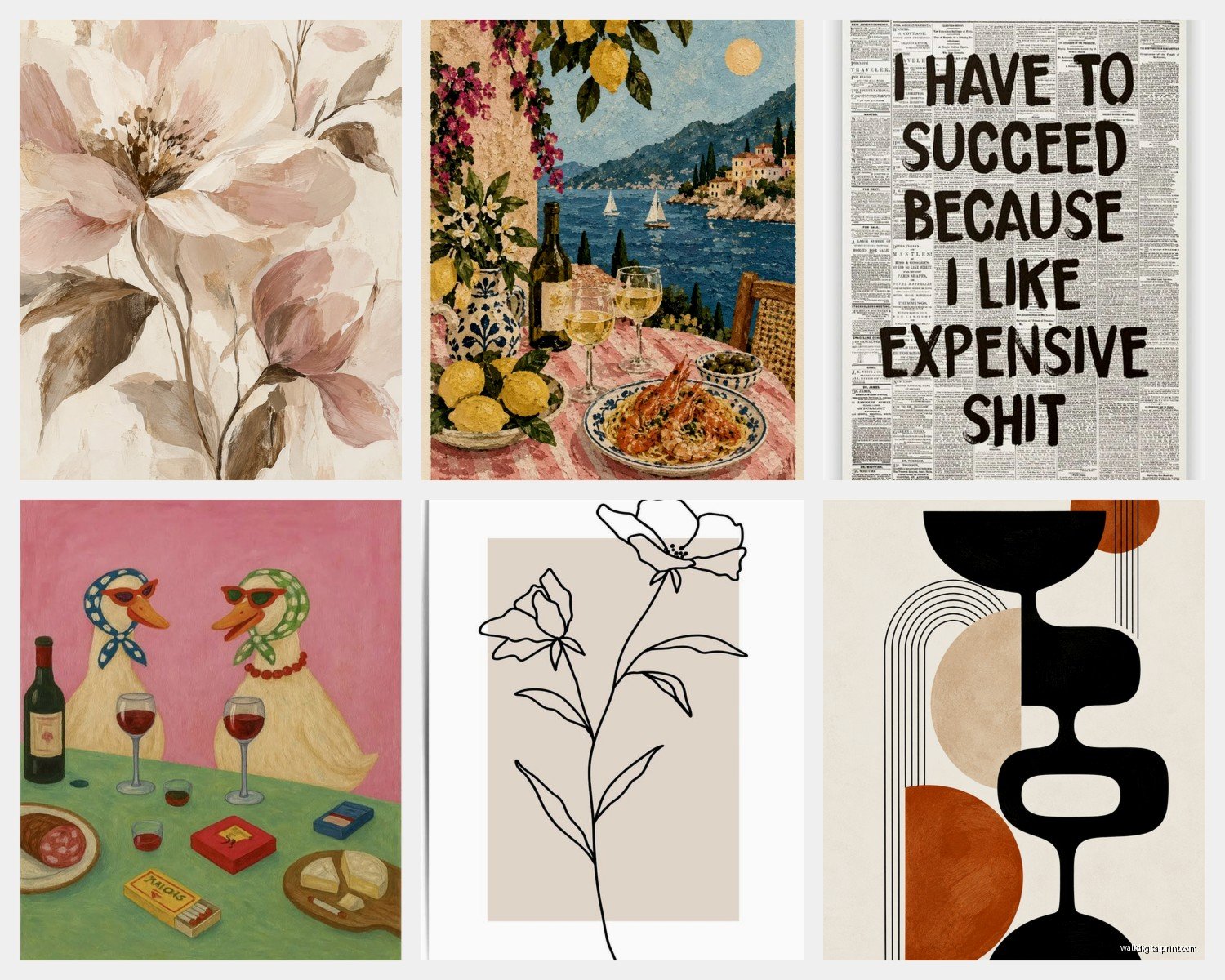
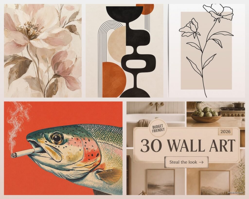
This is still everywhere. Single line drawings of faces, bodies, flowers, whatever. They’re super easy to DIY honestly if you’re even slightly artistic – I’ve seen people trace photos and turn them into line art. Or just buy them on Etsy, there are thousands.
The key with these is to keep everything else minimal. Don’t put busy patterned line art in a room that’s already got a lot going on. They work best on white or light neutral walls.
Vintage and Retro
The 70s vibe is huge – think orange and brown tones, geometric patterns, sunset gradients. These look amazing in entryways and dining rooms for some reason. I did a whole wall of vintage-inspired prints in warm tones for a client and it photographs so well.
You can find actual vintage prints at thrift stores and estate sales which is fun but time-consuming, or just get reproduction prints that have that vintage feel. Nobody can tell the difference in photos anyway.
Abstract and Organic Shapes
Those blob shapes and abstract forms in muted colors – very popular right now. They’re forgiving because there’s no “right way” to hang them and they work in basically any room. I have three of these in my office right now and I literally just picked colors that matched my desk chair and called it a day.
Typography and Quotes
Okay so this one is tricky because it can look really cheesy really fast. The trend now is more subtle typography – single words in interesting fonts, or quotes that aren’t the usual “live laugh love” situation. Foreign language quotes are big on Instagram right now, especially French or Italian phrases.
I personally think less is more with typography. One statement piece with text, not your whole wall covered in words.
The Instagram Grid Wall Thing
People keep asking me about this – where you arrange prints in a perfect grid to look like an Instagram feed on your wall. It’s very trendy but honestly it’s also really hard to execute well.
If you’re gonna do this, commit to it. All same size frames, all same color frames, consistent spacing. I use this method: measure your wall width, decide how many frames across you want, subtract the frame widths, divide the remaining space by the number of gaps you’ll have. That’s your spacing measurement.
Use Command strips for this if you’re renting because you’ll probably want to change it out. The hook ones that hold up to 16 pounds work for most standard frames.
Making It Work for Your Actual Space
Here’s what I tell everyone – trends are cool but your space has to function for YOU. If you’re gonna be staring at that wall every day, make sure you actually like it, not just that it would get likes on Instagram.
Consider your room’s purpose too. Bedrooms can handle more calming, minimal art. Living rooms can go bolder. Home offices need something that won’t be distracting on Zoom calls – I learned this the hard way when a client had this crazy colorful abstract piece right behind their desk and everyone kept asking about it in meetings.
Scale matters so much. Measure your wall space before buying anything. A print that looks huge in the product photo might be tiny on your actual wall. I usually recommend going bigger than you think you need.
The Cheap vs Expensive Question
Look, I mix high and low all the time. Nobody needs to spend $500 on wall art unless you really want to. Some of my favorite pieces in my apartment cost less than $30 total.
That said, there are times when spending more makes sense. If it’s a large focal point piece in your main living area, maybe invest in something nicer. If it’s for a rental or a room you’re not sure about yet, go cheap and switch it out when you want.
The frame quality matters more than the print quality a lot of the time. A $5 digital print in a nice $40 frame looks better than a $50 print in a cheap frame. Just my experience.
Actually Hanging Everything
Command strips are your friend if you’re renting or indecisive. They work really well for lighter frames. For anything over like 5 pounds, use actual picture hanging hardware.
The 57-inch rule – hang art so the center is at 57 inches from the floor. This is standard gallery height and it works in most spaces. Obviously adjust if you have really high or low ceilings.
For gallery walls, I make paper templates of each frame, tape them to the wall with painter’s tape, step back and look at the arrangement, make changes, then mark where the nails go through the paper. Sounds tedious but it saves so much time and wall damage.
Oh and get a stud finder if you’re hanging anything heavy. Drywall anchors work but finding a stud is always better. I’ve had frames fall off walls at 3am and it’s terrifying every time.
The TikTok trends change so fast that honestly, don’t stress too much about getting it perfect. By the time you finish your gallery wall there will be some new aesthetic trending anyway. Just pick stuff you actually like looking at and you’ll be fine.