Wall Art Guide, Wall Art Tutoriels
Forest Wall Art: Woods Trees Nature Wilderness Landscape
Nov
So I’ve been obsessing over forest wall art lately because like three different clients asked me about it in the same week and now I can’t stop seeing it everywhere. Let me dump everything I know because I literally just finished hanging a massive woodland piece in my own dining room and learned so much the hard way.
Figuring Out What Style Actually Works In Your Space
Okay so first thing, forest art isn’t just one vibe. I made this mistake thinking “trees are trees” but there’s like a huge difference between moody Pacific Northwest fog vibes, bright birch forests, abstract interpretations, and those super detailed wilderness landscapes.
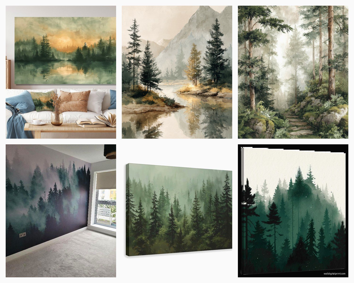
The moody dark forest stuff—think deep greens, grays, misty trees disappearing into fog—works insanely well in bedrooms or reading nooks. I put one above my bed last month and it’s actually helped me sleep better? Sounds weird but the calm energy is real. These pieces usually photograph best in spaces with minimal other wall decor because they’re kinda dramatic on their own.
Birch tree art is the crowd pleaser though. White bark, black markings, they work in literally every space I’ve tried them in. My mom has one in her kitchen and I have a client with basically the same print in their modern office. The vertical lines make ceilings look higher which is why I’m always pushing these for smaller rooms or apartments with that standard 8-foot ceiling situation.
Abstract forest pieces where the trees are more suggested than detailed… these need good lighting. I hung one in a hallway with terrible lighting and it just looked like blurry brown blobs until I added a picture light. With proper lighting though they add this artistic sophisticated thing without being too literal.
Size Matters More Than You Think
This is where everyone messes up including me the first dozen times. Forest scenes need space to breathe but also need to be big enough to create impact.
For above a sofa you want something that’s roughly two-thirds to three-quarters the width of your couch. I see people hang these tiny 16×20 prints above a massive sectional and it looks so sad and floating. Go big or go home basically. I just did a living room where we used a 60×40 inch forest landscape above a standard sofa and it completely transformed the whole room.
Bedroom above the bed—aim for something around 50-70% of your bed width. King bed gets bigger art, queen gets medium, you get it. My own bedroom has a king and I went with three separate 24×36 panels of a continuous forest scene which technically breaks the rules but looks amazing so whatever.
Dining rooms are tricky because you’ve got the table situation. I usually go bigger than feels comfortable when you’re just looking at the wall empty. The table and chairs fill so much visual space that your art needs to compete. Just finished a project where we did a 72-inch wide panoramic forest view and it’s *chef’s kiss*.
The Gallery Wall Approach
Wait I should mention gallery walls because they’re having a moment with nature art. Instead of one big piece you do like 4-9 smaller forest themed prints. Mix different seasons, different tree types, maybe throw in some wildlife if you’re feeling it.
The trick is keeping a consistent element—same frame color, same mat color, or same filter/tone on all the images. I did one with all black frames, white mats, and mixed forest photography from different locations and it looks cohesive even though technically nothing matches exactly.
Spacing between frames should be 2-3 inches. Closer than that looks cramped, further apart and they stop reading as a collection. Pro tip I learned from installing like 50 of these: tape newspaper or kraft paper templates to your wall first and live with it for a day before you start putting holes everywhere.
Print Types and Why It Actually Matters
Okay so you’ve got canvas, framed prints, metal prints, acrylic, wood prints… it’s overwhelming. Here’s what I’ve learned actually using all of these.
Canvas prints are the most popular for forest art and I get why. They’re lightweight, you can get them huge without breaking the bank, and there’s something about the texture that works with nature imagery. The wrapped edges mean no frame needed which saves money. But—and this is important—cheap canvas prints look cheap. The image needs to wrap around the sides nicely or it just looks unfinished. I only buy gallery wrapped now where the image continues on the sides.
Framed prints behind glass give you that gallery/museum vibe. They’re heavier and more expensive but they look expensive too. For formal spaces like home offices or dining rooms I usually go this route. The glass protects the print too so if you’re putting art in a kitchen or bathroom where there’s moisture, definitely frame it behind glass.
Metal prints are having a moment and honestly they’re so good for modern/industrial spaces. The colors pop differently, almost glowy? I have a forest sunset on metal in my entryway and people always ask about it. They’re durable too—I watched my friend’s dog literally jump up and scratch one and it was fine. They’re pricey though, probably the most expensive option per square foot.
Wood prints are cool if you want that rustic cabin vibe. The wood grain shows through the image which either looks amazing or distracting depending on the photo. Best for high-contrast images where the grain adds texture. I wouldn’t use them for subtle misty forest scenes.
Where to Actually Buy This Stuff
Society6 and Redbubble have tons of independent artists selling forest art. Quality varies but you’re supporting actual artists which feels good. I’ve ordered probably 20 pieces from Society6 and most have been great. Their sales are legit too—I never buy anything full price there, just wait two weeks and something will be 30% off.
Etsy is overwhelming but amazing for unique pieces. Search “forest wall art” and you’ll get like 50,000 results. Filter by your country to avoid insane shipping costs. I found this artist who does watercolor forest scenes and I’ve bought from her four times now. The personal touch is nice, she includes handwritten thank you notes which my clients love.
For budget friendly stuff that still looks good, Target and Amazon actually have decent options now. Target’s Threshold line has some nice forest photography prints. Amazon is hit or miss—read reviews carefully and check what material it actually is because the descriptions can be misleading.
If you want investment pieces, check out Minted or Artfully Walls. More expensive but curated quality. I use these for clients with bigger budgets who want something special.
Color Schemes That Don’t Fight Your Room
This is where I see people struggle. They fall in love with a forest print but it clashes with everything they own.
If your room is neutrals—grays, whites, beiges—you can go either way. Deep moody forests add drama, lighter birch or aspen scenes keep it airy. I slightly prefer adding the darker forest art to neutral rooms because it becomes this anchor point that gives the space depth.
Rooms with blue tones should get cooler forest scenes. Look for images with blue-greens, morning mist, winter scenes. Warmer forests with golden light or autumn colors will fight with blue walls or blue furniture.
Warm toned rooms with browns, oranges, reds need warmer forest art. Autumn forests, golden hour lighting, redwood scenes. I just did a room with terracotta accents and we found this incredible sunset-through-trees print that pulled everything together.
Green rooms are tricky with forest art because it’s like… green on green. Either go really dark moody forest so it contrasts, or go completely different like a black and white forest photograph. The middle ground usually looks muddy.
Hanging Height Because Everyone Gets This Wrong
The center of your art should be at eye level which is roughly 57-60 inches from the floor. This is the museum standard and it actually works in homes too.
But—and here’s where it gets weird—if you’re hanging above furniture, ignore that rule. Your art should sit 6-8 inches above the furniture piece. Couch, bed, console table, whatever. The art and furniture need to relate to each other visually.
For gallery walls, find the center point of the entire collection and put *that* at 57 inches. Not each individual piece. I map this out on the floor first, measure the total height and width, then transfer it to the wall.
Stairway walls are their own beast. I follow the angle of the stairs so the art climbs with you. The 57-inch rule applies but you measure from each individual stair tread, not the floor at the bottom.
Lighting Your Forest Art
Oh and another thing—lighting makes or breaks forest art especially. These pieces have depth and detail that disappears in bad lighting.
Picture lights are the classic choice. Those little brass or black bars that mount above the frame and shine down. They look fancy and professional. I use them for framed pieces in formal spaces.
Track lighting or adjustable can lights work great if you’re doing a gallery wall or have multiple pieces. You can aim them exactly where needed. Just avoid putting them too close—you don’t want hot spots or glare on glass.
Natural light is beautiful but be careful with direct sun. It’ll fade your prints over time. I had a client whose forest canvas was by a west-facing window and after two years it was noticeably lighter. UV protective glass helps if you’re framing, or just keep art out of direct sun paths.
My cat knocked over a lamp last week and I discovered that uplighting a forest print from below creates this cool dramatic effect but it’s definitely a vibe not everyone wants. Just throwing that out there.
Mixing Forest Art With Other Decor
Forest art plays well with natural materials obviously. Wood furniture, jute rugs, linen curtains, stone or ceramic accessories. The whole organic thing works together.
But it also looks sick in modern minimalist spaces. A single large-scale forest photograph in a room with clean lines and minimal furniture creates this beautiful tension. I did a client’s apartment that was very Scandinavian minimal and we added one massive black and white forest print and it was *perfect*.
Plants and forest art—you’d think it’s overkill but it’s actually great? Real plants add the 3D element and movement while the art adds scale and drama. Just did my living room with a forest print and like six different plants and it feels like a sanctuary.
Avoid mixing too many nature themes though. Forest art plus beach art plus mountain art in the same room starts feeling like a national parks gift shop. Pick your lane. I usually stick with one nature theme per room or at least per wall.
Quick Practical Stuff
Hanging hardware: use proper wall anchors if you’re not hitting studs. Forest art especially large pieces is heavier than you think. I use toggle bolts for anything over 10 pounds on drywall.
Wired backs are easier to hang level than sawtooth hangers. Just saying.
Clean your forest prints every few months with a dry microfiber cloth. Canvas you can vacuum gently with a brush attachment. Glass you can use glass cleaner but spray the cloth not the art.
If you’re renting and can’t put holes everywhere, command strips rated for the weight actually work. I was skeptical but I’ve had a 16×20 canvas up on command strips for eight months with zero issues.
Anyway that’s basically everything I know about forest wall art from actually dealing with it constantly. The main thing is just pick something that makes you feel calm or energized or whatever you need from that space and don’t overthink the rules too much you know