Wall Art Guide, Wall Art Tutoriels
Blue Abstract Wall Art: Ocean Sky Modern Non-Representational
Nov
So I’ve been obsessing over blue abstract pieces lately and honestly it started because this one client wanted something “ocean-y but not literal” which sounds impossible but actually opened up this whole world of non-representational art that’s way more interesting than those generic wave paintings everyone has.
Finding the Right Blue Abstract Piece
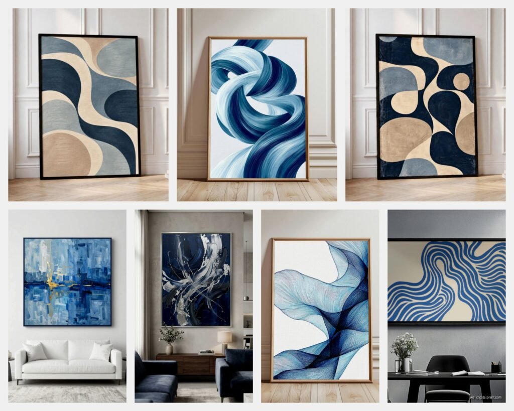
Okay so first thing – “blue abstract” is stupidly broad. You’ve got your navy pieces that read almost black in certain light, your cerulean bright situations, teal that leans green, and then those gorgeous dusty blues that somehow work with literally everything. I spent like three hours last Tuesday (my dog was at the groomer so I had time) just scrolling through different online galleries and here’s what I figured out.
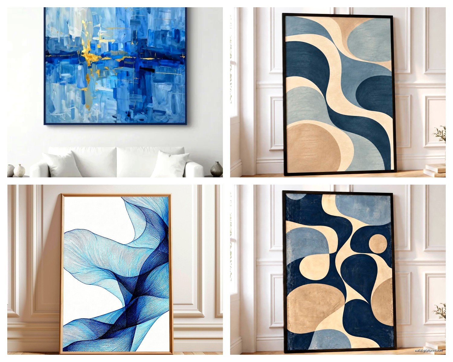
The ocean vs sky thing matters more than you’d think. Ocean-inspired abstracts tend to have more texture – think heavy brushstrokes, layered paint, sometimes actual sand mixed in which sounds gimmicky but can look amazing. Sky pieces are usually smoother, more about color gradients and negative space. Neither is better but you gotta know which vibe you’re going for.
Size Considerations That Actually Matter
Everyone says “measure your wall” but that’s only half of it. I learned this the hard way when I bought this stunning 60×40 piece for above my couch and it just… floated there looking lost. Here’s what actually works:
- Above furniture: go at least 2/3 the width of whatever’s below it
- Statement walls: bigger than you think, like genuinely go up a size
- Gallery walls: mix sizes but keep the total visual weight balanced
- Narrow walls: vertical orientation saves you every time
The thing nobody tells you is that blue abstract art can shrink visually depending on how much white or light color is in it. A piece that’s mostly pale blue with white will read smaller than a navy piece of the exact same dimensions.
What to Look for in Non-Representational Work
This is gonna sound weird but I always look at a piece and ask “what is this NOT showing me?” Good abstract art has this quality where your brain wants to find something recognizable – maybe a horizon line, maybe movement, maybe depth – but it never quite resolves into a specific thing. That tension is what makes it interesting.
With blue abstracts specifically, watch out for pieces that are trying too hard. You know the ones – they’ve got like twelve different techniques happening, metallic paint, texture paste, resin coating, and it’s just… a lot. The best pieces I’ve found use maybe two or three techniques max.
Texture vs Flat: Both Work But Differently
I used to think textured was automatically better because it feels more “arty” but honestly some of my favorite blue abstracts are completely flat. What matters is intention. A heavily textured piece needs good lighting – and I mean GOOD lighting – or it just looks muddy. I installed track lighting in my office specifically because I bought this gorgeous impasto ocean piece and in regular overhead light it looked like blue oatmeal.
Flat or low-texture pieces are actually way more versatile. They work in any light, they’re easier to clean, and they don’t compete with other textures in your room. If you’ve already got a chunky knit throw and a jute rug and velvet pillows, maybe skip the heavily textured art.
Color Combinations That Don’t Suck
Blue abstract art is never JUST blue, and this is where people get tripped up. You’ll see “blue abstract” and then it arrives and there’s also ochre and pink and suddenly it doesn’t work with your space. Here’s my breakdown:
Blue + White – Classic, safe, works with coastal and modern and even traditional spaces. Can read cold though, so if your room doesn’t get great natural light, maybe add warm wood tones in your furniture.
Blue + Gray – Super sophisticated, very now. Works amazing in contemporary spaces. I literally just hung a blue-gray abstract in a client’s bedroom last week and it made the whole room feel twice as expensive.
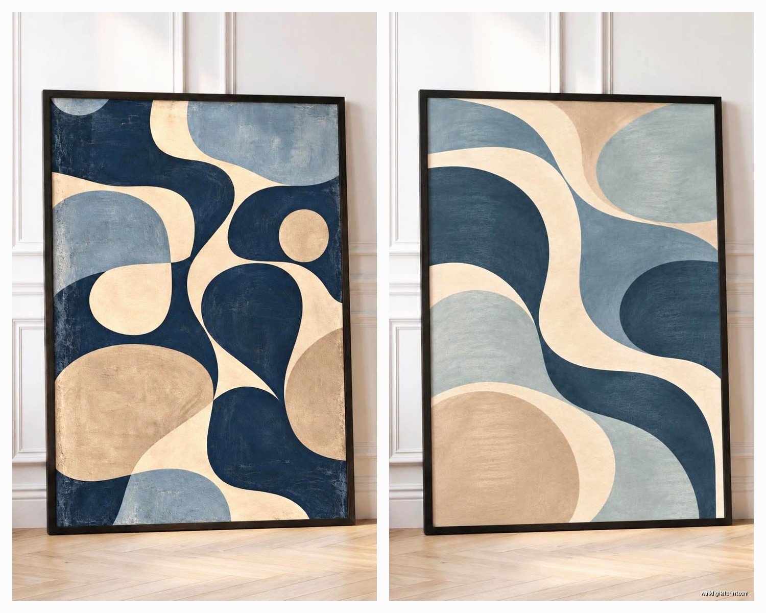
Blue + Warm Tones (ochre, rust, coral) – This is my favorite combo right now. The warmth keeps it from feeling too cold or sterile. There’s this one artist on Etsy who does blue and burnt sienna abstracts that make me want to buy everything.
Blue + Green – Trickier than you’d think. Can be gorgeous or can look like a bruise. The key is making sure one color dominates – either mostly blue with green accents or vice versa.
Blue + Metallics – Gold is having a moment with blue abstracts. Silver feels more dated to me but can work in the right space. Just don’t overdo it – a little metallic goes a long way.
Where to Actually Buy This Stuff
Okay so I’ve bought blue abstract art from basically everywhere at this point and here’s the real deal:
Original Art
Galleries are great if you wanna spend serious money and get something totally unique. I’m talking $800 minimum, often way more. But you’re getting a one-of-a-kind piece and usually you can meet the artist which is cool. I bought an original blue abstract from a local gallery last year and the artist actually came to my house to help me hang it, which was extra but also kinda awesome.
Online platforms like Saatchi Art or Artsy have originals at various price points. The photography is usually good enough that you can trust what you’re seeing. Just read the return policy because colors can be weird on screens.
Prints and Reproductions
Not gonna lie, most of my blue abstracts are high-quality prints and nobody can tell. The key is getting them properly framed – a $50 print in a $150 custom frame looks like a $500 original. I use a local framer who doesn’t judge me for bringing in Etsy prints.
Society6 and Minted have good options. The quality is consistent and returns are easy. Just size up from what you think you need because their photos make everything look bigger than it is.
Budget Options That Don’t Look Cheap
Target actually has some decent blue abstract prints right now in their Project 62 line. They’re like $30-60 and if you frame them yourself they totally work for starter pieces or rental situations.
HomeGoods is hit or miss but when you find something good it’s GOOD. I found this massive blue and white abstract there for $80 that still hangs in my entryway. You just gotta go regularly because inventory changes constantly.
oh and another thing – check out TJ Maxx’s website. Their home section online has way more selection than in stores and I’ve scored some really nice blue abstracts for under $100.
Hanging and Styling Tips
This is where I see people mess up constantly. You finally get your perfect blue abstract piece and then you hang it wrong and it just doesn’t work.
Height matters SO much. Center of the artwork should be at 57-60 inches from the floor. This is eye level for most people. I know you’ve heard this before but I literally still see art hung at like 72 inches and it makes the whole room feel off.
If you’re hanging above furniture, leave 6-8 inches between the furniture and the bottom of the frame. Not 2 inches, not 15 inches. That specific range just works.
Lighting Makes or Breaks It
I was watching this home renovation show the other night (my cat was sleeping on me so I couldn’t move) and they installed this stunning blue abstract and then lit it with a yellow-toned bulb and it looked greenish and terrible. Use daylight bulbs (5000K-6500K) for blue art. It keeps the colors true.
If you can swing it, picture lights are worth it. Those little lights that mount above the frame? They make even mediocre art look important. I put one on a $40 print and suddenly everyone asks where I got that “original piece.”
Styling Around Blue Abstract Art
The art should be the starting point, not an afterthought. I know you probably already have furniture and stuff but hear me out.
Pull one accent color from the painting and use it in your textiles. If your blue abstract has hints of coral, get coral pillows. If it’s got gray undertones, add a gray throw. This creates cohesion without being matchy-matchy.
Keep the wall color relatively neutral. White, cream, light gray, even a soft greige all work. I tried hanging a blue abstract on a dark navy wall once thinking it would be dramatic and it just disappeared. Learned that lesson fast.
What to Avoid
Don’t hang blue abstract art in a room that’s already super blue unless you’re going for a monochromatic thing (which can work but is risky). Too much blue gets cold and depressing fast.
Skip the themed decor. If you’ve got blue abstract art, you don’t also need anchor decorations and seashells and rope accents. Let the art be abstract – don’t make it literal with your styling.
Avoid busy patterns nearby. If your couch is a bold geometric print, your blue abstract is gonna compete with it. One statement piece per wall/area is the rule.
Maintaining Blue Abstract Art
This is boring but important – dust your art. I use a microfiber cloth every couple weeks. For textured pieces, a soft brush works better.
Keep it out of direct sunlight if it’s a print or has any paper elements. UV rays will fade that blue faster than you think. I had a beautiful cerulean print that turned grayish-blue after a summer in a south-facing window.
If it’s an original with actual paint, don’t use glass cleaner near it. Just dust and maybe very gently wipe the frame. I once sprayed Windex too close to a piece and got droplets on the canvas – had to pay someone to fix it.
Making It Work in Different Rooms
Living rooms: Go big or go home. This is where you can do a statement piece or a large-scale blue abstract. I love a massive piece above the sofa – it anchors the whole room.
Bedrooms: Softer blues work better here. Those really saturated navy abstracts can be too intense for a sleep space. I’ve got a pale blue and white piece above my bed and it’s calming without being boring.
Bathrooms: Yes you can put art in bathrooms. Just avoid directly above the shower where it’ll get steam damage. A small blue abstract in a bathroom feels spa-like and unexpected.
Home offices: Blue is supposed to boost productivity so this is actually perfect. I’ve got a blue-gray abstract behind my desk and I swear it helps me focus. Or maybe that’s just placebo but whatever works.
Kitchens are trickier – you want something that can handle potential grease and humidity. I’d stick with prints under glass rather than originals in kitchens.
Wait I forgot to mention – if you’re renting, use Command strips rated for the weight of your piece. They actually work and don’t damage walls. I’ve hung pieces up to 15 pounds with them no problem.
The whole point of blue abstract art is that it’s open to interpretation. Your ocean might be someone else’s sky might be someone else’s just-pretty-colors. That’s what makes it work in so many different spaces and styles. Just pick something that makes you feel something when you look at it, hang it at the right height with decent lighting, and don’t overthink the rest.