Wall Art Guide, Wall Art Tutoriels
Winter Wall Art: Snow Cold Season Holiday Landscape
Nov
So I’ve been meaning to tell you about winter wall art because honestly, I just finished redoing my client’s entire living room last week and the difference between getting it right versus just slapping up some snowy landscape is huge.
Why Winter Art Actually Works Year-Round
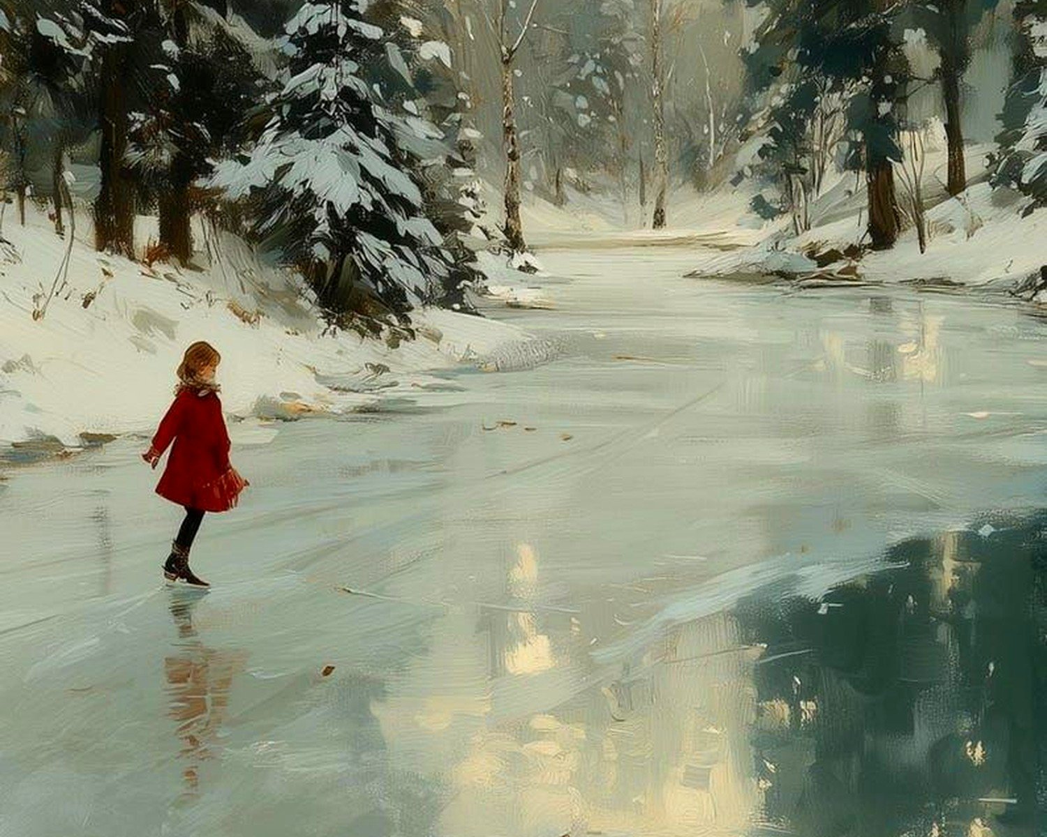
Okay so here’s the thing nobody tells you – winter wall art doesn’t have to come down after the holidays. I keep mine up through March because that’s when it actually feels seasonally appropriate, you know? The trick is avoiding anything that screams “Christmas” unless you’re cool with swapping it out. Look for pieces that focus on the actual season… snow-covered trees, frozen lakes, mountain landscapes, that kind of stuff.
I learned this the hard way when I bought this gorgeous winter scene that had tiny red ornaments in the background. Looked amazing in December, felt super weird in February when I was already thinking about spring but couldn’t justify taking it down yet.
Choosing the Right Style for Your Space
There’s basically four categories that work well and I rotate through all of them depending on the room:
Abstract Winter Landscapes
These are my go-to for modern spaces. Think blues, grays, whites with maybe some silver accents. The beauty is they read as “winter” without being literal. I found this amazing piece at a local gallery that was basically just layered shades of blue with white texture – cost me way too much but it works in literally any room because it’s not trying too hard.
For abstract stuff, look for pieces that use cool tones but have some depth. Flat, single-color canvases can feel cold in a bad way during winter when you’re already freezing.
Photographic Prints
Oh and another thing – high-quality photography prints of winter scenes are stupidly affordable now. I’m talking like $40-120 for something that looks gallery-worthy. Sites like Minted and Juniper Print Shop have incredible options. Just bought a black and white photo of birch trees in snow for my hallway and guests keep asking where I got it.
The key with photography is size. Don’t go small. A tiny 8×10 photo of a winter landscape just looks like… a postcard on your wall? Go at least 16×20 or bigger. I usually aim for 24×36 for statement pieces.
Traditional Landscape Paintings
This is gonna sound weird but I’ve been finding amazing original winter landscapes at estate sales. People don’t want their grandmother’s paintings anymore which is insane because some of them are genuinely beautiful. Picked up an oil painting of a snow-covered barn last month for $35. Needed a new frame but still.
If you’re buying traditional landscapes new, watch out for the ones that look too… Hallmark-y? You know what I mean. Too many happy trees, overly vibrant sunset colors, that Thomas Kinkade vibe. Unless that’s your thing, then go for it, but they can read as dated pretty quickly.
Minimalist Line Art
Wait I forgot to mention – minimalist winter scenes are having a moment. Simple line drawings of mountains, forests, that aesthetic. They work really well in bedrooms because they’re calm without being boring. Etsy is flooded with them, prices range from like $15 for a digital download you print yourself to $200+ for original ink drawings.
I printed my own set last year and honestly? Couldn’t tell the difference once they were framed. Just make sure you’re using good quality paper and printing at a proper print shop, not your home inkjet.
Color Schemes That Don’t Make You Depressed
Here’s what I’ve learned after watching clients complain about their winter art making rooms feel cold – you gotta balance the cool tones.
Pure white and blue winter scenes need warm-toned frames or warm accents in the room. I usually go with natural wood frames for snowy landscapes. The warmth of the wood totally changes how the piece feels.
My living room has gray walls (yeah I know, everyone has gray walls) and I added a winter landscape with touches of warm brown and soft yellow in the sky. Game changer. It’s still clearly a winter scene but doesn’t make the room feel like an icebox.
Also this might be controversial but all-white winter art can actually work in small doses. I have a textured white canvas with subtle silver details that I love, but it’s surrounded by warmer pieces and lots of plants. Context matters.
Sizing and Placement Strategy
Okay so funny story – I hung a massive winter landscape above my client’s couch and she called me the next day saying it made her living room feel twice as big. The piece was 48×36 and her couch was about 84 inches wide. That proportion was perfect.
The rule I follow: your art should take up about two-thirds to three-quarters of the furniture width below it. So if your couch is 90 inches, you’re looking at 60-67 inches of art width. You can do this with one large piece or a gallery wall.
For winter specifically, I’ve noticed vertical pieces work better in narrow spaces like hallways because they draw the eye up, making ceilings feel higher. Horizontal landscapes are better for above furniture.
Gallery Wall Configurations
If you’re doing a winter-themed gallery wall (which I love btw), mix sizes but keep a consistent color palette. I just did one with five pieces – three different winter forests, one abstract icy piece, and one simple mountain line drawing. All in black frames, all using blues and grays and whites.
Start with your largest piece and build around it. Don’t try to plan the whole thing on the floor first because it never looks the same on the wall – I just commit and use those command strip hooks so I can adjust without making a million holes.
Framing Without Going Broke
Custom framing is insanely expensive. Like $300+ for a single piece expensive. Here’s what I actually do:
Buy frames from Target, HomeGoods, or IKEA and find art that fits standard sizes. The RIBBA frames from IKEA are like $15-30 and look way more expensive than they are. I have probably twenty of them throughout my apartment.
If you fall in love with a non-standard size piece, check out Frame It Easy online. They do custom sizes for way less than frame shops. Usually around $60-100 depending on size.
My cat just knocked over my coffee but anyway – another option is just using clipboards or poster hangers for a more casual vibe. I’ve seen winter landscape prints hung with simple wooden magnetic hangers that look really cool and modern. Plus you can swap art seasonally without dealing with frames.
Where to Actually Find Good Winter Art
I’m gonna give you my real sources because I’m tired of people asking:
Society6 – tons of independent artists, prints start around $20, quality is solid
Etsy – best for digital downloads and original pieces, price range is all over the place
Local art fairs and markets – I find the most unique stuff here, usually $50-300 for originals
Minted – higher end but they have sales constantly, frame quality is excellent
Target’s Threshold line – surprisingly good for affordable framed prints, usually $30-80
Your local thrift stores and estate sales – gotta dig but the finds are worth it
One thing I learned is to search “winter landscape” but also try “snow scene,” “mountain art,” “frozen lake,” “winter forest” because different artists tag their work differently and you’ll find totally different results.
Mixing Winter Art with Existing Decor
You don’t need to redecorate your entire room around winter art. I add winter pieces to spaces that already have their own vibe and it works fine as long as you’re thoughtful about it.
In my bedroom which is mostly warm neutrals and blush tones, I added a soft winter scene with pink-tinted snow at sunset. It doesn’t clash because I pulled the pink tones from what was already there.
Wait I forgot to mention texture – if your room has a lot of smooth, modern surfaces, consider winter art with visible texture. Oil paintings, mixed media pieces, or even prints on canvas instead of paper. The texture adds warmth even if the subject is literally snow.
Seasonal Rotation Tips
This is gonna sound extra but I have a storage system. Under-bed storage containers with labels. “Winter Art,” “Spring Art,” whatever. Makes swapping seasonal pieces way less annoying.
I rotate about 40% of my wall art seasonally. The other 60% stays year-round. Winter pieces go up around Thanksgiving and come down late March usually. Some years I keep them longer if winter is dragging on.
The pieces I rotate in are usually above the console table in my entryway, in my hallway, and one wall in my living room. Everything else stays constant because constantly changing all your art is exhausting and expensive.
Storage Without Damage
Wrap framed pieces in bubble wrap or those foam corner protectors. Stack them vertically like records, not flat on top of each other. The weight can crack glass if you stack too many.
For unframed prints, store them flat in portfolios or large envelopes. Keep them somewhere climate-controlled because humidity can warp paper.
DIY Winter Art That Doesn’t Look Homemade
If you’re crafty at all, winter art is actually pretty forgiving to DIY. I made a series of three canvases last year using just white and gray paint with texture paste. Took like two hours total and they look intentional.
Another easy option – print high-resolution winter photos from free sites like Unsplash, get them printed at a proper print shop on nice paper, frame them in matching frames. Costs maybe $60 total for a set of three and looks completely professional.
I also did this thing where I bought cheap landscape paintings at Goodwill and painted over parts of them with white paint to make them look snow-covered. Sounds ridiculous but it worked? The original painting gives you the depth and detail, you just add the winter element.
Lighting Considerations
Something nobody talks about – winter art needs good lighting or it just looks dark and depressing. My living room winter landscape has a picture light above it and it completely transforms the piece at night.
If you can’t do picture lights, make sure your winter art is on a wall that gets decent natural light during the day. Or position a floor lamp nearby to highlight it in the evening.
I learned this when I put a beautiful dark winter forest print in my windowless bathroom and it just… disappeared. Moved it to the hallway where it gets light from the nearby window and suddenly it’s a focal point.
Avoiding Winter Art Mistakes
Things I’ve done wrong so you don’t have to:
Don’t buy art that’s too small for the space. Better to go bigger than you think you need.
Don’t match your art too perfectly to your throw pillows or it looks like a hotel.
Don’t hang everything at the same height in a gallery wall – vary it by a few inches for visual interest.
Don’t forget about scale – a tiny winter scene in a huge room gets lost, a massive piece in a small room overwhelms.
Don’t skip the proper hanging hardware – those little sawtooth hangers that come with frames are terrible, use proper picture hooks rated for the weight.
Making It Feel Cohesive
If you’re worried about winter art clashing with your style, stick to one or two colors from your existing palette and find winter scenes that incorporate those. My friend has a very warm, terracotta-heavy living room and she found winter sunset landscapes with orange and pink skies that work perfectly.
Or go monochromatic – black and white winter photography works in literally any decor style. It’s basically a cheat code for cohesion.
The mat color matters too. White mats feel crisp and modern, cream mats feel warmer and more traditional, black mats feel dramatic. I usually default to white for winter pieces because it echoes the snow.
Anyway I think that covers most of what I’ve figured out through trial and error. The main thing is just don’t overthink it – if a winter piece makes you happy when you look at it, it’s probably gonna work in your space.