Wall Art Guide, Wall Art Tutoriels
Large Coastal Wall Art: Oversized Beach Ocean Shore Designs
Nov
So I’ve been going down this rabbit hole with oversized coastal art lately because three different clients asked me about it in the same week, which felt like the universe telling me something. And honestly? The giant beach pieces are having a moment but you gotta be strategic or it just looks like you’re trying too hard to theme a vacation rental.
Size Actually Matters Here and Most People Get It Wrong
Okay so first thing – when we say “large” we’re talking at least 40×60 inches minimum. I see people hang a 24×36 above their couch and call it oversized and I’m like… no. That’s medium at best. For a proper statement piece over a king bed or a sectional, you’re looking at 60×40 or bigger. I just installed a 72×48 ocean horizon piece in a client’s living room last month and THAT’S when it actually feels intentional instead of like an afterthought.
The rule I use (and I stole this from a gallery curator friend) is that your art should take up about 2/3 to 3/4 of the furniture width below it. So if you’ve got an 8-foot sofa, you want something in the 60-70 inch range width-wise. Anything smaller just floats there looking sad.
The Three Types That Actually Work
There’s basically three categories of coastal wall art that don’t make your space look like a Jimmy Buffett fan club:
Abstract Ocean Stuff
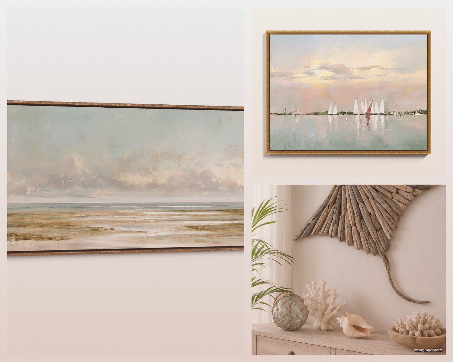
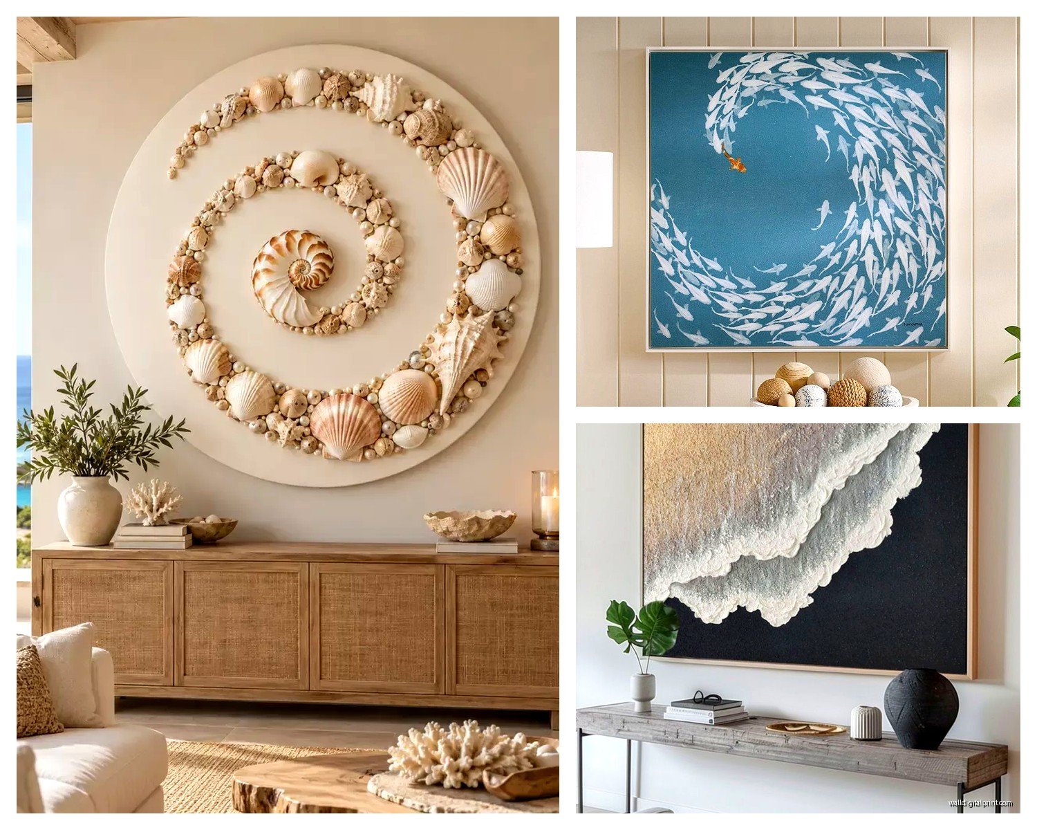
This is where you get those blurry watercolor-ish waves or aerial beach shots. They read as “ocean” without screaming BEACH HOUSE. I’m obsessed with the abstract wave paintings right now – the ones that are mostly blue and white with maybe some sand tones. They work in literally any room style because they’re more about color and movement than being literal.
The key is finding ones where the artist actually understands color theory. I’ve seen so many where someone just slapped turquoise and navy together and called it “coastal” but it looks flat. You want variation – maybe some teal, some deep indigo, some seafoam, some almost-white. Layers.
Minimalist Horizon Lines
Oh and another thing – those super simple ocean horizon photographs or paintings where it’s just sky meeting water? Chef’s kiss for modern spaces. I put a massive 60×80 one in a client’s bedroom (just a straight horizon line, pale blue water, white sky) and she literally texts me photos of it still because she’s so obsessed.
The thing with these is they need to be CRISP. If you’re going photography, it needs to be high-resolution professional stuff, not someone’s iPhone shot blown up. You’ll see the pixels and it’ll look cheap no matter how expensive the frame is.
Detailed Coastal Scenes
This is your beach grass closeups, your weathered docks, your rocky shorelines with all the texture. These work best in spaces that already have some traditional or organic elements. Like if you’ve got a lot of natural wood or linen or rattan happening, a super detailed sea grass photograph looks intentional. But if your space is all glass and chrome? It’s gonna feel confused.
Materials and What’s Actually Worth the Money
Okay so funny story – I ordered a “gallery-wrapped canvas” for my own place last year thinking it would be fine and it arrived looking like someone printed it at Kinko’s. Learned my lesson. Here’s what actually matters:
Canvas prints are the most common and they’re fine IF the canvas is thick (like 1.5 inch depth minimum) and properly stretched. The cheap ones have visible staples on the sides or the image wraps weird around the edges. You want gallery-wrapped where the image continues around the sides or it’s a solid complementary color.
Acrylic prints are having a moment and honestly I get it. The colors are SO vibrant and there’s this depth to them that’s really cool for ocean scenes. The light hits them different. But they’re heavy – like really heavy – so you need proper wall anchors. I watched my assistant almost drop a 48×72 acrylic piece and we both aged five years.
Framed prints under glass are classic but for oversized stuff the glass weight becomes a problem. And if you’re doing beach art, sometimes the glass reflection fights with the water in the image which is… a lot of shininess happening. I usually do framed prints WITHOUT glass for pieces over 40 inches, just a good quality print with a mat and frame.
Metal prints – okay this is gonna sound weird but metal prints for coastal art are incredible if your space can handle the modern vibe. The colors are waterproof (duh, it’s metal) and they have this luminous quality. Great for bathrooms or humid climates actually.
Color Palettes That Won’t Make You Cringe in Six Months
I’ve installed enough coastal art to know which color schemes have staying power. The super saturated turquoise and coral combo? That was 2018 and it’s already dated. Here’s what works long-term:
- Soft blues and grays with cream (literally never goes out of style)
- Navy and white with natural wood tones
- Sage green and sandy beige (very 2024 but I think it’s got legs)
- Black and white coastal photography (timeless and works with everything)
- Pale aqua and warm grays (feels expensive)
The trick is avoiding anything too tropical or Caribbean unless that’s genuinely your vibe. Most people want “coastal” not “tiki bar.”
Where to Actually Buy This Stuff
My client canceled this morning so I spent like an hour comparing oversized coastal art sources and here’s the real talk:
Etsy has tons of independent artists doing downloadable files you can print yourself at a local print shop. This is budget-friendly BUT you’re responsible for getting it printed large format and framed, which can actually end up costing more than buying ready-made. Good for custom sizes though.
Minted and Artfully Walls are my go-to for clients who want quality without going full custom. They have actual artists, good printing, and the framing options are solid. Not cheap but not gallery prices either.
West Elm and Pottery Barn have oversized coastal pieces that are… fine. They’re safe. Sometimes too safe. But if you need something quickly and you know it’ll be decent quality, they work.
Saatchi Art and Artsy if you’re going for original paintings or high-end photography. I’ve sourced some incredible 6-foot ocean paintings here but you’re paying for actual art, not decor.
Society6 and Redbubble are hit or miss on quality but good for testing out a style before committing to expensive versions.
Installation Tips Because I’ve Seen Some Disasters
Wait I forgot to mention – hanging oversized art is not a one-person job and it’s definitely not a eyeball-it situation. You need:
Proper anchors. Drywall anchors for anything under 30 pounds, but most large coastal pieces are gonna be heavier. I use heavy-duty picture hangers rated for the actual weight plus 10 pounds extra. Or better yet, find studs and mount into those.
A level. Like an actual level, not the app on your phone. I watched someone hang a 5-foot ocean panorama using their phone level and it was off by half an inch which doesn’t sound like much until you’re sitting on the couch staring at a crooked horizon line every day.
The right height. Center of the artwork should be at 57-60 inches from the floor (this is gallery standard). A lot of people hang stuff too high. Your eye level when standing is around 60-63 inches so the center of the piece should be slightly below that.
For pieces above furniture, leave 6-8 inches between the furniture top and the bottom of the frame. More than 10 inches and it looks disconnected, less than 5 and it feels crowded.
Multi-Panel vs Single Large Piece
Oh and another thing that comes up a lot – should you do one huge piece or a diptych/triptych situation?
I’m generally team single-piece for coastal art because the ocean is already inherently panoramic. Breaking it into panels can work if it’s an intentional artistic choice (like three separate wave studies in different colors) but those split panorama photos where it’s one image cut into three panels? They usually look gimmicky.
Exception: if you have a really wide wall (like 12+ feet) and a single piece would need to be comically large, then a series of 2-3 coordinating pieces works better. I did three 40×40 square abstract ocean pieces in a row for a client’s dining room and it was perfect. But they were each their own complete image, not one image chopped up.
Diptychs That Work
Two panels can be gorgeous if they’re designed as a pair. Like one that’s mostly sky and one that’s mostly water, or two different perspectives of the same beach. The gap between them becomes part of the composition. Just keep the spacing consistent – I usually do 2-4 inches between panels.
Styling Around Your Oversized Coastal Art
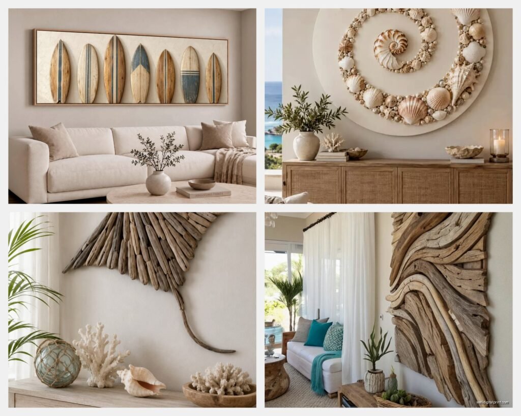
So you’ve got this massive ocean piece on your wall… now what? The whole room doesn’t need to be themed around it (please don’t do the whole shells and rope thing unless that’s really your aesthetic).
I usually pull 2-3 colors from the art and echo them in small doses around the room. Like if your ocean print has some warm sand tones, maybe that shows up in throw pillows or a blanket. If there’s a specific blue, maybe a vase or some books in that color family.
Texture is your friend. Coastal art pairs beautifully with natural textures – linen, jute, raw wood, stone. These materials have the same organic, elemental quality as ocean imagery.
Don’t overcrowd the wall. This is a statement piece. It doesn’t need a gallery wall around it or floating shelves on both sides. Let it breathe. Maybe a simple console table below with a plant and one sculptural object. Done.
My dog just knocked over my coffee which is probably a sign I should wrap this up, but real talk – the biggest mistake I see with oversized coastal art is people choosing something because it’s “pretty” without considering their actual space. A massive crashing wave print is dramatic and cool but if your room is small or your ceilings are low, it’s gonna feel overwhelming. A soft, minimal horizon line would probably serve you better.
And honestly? Sometimes the best coastal art doesn’t look obviously “beachy” at first glance. Some of my favorite installations have been abstract pieces that just happen to use ocean colors, or black and white photography of waves that reads more as abstract shapes than literal water. Those tend to age better and work with evolving design styles.
Last thing – if you’re ordering online (which, let’s be real, most people are), check the return policy before you buy. Colors look different on screens, sizes can be deceiving, and you won’t really know if it works until it’s on your wall. I always tell clients to live with a piece for at least a week before deciding because sometimes what feels too big at first becomes perfect once you adjust to it.