Wall Art Guide, Wall Art Tutoriels
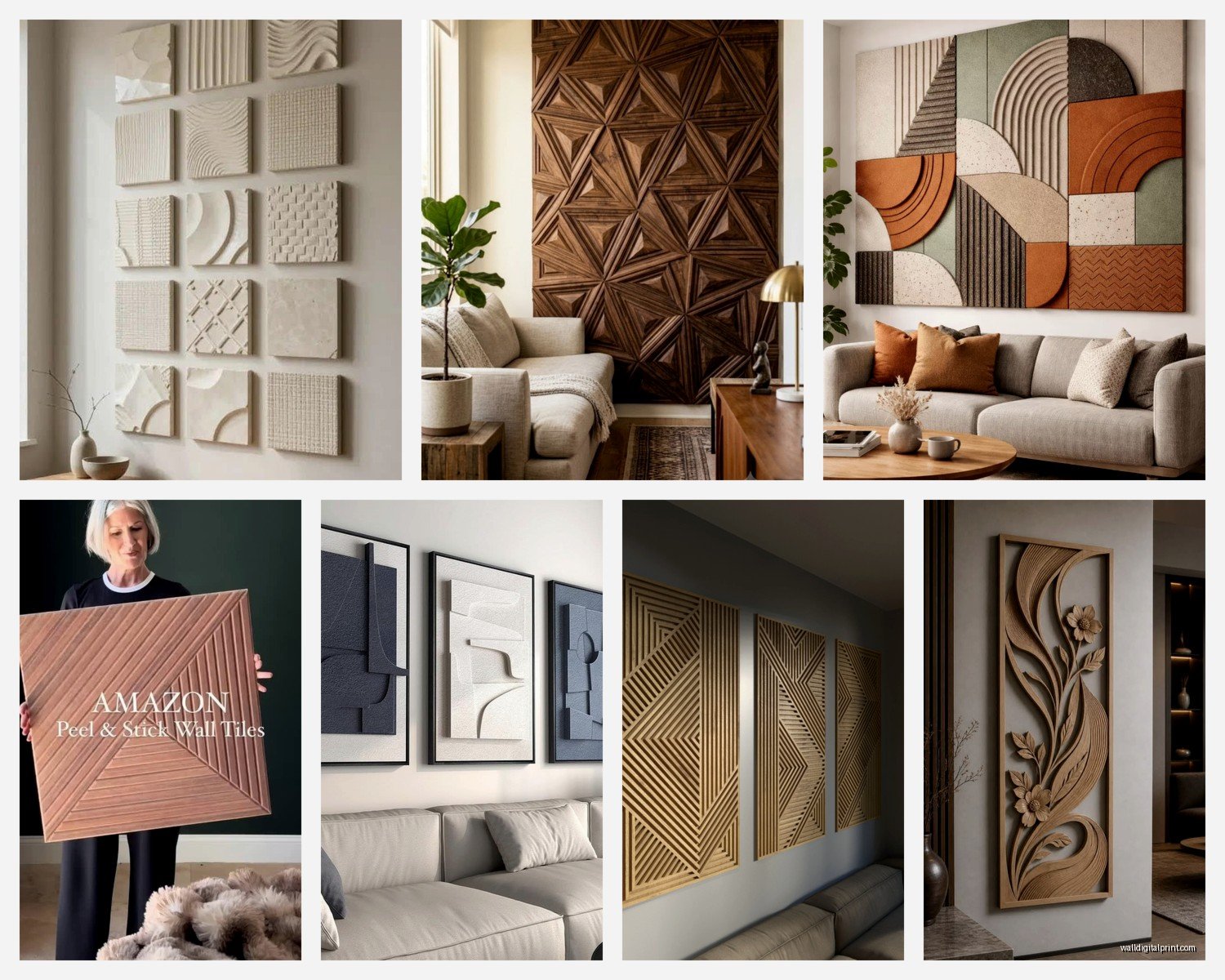
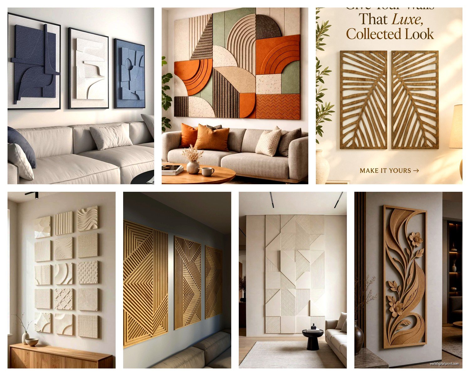
Wall Art Panels: Multi-Section Tile Module Designs
Nov
So I’ve been working with these multi-section wall art panels for like three years now and honestly they’re one of those things that look way more complicated than they actually are. You know when you see those massive installations in boutique hotels and think “I could never”? Yeah, you totally can.
The Basic Setup Nobody Tells You About
Okay so first thing – these modular tile designs come in sets, usually 3-panel, 5-panel, or sometimes these weird 4-panel configurations that I actually love but they’re harder to center. The panels are basically sections of one larger image split across multiple canvases or boards. Think of it like… if you took a poster and cut it into pieces but made it intentional and cool-looking.
The most common mistake I see is people buying these thinking they come pre-hung or connected. They don’t. You’re getting separate pieces that YOU have to arrange on your wall, and the spacing between them actually matters more than you’d think.
What You’re Actually Buying
Most of these panels come as:
- Stretched canvas (the most common, easiest to hang)
- Printed wood panels (heavier but more durable)
- Acrylic or metal prints (modern look, pain to hang correctly)
- Frameless edge prints (my personal favorite for contemporary spaces)
I did this install last month where the client bought metal panels without telling me and oh my god, the weight distribution was a nightmare. We had to use completely different hardware than what came in the box.
Measuring and Planning (Don’t Skip This Part)
So here’s where people mess up – they just start hammering nails into the wall. I’ve been guilty of this too, watched half an episode of that baking show while eyeballing placement and ended up with one panel like two inches off.
You need:
- Painter’s tape (the blue stuff)
- A level that actually works (check the bubble, mine was broken for months)
- Pencil
- Measuring tape
- Someone’s phone camera honestly, for perspective shots
The Spacing Thing Everyone Gets Wrong
The gap between panels should be between 2-4 inches for most residential spaces. I usually go with 2.5 inches because it looks intentional but not too separated. Galleries sometimes do wider gaps like 6-8 inches but that’s a specific aesthetic and your living room probably isn’t a gallery (unless it is, then do whatever).
Here’s my actual process: I tape out the entire arrangement on the wall first using painter’s tape to represent each panel’s edges. Stand back like 10 feet. Take a photo. Does it look right on your phone? Your phone doesn’t lie, your eyes do when you’re standing close.
The Actual Hanging Part
Okay so funny story, I once hung an entire 5-panel set using those command strips because the client was renting and paranoid about holes. Worked fine for like eight months then one panel just… fell off during dinner party. We found it behind the couch. Now I only use command strips for really lightweight stuff or if someone’s literally moving in three months.
Hardware Options That Actually Work
For canvas panels (under 5 lbs each):
- Standard picture hanging hooks rated for the weight
- Two hooks per panel if it’s wider than 20 inches
- Those sawtooth hangers that come pre-attached usually work fine
For heavier panels (wood, metal, acrylic):
- Wall anchors are non-negotiable unless you’re hitting studs
- I use the self-drilling anchors, the plastic toggle ones are annoying
- French cleats for anything over 15 lbs – they’re these interlocking brackets and they’re SO much easier than people think
My Actual Step-by-Step
Find your center point on the wall. Like the actual middle of where you want the whole arrangement. Mark it lightly with pencil.
If you have an odd number of panels (3 or 5), the center panel goes centered on that mark. If you have an even number… this is gonna sound weird but I usually offset the whole thing slightly to whatever side has more visual weight in the room. Like if there’s a big bookshelf on the left, I shift the art slightly right.
Start with the center panel or the middle two panels. Get those PERFECTLY level. Everything else follows from these.
Working outward, place your tape markers for the next panels, maintaining that 2-4 inch gap. Level each one as you go.
Mark your hanging points through the tape (you can feel the hardware on the back of the panel through the tape usually, or just measure from the top edge).
Remove tape, install hardware, hang panels.
Design Configurations That Actually Look Good
The classic horizontal 3-panel is foolproof. Like you really can’t mess this up if you keep them level. Works above sofas, beds, console tables, wherever.
5-panel sets get trickier. The standard layout is one large center panel with two smaller ones on each side. But I’ve also done:
- Staggered heights (step formation going up or down)
- Two on top, three on bottom in a pyramid-ish shape
- All five in a straight line if you have a really long wall
Vertical configurations work in narrow spaces like hallways or between windows. I did this in my own entryway with a 3-panel vertical set and it makes the ceiling look higher which is great because my apartment is kinda… not tall.
The Grid Layout
This is where you arrange panels in rows and columns like a tic-tac-toe board. Super modern looking but you gotta be precise. I use this for 4-panel, 6-panel, or 9-panel sets. The spacing has to be identical both horizontally and vertically or it looks sloppy.
My dog knocked into my ladder while I was installing a grid layout once and I had to start completely over because one nail hole was visible. Still annoyed about that.
Choosing Designs That Won’t Make You Cringe Later
Okay real talk – abstract designs age better than literal ones. I installed so many inspirational quote panels in 2018-2019 and now everyone wants them down. Meanwhile, the abstract geometric ones from the same era still look current.
What Works Long-Term
- Natural landscapes split across panels (mountains, oceans, forests)
- Abstract color fields that match your existing palette
- Black and white photography, especially architectural or nature
- Minimalist line drawings or botanical prints
- Textured designs that add dimension without being too specific
Avoid unless you’re really committed:
- Trendy colors that might not be trendy in two years
- Super literal images (like a giant close-up of a dandelion… very 2015)
- Anything with words unless it’s in another language or abstract text
- Character art or pop culture stuff for main living spaces (game rooms are different)
Size Considerations Nobody Mentions
The total width of your panel arrangement should be roughly 2/3 to 3/4 the width of the furniture below it. So if your sofa is 90 inches wide, your wall art should span about 60-70 inches total including the gaps between panels.
Height-wise, hang the center of the arrangement at 57-60 inches from the floor. This is standard gallery height and it just works. I’ve tried going higher or lower for ~aesthetic reasons~ and it always looks off.
For panels above a bed, leave at least 6-8 inches between the headboard and the bottom of the lowest panel. Learned this one the hard way when a client’s teenage son kept bonking his head sitting up in bed.
Room-Specific Sizing
Living room over a sofa: Go bigger than you think. Like seriously, people always go too small here. A 5-panel set that spans 70+ inches looks way better than a tiny 3-panel set that’s only 40 inches total.
Bedroom: Medium sized, 3-panel sets work best. You don’t want something too visually busy where you’re trying to sleep.
Dining room: This is where you can go dramatic. Large scale 5-panel sets or even those massive single-image pieces split into 6+ panels.
Bathroom: Small 2-3 panel sets, and make sure they’re actually rated for humidity or the edges will warp. Canvas is terrible in bathrooms btw.
Lighting Makes or Breaks These
Oh and another thing – if you don’t light these properly they just look flat and boring. I always recommend:
Picture lights mounted above (those brass or black arm lights), or track lighting aimed at the panels, or even just making sure there’s adequate ambient light in the room.
I installed this gorgeous 5-panel abstract set in a client’s windowless hallway and it looked terrible until we added two simple LED spotlights. Completely transformed it.
The Color Temperature Thing
Use warm white bulbs (2700-3000K) for warm-toned art and neutral to cool white (3500-4000K) for black and white or cool-toned pieces. I’ve seen people use daylight bulbs on everything and it makes warm art look sickly.
Maintenance and Adjustments
Dust these regularly with a microfiber cloth. Canvas panels especially attract dust along the edges. Every few months, check that they’re still level – walls shift, houses settle, things move.
If a panel starts tilting, don’t just push it back straight. Take it down and check the hardware. I’ve had sawtooth hangers literally bend over time from weight.
For canvas panels, you can tighten them if they start sagging by spraying the back lightly with water and letting them dry. The canvas shrinks slightly as it dries. Sounds fake but it actually works, did this for a client last week.
Where to Actually Buy These
I’m gonna be honest, the quality difference between expensive and cheap options isn’t always huge for these. I’ve gotten great sets from:
- Wayfair (hit or miss, read reviews carefully)
- Amazon (surprisingly decent if you filter by 4+ stars)
- Society6 and similar print-on-demand sites for unique designs
- Local art fairs if you want something actually unique
- Etsy for custom sizing or specific color requirements
The really expensive ones from specialized art retailers are usually just better quality printing and materials, but the actual visual impact isn’t necessarily better.
Wait I forgot to mention – always check the return policy before buying because these look different in person than online like 40% of the time. The colors especially can be way off from what your screen shows you.
Common Problems and Fixes
Panels won’t stay level: You’re probably using hooks that are too shallow. Switch to deeper hooks or add a second hanging point per panel.
Gaps look uneven: Measure from each panel edge to the next, don’t just eyeball it. Use a ruler or even just cut a piece of cardboard to your desired gap width and use that as a spacer guide.
Color doesn’t match the room: Add complementary accent pieces in the same color family as the art. Throw pillows, a blanket, even just some books on the coffee table can tie it together.
Looks too formal or stiff: Try a slightly asymmetrical arrangement or add other smaller art pieces nearby. Not everything has to be perfectly balanced.
The whole arrangement feels too small after installing: This happens SO often. Either add flanking pieces on the sides or swap for a larger set. Going bigger is almost always better than going smaller with these.
Anyway that’s basically everything I’ve learned from installing probably 50+ of these panel sets. The main thing is just to plan it out first, use proper hardware, and trust your eye when something looks off because it probably is.