
Wall Art Guide, Wall Art Tutoriels
Blue and Grey Wall Art: Ocean Sky Neutral Cool Combo
Nov
So I’ve been working with blue and grey wall art for like three years now and honestly it’s one of those combos that sounds boring on paper but then you see it in a room and you’re like oh okay yeah that makes sense. Let me just dump everything I know because I literally just finished a project with this exact palette last week.
Why This Actually Works When Other “Safe” Combos Don’t
The thing about blue and grey is they share this cool undertone that makes them play nice together without looking matchy-matchy. I had this client who was terrified of color and kept showing me beige inspiration pics, and I was gonna lose my mind, so I suggested we do ocean-y blues with slate grey and she literally transformed. The room went from hotel generic to actually having a vibe.
Grey acts as the neutralizer. Blue brings the mood. Together they create this atmospheric thing that works in basically any room because you can swing it modern, coastal, minimalist, or even slightly industrial if you add the right frames.
Picking Your Blues (This Part Matters More Than You Think)
Okay so not all blues work with grey. I learned this the hard way when I bought this gorgeous cerulean print and put it next to a charcoal grey abstract and it looked like a preschool art wall. Here’s what actually works:
- Dusty blues and soft greys – think faded denim with dove grey, super calming, works in bedrooms
- Navy and medium grey – more dramatic, I use this combo in dining rooms or home offices where you want it to feel serious but not cold
- Powder blue with warm grey – this is tricky because warm grey can look taupe-ish but if you get the balance right it’s really soft and approachable
- Teal-ish blue with cool grey – leans more contemporary, almost spa-like
- Sky blue with light grey – airy and open, perfect for small spaces
I tend to avoid bright cobalt blues with grey unless you’re going for that graphic poster look. It can work but it’s aggressive and you gotta really commit.
The Ratio Thing Nobody Talks About
This is gonna sound weird but the ratio of blue to grey in your wall art arrangement actually changes the whole room energy. I usually do 60/40 or 70/30 blue to grey. If you flip it and do mostly grey with blue accents, the room feels more sophisticated but also kinda serious. More blue and it feels breezier, more relaxed.
For my living room I did three pieces – two predominantly blue ocean scenes and one grey abstract – and it feels balanced. My cat keeps sitting in front of the grey one though which is annoying when people come over.
Types of Art That Work in This Palette
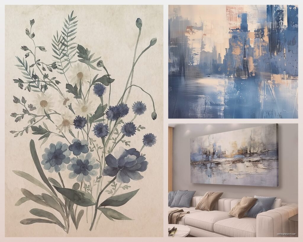
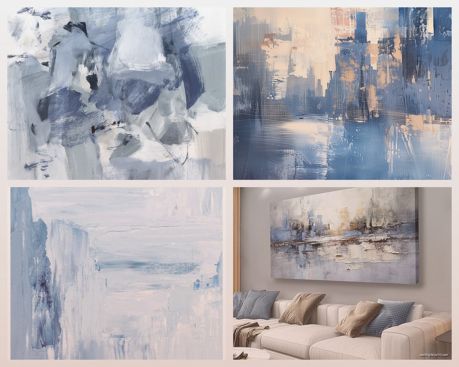
Abstract is the easiest route honestly. You can find blue and grey abstracts everywhere and they’re forgiving because there’s no “subject” to overthink. I like pieces with visible brushstrokes or texture because flat prints can look too corporate.
Ocean photography or paintings are the obvious choice and yeah it’s kinda on-the-nose but it works. Waves, horizons, coastal scenes – they naturally have these colors. Just make sure the photography is actually good quality because bad ocean prints look like stock images from a dentist office.
Geometric prints in blue and grey feel more modern and structured. These work really well in offices or contemporary spaces. I did a whole gallery wall of geometric prints for a client’s hallway and it turned out super clean.
Marble or agate prints with blue and grey veining are having a moment. They add that organic element without being too literal about the nature thing.
Line drawings or minimalist sketches with blue and grey accents – think botanical prints or architectural drawings. These add sophistication without overwhelming the space.
What Doesn’t Work (Learned Through Mistakes)
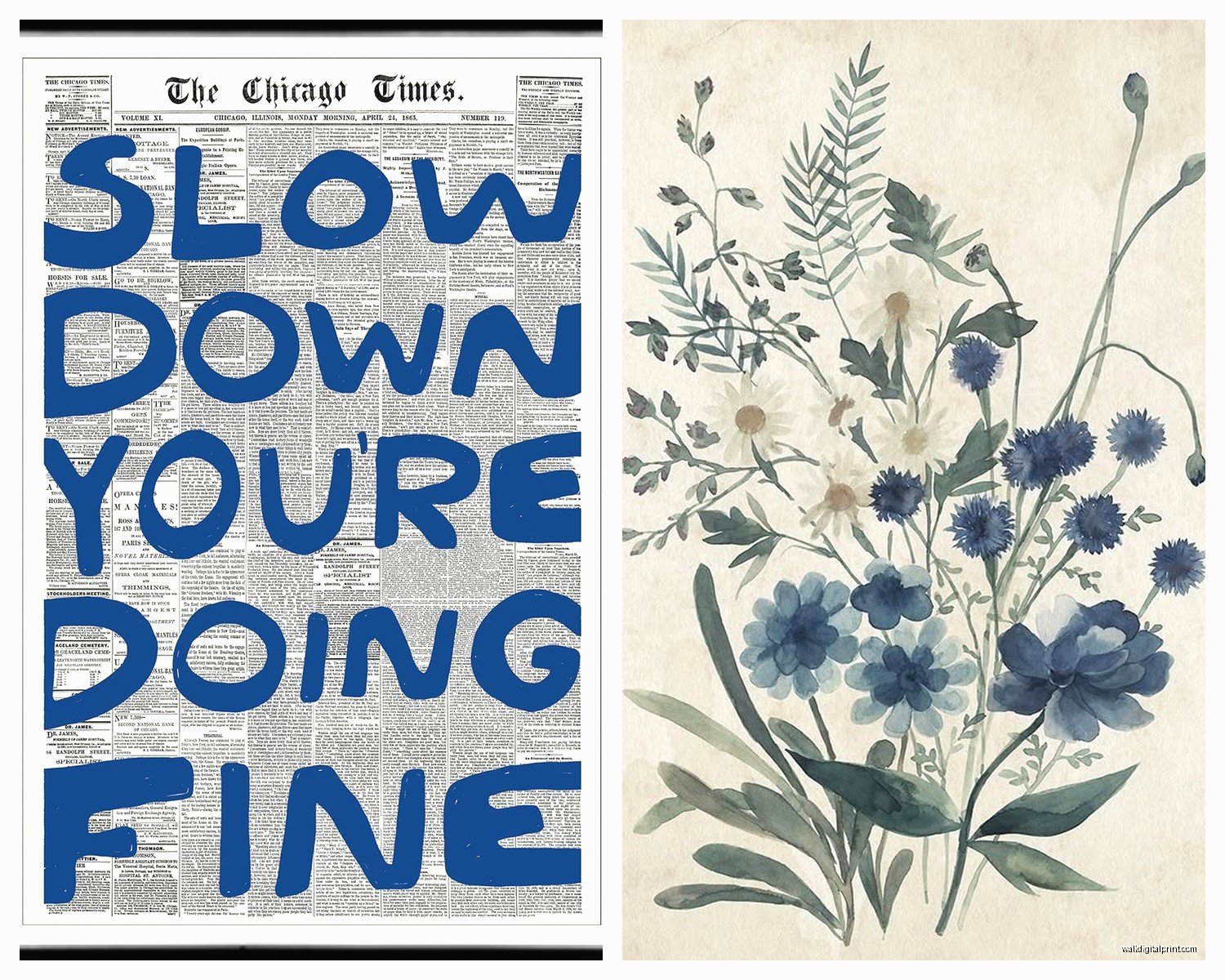
Overly busy patterns with too many shades of blue and grey just look chaotic. Stick to 2-3 shades max. Also those motivational quote prints in these colors usually look cheap unless the typography is really well designed.
Frame Colors and This Is Where People Mess Up
White frames keep it light and coastal. Black frames make it more dramatic and gallery-like. Natural wood frames warm it up if your blues and greys are leaning too cold. I almost always do white or black though because wood can muddy the palette unless you’re intentionally going for that mixed-material look.
Silver or metallic frames can work but they’re tricky – they need to be matte or brushed, not shiny. Shiny silver frames with blue and grey art gives off weird 2005 Home Goods energy.
Oh and another thing – if you’re doing a gallery wall with multiple pieces, keep the frame style consistent even if you vary the sizes. Mixed frame styles in this palette looks unintentional rather than eclectic.
Size and Placement Because This Changes Everything
One large statement piece (like 40×60 or bigger) in blue and grey creates a focal point. I did this above a grey sofa last month and it anchored the whole room. The piece was mostly blue with grey brushstrokes and it was just… chef’s kiss.
Diptychs or triptychs work really well with this combo because you can separate the colors across panels – like blue dominant on one side transitioning to grey on the other. It creates movement.
For gallery walls I usually do 5-7 pieces in varying sizes. Mix orientations – some vertical, some horizontal, maybe one square. Keep 2-3 inches between frames for a curated look or go really tight with 1 inch spacing for a more collected-over-time vibe.
Height matters more than people think. The center of your art should be at eye level which is roughly 57-60 inches from the floor. I see so many people hang stuff too high and it floats awkwardly.
Matching It to Your Wall Color
White walls – this is the easiest. Blue and grey art pops against white without competing. You can go bold or subtle.
Grey walls – make sure there’s enough contrast. If your walls are medium grey, use lighter blues and whites in the art or darker navy and charcoal. Same-tone-on-same-tone disappears.
Beige or greige walls – this is actually where blue and grey art shines because it cools down the warmth. Just make sure your greys don’t have brown undertones or it’ll clash.
Navy or dark walls – use art with lighter blues and pale greys so it doesn’t get lost. White or light frames help too.
I had this whole situation where a client had pale blue walls and wanted blue and grey art and it was almost impossible to make it work because everything blended. We ended up doing art with white backgrounds and blue/grey elements which created enough separation.
Texture and Medium Options
Canvas prints are standard and affordable. They work fine but can look flat. I usually go for gallery-wrapped edges so you don’t need a frame.
Framed prints under glass feel more polished and protected. Good for high-traffic areas or if you have kids.
Metal prints in blue and grey are super modern and the colors look incredibly vibrant. They’re pricier but durable and they have this luminous quality.
Textured paintings or mixed media pieces add dimension. If your room is full of smooth surfaces, a textured blue and grey piece breaks it up nicely.
Photography prints – go for matte finish. Glossy can create glare and looks cheap with these colors.
Where to Actually Buy This Stuff
I’m not gonna lie, I spend way too much time on Etsy looking at blue and grey abstract prints. There are so many independent artists and you can usually get digital downloads to print yourself which saves money. Just make sure you’re printing at a good lab – Costco or a local print shop works fine for larger sizes.
Society6 and Redbubble have tons of options and you can get them printed on different materials. The quality is decent for the price.
West Elm and CB2 if you want something more curated but you’re paying for the curation. I buy from them when clients have bigger budgets.
Minted has beautiful art prints and their framing options are solid. A bit expensive but worth it for statement pieces.
Local art fairs and galleries – this is where you find unique stuff. I got this amazing blue and grey watercolor from a local artist that I still think about. It cost more but it’s one of a kind.
Wait I forgot to mention – thrift stores and estate sales sometimes have vintage blue and grey art that’s already framed. You gotta dig but I’ve found some gems.
Styling the Rest of the Room Around It
Once you have your blue and grey art up, everything else should support it without competing. I usually pull one of the blue tones into throw pillows or a blanket. The grey can come through in a rug or curtains.
Metallic accents like brass or copper warm up the cool palette. I did a living room with blue and grey art and added brass picture lights and table lamps – it completely balanced the temperature of the room.
Natural elements like wood furniture, woven baskets, or plants keep it from feeling too sterile. Blue and grey can go cold really fast if you’re not careful.
White or cream upholstery grounds it. All grey furniture with blue and grey art can feel monotone unless you’re really intentional about varying the shades and textures.
Lighting Makes or Breaks This
Natural light shows the true colors. If your room doesn’t get much natural light, make sure you’re using bulbs in the 3000-4000K range – not too warm, not too cool. I had a piece that looked perfect in the store and then looked purple-ish in the client’s dimly lit bedroom because of warm bulbs.
Picture lights can highlight your art and add ambiance. I’m obsessed with those battery-operated ones from IKEA for renters.
Common Mistakes I See All the Time
Going too matchy with every blue being the exact same shade. Variation creates depth. Mix navy with sky blue with teal – as long as they share that cool undertone they’ll work.
Forgetting about scale. Tiny art on a huge wall looks lost. Better to go bigger than you think you need.
Hanging art too high like I mentioned before but seriously this is the number one mistake.
Choosing art last instead of building the room around it. If you love a piece of blue and grey art, let it dictate your other choices.
Not considering the mood of the space. Soft watercolor blues and greys don’t work in a home gym. Bold geometric blues and greys might be too intense for a bedroom.
Quick Combo Ideas That I’ve Actually Done
Ocean wave photography in navy and white + grey abstract + pale blue watercolor = coastal but elevated
Three matching blue and grey marble prints in a row = modern and symmetrical, works great in bathrooms or hallways
Large grey abstract as the anchor + two smaller blue geometric prints flanking it = balanced and structured
Mixed media pieces with texture in varying shades of blue and grey = layered and interesting, good for living rooms
Vintage botanical prints with blue flowers and grey backgrounds = traditional but fresh
Okay so funny story – I was watching The Great British Baking Show while arranging a gallery wall last week and I literally used the spacing between Paul Hollywood’s criticisms to decide where to place the nails. Worked out perfectly.
The main thing is just to trust your eye. Put pieces up with painter’s tape first to see how they feel. Live with them for a day or two. Blue and grey is forgiving enough that you can experiment without it looking crazy. And if you hate it you can always swap pieces around or add a pop of a warmer color to shift the vibe.
Also don’t overthink the “ocean sky” theme too literally. You can absolutely do blue and grey art that has nothing to do with water or weather and it still works because the colors themselves create that atmospheric quality. I’ve done industrial cityscapes, abstract expressionist pieces, minimalist line work – all in blue and grey – and they all felt cohesive just because of the palette.
