Wall Art Guide, Wall Art Tutoriels
Leaf Prints Wall Art: Botanical Foliage Nature Photography
Nov
So I’ve been obsessing over leaf prints lately and honestly it started because I was watching this documentary about rainforests while reorganizing my home office and thought… wait, why don’t I have more plants in here? But then I remembered I kill everything green, so wall art it is.
Getting Started With Botanical Wall Art
First thing you gotta know is that leaf prints come in like a million different styles and I’ve tested way too many for various client projects. The main categories are actual photography prints, watercolor botanical illustrations, and pressed leaf art. Each one gives you a totally different vibe.
Photography prints are my go-to because they’re versatile and you can find them in every price range. I’m talking anywhere from $15 Etsy downloads to $400 framed museum-quality prints. The sweet spot I’ve found is around $50-80 for a really good quality print that won’t fade.
Print Quality Actually Matters More Than You Think
Okay so here’s what I learned the hard way – and my client was NOT happy about this one. I ordered these gorgeous monstera leaf prints from this random website, super cheap, looked amazing in the photos. They arrived and the green was this weird neon color that looked nothing like the listing. Turns out the site was just dropshipping from somewhere and had zero quality control.
Now I only buy from places that specify:
- Giclée printing or archival quality inkjet
- Acid-free paper or museum-grade canvas
- Actual color calibration info
- Return policy that doesn’t make you wanna cry
The paper type changes everything. I did this whole comparison thing when my usual morning coffee run was closed and I had extra time – bought the same fern image printed on regular photo paper, fine art paper, and watercolor paper. The watercolor paper version had this texture that made it look more expensive and artistic, while the photo paper one looked kinda flat and cheap even though the image was identical.
Choosing Your Leaf Types
This is gonna sound weird but different leaves work better in different rooms. I’ve installed probably 200+ pieces of botanical art at this point and there’s definitely patterns.
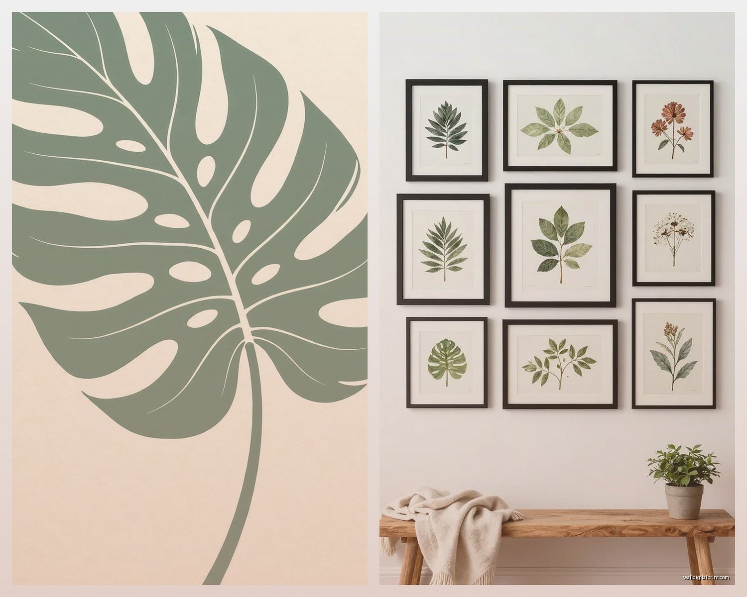
Monstera and palm fronds – these are everywhere right now but they’re popular for a reason. Big dramatic shapes work great in minimalist spaces or modern homes. They fill wall space without looking cluttered. I used a trio of black and white palm prints in a client’s bathroom and it completely transformed the space.
Ferns and delicate leaves – better for smaller spaces or gallery walls. They’ve got this intricate detail that draws you in close. I have a fern print above my desk and honestly I stare at it when I’m procrastinating. The patterns are kinda meditative.
Eucalyptus and olive branches – if you’re going for that farmhouse or Mediterranean vibe. They photograph beautifully with that silvery-green color. Works really well in kitchens and dining areas.
Tropical leaves (banana leaf, bird of paradise) – bold colors, big impact. These need space to breathe though. Don’t cram them into a tiny hallway.
Color Considerations That Nobody Talks About
Oh and another thing – the background color matters way more than the actual leaf sometimes. I learned this when I was curating pieces for an art show last year. A bright green leaf on white background feels fresh and clean. Same leaf on black background suddenly becomes moody and dramatic. On a cream or beige background it feels vintage and botanical-illustration-ish.
For most homes I recommend:
- White or light backgrounds for small rooms – they don’t close in the space
- Dark backgrounds for large walls that need anchoring
- Colored backgrounds (navy, sage, blush) when you want the art to be a statement piece
Wait I forgot to mention – if you have colorful furniture or busy patterns in your room, go for black and white botanical prints. They add that nature element without competing for attention. I did this in my friend’s living room where she has this wild floral sofa, and the B&W leaf prints actually made the whole room feel more cohesive instead of chaotic.
Where to Actually Buy These Things
Alright so here’s my tested list of sources, from cheapest to most expensive:
Etsy digital downloads – You can find beautiful high-resolution images for like $5-15, then print them yourself at a local print shop or online service. The quality depends entirely on the seller though. Look for shops with tons of reviews and sample images that show the actual resolution. I’ve bought from like 30 different Etsy sellers and my favorites are the ones that include multiple size options in one purchase.
The thing with digital downloads is you gotta know what you’re doing with printing. I use a local print shop that does archival printing and it costs about $25-40 per print depending on size, so total cost is still way under buying pre-made.
Society6 and Redbubble – these print-on-demand sites are hit or miss. The advantage is they handle everything including framing if you want. Prices are mid-range, like $30-100. Quality is… acceptable? Not amazing but not terrible. Good for renters who might move soon and don’t wanna invest heavily.
Minted and Artfully Walls – step up in quality and price. $80-200 range usually. The printing is noticeably better and they often have exclusive artist collaborations. I bought a set of eucalyptus prints from Minted for my bedroom and the color accuracy was perfect.
Local artists and photographers – honestly this is my favorite option when budget allows. You get unique pieces nobody else has, support actual artists, and the quality is usually incredible. I follow a bunch of botanical photographers on Instagram and several sell prints directly. Prices vary wildly but expect $100-300 for limited edition prints.
The Framing Situation
Okay so funny story, I once spent $40 on a gorgeous leaf print and then $200 on custom framing because I didn’t plan ahead. Don’t be me.
Here’s what actually works:
Standard sizes are your friend – if you buy prints in standard frame sizes (8×10, 11×14, 16×20, 18×24), you can get cheap frames literally anywhere. Target, IKEA, Amazon. I probably have 15 frames from IKEA’s RIBBA line and they look way more expensive than they are.
Matting makes everything look professional – a $15 print in a $20 frame with proper matting looks like a $200 piece. White or cream mats are classic. I sometimes use dark mats for dramatic leaf photos. The mat should be like 2-4 inches on all sides, or slightly wider on the bottom if you wanna get technical about it.
Mix frame colors intentionally or keep them uniform – I see people mixing black, white, and wood frames randomly and it looks chaotic. Either commit to one color for a cohesive look, or if you’re mixing, make sure there’s a pattern. Like all the large prints in black frames, smaller ones in wood.
My cat just knocked over my coffee while I’m writing this, so that’s fun.
Gallery Wall Layouts for Botanical Prints
If you’re doing multiple prints, layout is everything. I always do a floor test first – lay everything out on the floor in the arrangement before putting any holes in the wall. Take a photo, live with it for a day, see if you still like it.
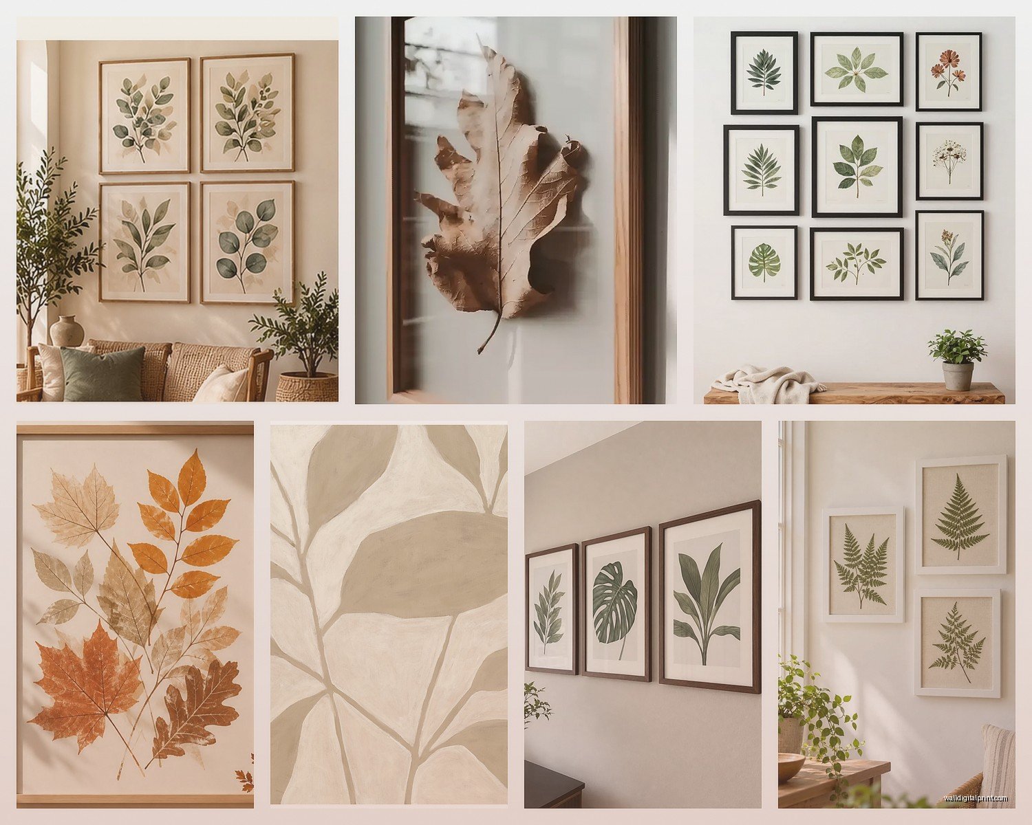
Grid layout – same size frames, evenly spaced. This is the easiest and looks clean and modern. I did a 3×3 grid of different fern species in a client’s home office and it became this cool focal point. Space them 2-3 inches apart.
Salon style – different sizes clustered together. This takes more planning but looks collected and interesting. Start with your largest piece and build around it. Keep 2-3 inches between frames.
Linear arrangement – three or four prints in a horizontal line. Perfect for above a sofa or bed. Keep them at the same height, and the total width should be about 2/3 the width of your furniture.
Photography vs Illustration Style
This comes down to personal taste but also the vibe of your space. Photography feels contemporary and realistic. You’re looking at an actual leaf, with all its imperfections and details. The macro shots where you can see the veins and texture? Those are my favorites for adding interest to minimalist spaces.
Vintage botanical illustrations have that scientific, library vibe. They’re perfect for traditional homes or if you’re going for that dark academia aesthetic. I used antique-style fern illustrations in a client’s study with dark green walls and it felt like a Victorian conservatory.
Watercolor botanical art is softer and more artistic. Better for bedrooms or spaces where you want a calming effect. The colors are usually more muted than photography.
Lighting and Placement Tips
Wait I forgot to mention this earlier but it’s actually super important – where you hang botanical prints affects how they look. Natural light can fade prints over time, especially if you’ve got direct sunlight hitting them. I learned this when a client called me six months after installation and her beautiful monstera print had turned yellowish.
Use UV-protective glass or acrylic if the print will get direct sun. Or just don’t hang valuable prints in super sunny spots. Save those for the walls that get indirect light.
For artificial lighting, I love using picture lights for botanical gallery walls. Makes them feel like actual art collection. But even just making sure your room lighting isn’t creating glare on the glass makes a huge difference.
Unexpected Places for Leaf Prints
Okay so beyond the obvious living room and bedroom spots, here’s where I’ve used botanical prints that worked surprisingly well:
- Bathroom – humidity can be an issue so use frames with sealed backs, but the spa-like vibe is worth it
- Kitchen – small herb prints or vegetable leaf prints near the cooking area
- Hallways – long vertical prints of palm fronds or bamboo make narrow halls feel taller
- Home office – I have clients who say looking at nature images actually helps them focus
- Mudroom or entryway – sets a welcoming natural tone right when you walk in
DIY Leaf Print Photography
If you wanna get really into it, you can make your own. I tried this last summer and it’s actually not that hard if you have a decent camera or even a good smartphone.
Collect interesting leaves – look for ones with good shape and minimal damage. Clean them gently. You can photograph them several ways:
Lay them on a white poster board in natural indirect light. Straight overhead shots work great. This is how most of those clean minimal leaf prints are made.
Or try backlighting – hold the leaf up to a window and photograph the light coming through. This highlights the vein patterns beautifully.
You can also do the flatbed scanner method which sounds weird but produces incredibly detailed images. Just lay leaves on your scanner, cover with black paper, and scan at high resolution.
I’m not gonna lie, my first attempts were pretty bad. But after watching some YouTube tutorials and practicing with different leaves, I got some images I actually framed for my own place.
Mixing Botanical Prints with Other Art
You don’t have to go all-in on just leaves. I usually mix botanical prints with other nature photography, abstract art in complementary colors, or even typography prints. The key is finding a common element – maybe it’s all black and white, or they all have the same frame style, or there’s a color that appears in each piece.
One of my favorite installations mixed large monstera photography with smaller abstract watercolors in green tones and one black and white landscape photo. Sounds like it shouldn’t work but the green color thread tied everything together.
The thing nobody tells you is that decorating with botanical prints is actually really forgiving. Nature is already beautiful, so even if your arrangement isn’t perfect, it usually still looks good. Just avoid the temptation to buy every leaf print you see (speaking from experience, I have a closet full of prints I haven’t hung yet).