Wall Art Guide, Wall Art Tutoriels
Leopard Print Wall Art: Animal Spotted Pattern Safari Decor
Nov
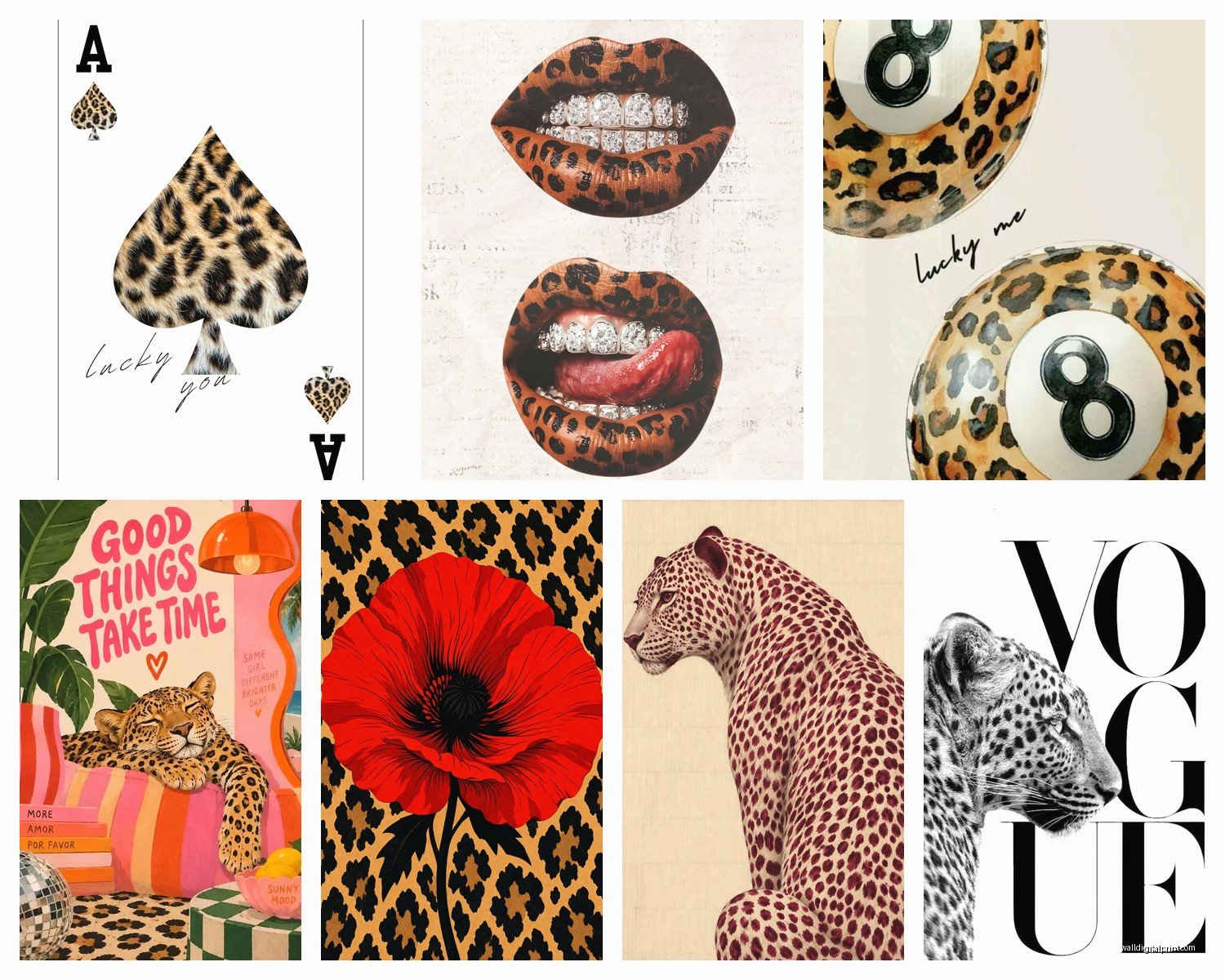
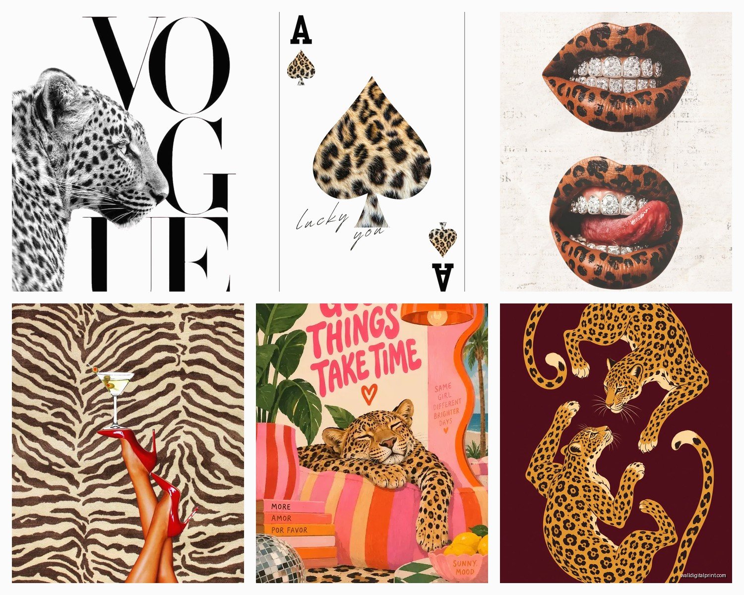
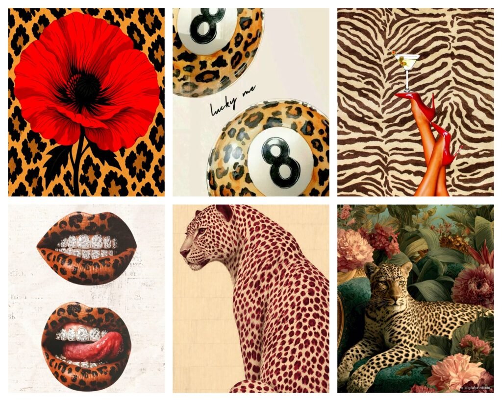
So I’ve been completely obsessed with leopard print wall art lately and honestly it started because a client asked me to redo their living room without making it look like a tacky 80s nightmare, which is apparently what everyone thinks happens when you bring animal prints inside. But here’s the thing – when you do it right, leopard print actually adds this incredible texture and movement to a space without being loud about it.
Picking the Right Style Without Making Your Space Look Like a Safari Gift Shop
Okay so first things first, you gotta figure out what kind of leopard print vibe you’re going for because they’re not all created equal. I learned this the hard way when I ordered what I thought was a “subtle abstract leopard” and it showed up looking like someone screenshot a National Geographic documentary.
The watercolor leopard prints are probably my favorite right now. They’re softer, the spots kinda bleed into each other, and they read more as art than costume. I’ve got one in my hallway that’s mostly cream and taupe with just hints of the traditional orange-brown, and people don’t even realize it’s leopard print at first glance. That’s the sweet spot you want.
Then there’s the graphic modern approach where the spots are super clean and geometric. These work amazing in contemporary spaces or if you’ve got that whole Scandinavian minimal thing going on. I used a black and white geometric leopard print in a client’s home office last month and it somehow made the space feel both professional and interesting, which is hard to pull off.
Size Matters More Than You Think
This is gonna sound weird but I literally measured wrong on my first leopard print purchase and ended up with this tiny 8×10 that looked absolutely ridiculous on my massive blank wall. My dog kept staring at it like even she knew it was wrong.
For above a sofa, you want something that’s at least two-thirds the width of your couch. So if you’ve got a standard 7-foot sofa, you’re looking at around 50-60 inches of art width. You can do a single large piece or a diptych or triptych situation. I actually prefer the multi-panel thing because it feels more intentional and less “I bought the biggest thing at HomeGoods.”
Small spaces though – that’s different. In a powder room or a narrow hallway, a smaller 16×20 or 18×24 can actually make more impact because the pattern isn’t overwhelming the whole room.
Color Schemes That Actually Work
Oh and another thing – the color palette of your leopard print matters SO much. Like, traditional brown and orange leopard is beautiful but it’s also the hardest to work with because it brings in warm tones that might clash with everything else you own.
I’ve had the most success with these combinations:
- Black and white leopard with literally any color scheme – it’s basically a neutral
- Gray and cream leopard for modern or transitional spaces
- Navy and gold leopard when you want something luxe but unexpected
- Blush pink and gray leopard for bedrooms or feminine spaces
- Charcoal and rust for that warm industrial vibe
The traditional tan/brown/black combo works best if your space already has warm wood tones and earthy colors. I used it in a room with terracotta accents and tons of natural wood and it was *chef’s kiss* perfect.
Frame or No Frame – The Debate I Have With Myself Constantly
Okay so funny story, I spent like three weeks going back and forth on whether to frame this gorgeous leopard canvas I bought. Here’s what I figured out through way too much trial and error:
Framed leopard print reads as more sophisticated and gallery-like. The frame contains the pattern and makes it feel collected rather than decorative. Use black frames for modern spaces, gold for traditional or glam, natural wood for boho or transitional. I usually go with a simple frame – nothing too ornate because the print itself is already busy.
Unframed canvas or prints work better for casual spaces and honestly they’re cheaper which matters when you’re testing out whether you even like animal print in your home. The wrapped canvas edges can look really clean and modern if the print extends around the sides.
For paper prints, you pretty much need a frame unless you’re going for a very casual pinned-to-the-wall gallery situation, which can actually look cool in a bedroom or creative space.
Where to Actually Buy This Stuff
Wait I forgot to mention – finding good leopard print wall art is weirdly harder than you’d think because there’s SO much bad stuff out there. Here’s where I actually shop:
Etsy is probably my number one source because you can find independent artists doing really unique interpretations. Search for “abstract leopard art” or “watercolor animal print” to avoid the really literal safari stuff. I found this amazing artist who does leopard prints in unexpected colors like sage green and dusty blue.
Society6 and Redbubble have tons of options and the nice thing is you can get the same design in different sizes and formats. I’ve ordered from both and the quality is pretty consistent. Just read the reviews on specific products.
For budget-friendly options, Target and H&M Home randomly have great leopard prints. You gotta check regularly though because their inventory changes constantly. I snagged a set of three leopard prints from Target for like $40 total and they’re still hanging in my guest room two years later.
If you want something really high-end, check out Minted or Saatchi Art. The prices are higher but you’re getting actual art prints, sometimes even originals.
The Gallery Wall Approach
This is my favorite way to use leopard print because you can mix it with other stuff and it feels more curated. I’m literally watching The Crown right now and getting distracted but anyway – gallery walls with leopard print.
The key is treating the leopard print as your “pattern” element. Here’s a formula that works:
- One leopard print piece as your focal point
- 2-3 solid color prints or photographs
- One other subtle pattern like stripes or abstract shapes
- Maybe a botanical or landscape for contrast
Keep the frames consistent – all black, all wood, or all gold. The cohesive frames let you mix wildly different art styles without it looking chaotic.
I did this in my dining room with a large watercolor leopard print, two black and white photographs, a vintage botanical print, and an abstract gold leaf piece. Everyone asks where I got it professionally designed and I’m like nope just trial and error and returning things to HomeGoods three times.
Rooms Where Leopard Print Actually Works
Okay so you’re probably wondering where to actually put this stuff. Living rooms are the obvious choice but I’ve found leopard print works in almost every room if you’re thoughtful about it.
Bedrooms: Above the bed is classic but make sure it’s not too bold if you’re a light sleeper. Sounds weird but busy patterns can actually make it harder to relax. Go for softer colors here. I’ve got a blush and gray leopard print above my bed and it’s calming somehow.
Bathrooms: Powder rooms are perfect for leopard print because they’re small spaces where you can be more dramatic. A bold leopard print in a half bath feels luxe and unexpected. Just make sure it’s properly framed or sealed if there’s moisture.
Home offices: This is where the graphic black and white leopard prints shine. They add visual interest behind your video call background without being distracting.
Entryways: First impression spaces can handle a statement. I’ve used leopard print in several entryway designs and it immediately sets a collected, confident tone.
Dining rooms: Works surprisingly well here, especially with brass or gold accents. Creates that vintage glam vibe without being too precious.
Mixing Leopard Print With Other Patterns
This is where people get nervous but honestly leopard print is pretty forgiving. The trick is varying the scale of your patterns.
If your leopard print is the bold busy element, pair it with:
- Small-scale patterns like mini dots or fine stripes
- Large-scale but simple patterns like big color blocks
- Textures rather than patterns – think chunky knits or natural weaves
I’ve successfully mixed leopard with plaid, with florals, even with other animal prints though that’s advanced level and you gotta be confident to pull it off. The key is keeping your color palette cohesive even when patterns vary.
DIY Options If You’re Crafty
Wait okay so if you’re on a tight budget or can’t find exactly what you want, you can totally DIY this. I made leopard print wall art for my spare bedroom using just canvas boards and acrylic paint and it honestly looks better than some stuff I’ve bought.
You can find tutorials on YouTube but basically you’re doing irregular oval and circular shapes in varying sizes. Layer them – do a base color, then darker spots, then add even darker accents on some spots. The imperfection is what makes it look organic and real.
Another option is printing your own. There are tons of free leopard print patterns online that you can download and print at a local print shop. I’ve done 24×36 prints for like $15 at FedEx. Just put it in a simple frame and nobody knows you didn’t spend $200 on it.
You can also buy plain canvas and use fabric or wallpaper to cover it. I’ve done this with leopard print fabric from the craft store – just wrap it around a canvas board and staple the back. Takes like 15 minutes.
Styling Around Your Leopard Print
Once you’ve got your art up, you gotta style around it properly. This is where a lot of people stop and then wonder why it doesn’t look “finished.”
Pull colors from the print into your accessories. If your leopard has warm browns, add brass candles or wooden bowls nearby. If it’s black and white, echo that with black picture frames or white ceramics.
Add texture to balance the visual business of the pattern. Smooth velvet, rough jute, soft linen – these tactile elements give your eye a rest from the spots.
Keep furniture around leopard print relatively simple. You don’t want a super ornate baroque chair competing with leopard spots. Let the art be the decorative element and keep larger pieces more streamlined.
Plants are your friend here. The organic shapes of plants complement leopard print really well and add necessary softness. I’ve got a fiddle leaf fig next to my living room leopard print and they’re like best friends.
Common Mistakes I See All The Time
Okay real talk – here’s where people mess up with leopard print wall art:
Going too literal with the safari theme. You don’t need palm leaves and wicker everywhere just because you have leopard print. The print itself is enough of a nod to nature.
Buying too small because they’re scared of commitment. Then it looks timid and apologetic. If you’re gonna do leopard print, commit to a proper size.
Matching everything too perfectly. Your throw pillows don’t need to match your art exactly. That looks costume-y and staged.
Hanging it too high. Standard rule is center of the art at 57 inches from the floor, same as any art. Don’t stick it way up near the ceiling just because you’re nervous about it.
Forgetting about lighting. Leopard print needs good lighting to show the depth and variation in the pattern. I added picture lights above mine and it made such a difference.
Oh and another thing – some people try to do leopard print in every room and it loses impact. Pick 1-2 spaces max. Let it be special.
Maintenance and Long-Term Thoughts
Canvas prints are pretty low maintenance – just dust them occasionally with a soft cloth. Don’t use water or cleaning products directly on canvas.
Framed prints under glass are even easier – you can actually clean the glass with glass cleaner though I usually just use a microfiber cloth.
If you’re worried about fading, keep your leopard print art out of direct sunlight. I learned this the hard way with a print that was in a sunny hallway – the colors washed out after like a year.
The nice thing about leopard print is it’s kind of timeless? Like yeah it goes in and out of fashion intensity but it never fully disappears. I’ve had the same leopard print in my hallway for four years and it still feels current.
If you get tired of it, leopard print is actually pretty easy to sell secondhand or you can move it to a different room for a fresh perspective. I’ve rotated my leopard prints around my house and they feel new each time.
Testing Before Committing
If you’re really unsure, start small. Get a single 16×20 print from somewhere with good return policies. Live with it for a couple weeks. See how you feel when you walk past it every day.
I always tell clients to tape up a piece of paper the size of the art they’re considering before buying. Helps you visualize the scale and make sure you actually want to look at leopard spots every single day.
You can also try temporary options first – there’s removable leopard print wallpaper or even large wall decals that you can test without committing to framing and hanging.
Honestly though, leopard print is one of those things that either speaks to you or it doesn’t. I’ve never seen someone be neutral about it. You’ll know pretty quick if it’s your thing.
Anyway that’s basically everything I’ve learned from using leopard print in probably 20+ design projects and my own home. It’s way more versatile than people think and adds that collected, layered look that’s hard to achieve with safer choices. Just gotta be a bit brave about it.