Wall Art Guide, Wall Art Tutoriels
Pink Wall Art for Living Room: Blush Rose Main Space Decor
Nov
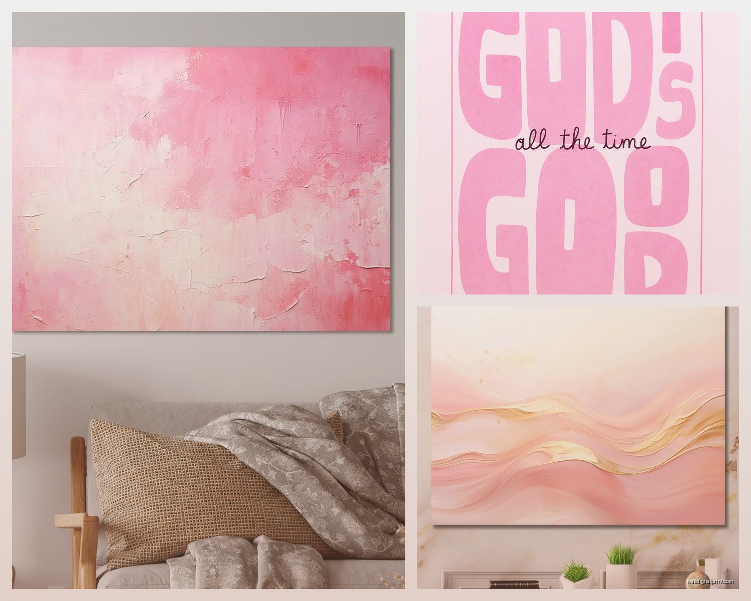
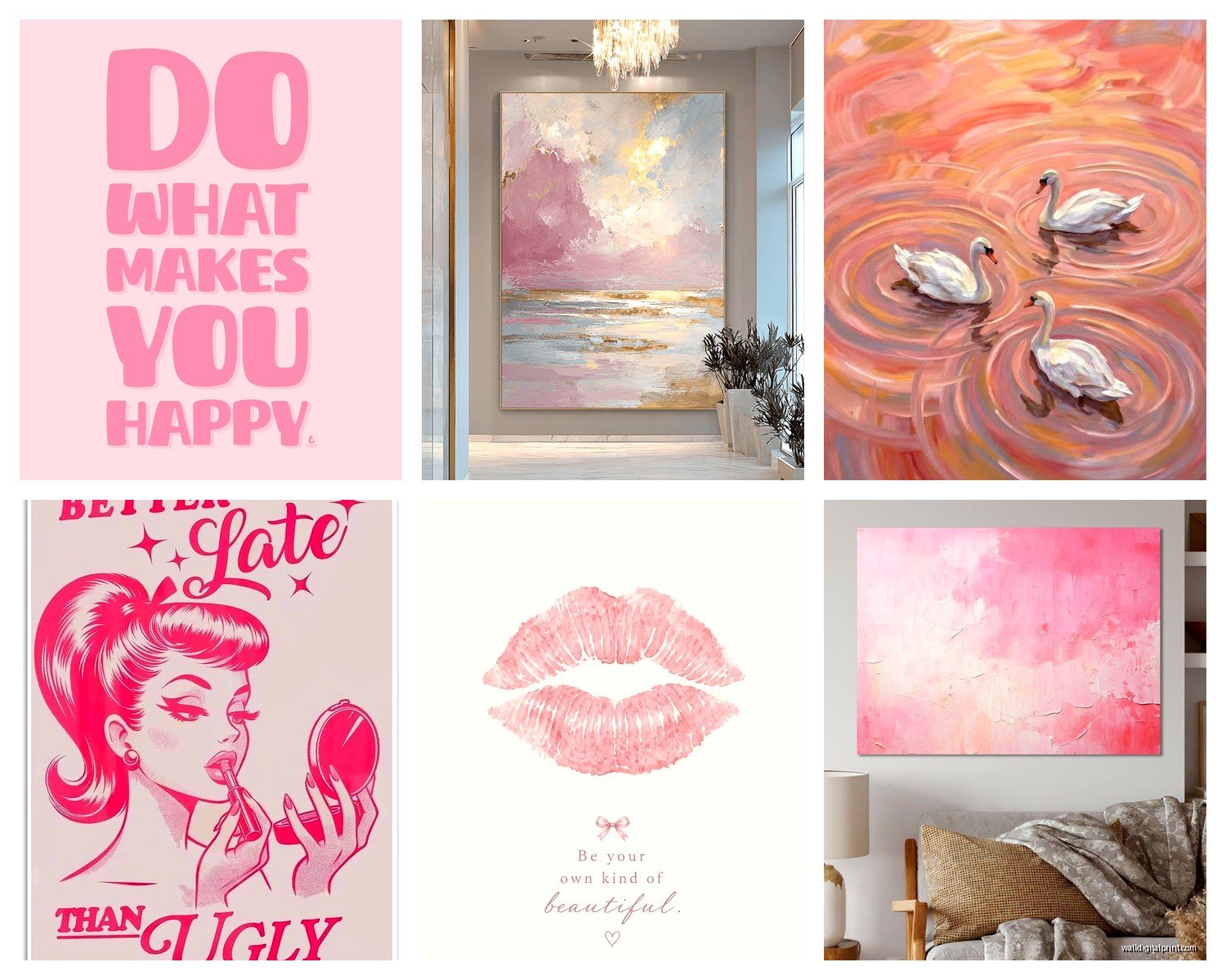
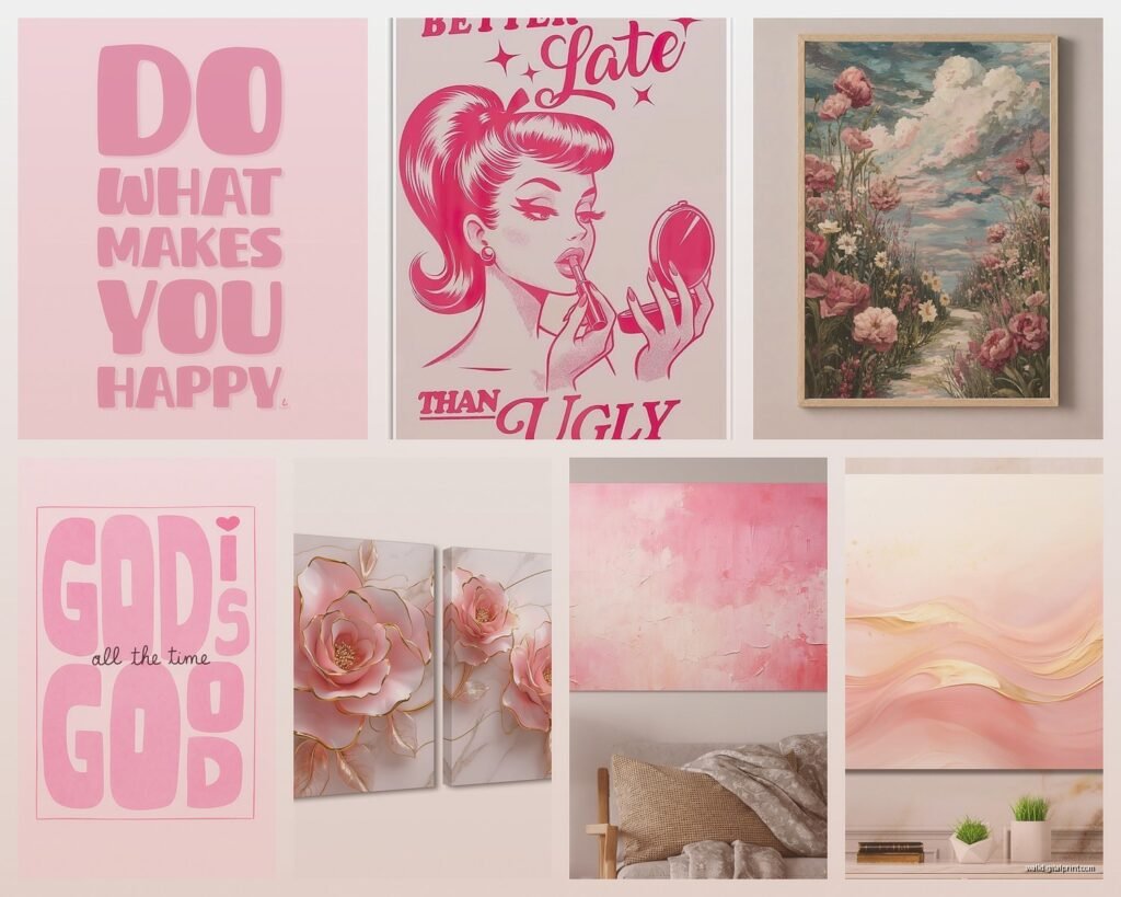
So I’ve been obsessing over pink wall art lately because honestly, blush and rose tones completely transformed my living room last year and now like half my clients want the same vibe. Let me just dump everything I know about this because I literally just finished hanging three different pink pieces in someone’s apartment yesterday.
Why Pink Actually Works When You Think It Won’t
Okay so here’s the thing about pink in living rooms – everyone’s scared it’ll look like a kid’s bedroom or too feminine or whatever, but blush and rose tones are genuinely sophisticated when you do them right. I was skeptical too until I tested it in my own space. The key is thinking of pink as a neutral, which sounds insane but stick with me.
Blush tones have this weird ability to make a room feel warmer without going full-on red or orange. They play really well with grays, creams, navy, even black. My living room has charcoal gray walls and the pink art I added made everything feel less cold without repainting anything.
Choosing the Right Shade of Pink for Your Space
This is where people mess up immediately. Not all pinks are created equal and lighting changes EVERYTHING.
If your living room gets tons of natural light, you can go deeper with dusty rose or mauve tones. They won’t look muddy because the sunlight balances them out. I have this one piece that’s almost terracotta-pink and in my south-facing living room it looks amazing, but when I tried something similar in a north-facing room it just looked… sad.
For rooms with limited natural light or lots of artificial lighting, stick with true blush – that barely-there pink that’s almost beige. It reflects light better and won’t make your space feel smaller or darker.
Cool undertones vs warm undertones matter too. If your existing furniture leans cool (grays, blues, silvers), go for pink with blue undertones. Warm-toned spaces with browns, creams, and golds need peachy-pink or coral-leaning rose.
Testing Before Committing
I’m gonna sound like your mom but seriously, get samples or order from places with good return policies. I use Anthropologie and Society6 a lot because their return process doesn’t make me want to scream. Also Etsy shops are usually cool about sending photos in different lighting if you ask.
Take photos of potential pieces on your phone and look at them in your actual living room throughout the day. Morning light vs evening light will completely change how a piece reads.
Size and Placement Because This Trips Everyone Up
The biggest mistake I see is people buying art that’s too small. Like, way too small. Your pink wall art needs to hold its own in the space.
For above a sofa, you want the art to take up roughly two-thirds to three-quarters of the sofa’s width. So if your couch is 90 inches, you’re looking at 60-65 inches of art. This can be one large piece or a gallery wall situation.
Single large pieces (like 40×60 or bigger) make a statement and honestly are easier to hang than multiple pieces. I hung a massive blush abstract piece above my friend’s sectional last month and it took maybe 20 minutes total. Gallery walls look amazing but you’re gonna spend three hours measuring and adjusting and probably putting extra holes in your wall. Ask me how I know.
Height-wise, the center of your art should be at eye level, which is roughly 57-60 inches from the floor. But if you’re hanging above furniture, leave 6-8 inches between the furniture top and the bottom of the frame. This keeps everything visually connected.
Styles That Actually Work
Abstract blush and rose pieces are the safest bet because they work with basically any decor style. I’ve used them in modern spaces, traditional rooms, even in a farmhouse-style living room where I thought it might clash but it totally didn’t.
Floral pink art can go either way – it can look incredibly sophisticated or really dated. The trick is finding pieces that are either super modern and graphic or very muted and watercolor-y. Avoid anything that looks like it came from a craft store in 2005, you know what I mean?
Geometric pink art is having a moment. Think pink and cream stripes, blush color blocks, rose-toned arches and shapes. These work especially well in contemporary or mid-century modern spaces.
Photography with pink tones – like desert landscapes at sunset, architecture with pink walls, abstract close-ups – can be really striking. I have this photo of a pink building in Mexico in my living room and people always ask about it.
Texture Matters More Than You Think
This is gonna sound weird but the texture or finish of your pink art changes the whole vibe. Glossy or glass-covered pieces feel more formal and reflect light, which can be good or bad depending on your lighting situation. Matte finishes feel more casual and contemporary.
Canvas prints have that gallery vibe but can look cheap if the quality isn’t there. Framed prints under glass look more finished and polished. I personally mix both – some canvases, some framed pieces.
Oh and acrylic prints are this thing I recently discovered where the image is printed on or behind acrylic glass and they have this depth that’s really cool. They’re pricier but for a statement piece they’re worth it.
Mixing Pink Art With Other Colors
You don’t need an all-pink gallery wall unless that’s your thing. Actually, mixing pink pieces with other colors usually looks better and more collected.
Pink and black is super chic. Like, unexpectedly sophisticated. I did this in a client’s living room last spring – two blush pieces, one black and white abstract, one with both colors – and it looked way more expensive than it was.
Pink and navy is classic and grounding. The navy keeps the pink from feeling too sweet.
Pink and green is having a major moment. Not like, hot pink and lime green, but blush with sage or dusty rose with olive. Very natural and calming.
Pink with metallics – gold, brass, or copper – adds warmth. Silver or chrome metallics with pink feels more contemporary and cool.
Where to Actually Buy This Stuff
Okay so I’ve tried like every source at this point and here’s what I actually recommend:
Society6 has tons of options in every size and you can get the same image as a framed print, canvas, or whatever. Quality is pretty consistent and they have sales constantly. Wait for a sale, you’ll save like 30%.
Minted has more curated, higher-end options. Better quality overall but more expensive. Their framing is really nice though if you don’t wanna deal with that separately.
Etsy is great for unique pieces and supporting individual artists. Quality varies wildly so read reviews carefully. I’ve gotten some of my favorite pieces here but also some disasters, so.
Anthropologie for when you want something that looks expensive and don’t mind paying for it. Their art is actually good quality and the framing is nice. Wait for their home sale events.
Desenio is this Swedish company that’s become huge – affordable prints, modern designs, lots of blush and pink options. Shipping takes a while but prices are good.
Target and HomeGoods for budget options but you gotta go in person and dig. I’ve found some surprisingly good pink art at both but it’s hit or miss.
DIY Options If You’re Into That
I’m not super crafty but even I’ve made decent pink abstract art. Get a canvas, some blush and white acrylic paint, maybe a rose or mauve, and just make organic shapes or brush strokes. It doesn’t need to be perfect – abstract is forgiving.
Frame fabric or wallpaper samples. Anthropologie has beautiful pink wallpaper and you can buy samples for like $5, frame them in simple frames from Ikea, and suddenly you have custom art.
Print your own photos if you’ve taken any good ones with pink tones. Sunset shots, flowers, architecture, whatever. Print them large format at a print shop (Costco does this cheap) and frame them.
Styling Around Your Pink Art
Once you’ve got your pink wall art up, you’re gonna want to echo those tones elsewhere so it doesn’t look random. Not matchy-matchy, just connected.
Add blush or rose pillows to your sofa. Even just one or two makes a difference. Velvet in these tones looks especially good and feels expensive.
A pink throw blanket draped over your couch or chair ties things together. I have this dusty rose chunky knit one that I’m obsessed with.
Pink flowers or plants with pink tones in the room create a nice connection. I keep pink roses or peonies when they’re in season, or those pink-tinged eucalyptus stems.
Books with pink spines on your coffee table or shelves. This sounds extra but it actually works if you’re styling a bookshelf near your pink art.
Don’t go overboard though. Like three to five pink elements total including your art is plenty. More than that and you’re entering theme territory.
Lighting Your Pink Art Properly
This is something people forget about and then wonder why their art looks flat. Good lighting makes mediocre art look great and great art look amazing.
Picture lights are the classic solution – those little lights that mount above the frame. They’re dramatic and work well with traditional decor but can look fussy in modern spaces.
Track lighting or adjustable ceiling spotlights are what I use most. You can aim them at your art and adjust as needed. More flexible than picture lights.
Floor lamps or table lamps positioned to throw light toward your art work if you don’t wanna install anything. Just make sure the light isn’t creating glare on glass-covered pieces.
Warm white bulbs (2700-3000K) make pink tones look richer and more inviting. Cool white bulbs can make them look washed out or weird.
Common Mistakes I See All the Time
Hanging art too high. Seriously, lower than you think. People always hang things too high and it makes the room feel disconnected.
Choosing pink that clashes with existing undertones. If everything in your room is cool-toned and you add warm peachy-pink art, it’s gonna look off.
Getting art that’s too small and then hanging a bunch of small pieces scattered randomly. Either go big or create an intentional gallery wall with a plan.
Forgetting about the frame. The frame matters almost as much as the art. Thin black frames are safe and modern. Thick ornate frames can look dated unless your whole room is traditional. Natural wood frames work with almost everything and warm up pink tones nicely.
Not considering what’s across from the art. If your pink art faces a window, the natural light might wash it out during the day. If it faces a bold-colored wall, that color will reflect onto the art.
Making It Work Long-Term
The nice thing about blush and rose tones is they’re trendy right now but also kinda timeless? Like, they’re not gonna look as dated as some other trends. But if you’re worried about committing, here’s what I tell people:
Start with one statement piece rather than doing a whole gallery wall. You can always add more later but it’s harder to scale back.
Choose art with multiple colors including pink rather than all-pink everything. This gives you more flexibility if you redecorate later.
Stick with more muted, sophisticated pinks rather than hot pink or super bright tones. Blush, dusty rose, mauve, terracotta-pink all have more staying power.
My cat just knocked over my water bottle so I gotta go deal with that, but honestly I think I covered most of what you need to know. The main thing is just don’t overthink it – pink wall art in living rooms works way better than people expect and once you get one piece up you’ll probably want more. Start with something you genuinely love looking at and build from there. The technical stuff about placement and sizing matters but not as much as actually liking what you’re looking at every day.