Wall Art Guide, Wall Art Tutoriels
Ocean Prints Wall Art: Sea Water Wave Beach Photography
Nov
So I’ve been absolutely obsessed with ocean prints lately and honestly it started because this client wanted to do a whole coastal thing but didn’t want it to look like a beach house threw up in her living room, you know? And I ended up going down this rabbit hole of wave photography that I’m still kinda in.
The Stuff Nobody Tells You About Buying Ocean Prints
Okay first thing – the quality difference between a $20 print and like a $150 one is REAL but it’s not always what you think. I ordered five different wave prints from various places last month (my dog literally watched me unpack them all like I was insane) and the main difference wasn’t even the photography itself. It was the paper quality and how the colors translated.
The cheap ones? They go weirdly cyan. Like that artificial blue that screams “I bought this at a big box store.” The better quality prints maintain those subtle greens and grays that actual ocean water has. Real waves aren’t just blue, they’ve got this whole thing with light and sediment and… wait I’m getting ahead of myself.
Print Types That Actually Matter
You’re gonna see these options everywhere:
- Giclée prints on fine art paper
- Canvas wraps
- Metal prints
- Acrylic face mounts
- Regular photo prints
I used to just default to canvas because that’s what everyone does, right? But for ocean photography specifically, I’ve completely changed my mind. Canvas can make the details muddy, and with wave photos you WANT those details – the spray, the foam texture, the way light hits the water.
Metal prints are honestly incredible for this. The colors stay vibrant and there’s this depth that works perfectly with water imagery. They’re pricey though. I did one for my own place (a massive wave shot from Hawaii) and it cost like $300 but it’s been up for two years and still looks brand new. No fading, no warping.
Acrylic is the luxury option and okay yeah it’s gorgeous. The way it makes the water look almost three-dimensional is pretty wild. But you’re paying for it – we’re talking $400+ for anything decent-sized.
Size and Placement Because This Is Where People Mess Up
I cannot tell you how many times I’ve walked into someone’s place and they’ve got this tiny 16×20 ocean print on a massive wall and it just looks sad and lost. Ocean photography needs SPACE. The whole point is that immersive feeling.
For a standard living room wall (let’s say like 10-12 feet wide), you want at least 40×60 inches. I know that sounds huge but trust me. Actually, my friend did a 30×40 first, hated it, ordered the 50×70 and was like “oh NOW I get it.”
The Height Thing
Hang ocean prints lower than you think. Standard rule is 57 inches center point but for wave photography? I go lower, especially if it’s a shot looking into the wave. You want people to feel like they’re standing at the shore, not floating above it. Around 50-55 inches center feels way more natural.
Oh and another thing – if you’re doing a gallery wall with multiple ocean shots, keep them all from similar perspectives. Don’t mix aerial shots with eye-level waves with underwater stuff. It gets visually chaotic real fast.
Finding Good Photography That Isn’t Basic
Etsy has some incredible ocean photographers but you gotta dig past the first five pages of results. The algorithm pushes the bestsellers which are often… fine but generic. I found this photographer from Australia who shoots the most insane turquoise waves and her shop was on like page 8.
Look for these things in the actual photography:
Composition – Is there a clear focal point? With waves, you want either a dramatic curl, interesting light, or compelling foreground elements like rocks or foam patterns.
Color accuracy – Does the water look real? If it’s SO blue it looks tropical but the photo says it’s from Maine, that’s over-edited.
Sharpness where it matters – The spray and foam should be crisp. If everything’s soft and dreamy, it can read more like a watercolor than a photograph.
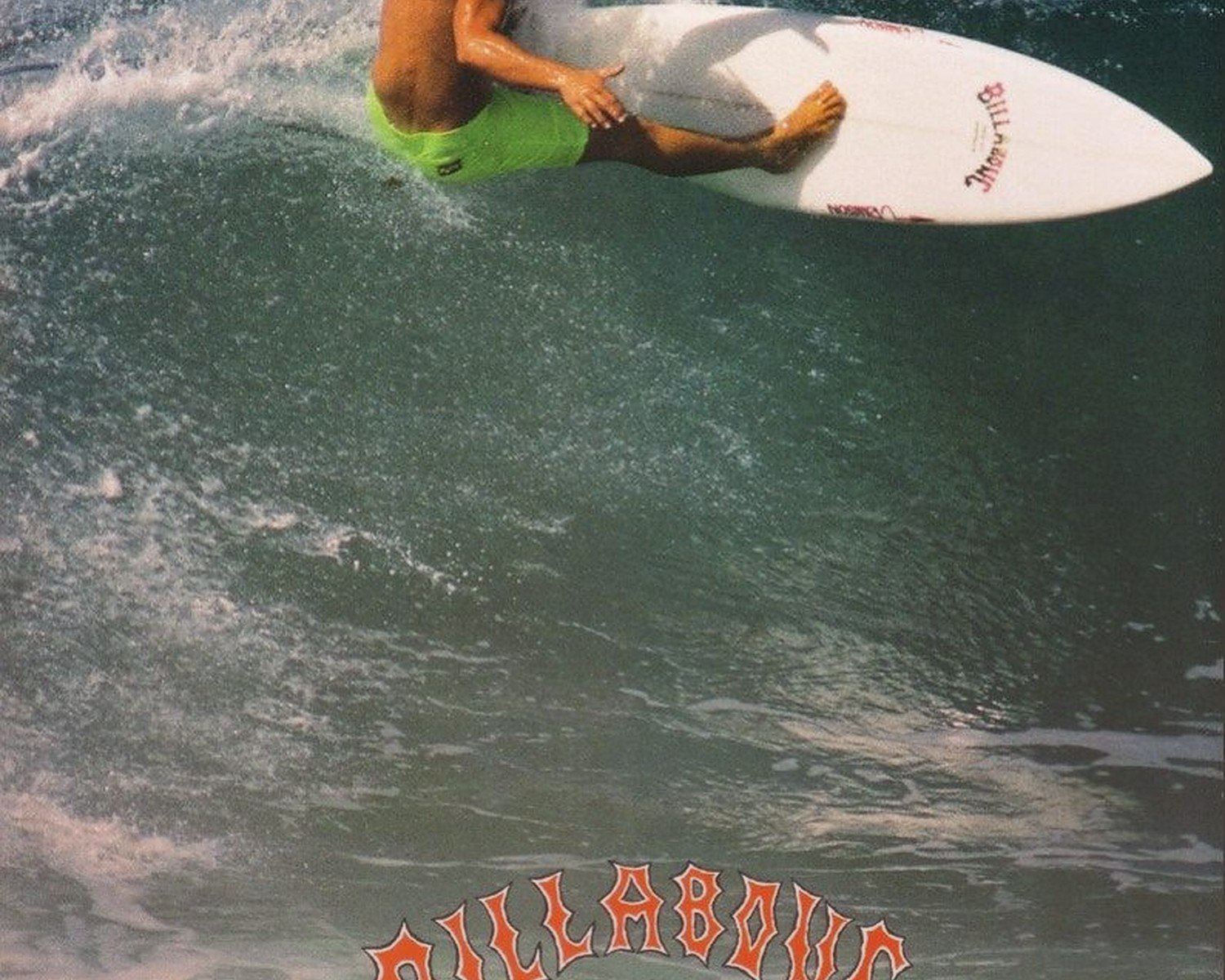
Unique perspective – Honestly there are ten million photos of waves crashing straight-on. The interesting ones are shot from inside the barrel, or super tight on the foam texture, or from weird angles.
Print-on-Demand vs Original Prints
This is gonna sound weird but I actually prefer working with photographers who print-on-demand through professional labs rather than printing themselves. Unless they’re established fine art photographers with proper equipment, the quality control is better through a good lab.
I’ve gotten “original prints” from photographers that were clearly just run through their home inkjet and they fade SO fast. Meanwhile prints from places like Printique or Bayphoto (which a lot of pro photographers use) are consistently good.
Framing Decisions That Make or Break It
White frames are safe but they can make ocean prints look too… beachy? Like in a “live laugh love” kinda way. I’ve been using natural wood frames lately – light oak or maple – and it gives coastal vibes without being theme-y.
Black frames look amazing with dramatic storm waves or black and white ocean photography. Really moody and gallery-like.
No frame at all works great for canvas wraps or if you’re mounting directly to backing board. That modern clean look lets the image do all the talking.
Matting Yes or No
For ocean prints I usually skip matting unless the photo has a lot of negative space already (like a minimalist horizon shot). Wave photos are usually so dynamic and full of texture that matting just distances you from the action.
But if you DO mat, go big. Like 4-inch borders minimum. Tiny mats look cheap no matter what you paid for them.
The Lighting Situation
Okay so funny story – I hung this gorgeous wave print in my hallway and it looked completely different depending on time of day. Morning light made it look flat and washed out. Evening light was perfect and moody.
Natural light is tricky with ocean photography because there’s already so much light and reflection IN the image. Direct sunlight can actually blow it out. I’ve learned to either position them on walls perpendicular to windows or add picture lights.
Picture lights changed everything for me. The ones that mount right above the frame. You can get battery-operated ones now which is great for renters. It gives you control over how the piece looks instead of fighting with your window situation.
Avoid overhead recessed lighting pointing straight down at ocean prints – creates glare and weird reflections, especially if there’s glass or acrylic involved.
Mixing Ocean Photography with Other Art
You’d think ocean prints only work in coastal-themed rooms but that’s actually not true at all. I’ve used them in totally modern spaces, traditional spaces, even kinda industrial lofts.
The key is treating them like abstract art rather than “beach decor.” A close-up of foam and bubbles is basically an abstract texture study. An aerial shot of waves is geometric patterns. Frame it and place it like you would any fine art photograph.
That said, don’t go overboard (pun intended I guess). One or two ocean pieces max per room unless you’re genuinely going for a themed space. Mix with:
- Black and white photography of other subjects
- Abstract paintings with complementary colors
- Architectural photography
- Minimalist line drawings
Color Scheme Considerations
Blue and white ocean prints are everywhere but honestly the most interesting ocean photography has way more color variation. Look for:
Green-tinted waves from certain beaches with specific mineral content – these work amazing with warmer interiors
Stormy gray seas – incredibly versatile, goes with literally any color scheme
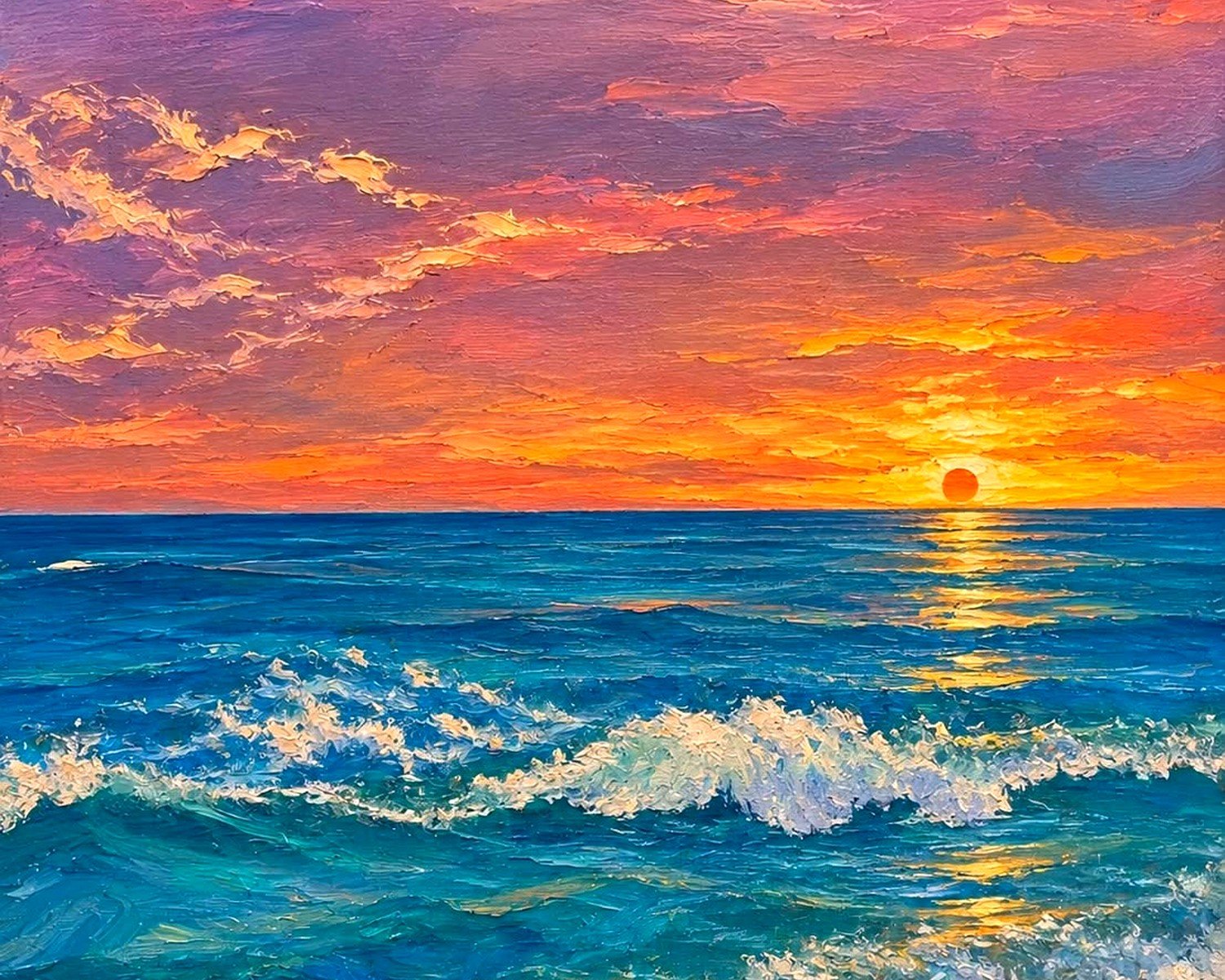
Golden hour shots where the water reflects orange and pink light – gorgeous with brass fixtures and warm woods
Deep navy and teal – sophisticated alternative to bright blue
I just finished a project where we used this moody charcoal-colored wave print in a room with burgundy accents and brass fixtures and it was *chef’s kiss*. Nobody expects ocean art in a jewel-toned room but it totally works.
Black and White Ocean Prints
Can we talk about how underrated these are? Black and white wave photography is dramatic as hell and works in spaces where color ocean prints would feel too casual.
The texture really pops without color to distract from it. All that foam and spray becomes this incredible pattern study. I use these in offices a lot, or dining rooms where you want something striking but not overly beachy.
Practical Stuff About Ordering
Always always ALWAYS order a sample print first if you’re spending serious money. Most good photographers or print shops offer smaller sizes. Get the 8×10 or 11×14 version before committing to the giant expensive one.
Check your wall color against the print in different lighting. What looks perfect in afternoon sun might look completely wrong at night with lamps on.
Read the file specifications – you want at least 300 DPI for anything you’re printing large. If a photographer is selling digital downloads, make sure the file size supports the dimensions you want. A 2000×3000 pixel file is NOT gonna look good at 40×60 inches no matter what.
Shipping Nightmares
Large prints ship rolled usually which is fine but make sure you know how to flatten them properly. I leave mine rolled the opposite direction for 24 hours before framing. Or if it’s already mounted, insist on serious packaging – I’ve had glass arrive shattered more times than I wanna admit.
Metal and acrylic prints ship better because there’s no glass to break, just FYI.
DIY Printing vs Professional
I tried printing my own ocean photos at FedEx once and… don’t. Just don’t. The color calibration is terrible and you have zero control over paper quality. You’ll spend $50 trying to get it right and end up with something that looks worse than a $30 print from a real photo lab.
If you wanna go the budget route, Printful and Society6 have decent quality for the price. Not amazing, not terrible. Good for rentals or if you like changing your art frequently.
For investment pieces, use actual photography labs or buy direct from photographers who use them. The price difference is worth it when you’re looking at something every single day.
Maintenance Real Talk
Ocean prints behind glass collect dust like crazy in the frame edges. Microfiber cloth every couple weeks.
Canvas prints can absorb smells if you hang them in kitchens – learned this the hard way when a client’s wave canvas started smelling like fried food.
Metal prints just need occasional wiping with a damp cloth. Easiest maintenance ever.
Acrylic shows fingerprints SO easily. If you have kids, maybe skip this option or hang it high enough that they can’t touch it.
Direct sunlight will fade ANY print over time. Even the expensive ones. If you’ve got a west-facing wall with afternoon sun, either use UV-protective glass or pick a different wall.
Oh wait I forgot to mention – some photographers offer replacement guarantees or will reprint if fading happens within a certain timeframe. Ask about this before buying.
Budget Breakdown
Since you’re probably wondering what this actually costs:
Budget friendly ($50-150): 24×36 or smaller, regular photo print or basic canvas, standard frame or no frame
Mid-range ($150-400): 30×40 to 40×60, giclée print or metal print, decent framing
Investment ($400+): Large format 40×60+, acrylic or high-end metal, custom framing, limited edition prints from known photographers
I usually tell people to spend their money on SIZE and print quality over fancy framing. You can always upgrade the frame later but you’re stuck with the print itself.
Anyway that’s basically everything I’ve figured out through way too many hours of comparing prints and probably annoying every photographer on Etsy with questions. Let me know what you end up getting!