Wall Art Guide, Wall Art Tutoriels
Abstract Face Wall Art: Modern Portrait Figure Minimalist
Nov
So I’ve been working with abstract face wall art for like three years now and honestly it’s one of those things that seems straightforward until you’re standing in someone’s living room wondering why that $300 print looks completely wrong on their wall.
Let me just dump everything I know because I literally just finished styling a client’s space yesterday with these and I’m still thinking about what worked and what didn’t.
The Scale Thing Nobody Talks About
Okay so first thing – size is gonna make or break this whole situation. I see people buying these gorgeous minimalist face prints online and then they arrive and they’re like… the size of a dinner plate. And it just looks sad on a big wall.
Here’s what I do: measure your wall space, then go BIGGER than you think. If you’ve got a space that’s like 60 inches wide, you want art that’s at least 40-45 inches wide, or you group smaller pieces to fill that visual weight. I learned this the hard way when I bought three 8×10 face prints for above my couch and they looked like postage stamps. Had to return them and size up to 24×36 and suddenly the whole room made sense.
For over a bed or sofa, the art should be roughly 2/3 the width of the furniture. So if your couch is 90 inches, you’re looking at 60 inches of art width total. You can do one big piece or a gallery wall situation but that’s the target.
Picking Your Style Without Losing Your Mind
Abstract face art falls into like a million subcategories and this is where people get stuck scrolling Etsy at midnight (guilty).
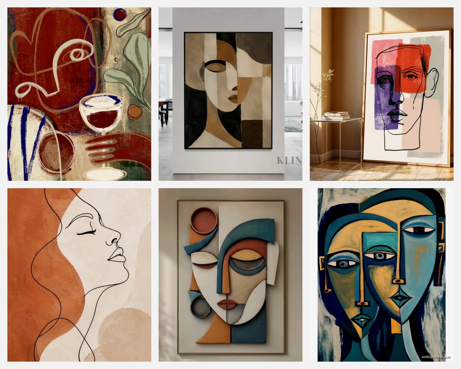
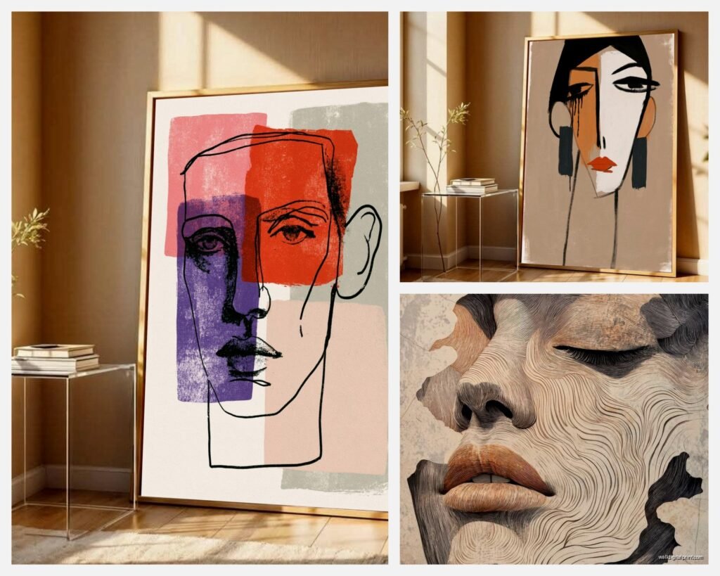
Line drawing faces – these are the super minimal ones, usually one continuous line or very few lines. They’re everywhere right now. Good for: Scandinavian vibes, modern spaces, places that already have a lot going on. Not good for: if your space needs warmth or color.
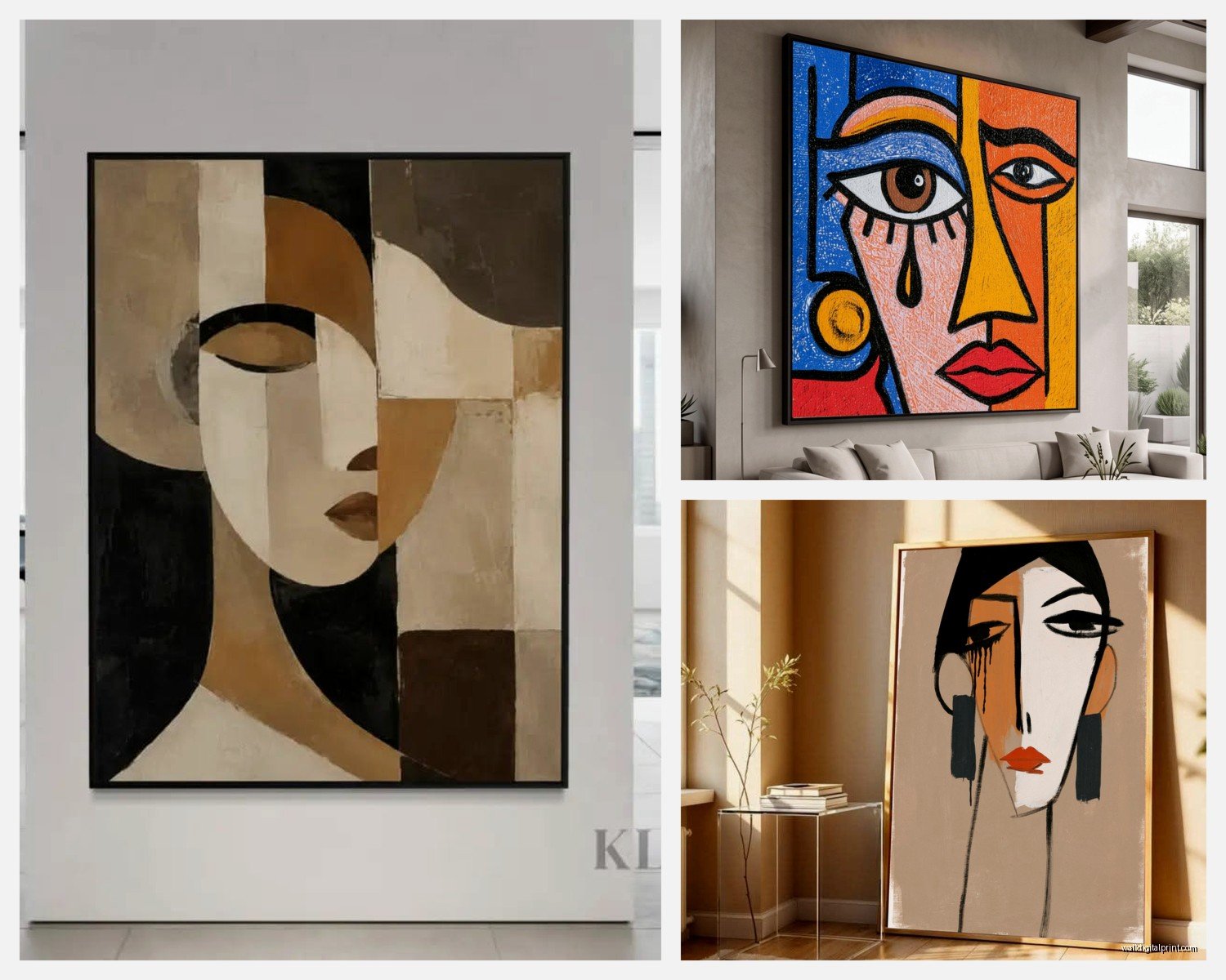
Cubist-inspired faces – think Picasso-esque, geometric, fragmented features. These have more visual weight and work better in spaces that can handle something bolder. I used one in a client’s office and it became this whole conversation piece.
Abstract portraits with color blocks – faces broken up with sections of color, usually earth tones or jewel tones. These are my favorite actually because they bridge that gap between minimal and warm. They don’t feel cold like pure line drawings can.
Textured/painterly abstract faces – more brushstrokes visible, less precise. These add softness and work in bedrooms really well.
The trick is matching the style intensity to your room’s personality. Minimal room = you can go bolder with the art. Busy room with patterns and textures = keep the art more restrained.
Color Coordination That Actually Works
This is gonna sound weird but I don’t match colors exactly anymore. I used to try to pull the exact beige from the art into the throw pillows and it always looked too matchy-matchy, like a hotel room.
Instead, I look at the undertones. If the abstract face has warm peachy skin tones, I make sure the room has other warm elements – maybe brass fixtures, wood furniture, terracotta pots. The colors don’t have to match; they just need to be in the same temperature family.
My client yesterday had this gorgeous sage green couch and we put up an abstract face with rust and cream tones. Doesn’t sound like it should work but the warm undertones in both made it feel cohesive.
Oh and another thing – black and white line drawings are NOT neutral. They read very modern and crisp, which is great, but if your space has a lot of vintage or rustic elements, they can feel out of place. In those rooms, I go for abstract faces with softer, more organic lines and muted colors.
Where to Actually Buy These
I’ve ordered from everywhere at this point, here’s the real breakdown:
Etsy – best for digital downloads and unique pieces. You can find stuff here that doesn’t look like everyone else’s apartment. Downside is quality varies wildly. Always check reviews and make sure they show actual customer photos, not just mockups.
Minted – more expensive but consistently good quality. Their framing options are solid too. I use them when a client has a bigger budget and wants something that feels special.
Society6 – good middle ground. Lots of artists, decent printing, tons of size options. Shipping can be slow though.
Desenio/The Poster Club – if you want that Scandinavian minimalist vibe, these are your spots. Pretty affordable, ships from Europe so factor in shipping time.
Local artists on Instagram – honestly some of my best finds. Search hashtags like #abstractfaceart #minimalistportrait and filter by your location. You can often get originals or limited prints for reasonable prices and you’re supporting actual people.
Wait I forgot to mention – if you’re buying digital downloads to print yourself (which can save you SO much money), make sure you’re getting high resolution files. Minimum 300 DPI. And find a local print shop that does giclée printing, not your office printer. The quality difference is massive.
Framing Without Spending Your Rent Money
Frames are where costs spiral out of control. A $30 print suddenly needs a $150 frame? No thanks.
Here’s my system: IKEA Ribba frames for smaller prints (they’re like $15-20 and look way more expensive than they are). For bigger pieces, I use Framebridge for special projects but for everyday stuff, I go frameless or do the float mount thing.
Float mounting is when you mount the print on foam board with a small gap between the print and the wall. Gives it a modern, gallery feel without the frame cost. You can DIY this with foam core from the craft store and double-sided tape, or buy pre-made float mounts online.
If you do want frames, thin black or natural wood are the most versatile. I know gold frames are having a moment but they’re very specific and might feel dated in a few years. Stick with classics unless you’re ready to switch things up regularly.
My cat just knocked over my coffee so gimme a sec… okay back.
The Hanging Part That Everyone Overthinks
Eye level is 57-60 inches from the floor to the CENTER of the artwork. This is the museum standard and it actually works in homes too. I use 58 inches as my default.
If you’re hanging above furniture, leave 6-8 inches between the furniture top and the bottom of the frame. Any more and it looks like the art is floating away, any less and it feels crowded.
For gallery walls with multiple abstract faces (which can look really cool), lay everything out on the floor first. Take a photo. Live with that photo on your phone for a day or two. I know it sounds excessive but I’ve had clients who rushed the layout and hated it after.
Use paper templates taped to the wall before you commit to holes. Trace your frames on kraft paper, cut them out, tape them up with painter’s tape. Move them around until it feels right. The spacing between frames should be consistent – I usually do 2-3 inches between pieces.
Styling the Space Around the Art
Okay so you’ve got your abstract face art up, now what? The room needs to support it, not compete with it.
Keep the wall relatively clear. Maybe one floating shelf below with minimal styling – a small plant, a candle, a small sculpture. But don’t go crazy. The art needs breathing room.
Lighting matters more than people think. If you can, add a picture light or position a floor lamp so it illuminates the art at night. It changes the whole vibe and makes the space feel intentional.
I layer in other abstract elements in the room – maybe abstract face art on the wall, then geometric patterns in the rug, organic shapes in the side table. It creates this visual conversation without being too literal.
Things that look good with abstract face art:
- Natural materials like wood, linen, rattan
- Plants (obviously)
- Sculptural vases or objects
- Neutral textiles with interesting textures
- Vintage furniture mixed with modern pieces
Things that can clash:
- Too many other portraits or faces in the room (gets weird)
- Busy wallpaper behind the art
- Overly themed decor (like if everything is farmhouse rustic, minimalist face art might feel off)
- Too many competing focal points
The Multi-Piece Situation
Using multiple abstract face prints together can be amazing or chaotic. Here’s what works:
Keep them in the same style family – all line drawings, or all with similar color palettes. Mixing a colorful cubist face with a simple line drawing usually doesn’t work unless you really know what you’re doing.
Odd numbers look better than even. Three or five pieces instead of two or four. It’s a design rule that actually holds up.
I did a series of three abstract faces in different skin tones for a client and it was this beautiful representation thing but also just looked cohesive because the style was consistent. That’s the kind of thing you can’t really pull off with random pieces.
Common Mistakes I See All the Time
Hanging it too high – seriously, this is the number one issue. People think art should be near the ceiling for some reason. It should be at eye level, which is lower than you think.
Choosing art that’s too subtle for the space – if you have a large, bright room with lots of natural light, a tiny delicate line drawing might just disappear. Scale and contrast matter.
Not considering the room’s purpose – abstract face art in a dining room hits different than in a bedroom. Dining rooms can handle bolder, more conversation-worthy pieces. Bedrooms usually benefit from softer, more calming interpretations.
Buying prints that are too trendy – okay this is subjective but like, if something is EVERYWHERE on Instagram right now, maybe wait. I’m seeing the exact same one-line face print in every millennial apartment and it’s gonna feel dated soon. Look for pieces with a little more uniqueness.
DIY Options If You’re Feeling Creative
You can actually create your own abstract face art and honestly sometimes it turns out better than stuff you’d buy because it’s actually meaningful to you.
Get a large canvas, some acrylic paint, and just start with basic shapes. Abstract faces are forgiving – they’re not supposed to be realistic. I did this during lockdown when my clients all canceled and I ended up with three pieces I still have in my apartment.
Or try the continuous line drawing technique – put pen to paper and draw a face without lifting the pen. It’s harder than it looks but even the “mistakes” look intentional with abstract art.
There are also those paint-by-number kits now for abstract faces if you want something between DIY and buying finished art.
Making It Work Long-Term
The thing about abstract face art is it’s pretty timeless compared to other trends. Human faces and figures have been art subjects forever, and the minimalist interpretation feels modern but not trendy-modern, you know?
That said, rotate your art seasonally if you can. I have a few different pieces and I’ll swap them out when I’m feeling like the room needs freshening up. It’s easier than redecorating and makes the space feel new.
And honestly if you get tired of a piece, don’t force it. Sell it on Facebook Marketplace or donate it. Your space should make you happy, not feel like a commitment you’re stuck with.
Oh and one last thing – if you’re renting and can’t put holes in the walls, command strips actually work for lightweight frames. I’ve used them plenty of times. Just make sure you get the right weight capacity and follow the instructions exactly or you’ll have art crashing down at 3am (happened to me once, scared me half to death).
The whole point of abstract face art is it adds this human element to a space without being too literal or personal. It’s sophisticated but accessible, minimal but still warm. When you get it right, it just makes a room feel pulled together in this effortless way that’s hard to achieve otherwise.