Wall Art Guide, Wall Art Tutoriels
Yellow Wall Art for Living Room: Sunny Cheerful Main Space
Nov
So I’ve been kinda obsessed with yellow wall art lately because honestly, my living room was giving funeral home vibes and I needed to fix that fast. Yellow is one of those colors that people either go all in on or they’re terrified of, but here’s the thing – it’s actually way more forgiving than you’d think if you know what you’re doing.
Finding the Right Yellow Shade That Won’t Make You Cringe
Okay so first mistake everyone makes is thinking all yellows are created equal. They’re NOT. I learned this the hard way when I bought this “cheerful sunflower” print that looked like a highlighter threw up on my wall. You’ve gotta match the yellow to your existing space, and I mean really look at what you already have going on.
If your living room has cool-toned grays or blues, go with a lemon yellow or pale butter shade. The warm yellows with orange undertones are gonna clash like crazy and you’ll hate it within a week. For warm spaces with browns, creams, or warm grays, those golden mustard yellows or amber tones are *chef’s kiss*.
I spent like three hours at this art gallery last month – my dog had eaten through his leash that morning so I was already in a mood – but I noticed how the lighting completely changed how yellow art looked. Natural light makes pale yellows almost disappear, while it makes bright yellows pop even more. Under warm artificial lighting, cool yellows can look kinda sickly? So test this stuff if you can.
Size Actually Matters More Than You Think
Here’s where people mess up constantly. They buy art that’s too small because they’re scared of commitment or whatever. But a tiny yellow piece on a big wall just looks like you forgot to finish decorating.
For above a sofa, you want something that’s roughly two-thirds to three-quarters the width of the couch. So if you’ve got a standard 84-inch sofa, you’re looking at art that’s around 55-60 inches wide. You can do a single large piece or a gallery wall situation, but that total visual width needs to hit that range.
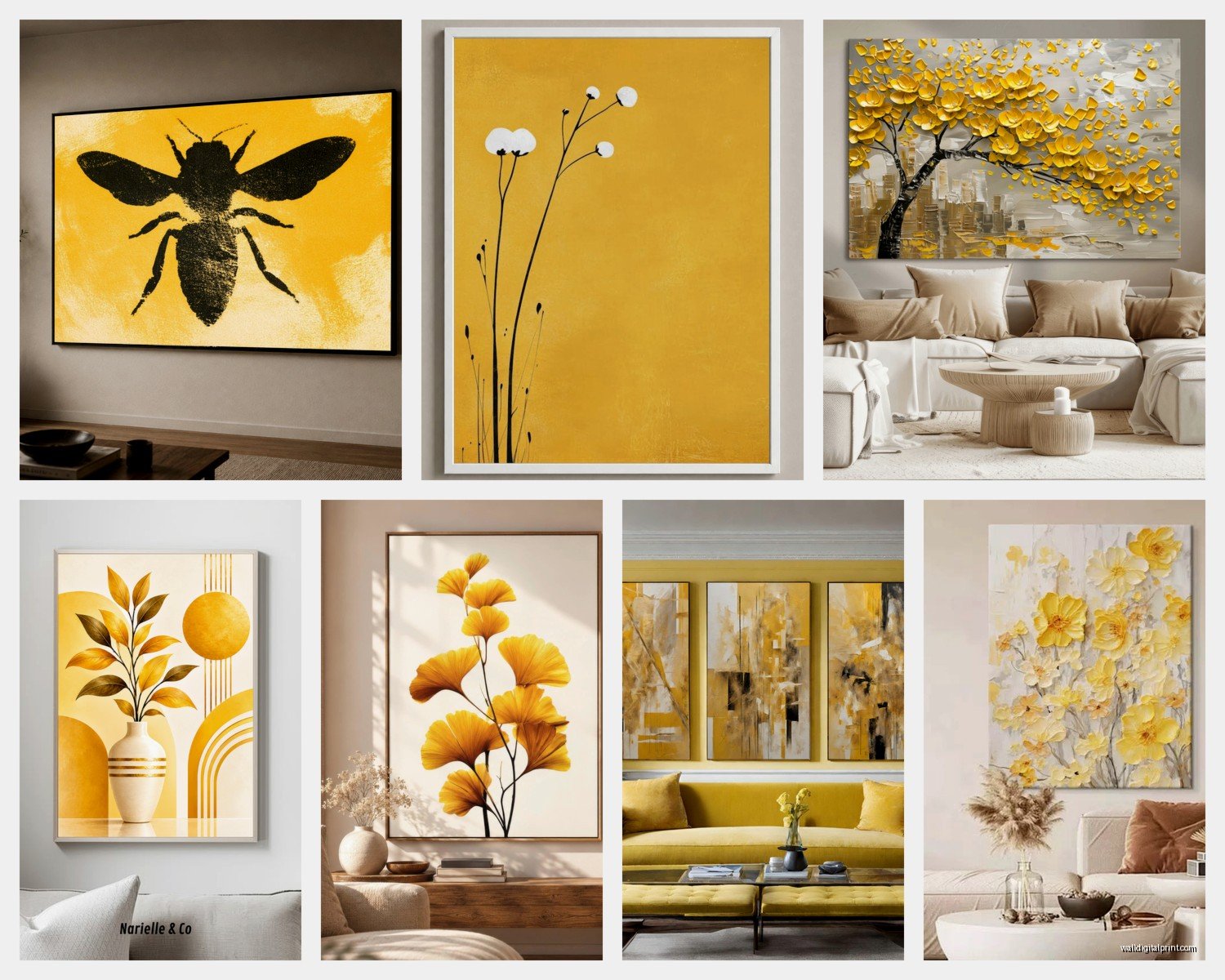
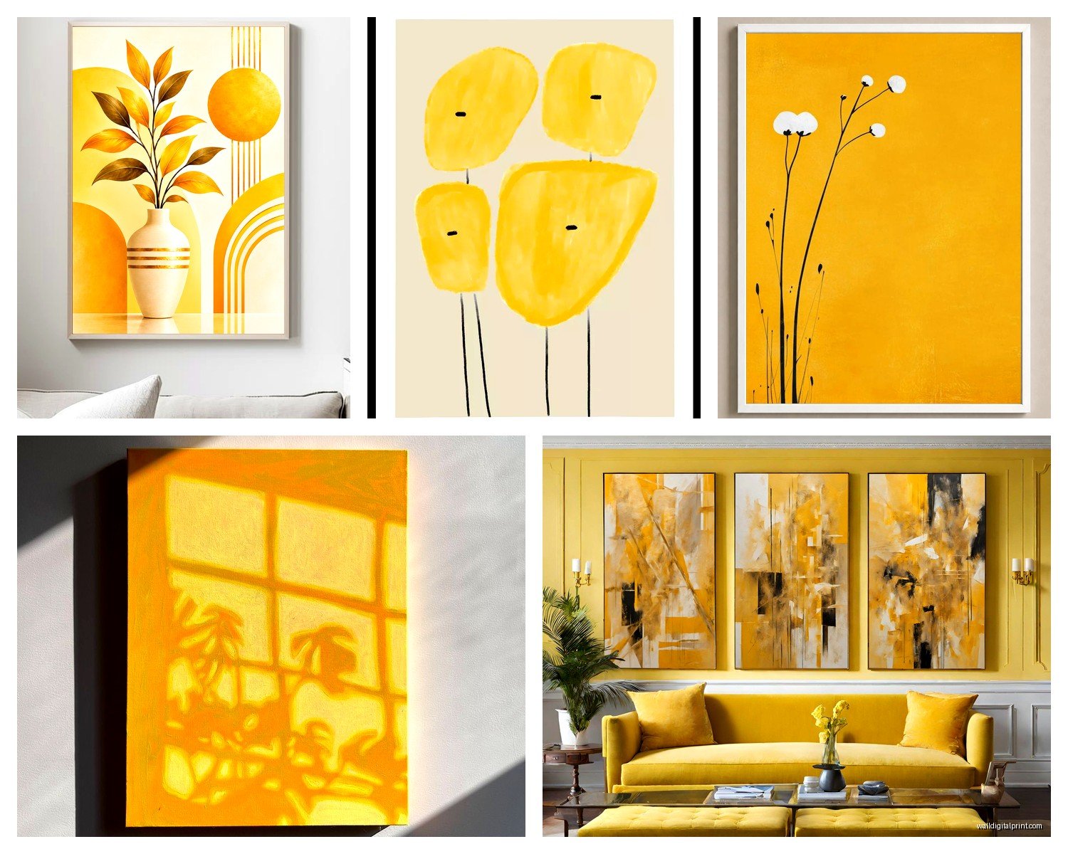
Single statement pieces work great if you want simple and impactful. I did this in my own place with this massive abstract yellow and gray canvas – cost me way more than I wanted to spend but it completely transformed the room. The yellow pulls your eye immediately when you walk in, which is exactly what a living room needs.
Gallery walls are trickier with yellow because too much yellow gets overwhelming fast. I usually do like 30-40% yellow pieces mixed with neutrals and maybe one complementary color. Had a client who wanted ALL yellow in a gallery wall and I had to talk her down because it would’ve looked like a school bus exploded.
What Actually Works Style-Wise
Abstract art is probably the safest bet for yellow because it’s forgiving. You get movement and energy without committing to a specific subject that might feel too literal. I’m really into those brushstroke abstracts right now where yellow blends into white or gray – gives you the color impact but keeps things sophisticated.
Botanical prints with yellow flowers are having a moment and they’re not going anywhere. Sunflowers are kinda obvious, but yellow roses, daffodils, or those vintage botanical illustration styles work really well. Just avoid anything too cutesy unless your whole aesthetic is cottage core, which, no judgment, but know what you’re committing to.
Geometric art in yellow is super versatile. Clean lines, mid-century modern vibes, works in contemporary or transitional spaces. I sourced this amazing geometric piece with yellow triangles for a client’s living room and it tied together their Scandinavian furniture perfectly.
Photography with yellow accents can be stunning – think yellow doors, taxi cabs, sunsets with golden tones, fields of flowers. More subtle than a solid yellow painting but still brings that warmth.
Where to Actually Buy This Stuff
Okay so gonna be real with you, budget matters here. If you’re working with limited funds, places like Society6 or Minted have tons of affordable prints. You can get good quality for like $50-150 depending on size. The art itself is usually pretty decent, but you’ll probably want to upgrade the frame eventually.
Etsy is hit or miss but I’ve found some incredible original pieces there. Search for “yellow abstract canvas” or “mustard wall art” and filter by your size needs. Read the reviews obsessively though because some sellers use photos that don’t match what you actually receive.
HomeGoods and TJ Maxx have surprised me lately with their art selection. It’s totally random what you’ll find, but I’ve scored some gorgeous yellow pieces for under $100. You gotta go regularly though because inventory changes constantly.
For original art, local galleries and art fairs are where I find the best stuff. Yes it’s more expensive, but you get something nobody else has. Plus supporting actual artists feels good, and they can often customize sizes for your space.
Mixing Yellow with Other Colors Without Creating Chaos
Yellow and gray is like the easiest combination ever. Cool grays tone down bright yellows, warm grays complement golden yellows. This is my go-to recommendation for people nervous about color.
Yellow and navy creates this classic, preppy vibe that works in traditional or transitional spaces. The navy grounds the yellow so it doesn’t feel too energetic.
Yellow and white keeps things fresh and bright but can wash out if you don’t have enough contrast elsewhere in the room. Make sure you’ve got some darker furniture or accessories to anchor everything.
Yellow with teal or turquoise gives you that fun, eclectic energy. It’s bolder than yellow and gray but not as intense as yellow and red would be.
Oh and another thing – consider your existing accent colors. If you’ve got throw pillows, rugs, or curtains with certain colors, your yellow art should complement those. I had this whole situation where a client’s purple accent chair completely clashed with the golden yellow art she wanted, and we had to either change the art or the chair. She kept the chair, we went with a cooler lemon yellow instead.
Framing Makes or Breaks the Whole Thing
Don’t cheap out on framing if you can help it. A gorgeous yellow print in a flimsy black plastic frame looks like dorm room decor.
For modern spaces, go with simple frames – black, white, natural wood, or metallic finishes. Keep the frame thin so it doesn’t compete with the art itself.
Traditional spaces can handle more ornate frames. Gold or bronze frames with yellow art can look really elegant if done right, but it’s a fine line before it becomes too much.
Floating frames (where there’s space between the art and frame) work great with abstract yellow pieces because they create this gallery-like feel.
Canvas prints can go frameless if you want that contemporary look, but make sure the edges are finished nicely. Some cheaper canvas prints have messy edges that look unprofessional without a frame.
Placement Strategy That Actually Makes Sense
Height matters way more than people realize. The center of your art should be at eye level, which is roughly 57-60 inches from the floor. I see so many living rooms where art is hung way too high and it throws off the whole room’s proportions.
Above the sofa is the obvious spot, but don’t ignore other walls. A yellow piece on the wall opposite your main seating can create a nice focal point and balance the room visually.
Near windows can be tricky because direct sunlight will fade some prints over time. If you’re putting yellow art near a sunny window, make sure it’s UV-protected or expect to replace it eventually. Learned this the hard way with a print that went from butter yellow to sad beige in like eight months.
Lighting Your Yellow Art Properly
This is gonna sound weird but lighting can make your yellow art look completely different. I was watching this home renovation show the other night – my cat knocked over my wine during it, whole thing – and they had this segment about art lighting that was actually useful.
Picture lights mounted above the frame work great for traditional spaces and really make the art pop. You can get battery-operated ones now so you don’t need an electrician.
Track lighting or adjustable can lights let you spotlight the art without installing anything directly on the wall. This works especially well if you have high ceilings.
Ambient lighting from lamps and overhead fixtures is usually enough for most living rooms, honestly. Just make sure you’re not creating glare on glass-covered art.
Common Mistakes I See Literally All the Time
Buying art online without checking dimensions. I cannot stress this enough – that piece that looks huge online might be 16×20 inches and look like a postage stamp on your wall. Always check actual measurements and compare them to your wall space.
Matching too perfectly with other yellow accents in the room. You want coordination, not matchy-matchy. If your throw pillows are bright yellow, maybe go with a softer yellow in your art, or vice versa.
Ignoring the room’s natural light situation. A north-facing room with limited natural light needs brighter yellows to maintain that cheerful vibe. South-facing rooms with tons of sun can handle more muted yellows without feeling dark.
Hanging multiple yellow pieces too close together. Unless you’re doing an intentional gallery wall, space out your yellow art. Too much yellow in one concentrated area is overwhelming.
Forgetting about proportion with your furniture. A massive yellow abstract above a small loveseat looks bizarre. Scale your art to your furniture size.
Testing Before Committing
Most people don’t know you can test this stuff before buying. Print out a basic yellow rectangle in your approximate size, tape it to the wall, and live with it for a few days. See how it makes you feel, how the light hits it at different times of day, whether it works with your furniture arrangement.
Some online retailers have pretty good return policies. Minted and Artifact Uprising both let you return stuff within a certain timeframe if it doesn’t work. Just keep all the packaging and don’t damage anything.
Visit galleries and model homes to see yellow art in actual living spaces. Take photos of combinations you like and note what specific shades and styles appeal to you. I do this constantly and have like 500 photos on my phone of art installations.
Budget Breakdown for Different Price Points
If you’ve got under $100, focus on prints from places like Society6, Desenio, or Printable art on Etsy that you print yourself. Frame separately from Target or IKEA. Total cost maybe $75-90 for something decent-sized.
$100-300 range gets you better quality prints with nicer frames, or small original pieces from emerging artists. This is the sweet spot for most people honestly.
$300-800 opens up larger original pieces, limited edition prints, or really high-quality framed art from established online retailers.
Over $800 you’re looking at gallery-quality original art, commissioned pieces, or investment artwork. Only go here if yellow art is gonna be a long-term focal point in your space.
Wait I forgot to mention – sales and discount codes are your friend. Sign up for emails from art retailers because they’re constantly running 20-30% off promotions. I got a $400 piece for $280 during a Memorial Day sale last year.
The thing about yellow wall art is it really does change the energy of a living room immediately. It’s not some subtle shift – people will walk in and notice. So make sure you actually like yellow before committing to a large expensive piece. But if you do it right, matching the shade to your space and sizing appropriately, it creates this welcoming atmosphere that makes everyone wanna hang out in your living room longer. Which I guess is the whole point of a living room anyway.