Wall Art Guide, Wall Art Tutoriels
Boho Printable Wall Art: Free Bohemian Download Designs
Nov
So I’ve been downloading and testing boho printable wall art for like three months now because my living room looked so blank and I was NOT about to spend $200 per piece at those fancy galleries. Let me tell you what actually works and what’s a waste of time.
Where to Actually Find Free Boho Printables That Don’t Look Cheap
Okay so first thing – not all free printables are created equal. Some look like someone made them in MS Paint in 2005. The good stuff is usually on Etsy but you gotta search specifically for “free boho wall art printable” or “bohemian art freebie.” A bunch of sellers offer one or two free designs to get you on their email list, and honestly? Sometimes those freebies are better quality than paid ones I’ve seen.
Pinterest is actually decent for this but here’s the trick – don’t just search “boho printable.” You’ll get a million results and waste two hours. Instead try “terracotta boho print” or “neutral bohemian line art” or “abstract boho shapes.” Way more specific, way better results.
Creative Fabrica has a free section if you sign up. I found some really good geometric boho pieces there last month while my cat was literally sitting on my keyboard trying to help. They have this whole bohemian collection with sun and moon designs that don’t look too witchy if that’s not your vibe.
The Sites I Actually Use
Unsplash and Pexels aren’t technically printable sites but listen – you can download high-res boho photography for FREE and just print it. I did this with a desert landscape photo and honestly it looks like I paid $150 for it. Just make sure you’re downloading the highest resolution available.
Canva has free templates. Yeah yeah I know everyone uses Canva but their boho section is genuinely good. You can customize colors to match your space which is huge. Changed all the oranges to terracotta tones in one design and it was perfect for my hallway.
File Formats and Why You Should Care
This is gonna sound boring but it matters SO much. You want PDF or high-res JPG files. At least 300 DPI if they list it. Anything less and it’ll print blurry and look terrible on your wall.
PNG files are good too especially if there’s transparency involved. I downloaded this moon phase print as a PNG and the background was transparent so I could print it on cream cardstock instead of white. Game changer.
If you see a file that’s like 500KB… it’s probably too small to print nicely at any decent size. I learned this the hard way. Printed an 11×14 from a tiny file and you could see the pixels from across the room. My sister came over and was like “did you print that at home?” in THAT tone, you know?
What Sizes Actually Work in Real Spaces
So here’s what I figured out after printing like 30 different pieces. For a gallery wall, mix 8x10s and 5x7s. It’s the easiest ratio to work with and frames are cheap at Target or IKEA.
If you want a statement piece over a couch or bed, go 16×20 or 18×24. Anything smaller looks dinky from across the room. I thought a 11×14 would work over my bed and it just… floated there looking sad.
Three 8x10s in a row works perfectly over a console table or dresser. This is my go-to setup and I’ve used it in probably five different spaces at this point.
The Printing Part Nobody Talks About
Your home printer probably won’t cut it unless you have a decent photo printer. The colors will be off and the paper quality isn’t great. I tried printing on regular printer paper once and it looked exactly like what it was – a printout.
Staples or FedEx Office are your friends. Upload the files to their website, select cardstock (I usually do matte), and pick them up same day. An 8×10 on cardstock costs like $3. A 16×20 is around $12-15. Still way cheaper than buying art.
Oh and another thing – always do matte finish unless the design is specifically meant to be glossy. Glossy shows every fingerprint and reflects light weird on walls.
Color Matching Your Space
This is where it gets fun but also kinda tedious. Take a photo of your room in natural light. Then when you’re looking at printables on your phone or computer, you can compare them right there.
Most boho printables come in these color families:
- Terracotta, rust, burnt orange – warm and earthy
- Sage green, olive, dusty blue – calm and neutral
- Black line art on white – minimalist boho vibes
- Mustard, ochre, brown – 70s boho
- Cream, beige, taupe – super neutral backdrop friendly
I have a whole folder on my desktop organized by color scheme because otherwise I download everything and then can’t find anything. Very organized of me for once.
Wait I forgot to mention – if you find a design you love but the colors are wrong, you can sometimes edit them. If it’s a simple line art piece, open it in Canva (even the free version) and change the colors. Did this with a sun design that was black – changed it to terracotta and it was perfect.
Frames Make or Break the Whole Thing
Okay so you can have the most gorgeous boho print but if you put it in a cheap frame it’ll still look cheap. But here’s my secret – you don’t need expensive frames, you just need consistent frames.
IKEA Ribba frames in black or wood tone. Buy like 10 of them in the same size. Instant cohesive gallery wall. They’re like $5-7 each and look way more expensive.
For larger prints, go with simple wooden frames from Amazon or Target. Nothing ornate or decorated. Simple rectangular frames let the art be the focus.
This is gonna sound weird but I sometimes skip the frame entirely for really large prints. I mounted a 24×36 boho landscape directly to foam board (used spray adhesive) and hung it with command strips. Looks intentionally minimalist and modern.
Matting Thoughts
White mats make everything look more professional. If you’re printing an 8×10, get an 11×14 frame with an 8×10 mat. That white border creates breathing room and makes the art pop.
You can cut your own mats if you’re brave and have a steady hand. I did this exactly once and the edges were so crooked. Just buy pre-cut mats online, they’re not expensive.
Gallery Wall Layouts That Actually Work
So I’ve installed probably 15 gallery walls at this point between my own place and helping friends. Here’s what I know works:
The grid layout is foolproof. Four frames in a perfect square or six frames in two rows of three. All the same size, evenly spaced. You literally cannot mess this up if you measure properly.
The salon style (different sizes clustered together) looks amazing but takes planning. Lay everything out on the floor first. Take a photo. Measure the whole arrangement. Then map it on the wall with painters tape before you start hammering nails. Trust me on this.
One large piece flanked by two smaller pieces. This is my lazy person gallery wall and it works every time. 16×20 in the middle, 8x10s on each side. Done.
Design Styles Within Boho That You Should Know
Not all boho is the same and this matters when you’re searching for downloads.
Minimalist Boho – simple line art, neutral colors, lots of negative space. Think single line figure drawings or abstract shapes. This works in modern spaces that lean boho.
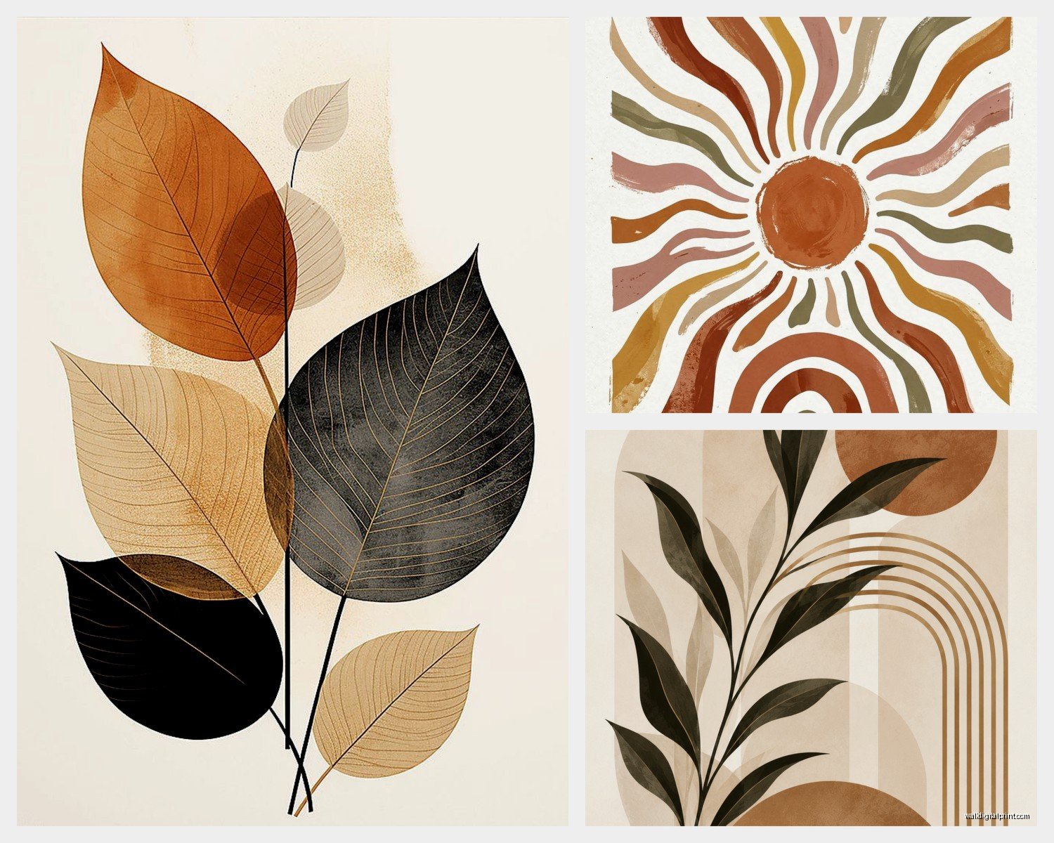
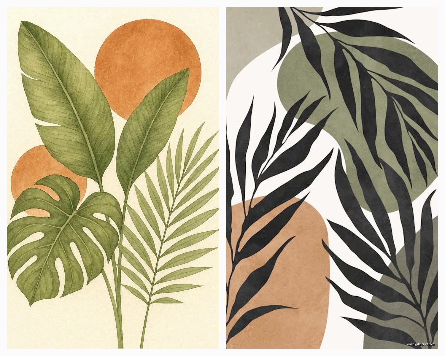
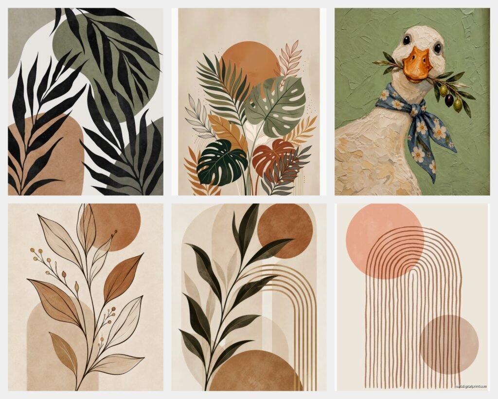
Earthy Boho – terracotta, plants, desert vibes, natural textures. This is what most people think of as boho. Lots of sun and moon imagery, pampas grass, cacti.
Eclectic Boho – mixed patterns, bold colors, global influences. Harder to pull off but looks amazing when done right. You need more confidence with this style.
Vintage Boho – 70s inspired, mustard yellow, macrame vibes, retro fonts. Very trendy right now. Pairs well with actual vintage furniture.
I tend to stick with minimalist and earthy because they’re easier to live with long-term. That eclectic stuff can feel overwhelming after a while.
Common Mistakes I Made So You Don’t Have To
Printing too small. I already mentioned this but seriously, go bigger than you think. Your walls can handle it.
Hanging things too high. The center of your art should be at eye level, which is usually around 57-60 inches from the floor. I hung a whole gallery wall six inches too high once and had to redo every single nail hole.
Mixing too many styles. Pick a vibe and stick with it. I tried mixing minimalist line art with busy patterned prints and it looked chaotic in a bad way.
Not considering your wall color. What looks good on a white background online might disappear on your beige walls. I downloaded this cream and white print that was basically invisible on my walls. Had to print it on dark gray paper instead.
Forgetting about spacing. Leave at least 2-3 inches between frames in a gallery wall. Closer than that and it feels cramped. Learned this from watching a YouTube video at like 11pm one night when I should’ve been sleeping.
How to Make Free Printables Look Expensive
This is the real secret honestly. It’s all in the presentation.
Use quality paper or cardstock. The difference between regular paper and nice cardstock is huge. Spend the extra dollar per print.
Frame everything. Even if they’re cheap frames, framed art looks intentional. Unframed prints taped to walls look like college dorm rooms.
Create a cohesive color story. All warm tones or all cool tones. Mixing color temperatures randomly looks messy.
Add texture with mats or layering. Double mat a special piece (mat inside another mat). Or layer a smaller frame over a larger print.
Light it properly. I put picture lights above my bigger pieces or use track lighting to highlight my gallery wall. Makes such a difference at night.
Organizing Your Downloaded Files
Okay this is boring but necessary. Create folders on your computer:
- Boho Prints – To Print
- Boho Prints – Printed
- Boho Prints – By Color
- Boho Prints – By Size
Name your files something useful like “terracotta-sun-8×10” not “IMG_8475.jpg” because you will never find anything again otherwise.
Save multiple versions if you edit colors. I have like four versions of the same moon print in different color schemes.
Seasonal Switching
One of the best things about printables is you can switch them out. I keep a rotation going:
- Spring – lighter colors, floral line art, soft pastels
- Summer – bold terracotta, desert vibes, warm tones
- Fall – deeper oranges, brown tones, cozy vibes
- Winter – cooler neutrals, minimalist pieces, more white space
Takes like 20 minutes to swap out a gallery wall and suddenly your space feels completely different. Way easier than redecorating.
My friend thinks I’m crazy for doing this but whatever, I like the variety.
Legal Stuff You Should Probably Know
Most free printables are for personal use only. Don’t go printing 50 copies to sell at a craft fair. That’s not cool and technically illegal.
If a designer offers something free, respect their terms. Some say you can’t modify it, others are fine with color changes for personal use. Usually there’s info in the listing or download file.
Credit the artist if you post your gallery wall on Instagram. It’s just nice and helps them get discovered. I always tag the designers when I share my walls.
That said, once you print something and hang it in your home, you’re good. This is all about if you try to profit from someone else’s work.
Quick Fixes for Common Problems
Colors look different when printed: This happens because screens show RGB colors and printers use CMYK. Not much you can do except test print a small version first if color accuracy is crucial.
File won’t download: Try a different browser. Sometimes files don’t download properly in Safari but work fine in Chrome. Also check your download folder because sometimes they save and you just don’t notice.
Print looks pixelated: File resolution was too low. Try to find a higher quality version or print it smaller. An image that looks fine at 5×7 might look terrible at 11×14.
Can’t decide on layout: Use that painter’s tape trick I mentioned. Or honestly, just start with a simple grid. You can always rearrange later.
So yeah, that’s basically everything I’ve learned about boho printable wall art. It’s way less complicated than it seems and honestly super satisfying when you step back and see a whole wall you put together for like $50 total. Just start with a few pieces, see what you like, and build from there. You’re gonna make mistakes but that’s fine because it’s all cheap enough to redo anyway.