Wall Art Guide, Wall Art Tutoriels
Beach Prints Wall Art: Ocean Shore Coastal Photography
Nov
So I’ve been totally obsessed with beach prints lately and honestly it started because a client wanted to redo their bedroom and I went down this whole rabbit hole of coastal photography. Like, I thought it would be simple but there’s actually a lot to consider when you’re picking ocean shore prints.
Figuring Out What Style Actually Works
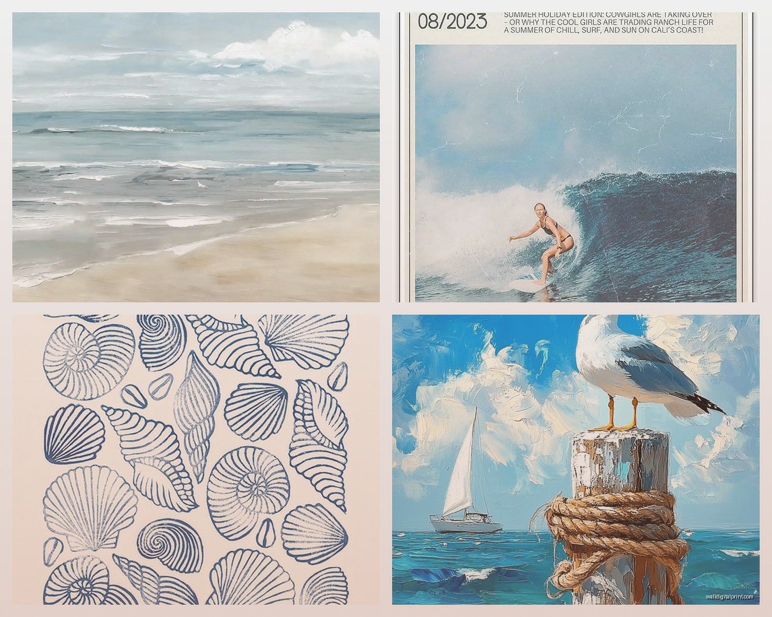
Okay so first thing – not all beach photography is created equal. You’ve got your super saturated sunset shots that look like someone cranked the saturation to 100 (which…they probably did), then there’s the moody black and white stuff, and then there’s what I call the “airy coastal” vibe which is like pale blues and whites and sandy neutrals.
I spent like three hours last Tuesday comparing prints because my meeting got moved and honestly? The style you pick matters way more than the actual beach in the photo. Nobody’s gonna know if it’s Malibu or the Outer Banks unless you tell them. What they WILL notice is whether the colors work with your space.
The Moody Black and White Route
If you’ve got a modern or minimalist space, black and white ocean photography is gonna be your best friend. I usually look for shots with really strong contrast – like dark stormy waves against white foam. The texture becomes the focal point instead of color, which is actually perfect if you’ve already got a lot going on color-wise in your room.
What I’ve learned though is that you gotta go BIG with black and white beach prints. Like, a tiny 8×10 on a huge wall just looks sad and unfinished. I’m talking at least 24×36 or bigger. The drama needs space to breathe.
Colorful Sunset Vibes
Now if you want those gorgeous orange and pink sunset shots…just be careful. They can look really beautiful OR really tacky depending on the saturation levels. I always tell people to look at the preview and if the colors look like they’re glowing radioactive, probably skip it. You want sunset tones that feel natural, not like a screensaver from 2005.
The thing about colorful beach prints is they need to be THE statement piece. You can’t really have a bright coral sunset photo competing with patterned throw pillows and gallery walls. It’s gotta be the main event.
Size and Placement (This Is Where People Mess Up)
Oh and another thing – sizing is where I see the most mistakes. People buy these beautiful prints and then they’re either way too small or weirdly proportioned for the space.
Here’s what actually works: measure your wall space first (I know, obvious, but you’d be surprised). Then subtract about 6-8 inches from each dimension. That’s roughly how big your print should be to look intentional. If you’ve got a 60-inch wide wall space, you’re looking at a print around 48-54 inches wide.
For above furniture like beds or sofas, the print should be about two-thirds the width of the furniture. So if your couch is 90 inches wide, you want your beach print to be around 60 inches. Or you could do a triptych situation which…okay I’ll get to that in a second.
The Triptych Thing Everyone’s Doing
So triptychs are basically three prints hung together as one cohesive piece. I’m kinda obsessed with these for beach photography because you can show a panoramic ocean view across three panels. It feels more dynamic than one big rectangle.
But spacing matters SO much here. Keep the panels about 2-3 inches apart. I’ve seen people do like 6 inches between panels and it just looks like three separate photos that happen to be near each other. You want them to read as one unit from across the room.
Print Quality (Don’t Cheap Out Here)
Okay this is gonna sound preachy but I gotta say it – print quality makes or breaks beach photography. Ocean scenes have so much subtle detail in the water texture and foam and sand that if the print is low resolution or printed on crappy paper, it looks flat and lifeless.
Look for prints that are at least 300 DPI. If you’re buying from Etsy or an independent photographer (which I recommend btw), message them and ask about their print quality. Legit sellers will happily tell you they use archival paper or professional printing services.
I usually go for either:
- Fine art paper with a slight texture (makes the image feel more artistic)
- Canvas prints for a more casual look
- Metal prints if you want something really modern and sleek
Metal prints are actually insane for beach photography because they make the water look almost luminous. The colors pop in this really cool way. But they’re pricey and they’re HEAVY so you need proper wall anchors.
Framing Decisions That Matter
White or light wood frames = coastal and airy
Black frames = modern and dramatic
No frame (canvas wrap) = casual and relaxed
I tend to do white frames for most beach prints because it enhances that breezy coastal feeling. But if you’ve got a more masculine or modern space, black frames with white matting look really sharp.
Oh and matting – I almost always use matting for paper prints. It creates breathing room around the image and makes everything look more expensive and curated. Standard is like 2-3 inches of mat on all sides.
Where to Actually Buy These Prints
So I’ve bought beach photography from allll over at this point. Here’s my honest breakdown:
Etsy: This is where I find the most unique stuff. Independent photographers selling their actual work. Quality varies wildly though so read reviews carefully. I bought this gorgeous misty Oregon coast print from a seller there last year and it’s still one of my favorites. Just make sure they offer the size you need before you fall in love with an image.
Society6 and similar POD sites: Good for variety and they handle framing which is convenient. The quality is decent but not amazing. I use these more for clients on tight budgets.
Local photographers: If you live near a coast, check out local galleries and photographer websites. You can sometimes get custom sizing and the images feel more special because they’re from your actual region.
Big box stores: Honestly I’ve gotten some okay prints from HomeGoods and West Elm. They’re fine for like a guest room or something where you’re not looking at it constantly. But they’re usually pretty generic compositions.
Composition Things to Look For
Wait I forgot to mention – the actual composition of the photo matters. My cat just knocked over my coffee so gimme a sec…okay back.
So composition. You want to look for:
Rule of thirds: The horizon line shouldn’t be dead center. It should be in the upper or lower third of the image. This creates more visual interest.
Leading lines: Waves, shorelines, or footprints that draw your eye through the image. These make photos feel more dynamic.
Negative space: Empty sky or smooth water can be really powerful, especially for minimalist spaces. Don’t be afraid of “boring” compositions if they’re well executed.
I’ve noticed that aerial beach shots are having a moment right now – those overhead views of waves meeting sand with tiny people for scale. They’re gorgeous but they’re also EVERYWHERE so if you want something more timeless, maybe skip the drone shots.
Color Coordination (The Part Nobody Talks About)
This is gonna sound weird but I actually take photos of my room on my phone and then look at beach prints next to those photos before buying. It sounds extra but it’s saved me from some really bad purchases.
Your beach print needs to work with your existing color palette. If you’ve got warm-toned woods and terracotta accents, look for golden hour beach shots with warm light. If your space is all grays and blues, cooler-toned ocean photography will feel more cohesive.
And here’s something I learned the hard way – if you have very warm lighting in your room (like those Edison bulbs everyone was obsessed with), cool-toned blue prints can look kinda sickly. The warm light fights with the cool tones. You might need to add some warmer elements to the print selection or change your lighting situation.
Mixing Beach Prints with Other Art
You don’t have to go full coastal theme just because you have beach photography. I actually think mixing beach prints with other art styles looks more interesting and less themed.
Try pairing ocean photography with:
- Abstract art in coordinating colors
- Botanical prints
- Simple line drawings
- Vintage maps
The key is varying the styles but keeping the color palette cohesive. So if your beach print has soft blues and sandy beiges, pull those same tones into your other pieces.
Care and Longevity Stuff
Okay practical stuff – don’t hang beach photography in direct sunlight if you can avoid it. The colors will fade over time, especially if it’s a photo print rather than canvas or metal. I learned this when a client’s gorgeous sunset print got all washed out after a year next to a west-facing window.
If you’re hanging in a bathroom (which can totally work for beach prints), make sure it’s properly sealed or framed with glass. The humidity will warp unprotected prints pretty quickly.
Dust them occasionally with a microfiber cloth. Don’t use cleaning products directly on the print surface. If it’s framed under glass, you can use glass cleaner on the glass but be careful not to let liquid seep behind the frame.
The Seasonal Switch Thing
Some people like to rotate their art seasonally and beach prints are perfect for this. I keep summer coastal scenes for warm months and switch to moodier ocean photography in fall and winter. It’s not necessary but it keeps your space feeling fresh if you’re someone who gets bored easily.
You can store prints flat in a portfolio case or standing upright in a closet. Just keep them away from moisture and extreme temperatures.
Custom Printing Your Own Photos
If you’ve taken beach photos yourself, getting them professionally printed can be way more affordable than buying from artists (though please support artists when you can). I use Mpix or Nations Photo Lab for client projects. Their quality is solid and turnaround is fast.
Just make sure your original photo is high enough resolution. If it looks pixelated when you zoom in on your computer, it’s gonna look worse printed large. Generally you need a file that’s at least 3000 pixels on the shortest side for decent quality at larger sizes.
Common Mistakes I See All the Time
Hanging prints too high – the center of the artwork should be at eye level, which is usually around 57-60 inches from the floor
Matching the frame to furniture too exactly – it looks matchy-matchy and dated. Your frame should coordinate with the overall vibe, not match your coffee table wood exactly
Buying prints that are too small for the space – when in doubt, size up
Ignoring the undertones – a greenish-blue ocean print will look off if your room has warm red undertones
Forgetting about the backing – cheap backing boards warp over time, especially with larger prints
Oh and another thing – if you’re ordering online, check the return policy before buying. Colors can look really different in person than on your screen, and some sellers are way better about returns than others.
I’ve probably spent way too much time thinking about beach prints at this point but honestly when you get it right, they completely transform a space. There’s something about ocean photography that just makes rooms feel calmer and more pulled together. Just take your time with the selection process and don’t impulse buy the first pretty sunset you see.