Wall Art Guide, Wall Art Tutoriels
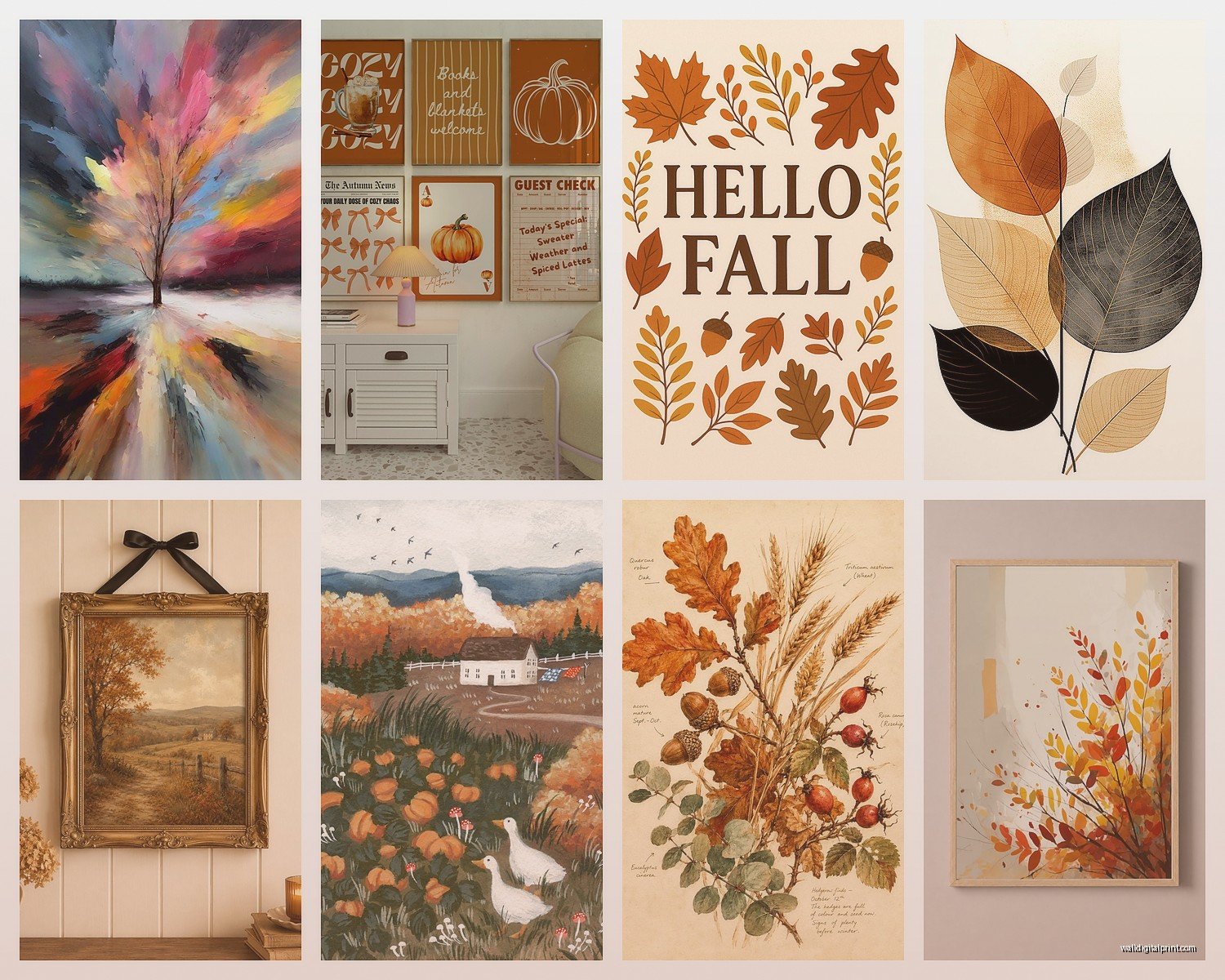
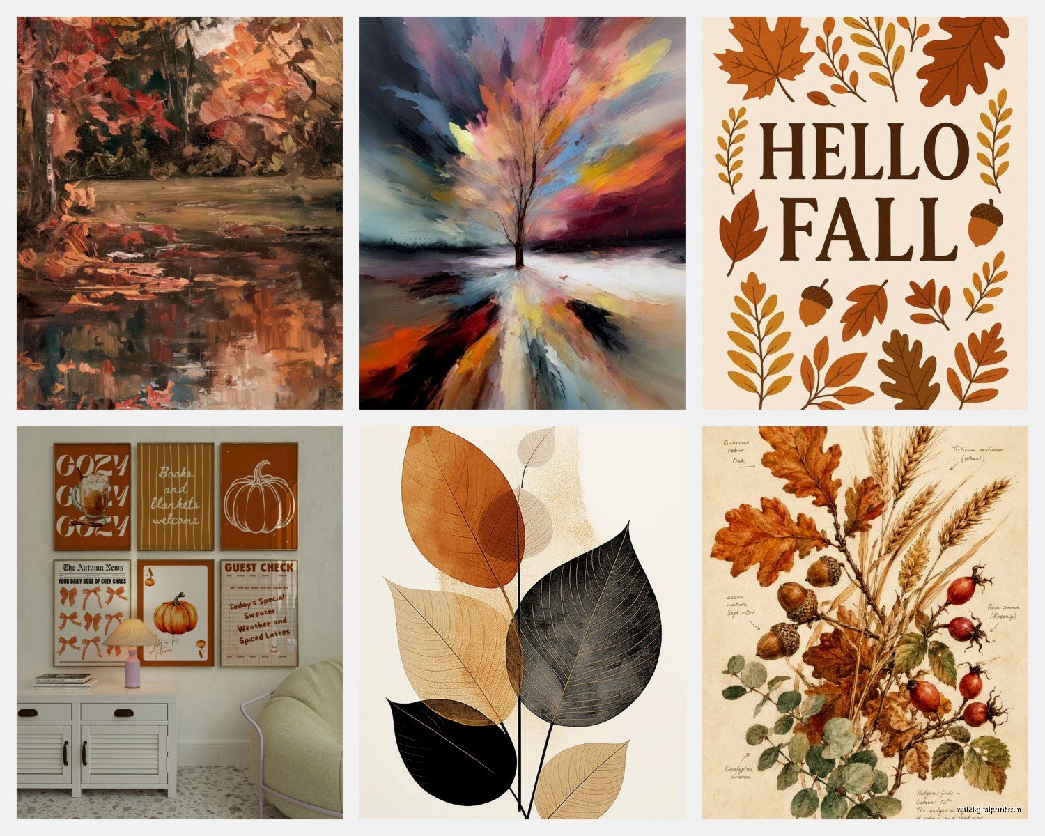
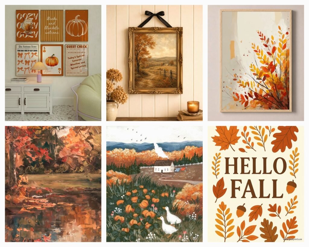
Autumn Wall Art: Fall Foliage Harvest Season Decor
Jul
So I’ve been decorating with autumn wall art for years now and honestly it’s one of those things where you can go really wrong or really right depending on what you pick. Like last week my neighbor bought this massive canvas with glittery pumpkins and it looked like a Halloween store threw up in her living room, so let me save you from that.
Start With Your Actual Wall Color
Okay so this sounds obvious but I cannot tell you how many people skip this step. Your wall color matters SO much with fall art. I’ve got this client with deep navy walls and we tried traditional orange and red fall pieces and it was… bad. Really bad. What actually worked was going with muted golds, burnt sienna, and cream tones. The contrast was way better.
If you’ve got white or light gray walls (which like 80% of people seem to have now), you can pretty much do whatever. Bright oranges, deep burgundies, forest greens – it all pops. But if you’re working with darker walls or that trendy sage green everyone did during lockdown, you gotta think about contrast more carefully.
The Three Types That Actually Work
I’ve tested a ridiculous amount of autumn wall art and it basically breaks down into three categories that don’t look cheesy:
Abstract Fall Colors
This is my go-to recommendation for people who want autumn vibes without literal pumpkins and leaves everywhere. Look for abstract pieces with fall color palettes – rust, ochre, deep plum, burnt orange, that gorgeous copper color. I found this amazing piece at a local art fair last year that’s just brushstrokes in autumn tones and it works from September through November without screaming “IT’S FALL” at everyone who walks in.
The trick here is making sure it’s actually abstract and not just… blurry leaves. There’s a difference. You want intentional color blocking or interesting textures, not something that looks like someone photographed foliage out of focus.
Botanical Prints (But Make Them Sophisticated)
Pressed leaf prints, vintage botanical illustrations, that whole aesthetic. This works because it feels collected and intentional rather than seasonal decoration. I’ve got a set of three framed vintage botanical prints with different fall leaves – oak, maple, and birch – and they’re in simple black frames with cream matting. Cost me maybe $45 total to print and frame at a local shop.
The key is going vintage or scientific illustration style. Not cute cartoon leaves. Not watercolor leaves with inspirational quotes (please god no inspirational quotes). Think more like something you’d find in an old biology textbook but pretty.
Moody Landscape Photography
This one surprised me because I used to think landscape photos were kinda boring for wall art but the right autumn landscape is *chef’s kiss*. Misty morning in a forest, fog rolling over harvest fields, that golden hour light through bare branches.
I picked up this print from an Etsy photographer last fall – it’s a foggy forest scene with trees in peak autumn color and it literally makes people stop and stare. The trick is finding ones with interesting composition and lighting, not just “here’s some pretty trees.” Look for dramatic weather, interesting perspective, or really exceptional light quality.
Size and Placement (Where People Mess Up)
Okay so funny story, I once hung a piece that was way too small over my client’s couch and we both stood there like “why does this look so weird” for a solid five minutes before we realized. Here’s the actual math that works:
For over a sofa or console table, your art should be roughly 2/3 the width of the furniture. So if your couch is 90 inches wide, you want art that’s around 60 inches across. This can be one large piece or a gallery wall situation.
Height-wise, the center of your artwork should be at eye level, which is usually around 57-60 inches from the floor. But if you’re hanging above furniture, leave 6-8 inches between the furniture top and the bottom of the frame.
I’m gonna be honest, I still sometimes eyeball it and then have to rehang things because I was wrong. My cat judges me every time I break out the level and hammer again.
Mixing Autumn Pieces With Year-Round Stuff
This is where it gets interesting and also where you can actually make fall decor work without completely redecorating every season. I keep probably 70% of my wall art the same year-round and just swap out a few key pieces for autumn.
My living room has a large abstract piece that stays up always (it’s mostly cream and gray with touches of gold), and then I flank it with two smaller autumn-specific pieces just for fall. When December hits, I swap those two smaller pieces for winter themed stuff. The main piece ties everything together so it doesn’t feel disjointed.
Or you can do what I did in my dining room which is create a gallery wall where only 3 out of 7 pieces are seasonal. The others are neutral enough that they work with anything – black and white photography, simple line drawings, that kind of thing.
The Gallery Wall Approach
Speaking of gallery walls, this is probably the most flexible option for seasonal decorating. You can swap individual pieces without redoing the whole thing.
My formula that actually works:
- Start with 5-9 pieces total (odd numbers look better for some reason)
- Mix frame colors but keep them in the same tone family – all warm woods, or all black, or all metallics
- Vary your sizes but include at least one larger anchor piece
- Make 2-3 of them seasonal and the rest permanent
- Map it out on the floor first because I’ve learned this lesson the hard way multiple times
I use those Command picture hanging strips for my seasonal pieces so I’m not putting new holes in the wall every few months. They hold up to like 16 pounds which is plenty for most framed prints.
What to Actually Avoid
Let me just save you some money and regret here. These things never look as good in your house as you think they will:
Words. Wall art with words. “Gather,” “Thankful,” “Blessed,” “Fall in Love” – just no. It’s gonna look dated in two years and it’s already kinda tired now. If you want text, go with maybe a vintage-style print that has botanical names in Latin or something educational rather than inspireational.
Glitter or metallic accents on canvas prints. I don’t care how good it looks online, it reads as crafty in person unless you’re deliberately going for that aesthetic.
Anything that’s obviously mass-produced from those home decor stores that shall remain nameless but you know the ones. The quality is usually terrible and everyone has the same pieces.
Super literal harvest imagery like cornucopias or people picking apples. Unless your aesthetic is very traditional Americana, this stuff tends to look more Thanksgiving specifically rather than general autumn.
Where to Actually Buy This Stuff
Okay so I’ve spent way too much time hunting for good autumn wall art and here’s where I’ve had the best luck:
Etsy – but you gotta dig past the first few pages of search results. Look for independent photographers and artists. The digital downloads are super affordable (usually $5-15) and then you can print them at your local print shop or even Costco if you have a membership. I’ve done this probably a dozen times and the quality is solid if you go with a decent paper.
Local art fairs and markets – I know this sounds like boomer advice but hear me out. You find unique stuff nobody else has, you can see it in person before buying, and you’re supporting actual artists. Plus you can often negotiate on price which you definitely cannot do at West Elm.
Thrift stores and estate sales – for vintage botanical prints and landscape paintings. Last month I found a gorgeous oil painting of a forest scene for $30 at an estate sale. It needed a new frame but that was another $40 and now I have a piece that cost me $70 total that looks like it should’ve been $400.
Society6 and similar print-on-demand sites – the quality varies by artist but I’ve had good experiences overall. They do sales pretty regularly so wait for like 20-30% off if you can.
DIY Options That Don’t Look DIY
If you’re crafty at all (or even if you’re not really), there are some genuinely good DIY autumn wall art options that don’t scream “I made this with Mod Podge.”
Pressed leaves in floating frames – I did this in my office and it actually looks museum-quality. You need:
- Fresh fall leaves in good condition
- Heavy books for pressing (I used art books because they’re huge)
- Parchment paper
- Floating glass frames from IKEA or Amazon
- Like two weeks of patience while they press
The trick is picking leaves that aren’t too thick and making sure they’re completely dry before framing or they’ll mold. Been there, learned that lesson.
Large-scale abstract art is surprisingly doable even if you think you can’t paint. Get a large canvas, pick 3-4 autumn colors, and just do color blocking or loose brushstrokes. I watched half of a true crime documentary while making one and it turned out great. Nobody needs to know it’s not from a gallery.
Lighting Makes or Breaks It
Oh wait I forgot to mention this earlier but it’s actually super important – how you light your autumn wall art changes everything. I installed picture lights above a few key pieces and the difference is insane. It makes even affordable prints look expensive and gallery-worthy.
If you don’t wanna deal with hardwiring, they make battery-operated picture lights now that are pretty decent. I’ve got a couple from Amazon that last like 6 months on a set of batteries.
Natural light is obviously ideal but watch out for direct sunlight because it’ll fade your prints over time. I learned this the expensive way with a print that was in direct afternoon sun for one summer and the colors totally washed out.
Seasonal Rotation System
Since you’re gonna want to swap this stuff out eventually, here’s how I store seasonal wall art without it getting damaged:
I use those under-bed storage containers with dividers. Wrap each piece in tissue paper or bubble wrap, store them flat, label the container “Fall Wall Art” like a normal person. Takes up way less space than you’d think.
Some people use portfolio cases which work great if you’ve got the closet space. I don’t, so under the bed it is.
The Actual Budget Breakdown
Because I know you’re wondering what this actually costs if you’re starting from scratch:
Budget option ($50-100 total):
- 2-3 digital prints from Etsy ($10-20)
- Printing at Costco or local shop ($30-50)
- Simple frames from IKEA or Target ($30-40)
Mid-range option ($150-300 total):
- Mix of prints and one original piece from local artist
- Better quality frames, maybe some matting
- Possibly one canvas print from Society6 or similar
Investment option ($400+):
- Original artwork from established artists
- Custom framing with museum-quality materials
- Large statement pieces
I usually tell people to start budget and upgrade pieces over time as you figure out what you actually like living with. I’ve definitely bought “investment” pieces that I ended up hating after a month.
The stuff I’ve had up for years tends to be the pieces I really thought about before buying, not the ones I impulse purchased because they were pretty in the store. So maybe don’t buy wall art while you’re hungry or tired or watching those home makeover shows that make everything look amazing.