
Wall Art Guide, Wall Art Tutoriels
Dolphin Wall Art: Marine Mammal Ocean Intelligent Creature
Jul
So I’ve been obsessing over dolphin wall art lately because three different clients asked about it in the same week and now my entire algorithm thinks I’m running a marine biology museum or something. But honestly? It’s one of those themes that can go really right or really wrong, and I’ve seen both ends of that spectrum.
The Thing Nobody Tells You About Dolphin Art
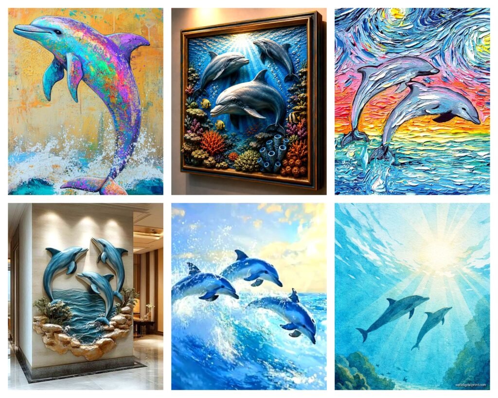
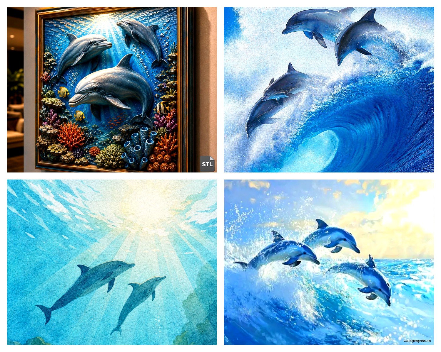
Okay so first off, dolphin art has this weird reputation problem. Like, people immediately think tacky beach motel or that one aunt who collects dolphin figurines. But here’s what I figured out after staging like fifteen coastal properties last year—it’s all about the artistic approach. A photorealistic dolphin jumping through waves at sunset? Yeah, that’s gonna read as 2003 beach condo. But an abstract line drawing of a dolphin pod, or a sophisticated black and white underwater photograph? Completely different vibe.
I literally spent my entire Saturday (my dog was NOT happy about the lack of park time) looking at dolphin prints because a client wanted ocean themes but her house is this gorgeous modern minimalist situation. And you can’t just slap any dolphin image in there.
Style Categories That Actually Work
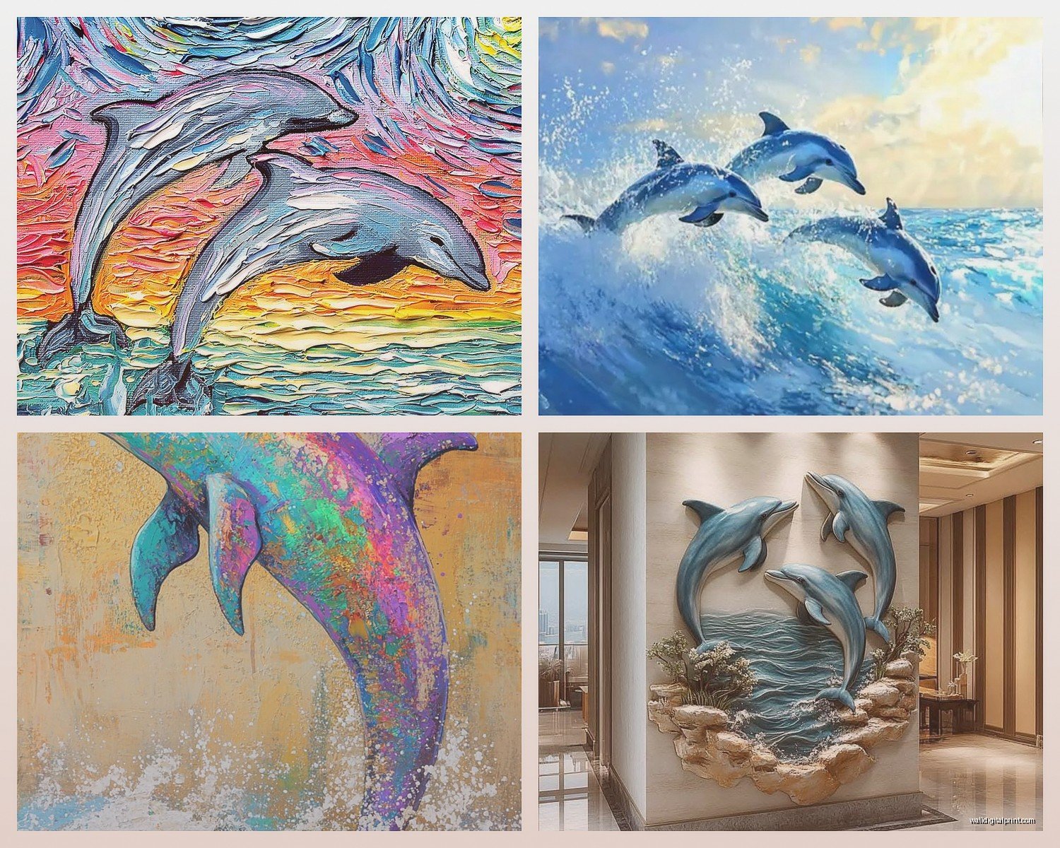
The contemporary abstract stuff is probably your safest bet if you’re worried about it looking cheesy. I’m talking geometric interpretations, watercolor splashes that suggest dolphin shapes rather than drawing every detail. There’s this one artist—I can never remember her name but she does these incredible navy and gold leaf pieces—where the dolphin is basically just suggested through negative space. That sold me on the whole concept.
Then you’ve got the scientific illustration route which is SO underrated. Like vintage marine biology textbook vibes. These work amazing in offices or studies because they feel intellectual and collected rather than decorative. I found a set of four prints that look like they came from an 1800s expedition journal and used them in a lawyer’s home office. He was initially skeptical about “dolphin pictures” but when he saw them framed in thin black frames against his charcoal walls… totally different story.
Size and Placement Mistakes I’ve Made
Oh and another thing—size matters way more than people think with marine life art. I once hung a massive 48×36 dolphin canvas in a client’s living room and it was too much. Like the dolphins were LOOMING. Marine mammals need breathing room in the composition itself, so when you go big, make sure there’s lots of negative space in the actual image. Ocean, sky, that kind of thing.
Best sizes I’ve found:
- Small spaces like bathrooms or hallways: 16×20 or smaller, maybe a set of three
- Bedroom accent walls: 24×36 works perfectly above a dresser
- Living rooms: either go big (40×60) with lots of white space in the image, or do a gallery wall situation
- Kids rooms: honestly anything goes but 20×30 is that sweet spot
The Gallery Wall Approach
This is gonna sound weird but my most successful dolphin installations have been mixed gallery walls where the dolphin isn’t even the star. Like, you include one or two dolphin pieces among other ocean elements—shells, waves, coral, sea glass colors. It contextualizes the dolphin as part of a larger marine ecosystem story rather than making it the whole personality of the room.
I did this in a teenager’s room last month where we mixed a single minimalist dolphin print with abstract ocean paintings, a vintage surfboard (decorative, not real), and some typography prints with ocean quotes. The dolphin piece almost disappeared into the collection but in a good way? It felt curated instead of theme-y.
Color Schemes That Don’t Scream Tourist Trap
Okay so funny story, I was watching this documentary about dolphins while researching (procrastinating) and realized that real dolphins in their natural habitat exist in these incredibly sophisticated color palettes. Deep navy blues, grey-greens, silvery whites, those murky turquoises. NOT the bright aqua and sunshine yellow combo you see in beach stores.
If you stick to this more realistic, moody palette, your dolphin art automatically elevates itself. I’m talking:
- Charcoal and white for ultra modern spaces
- Navy, cream, and maybe a touch of rust or coral for warmth
- Teal and grey for that spa-like bathroom vibe
- Black and white photography for literally anywhere that needs sophistication
The metallic trend is interesting too—silver and gold dolphins on deep blue or black backgrounds. I was skeptical but saw one in person at a gallery and it was actually stunning. Very art deco vibes, which I wasn’t expecting from dolphin art but it works in the right space.
Materials and Finishes Worth the Money
So canvas prints are fine but they’re everywhere and they can look cheap if the image quality isn’t great. What I’ve been gravitating toward:
Metal prints for dolphin photography. The way light reflects off metal mimics water in this really cool way. I used an aluminum print of a dolphin pod for a client’s pool house and even though it was pricey (like $200 for a 24×36) it looks incredible. The depth and luminosity you get… regular prints can’t compete.
Acrylic face mounting is another option that’s super sleek. The image gets mounted behind a sheet of acrylic so there’s this glossy, modern finish. Works really well for minimalist spaces where you want the art to feel like an art gallery piece rather than décor.
Wood prints surprised me too. I initially thought they’d be too rustic for dolphin subjects but there’s something about the wood grain showing through a dolphin image that makes it feel organic and less cutesy. Used one in a cabin renovation and it was perfect.
Framing Choices That Matter
Wait I forgot to mention—framing can make or break this whole thing. Those chunky white or turquoise painted frames? That’s what’s giving you the beach motel energy. Instead:
Thin black metal frames for modern spaces, thick natural wood for coastal casual, or go frameless with a float mount for contemporary. I’ve also done dolphin prints in brass frames which sounds insane but in the right maximalist space it’s chef’s kiss.
One client insisted on driftwood frames which I thought would be too literal but we found these really refined pieces from this woodworker in Oregon and they actually grounded the whole room. So I guess rules are meant to be broken but you gotta know what you’re doing.
Where to Actually Buy Quality Pieces
Etsy is hit or miss but when you find a good artist it’s gold. Search for “abstract dolphin print” or “minimalist dolphin art” rather than just “dolphin wall art” because the algorithm will show you more sophisticated stuff. I’ve found amazing independent photographers there too.
Society6 and similar print-on-demand sites are convenient and you can get the same image in different formats. Quality is decent, not amazing but totally acceptable for most residential spaces. Just read reviews about color accuracy.
Local galleries if you’re in a coastal area obviously, but also don’t sleep on marine conservation organizations. They often sell photography prints and the money goes toward ocean protection which is a cool story to tell guests. Plus the photography is usually legit because it’s taken by actual marine researchers.
For kids’ rooms, honestly Target and HomeGoods have some surprisingly cute options if you dig past the obvious stuff. I found this watercolor dolphin set at HomeGoods for like $40 that my client’s six-year-old daughter obsessed over and it’s held up great.
Room-by-Room Strategy
Bathrooms are actually the easiest place to do dolphin art because the ocean connection is built-in. Keep it small, keep it simple. A single framed print above the toilet or a pair flanking the mirror. I like black and white photography here—feels clean and spa-like rather than themey.
Bedrooms can handle more whimsy. This is where you could do a slightly more playful dolphin piece, especially in kids’ or teen rooms. But for adult bedrooms I’d still keep it sophisticated. That scientific illustration style works great, or a really artistic photography piece. Above the bed or on the wall opposite so you see it when you wake up.
Living rooms need the most restraint. This is where the abstract approach really shines. Or if you’re doing photography, make it a statement piece with museum-quality printing and framing. I wouldn’t do multiple dolphin pieces in a living room unless they’re part of a larger gallery wall situation.
Offices or studies are perfect for the vintage scientific illustration vibe I mentioned. Makes it feel collected and intentional rather than decorative. Also works for those moody blue-toned photography prints.
The Kids Room Exception
Okay so kids rooms are where you can actually have fun with this and not worry as much about sophistication. My niece has this whole underwater mural situation with dolphins and it’s adorable. For kids you can:
- Mix in some educational elements like dolphin facts
- Use brighter colors that you’d avoid elsewhere
- Include cartoon or illustrated dolphins without shame
- Create a whole underwater scene with dolphins as part of it
But even here, I’d suggest avoiding the super commercial licensed character stuff and going for independent artists on Etsy who make kids’ art that doesn’t make parents want to gouge their eyes out.
Common Mistakes and How to Avoid Them
Matching everything to the dolphins is probably the biggest one. Like, you don’t need dolphin art AND dolphin throw pillows AND a dolphin lamp. Pick your statement and let everything else be complementary, not matchy-matchy.
Too many dolphins in one space. One or two pieces max per room unless you’re genuinely going for a dedicated ocean theme in like a beach house. And even then, mix it up with other marine life.
Ignoring the intelligence factor. This sounds pretentious but dolphins are literally one of the most intelligent creatures on earth. The art you choose should reflect that sophistication. Cutesy cartoon dolphins don’t honor that unless they’re in a kid’s space.
Forgetting about the rest of your décor style. A hyperrealistic jumping dolphin isn’t gonna work in your scandinavian minimalist apartment no matter how much you love dolphins. Find dolphin art that matches your existing aesthetic rather than trying to force it.
Testing Before Committing
This is something I do with every client and you should too—tape up paper templates or use those peel-and-stick poster sheets to test placement and size before buying. I’ve saved so much money and returns by doing this. You think you want a huge dolphin canvas until you see what 48 inches actually looks like on your wall.
Also consider lighting. Dolphin art with lots of dark blues and greens needs good lighting to avoid looking muddy. I’ve installed picture lights above some pieces and it completely transformed them.
Oh and if you’re renting, command strips are your friend but make sure you’re not exceeding weight limits. Lost a deposit once because a client’s heavy framed dolphin print pulled paint off the wall when we removed it. Not fun.
Natural light considerations matter too—direct sunlight will fade prints over time so either use UV-protective glass or avoid placing them in super sunny spots. Learned that one the hard way with a beautiful but now very pale dolphin photograph.
Anyway, that’s basically everything I’ve figured out about dolphin wall art through trial and error and way too many client projects. It’s totally doable to make it look sophisticated and intentional rather than like you’re decorating a seafood restaurant, you just gotta be strategic about it.
