Wall Art Guide, Wall Art Tutoriels
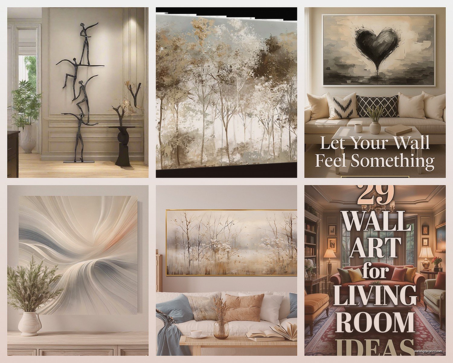
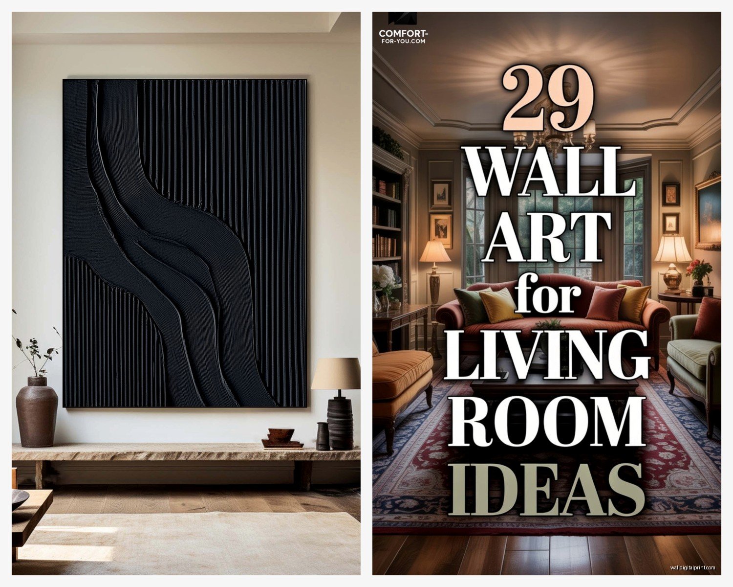
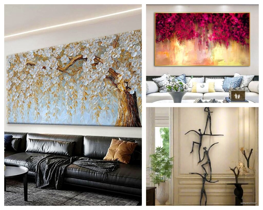
Best Wall Art for Living Room: Top Rated Main Space 2026
May
So I’ve been obsessing over wall art for living rooms lately because honestly, three different clients asked me about this in the same week and I ended up doing this deep dive into what’s actually worth buying in 2026. Like, the market has changed so much even from last year.
Size Actually Matters More Than You Think
Okay so first thing – everyone buys art that’s too small. I’m guilty of this too. I had this tiny 16×20 print above my couch for like two years before I realized it looked ridiculous. Your living room wall art needs to be substantial, and I mean like 40×60 inches minimum for above a sofa, or go with a gallery wall situation where the entire collection spans at least 60 inches wide.
The rule I tell people is that your art should take up about two-thirds to three-quarters of the furniture width below it. So if you’ve got an 8-foot sofa, you’re looking at roughly 60-72 inches of art coverage. Sounds huge right? But trust me, when you actually put it up, it’ll look proportional.
What’s Actually Trending That Doesn’t Suck
Abstract pieces are still dominating but like, the good news is we’ve moved past that generic gray and beige stuff from 2019. The abstract work that’s rating well now has actual depth – textured pieces with heavy gel medium, or mixed media that combines paint with natural fibers or metal leaf.
I just installed this massive triptych at a client’s place from an artist who works with recycled textiles and acrylic, and it’s got this incredible dimension that photographs terribly but looks amazing in person. Cost them about $800 but it’s a statement piece that makes their entire open-concept space feel intentional.
Framed Photography Is Having a Moment
Large-scale photography is back, but not the coffee-table-book stuff. I’m talking about oversized prints – like 40×60 or bigger – of architectural details, aerial landscapes, or even abstract macro photography. There’s this one seller doing close-ups of desert formations that look almost like abstract paintings until you get up close.
The key with photography is going big and keeping the frame simple. Black metal frames or natural wood, none of that ornate gallery stuff unless your whole vibe is maximalist.
Budget Breakdown Because Let’s Be Real
If you’ve got $200-$500 to spend, you’re actually in a sweet spot. Here’s what I’d prioritize:
- Canvas prints from independent artists on platforms like Saatchi or even Etsy – you can find original work or high-quality giclée prints in the $300-$400 range
- Framed posters from museum shops, but sized up – the big ones, not the standard sizes everyone has
- Textile wall hangings if your space leans boho or eclectic, they’re adding texture that flat art can’t
- DIY frame good paper prints – buy a $60 print and spend $150 on custom framing, it’ll look like a $1000 piece
Under $200 gets trickier but it’s doable. I’ve found some surprisingly good oversized canvas prints on Amazon of all places, specifically abstract landscapes that don’t look mass-produced. You gotta dig through a lot of garbage though.
The Expensive Route That’s Worth It
If you can swing $1000+, invest in original art. I know that sounds obvious but hear me out – the resale value actually holds or increases with original work from emerging artists. I bought a piece in 2021 for $1,200 and it recently got appraised at $2,800 because the artist has blown up.
Local art fairs are goldmines for this. You meet the artist, negotiate directly, and you’re getting something nobody else has. Plus there’s something about having actual brushstrokes and texture on your wall that just elevates a space differently.
Color Coordination Without Being Matchy-Matchy
Oh and another thing – don’t try to match your art to your throw pillows exactly. That’s dated and it looks staged. Instead, pull one or two accent colors from your existing palette and let the art introduce new tones.
My living room has a lot of warm grays and cognac leather, and I went with this massive abstract piece that’s primarily deep blue and rust with touches of gold leaf. The blue was totally new to the room but now it’s become this anchoring color that I’ve pulled into other accessories. It feels collected rather than designed, if that makes sense.
Neutrals Done Right
If you’re committed to neutral art – and look, I get it, it’s easier to live with – at least make sure it has serious texture or layering. Flat beige abstract prints are just boring at this point. Look for pieces with:
- Visible brushwork or palette knife texture
- Multiple layers you can see when light hits it
- Natural materials like handmade paper or linen canvas
- Subtle metallic accents that catch light
I’m watching this show about art forgers while writing this and it’s wild how much technique matters, but anyway – texture is what separates interesting neutral art from hotel lobby art.
Gallery Walls That Don’t Look Chaotic
Okay so gallery walls are still popular but the execution has gotten more refined. The Pinterest chaos of 47 mismatched frames in random arrangements? We’re past that thank god.
Current approach that’s working: pick a cohesive frame style (all black, all natural wood, or all white), vary the sizes but keep to 5-7 pieces max, and maintain consistent spacing – I use 2-3 inches between frames.
Layout tip that changed everything for me: cut out paper templates of your frames and tape them to the wall first. Move stuff around until it feels balanced. I know everyone says this but seriously, it saves so many nail holes. My walls look like swiss cheese from before I learned this trick.
Mix Your Media
The gallery walls that look most current mix different types of art – a photograph next to an abstract print next to a pencil drawing. But keep the color palette relatively cohesive. Like, all warm tones or all cool tones, or all black and white.
I just did one for my sister that’s all botanical prints but from different sources and eras – vintage illustrations, modern photography, one original watercolor. All in black frames with white mats. Cost her maybe $400 total and it looks way more expensive.
Statement Pieces Worth The Investment
Sometimes one massive piece is better than multiple smaller ones, especially if you’ve got a large blank wall and a contemporary space. Here’s what’s rating highest right now:
Oversized abstract landscapes – not traditional landscapes but abstract interpretations of horizons, water, or sky. There’s something calming about horizontal compositions that works perfectly in living spaces.
Textured fiber art – woven wall hangings or textile pieces are huge right now, especially in natural fibers. They add warmth and dimension that painted pieces can’t match. I’ve got this cream-colored woven piece above my entryway table that people always ask about.
Line art portraits – if you can find an artist who does custom continuous line portraits, these are incredibly personal and sophisticated. I commissioned one of my daughter for like $350 and it’s become my favorite piece in the house.
Practical Installation Stuff Nobody Talks About
Hanging art correctly makes such a difference and people mess this up constantly. Center point should be at eye level, which is roughly 57-60 inches from the floor to the center of the artwork. Not the top, not the bottom – the center.
For art above furniture, leave 6-8 inches between the furniture top and the bottom of the frame. More than that and it looks like it’s floating away, less and it feels cramped.
Use proper hardware please. I’ve seen too many expensive pieces crash down because someone used those cheap sawtooth hangers. For anything over 20 pounds, use wall anchors or hit studs. For really heavy pieces, I use heavy-duty picture hanging strips plus wire and hooks as backup.
Lighting Makes or Breaks It
This is gonna sound extra but proper lighting transforms art. If you can add picture lights or even just adjust your existing lighting to highlight your wall art, do it. I installed these wireless LED picture lights above my main pieces and the difference is insane.
Even just repositioning a floor lamp to cast light on your art changes how it reads in the space. Colors look richer, texture becomes more apparent, and it creates this gallery-like atmosphere that makes your whole room feel more intentional.
Where To Actually Shop
My go-to sources that consistently have good stuff:
Minted – their limited edition prints are actually limited and the quality is solid, plus you can get custom framing that doesn’t cost a fortune
Saatchi Art – for original work and prints from emerging artists, good range of prices
Local art studios and co-ops – seriously, this is where you find unique pieces and can negotiate
Estate sales – weird suggestion but I’ve found incredible vintage art at estate sales for nothing, then reframed it
Society6 and similar – the quality has gotten way better, good for trendy pieces you might want to swap out eventually
Avoid HomeGoods/TJ Maxx art unless you’re really good at sorting through the mass-produced stuff. Sometimes you find gems but it’s rare.
Mistakes I See People Make
Hanging everything too high – I see this constantly, art floating near the ceiling looking weird
Buying art that matches their paint color exactly – it just disappears into the wall
Going too small – we covered this but it’s the most common mistake
Treating art as an afterthought – it should be part of your design plan from the start, not something you grab last minute
Not considering the room’s function – your living room art can be more experimental than your bedroom, which should probably be calming
The Rental Situation
If you’re renting and can’t put holes everywhere, there are actually good solutions now. Command picture hanging strips hold way more weight than they used to – I’ve had 20-pound pieces up for years with no issues.
Lean art on mantels, consoles, or even the floor against the wall. Oversized pieces leaning casually can look really intentional if your style is relaxed and contemporary.
Picture rails or gallery systems that hang from the ceiling are another option, though they require ceiling hooks which some landlords allow.
Final Thoughts That Aren’t Really Final
The best living room art is stuff you genuinely connect with, not what some designer says is trending. That said, if you’re stuck, abstract landscapes and textured neutral pieces are safe bets that won’t feel dated in three years.
Start with one statement piece rather than trying to fill every wall immediately. Live with it, see how it affects the space, then build from there. I’ve been in my current place for four years and I’m still adding and moving art around.
And honestly? Sometimes the piece you’re unsure about ends up being your favorite. I almost didn’t buy this weird green abstract piece that’s now the focal point of my living room because it felt like too much color, but my cat kept sitting in front of it at the gallery like she was trying to tell me something, so I went for it. Best impulse purchase I’ve made.
Don’t overthink it to the point where you end up with bare walls for months. Imperfect art up on the wall beats perfect art still in your head.