Wall Art Guide, Wall Art Tutoriels
Gray Bathroom Wall Art: Neutral Contemporary Bath Decor
May
So I’ve been basically living in bathroom makeovers lately and gray wall art is honestly such a lifesaver when you’re trying to make a bathroom feel less… I don’t know, sterile? Like my friend Sarah just redid her master bath and went full gray tile thinking it’d be elegant but then it felt like a fancy hospital, and we fixed it entirely with the right art pieces.
Why Gray Art Actually Works Better Than You’d Think
Okay so here’s the thing about gray bathroom art that I didn’t get until I started curating pieces for clients – it’s not about making the room MORE gray, it’s about giving all that neutrality some actual depth. You know how a gray sweater looks completely different in different lighting? Same concept. I spent like three hours last Tuesday (my afternoon appointment canceled, don’t even get me started) just photographing the same gray abstract print in different bathroom lighting scenarios and the difference was wild.
The trick is layering different gray tones. If your tiles are cool gray, you actually want some warmer grays in your art. Sounds backwards but trust me on this one.
What Actually Looks Good on Bathroom Walls
Canvas prints are gonna be your best friend here because moisture and paper prints don’t mix well. I learned this the hard way in my own powder room – had this gorgeous charcoal botanical print that just started warping within like six months. Now I only recommend:
- Canvas wraps with sealed edges
- Acrylic or plexiglass mounted prints
- Framed pieces with moisture-resistant backing
- Metal prints if you want something really durable
Metal prints in gray tones are actually having a moment right now. They’ve got this subtle sheen that picks up bathroom lighting in this really cool way. I just installed three small metal gray botanical prints above a client’s soaking tub and the way they catch the light when she’s got candles going is *chef’s kiss*.
Size and Placement Without Overthinking It
Bathrooms are tricky because you’ve got all this stuff interrupting your wall space – mirrors, towel bars, toilet paper holders, light fixtures. My general rule that’s worked like 90% of the time:
Above the toilet – go for something 16×20 or two pieces that are 11×14 side by side. This is prime real estate honestly because everyone’s gonna be looking at that wall whether they want to or not lol
Opposite the vanity – if you’ve got the wall space, this is where you can go bigger. A 24×36 piece or even a three-panel set. You’ll see it in the mirror which creates this cool layered effect.
Next to the shower – smaller pieces work better here, like 8×10 or 11×14, because moisture concerns and also you don’t want anything too visually heavy when you’re trying to relax
Gray Art Styles That Don’t Feel Boring
So when most people think gray bathroom art they picture like… sad geometric shapes? But there’s actually so much variety. These are the styles I keep coming back to:
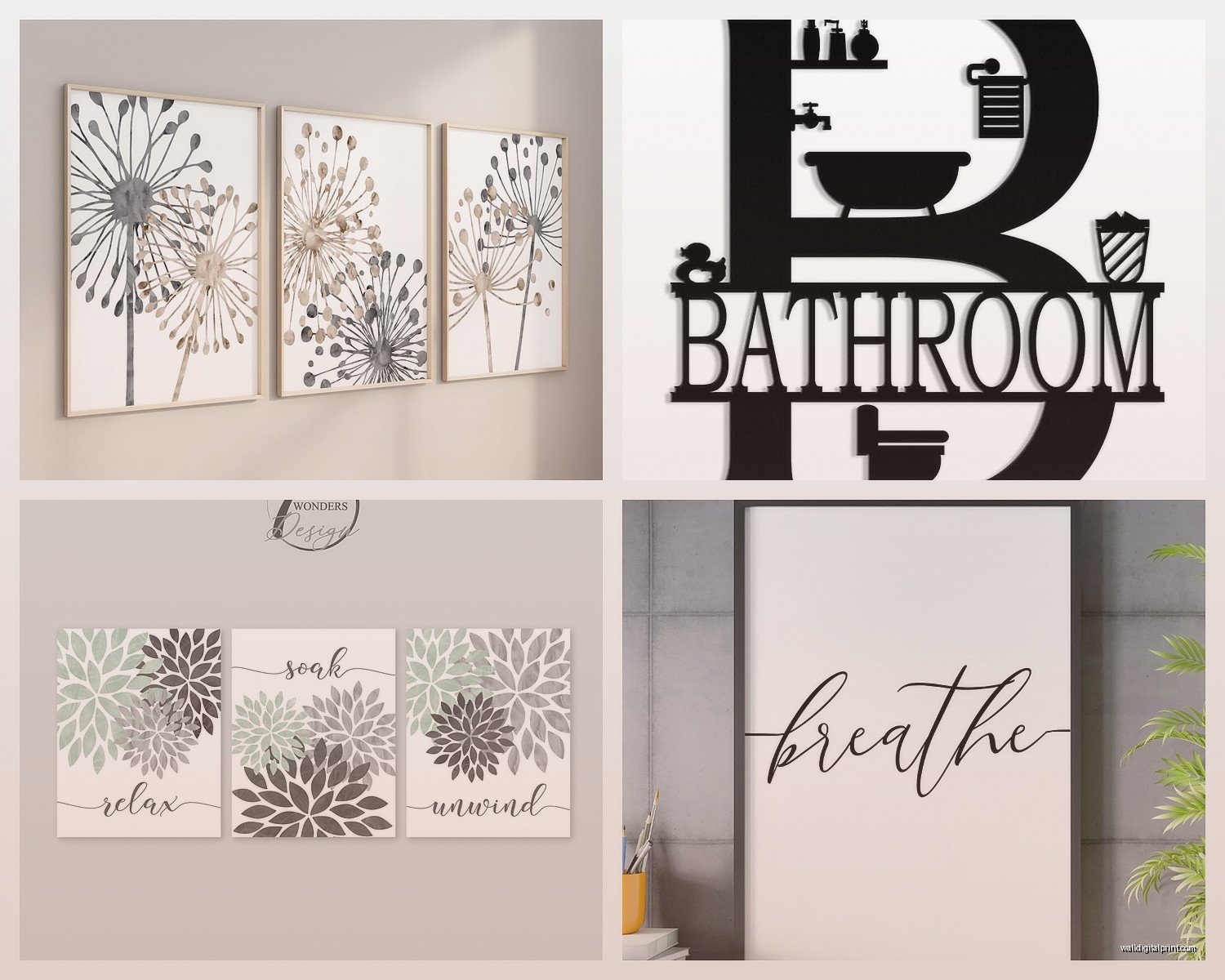
Abstract gray washes – These look like watercolor but in grayscale. Super soothing, kinda reminds me of fog or mist which works perfectly in a bathroom. I found this artist on Etsy (gonna try to find the shop name hold on) who does these amazing gray gradient pieces that look expensive but they’re like $45 for a digital download you can print yourself.
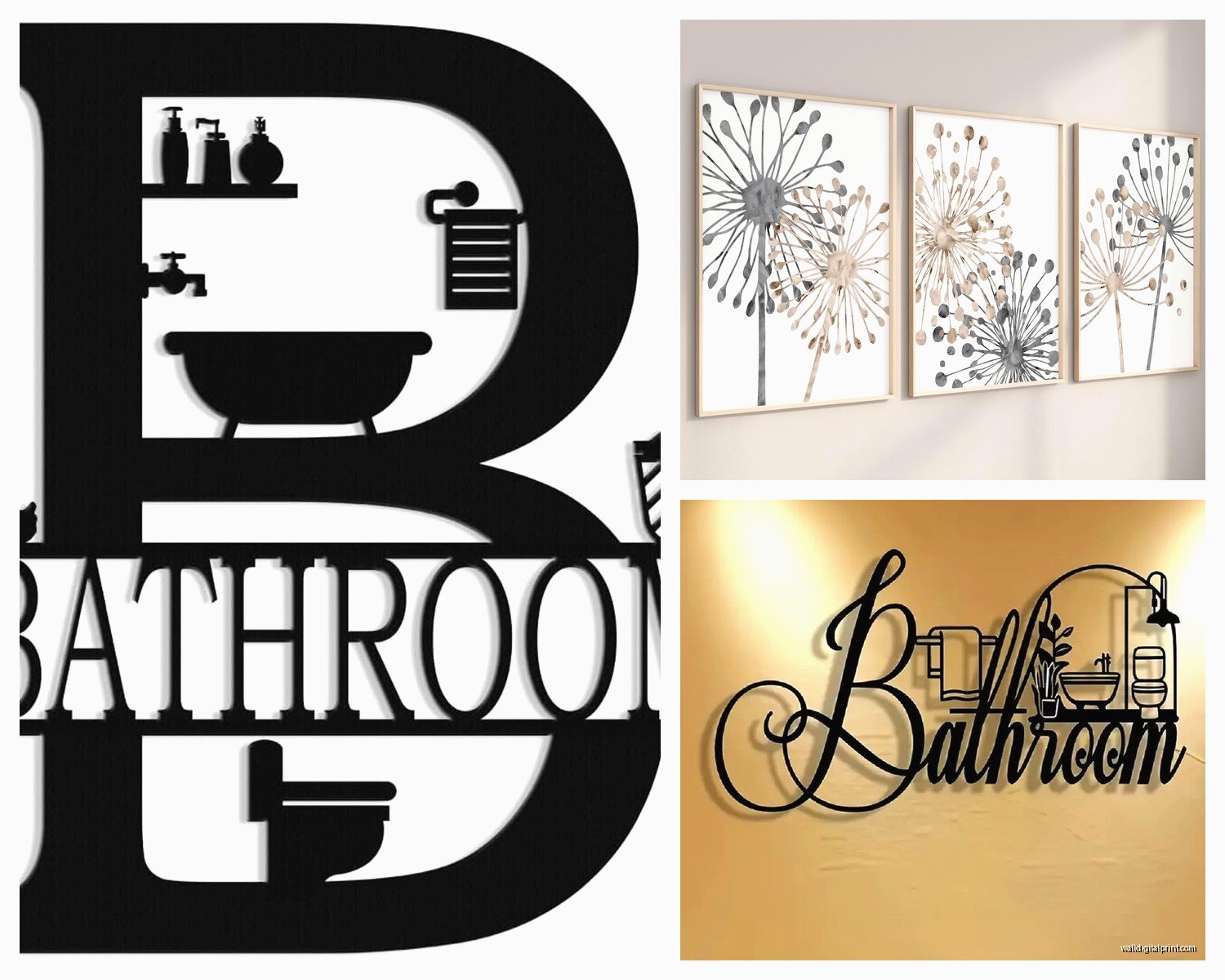
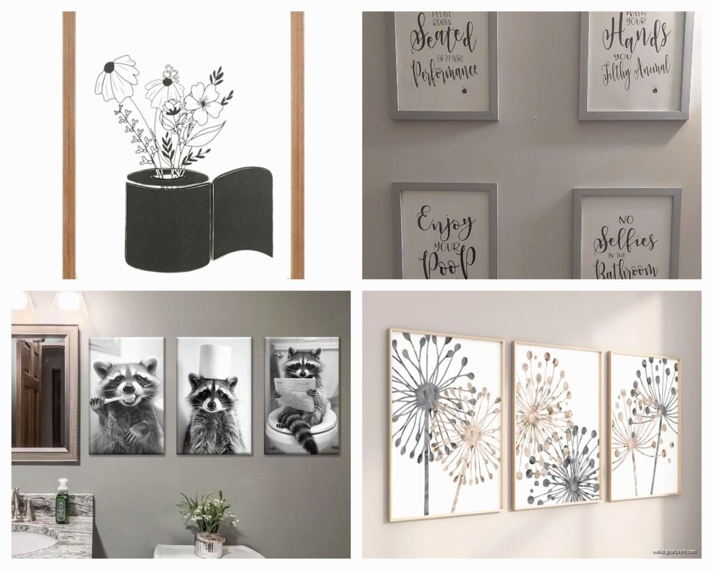
Botanical line drawings – Simple plant outlines in charcoal or gray ink on white backgrounds. These are EVERYWHERE right now but they’re popular for a reason. They add organic shapes without color competition. I have three eucalyptus prints in my guest bath and literally every visitor asks where I got them.
Marble or agate patterns – Gray marble art or those sliced agate designs bring in natural texture. They photograph really well too if you’re one of those people who posts bathroom selfies (no judgment, the lighting in bathrooms is usually great).
Minimalist photography – Black and white or grayscale photos of architecture, seascapes, beaches. There’s something about a foggy pier photo in a bathroom that just works. Maybe it’s the water connection? I don’t know, I’m not a psychologist.
Mixing Gray Art With Your Existing Stuff
Oh and another thing – you don’t have to commit to ALL gray art. Actually please don’t because that can get flat real quick. I usually do like a 70/30 split. Mostly gray pieces with one accent that brings in whatever other color is in the bathroom.
My client Jessica has this beautiful bathroom with gray subway tile and white fixtures, and we did two large gray abstract pieces but then added one smaller piece with a tiny pop of sage green. It tied into her plants and suddenly the whole thing felt intentional instead of accidentally monochrome.
This is gonna sound weird but I also sometimes frame gray art in natural wood frames instead of black or white. The warmth of the wood keeps gray from feeling cold. I’m looking at my own bathroom right now and the walnut frame around my gray geometric print completely changes the vibe.
Where to Actually Buy This Stuff
Okay so I’ve tried basically every source and here’s what’s actually worth your time:
Etsy – Best for digital downloads and custom pieces. You can find gray bathroom art sets for like $20-40 that you just download and print at Staples or wherever. Quality varies obviously but read the reviews. I’ve gotten probably 60% of my bathroom art from Etsy sellers.
Society6 – Good for consistent quality and they have tons of gray abstract stuff. Prices are medium range. Their canvas prints hold up well to humidity in my experience. They also do sales pretty regularly so maybe wait for one of those.
Target and HomeGoods – For physical pieces you can see in person. The selection is hit or miss but when you find something good it’s usually reasonably priced. I found this amazing three-piece gray and white abstract set at HomeGoods for $35 total last month and I’m still thinking about going back to see if they have more.
Minted – More expensive but really high quality. Their framing options are good if you want something move-in ready. They have this whole “bathroom art” category which is convenient.
Local art fairs and markets – I know this sounds precious but I’ve gotten some of my favorite gray pieces from local artists. Plus you can ask them about moisture-resistant options and they usually know their stuff.
The Practical Stuff Nobody Tells You
Hanging art in bathrooms is slightly different than other rooms because moisture and also you might have drywall anchors to worry about if you’re hanging above tile.
Command strips work for lightweight pieces under like 3 pounds. I use them in rentals all the time. Just make sure the wall is completely dry when you apply them.
For anything heavier you’re gonna need actual anchors. If you’re going into drywall it’s straightforward, but if you need to drill into tile… honestly I call my handyman for that because I’ve cracked too many tiles trying to DIY it. Not worth the risk.
Also – and I cannot stress this enough – make sure everything is level. Bathrooms are small spaces so crooked art is REALLY obvious. I use a laser level now because my cat knocked over my regular level and honestly it’s so much easier.
Styling Multiple Pieces Together
Gallery walls in bathrooms can look amazing or completely chaotic. The difference is usually spacing and consistency.
If you’re doing multiple gray pieces, keep the frames consistent. All black, all white, or all natural wood. Mixing frame colors in a small space reads as messy instead of eclectic.
Space them 2-3 inches apart. Closer than that feels crowded, wider feels disconnected.
Stick to odd numbers – three or five pieces usually looks better than two or four. I have no idea why this is a design rule but it really does work.
Wait I forgot to mention – if you’re doing a set of prints, you can buy those pre-designed sets where they’re meant to go together. Takes all the guesswork out. I just did this for a client’s kids bathroom with three gray whale prints and it took like 20 minutes total to hang them and it looks like we spent hours planning it.
Lighting Matters More Than You Think
Your bathroom lighting is gonna completely change how gray art looks. Warm white bulbs make gray look softer and more beige-toned. Cool white bulbs make it look sharper and sometimes slightly blue.
I usually recommend warm white (2700-3000K) for bathrooms because it’s more flattering for everything including the art. But if your bathroom has no natural light you might want slightly cooler bulbs (3500K) so it doesn’t feel too yellow.
Natural light changes throughout the day too. I had this one piece that looked perfect in morning light but kinda washed out in afternoon sun. Had to move it to a different wall. Something to consider if your bathroom has a window.
Themes That Work Well
If you need a cohesive theme to guide your choices, these are the ones I keep using:
Spa-inspired – Think zen gardens, smooth stones, bamboo in grayscale. Very calming, works great in master bathrooms.
Coastal neutral – Gray seascapes, beach grass, shells. Less beachy-kitschy, more sophisticated coast. I’m watching this show about coastal properties right now actually and the bathrooms always have this kind of art.
Modern geometric – Clean lines, shapes, patterns in various gray tones. Good for contemporary spaces.
Organic minimalist – Simple plant forms, landscapes, natural textures. This is my personal favorite because it brings nature in without being too literal.
You don’t have to pick just one theme but they should all kinda speak the same language if that makes sense.
Quick Fixes for Common Problems
Your gray art looks flat – add a piece with texture or a deeper charcoal tone for contrast
Everything feels too matchy – introduce one element that’s slightly off, like a different frame style or a piece with subtle texture
The art disappears into gray walls – use white matting in the frames to create separation
Small bathroom feels cluttered – go with one larger piece instead of multiple small ones
Honestly the biggest mistake I see is people being too timid with their gray art choices. They pick something so light and subtle it basically vanishes. Don’t be afraid of darker grays and strong contrast. Your bathroom can handle it.
I’ve gotta wrap this up because I’m meeting another client in like 30 minutes, but seriously gray bathroom art is one of those things that seems simple but makes such a difference. Start with one piece you really love and build from there. You don’t have to do everything at once.