Wall Art Guide, Wall Art Tutoriels
Wall Art for Gray Living Room: Neutral Main Space Styling
May
So I’ve been working with gray living rooms for like three years now and honestly the wall art thing used to stress me out way more than it should’ve. But here’s what I figured out after hanging probably hundreds of pieces in neutral spaces.
Why Gray Walls Are Actually Amazing for Art
Okay first thing – gray is weirdly forgiving? Like you’d think it’s limiting but it’s actually the opposite. I had this client last month with Agreeable Gray walls (which is basically gray-beige, whatever) and we tested like six different art styles and they ALL worked. The key is that gray doesn’t compete with your art the way a bold color does.
The thing about gray living rooms is they need art more than other spaces. Without it they can look like… a fancy waiting room? My friend made that mistake when she first painted her living room this cool charcoal shade and didn’t hang anything for two months. She kept texting me like “why does my house feel like a hotel lobby” and I was like yeah you need actual personality on those walls.
Working With Your Gray Tone
This matters more than people realize. Cool grays (the ones with blue undertones) vs warm grays (the greige situation) need slightly different approaches.
For cool grays I usually go with:
- Black and white photography – classic but it works
- Navy or deep teal accents in abstract pieces
- Silver or white frames
- Minimal line drawings
For warm grays:
- Anything with terracotta or rust tones
- Gold or brass frames absolutely
- Cream and beige abstracts
- Botanical prints with brown stems
I learned this the hard way when I put a super cool-toned piece in a greige room and it just looked… off. Like when you wear the wrong undertone of foundation, you know?
Size and Scale That Actually Works
Okay so this is gonna sound weird but I measure everything now. I used to just eyeball it and wonder why things looked small and sad on the wall.
For above a sofa – you want your art to be about two-thirds to three-quarters the width of the sofa. So if you have an 84-inch sofa, you’re looking at roughly 56-63 inches of art width. That can be one big piece or a gallery wall situation.
Single large pieces work best when:
- Your room is minimalist and you don’t want visual clutter
- The sofa is a solid color (not patterned)
- You have high ceilings – like 9 feet or more
- You want one statement moment instead of multiple focal points
I just finished a project last week where we hung this massive 60×40 abstract piece above a gray sectional and it completely transformed the space. But the ceilings were 10 feet so we had room to go big.
The Gallery Wall Approach
Gallery walls in gray living rooms are like… they’re having a moment but you gotta do them right. I see so many people hang a bunch of random frames with huge gaps and wonder why it looks messy.
Here’s my actual process:
- Lay everything on the floor first – I cannot stress this enough
- Keep spacing consistent at 2-3 inches between frames
- Use paper templates taped to the wall before hammering anything
- Start with your largest piece and build around it
- Maintain a unified color palette – max three main colors plus neutrals
My dog keeps stealing the paper templates which is super annoying but anyway.
The rule I follow is pick ONE unifying element. Either all the frames match, or all the art has a similar color scheme, or all the subjects are related (all botanical, all abstract, whatever). Without that thread it just looks like you grabbed random stuff from HomeGoods.
Color Schemes That Don’t Fight Gray
This is where people get paralyzed with choices. With gray walls you can honestly go several directions.
Monochromatic approach: All grays, blacks, whites. Super sophisticated but can feel cold if your space doesn’t get much natural light. I did this in a north-facing living room once and had to add warmer elements later because it felt like a cave.
Warm accents: This is my go-to honestly. Think rust, terracotta, warm browns, golden yellows. These colors make gray feel cozy instead of sterile. I’m obsessed with abstract pieces that have like burnt orange and cream right now.
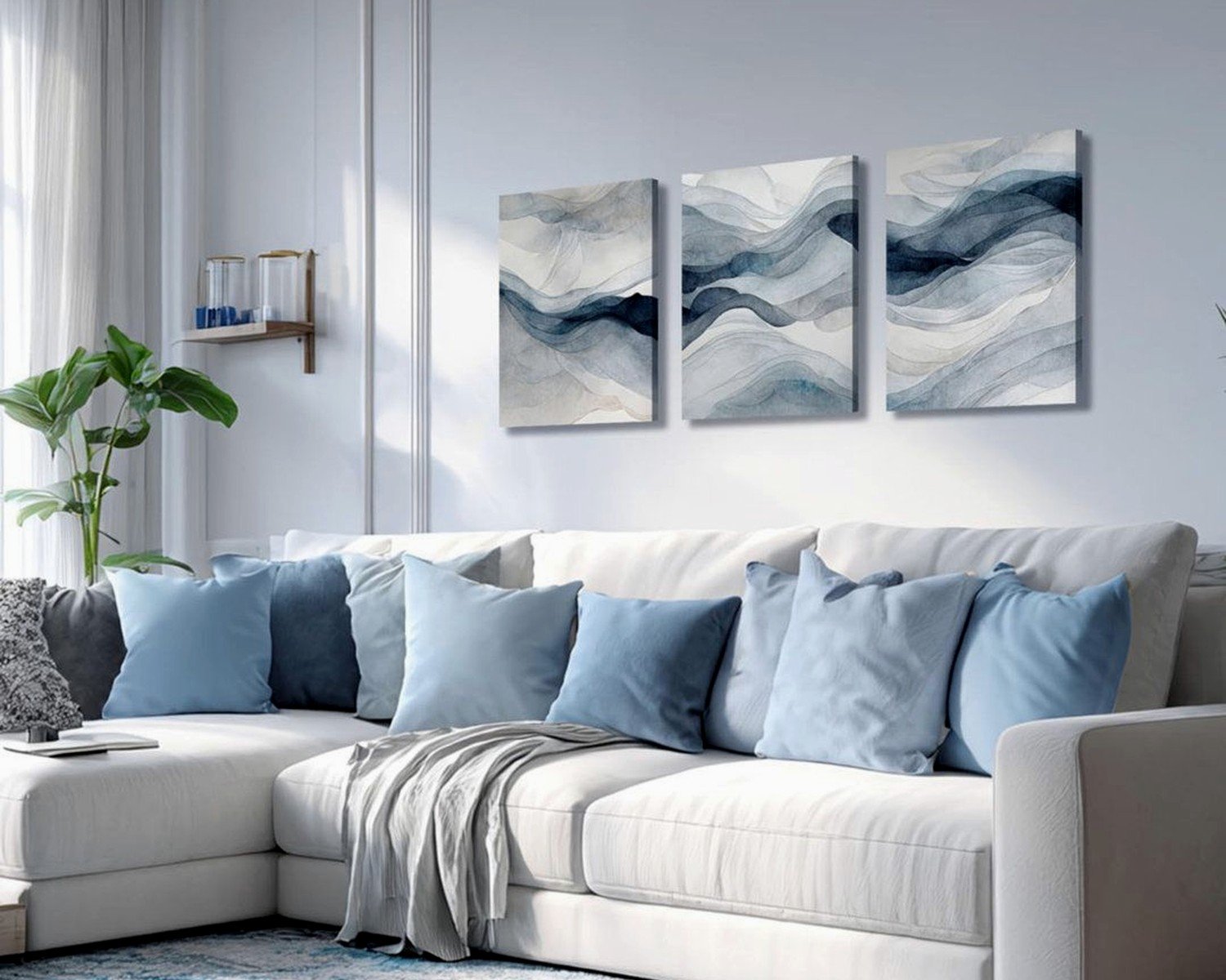
Jewel tones: Emerald green, sapphire blue, deep purple. These pop SO nicely against gray. I have this one piece in my own living room that’s mostly gray with this deep teal accent and everyone comments on it.
Blush and soft pastels: Works better with lighter grays. The combo of pale gray walls with dusty pink or soft sage art is very calming. Good for if you want that serene vibe but not like… boring.
One thing I learned – avoid muddy colors. Like those murky browns or dull greens that have no clarity. They’ll just blend into the gray and disappear. You want either clear, saturated colors OR very intentional neutrals.
Frame Selection Because It Matters More Than You Think
Okay so I used to think frames were whatever but they’re actually doing a lot of heavy lifting in a neutral space.
For modern gray living rooms:
- Thin black metal frames – sleek and don’t overwhelm the art
- Natural wood (oak or walnut) – adds necessary warmth
- White frames if your gray is super light and you want cohesion
- Brass or gold for warm grays specifically
Chunky ornate frames can work but only if that’s your whole vibe. Like if you’re doing traditional or maximalist styling. Otherwise they fight with the simplicity of gray walls.
I mixed frame colors in a gallery wall once and immediately regretted it. Looked chaotic. Now I stick to one frame color per wall, maybe two if they’re very different sizes and styles.
Matting Choices
White or cream mats are safe. Black mats are dramatic – use them when you want the art to feel more important or gallery-like. I love black mats with line drawings or prints that have a lot of white space.
Double matting (where you have two layers of mat board in different colors) can add sophistication but it’s also more expensive. I do this for smaller pieces that need more presence on the wall.
Specific Art Styles That Work
Let me just run through what I’ve actually used successfully because theory is nice but you need real examples.
Abstract art: This is probably the easiest route. Large-scale abstracts in your chosen color palette instantly add personality. I look for pieces with texture or visible brushstrokes because they add dimension to flat gray walls. The ones that are just printed on canvas feel cheap to me unless they’re really well done.
Black and white photography: Classic for a reason. Architectural photos, landscapes, portraits – all work. I framed a series of black and white city photos for a client’s gray living room last month and the contrast is perfect. Very crisp and clean.
Botanical prints: These add an organic element which gray spaces often need. Pressed leaves, vintage botanical illustrations, modern plant photography. Just make sure they have enough contrast to read against the gray.
Line drawings: Super trendy right now but I actually think they work. Simple one-line faces or figures or abstract shapes. Keep the frames simple and these can be really striking.
Textured pieces: Woven wall hangings, fiber art, anything three-dimensional. Gray walls make a great backdrop for texture because you can actually see all the dimension. I hung this chunky woven piece in cream and rust tones and it added so much warmth.
Geometric patterns: Mid-century style geometric prints work nicely. The clean lines complement the neutrality of gray without being boring.
wait I forgot to mention – avoid art that’s predominantly gray unless you’re very intentional about it. I see people buy gray abstract art for their gray walls and then everything just blends together. Unless there’s significant contrast or texture, it disappears.
Practical Hanging Tips
The center of your art should be at eye level, which is roughly 57-60 inches from the floor. But above furniture it’s different – you want 6-8 inches between the top of the sofa and the bottom of the frame.
Use actual picture hanging hardware. Those 3M strips are fine for lightweight pieces but anything substantial needs proper hooks. I’ve seen too many pieces crash down at 2am.
For gallery walls, I literally use a laser level now. My client last week watched me do this and was like “that seems excessive” but then when everything was perfectly aligned she got it.
If you’re hanging a heavy piece, find the studs. Or use drywall anchors rated for the weight. This isn’t the place to wing it.
Layering and Styling Around the Art
Your wall art shouldn’t exist in isolation. I always think about how it connects to the rest of the room.
Pull one accent color from your art into throw pillows or a blanket. Not matchy-matchy where everything is the same rust color, but like… echoes of it. This makes the space feel intentional.
Consider adding wall sconces or picture lights if your art is large or important enough. The lighting makes such a difference, especially in a gray room that might not get tons of natural light.
Lean smaller pieces on the mantel or console table instead of hanging everything. This creates layers and makes the space feel more collected over time rather than decorated all at once.
What Not to Do
Don’t hang everything too high – this is the most common mistake. People are scared of furniture blocking art so they hang it way up near the ceiling and it looks disconnected.
Don’t be afraid of negative space. You don’t need to fill every wall. Gray walls can handle some breathing room.
Don’t buy art just because it matches your couch. I mean obviously consider your existing colors but the art should be something you actually like, not just coordination for coordination’s sake.
oh and another thing – don’t use the wire on the back of frames if you can avoid it. It makes everything hang crooked. Use D-rings or sawtooth hangers for a flush mount.
Where I Actually Shop for Gray Living Room Art
Etsy has tons of downloadable prints you can get printed at your local print shop. Way cheaper than buying pre-framed and you control the frame choice.
Local art fairs and markets – I find unique pieces here that nobody else has. Plus supporting actual artists feels good.
Minted and Artfully Walls for more curated but still accessible options. Their framing is decent quality.
Vintage shops for old botanical prints or architectural drawings. These have character that new prints sometimes lack.
Society6 and Redbubble if you want something specific or quirky. Quality varies but returns are easy.
I’ve honestly found great stuff at HomeGoods too, you just have to dig through the bad stuff. went there last Tuesday while my cat was at the vet and found this amazing abstract piece for like $60.
For my own house I actually commissioned a local artist to do a custom piece that incorporated specific colors from my space. More expensive but it’s perfect and nobody else has it.
The thing about styling a gray living room is you’re starting with this beautiful neutral canvas. The art you choose literally defines the whole personality of the space. So take your time, test things out, and don’t be afraid to change your mind. I’ve rehung art in my own house probably five times because I’m never fully satisfied and that’s fine.
Just start with one piece you genuinely love and build from there. You don’t need to fill all the walls at once.