Wall Art Guide, Wall Art Tutoriels
Bird of Paradise Wall Art: Tropical Flower Exotic Decor
Jun
So I’ve been obsessing over bird of paradise wall art lately and honestly it’s one of those things that can either look absolutely incredible or totally tacky depending on how you approach it. Like, I just finished a project where my client wanted “tropical vibes” and we went through probably fifteen different pieces before finding the right one.
The thing about bird of paradise art is that it’s having this massive moment right now but you gotta be careful because it can read very 2019 instagram if you’re not thoughtful about it. I learned this the hard way when I bought this huge canvas print that looked amazing online and then it arrived and the colors were so oversaturated it literally hurt to look at.
Choosing the Right Style for Your Space
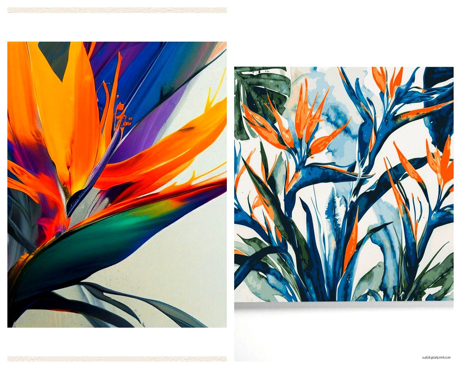
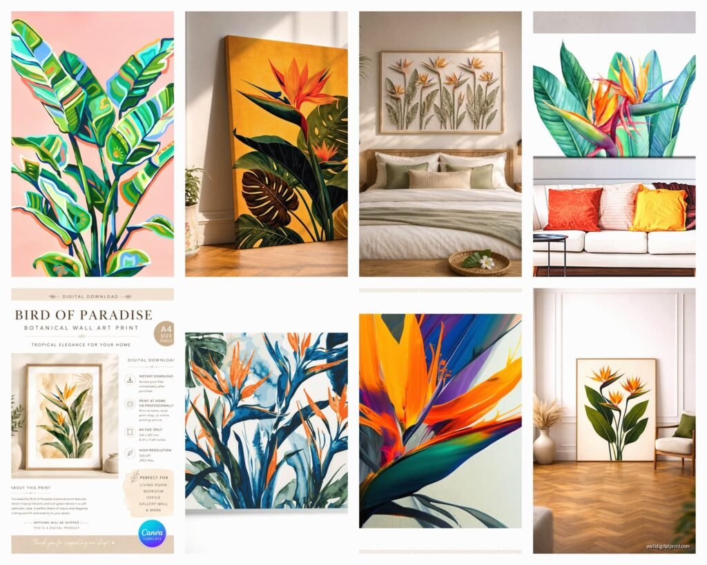
Okay so first thing – you need to figure out what style actually works with your existing decor because bird of paradise comes in like a million different artistic interpretations. There’s the super realistic botanical prints which I’m personally obsessed with right now, the watercolor versions that can be hit or miss, abstract interpretations, vintage botanical illustration style, and then the modern graphic design approach.
The realistic botanical prints work best in spaces that already have some natural elements. Like if you’ve got wood furniture, linen textures, maybe some actual plants (even if they’re fake don’t tell anyone). I used a massive realistic bird of paradise print in a client’s dining room last month and paired it with a reclaimed wood table and it was *chef’s kiss*. But that same print would’ve looked completely out of place in her friend’s ultra-modern apartment with all the chrome and glass.
Watercolor versions are tricky because they can go twee really fast. I’ve found they work best in bedrooms or bathrooms where you want something softer. There’s this one artist on Etsy – wait I need to find the name… okay I can’t remember right now but I’ll circle back to that. Anyway, watercolor bird of paradise pieces need to have some depth to them, not just wishy-washy pale colors or they disappear on the wall.
Abstract and Modern Interpretations
Abstract bird of paradise is where things get interesting. I recently saw this piece that was basically just the color palette and general shapes of the flower rendered in geometric forms and it was stunning. This style works in more contemporary spaces, especially if you’re trying to bring in color without going full tropical theme. Like you can have one abstract bird of paradise piece and nobody’s gonna think you’re trying to turn your living room into a tiki bar.
The vintage botanical illustration style is my secret weapon for clients who want something sophisticated. These look like they came from an old botanical textbook – usually on aged paper backgrounds with Latin names and everything. They add tropical elements without screaming TROPICAL VACATION which is important if you live somewhere like Minnesota and don’t wanna look like you’re in denial about your climate.
Size and Scale Matters More Than You Think
This is where people mess up constantly. They either go too small or don’t consider the proportions of the actual flower. Bird of paradise has these really distinctive long leaves and dramatic flowers that look best when you can actually see the details.
For above a sofa you’re looking at minimum 40 inches wide, honestly I’d go bigger. I did a 60-inch wide piece for someone last week and it completely transformed the room. But here’s the thing – if you’re doing a gallery wall situation, you can go smaller with individual pieces. I’m currently working on a layout with three 16×20 prints and it’s working because they’re part of a larger composition.
Single statement pieces need to be STATEMENT pieces. Don’t put a tiny 12×16 print on a huge wall and expect it to do anything. Your eye needs something to land on. My cat just knocked over my coffee thinking about it… anyway where was I.
Orientation Questions
Vertical vs horizontal is actually a big decision with bird of paradise art. The flower naturally grows vertically so portrait orientation feels more authentic, but landscape orientation can work better for certain wall spaces. I’ve got a horizontal piece in my own entryway because the wall space above my console table is wider than it is tall. The artist composed it with multiple flowers and leaves spreading across the canvas which makes the horizontal format make sense.
Color Palette Coordination
Okay so this is gonna sound obvious but the colors in your bird of paradise art need to actually work with your room. The classic bird of paradise has those bright orange and blue-purple tones which are GORGEOUS but also pretty bold. If your room is all neutrals this can be amazing as your pop of color, but if you’ve already got a lot going on colorwise you might want to look for pieces with more muted tones.
There are white bird of paradise varieties that make for really elegant art – way more subtle. I used a white bird of paradise photograph printed on textured paper for a client who wanted tropical elements but had this whole cream and sage green color scheme going. Worked perfectly.
Some artists play with unrealistic color palettes – I’ve seen bird of paradise in blush pinks, navy blues, emerald greens as the primary colors. These can be really cool if you’re trying to match specific colors in your space. There’s this one print I’m eyeing right now that’s done in coral and teal tones that would be perfect for a coastal vibe.
Material and Framing Considerations
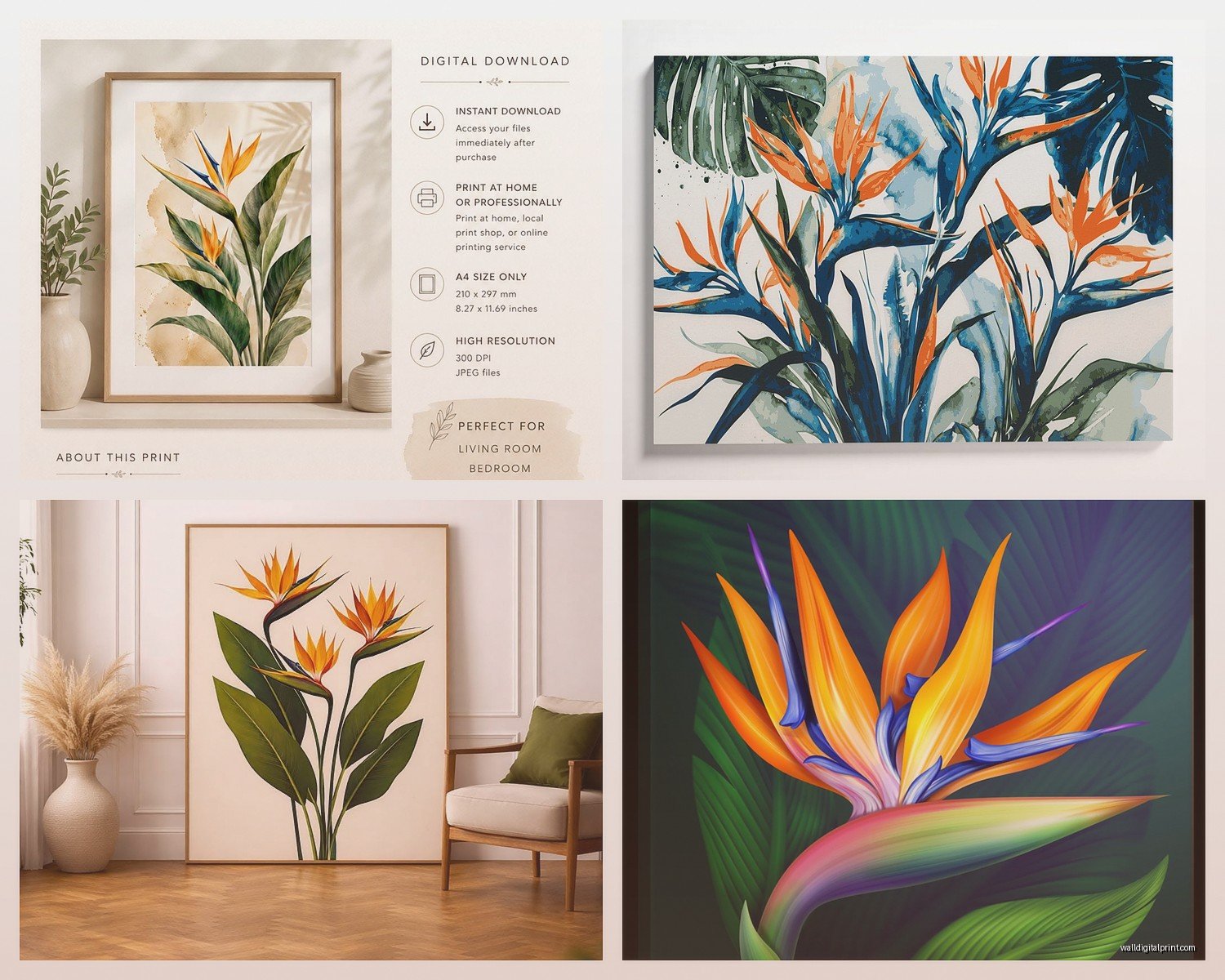
Canvas prints are the most common and honestly they’re fine for most situations. They’re affordable and you can hang them without framing which saves money. But – and this is important – make sure you’re getting a gallery-wrapped canvas where the image continues around the edges. Nothing looks cheaper than a canvas print with white edges.
Paper prints with proper framing look way more elevated in my opinion. I almost always recommend this route if budget allows. You can get museum-quality paper prints that have incredible detail and color accuracy. Frame them with a mat in a simple frame – doesn’t need to be fancy, just clean lines. I’m partial to thin black or natural wood frames for bird of paradise prints because ornate frames compete too much with the drama of the flower itself.
Metal prints are having a moment and they can look really cool with bird of paradise art, especially if you’re going for a modern vibe. The colors are incredibly vibrant on metal and there’s this luminous quality that works well with the tropical subject matter. They’re pricey though.
Acrylic and Glass Options
Acrylic prints are another option – the image is printed and mounted behind acrylic which gives it depth and makes colors pop. These look super high-end but they’re heavy and expensive. I used one in a corporate office space and it was worth the investment for that setting but probably overkill for most homes.
Traditional framing under glass is classic and protects the print. If you’re going this route with bird of paradise art, consider non-reflective glass because you don’t want glare obscuring those beautiful details. Yeah it costs more but it’s worth it.
Where to Actually Buy Good Pieces
Okay so I’ve bought bird of paradise art from like everywhere at this point. Etsy is honestly great for unique pieces and you’re supporting actual artists. Just read the reviews carefully and make sure you understand what you’re getting – is it a digital download you need to print yourself? An original? A print they’ll ship to you?
Society6 and Redbubble have tons of options from independent artists. The quality is decent for the price point. I’ve ordered several pieces from Society6 and they’re good for spaces where you don’t need museum-quality but want something better than a poster.
Minted has really beautiful curated options. Their printing quality is excellent and they have tons of framing options. More expensive than print-on-demand sites but worth it for important spaces. I just ordered from them last week actually for my office refresh.
Anthropologie randomly has amazing bird of paradise art sometimes. It’s hit or miss and overpriced but occasionally you find something perfect. Same with West Elm and CB2 – they jump on trends so they’ve definitely got tropical options right now.
For high-end stuff, check out Artfully Walls or Serena & Lily. These are investment pieces but the quality and uniqueness are there. I’ve used pieces from both for clients who wanted something nobody else would have.
Don’t sleep on local art fairs and markets either. I found this incredible bird of paradise painting at a local market last summer that I’m still obsessed with. It’s an original and cost less than some of the prints I’ve bought online.
Styling Bird of Paradise Art
So you’ve got your art, now you gotta style around it properly. This is where I see people struggle because they get the art right but then everything else fights with it.
Keep the surrounding decor relatively simple. Bird of paradise is already a statement so you don’t need to pile on more bold patterns and colors right next to it. I like pairing it with solid color pillows, simple texture through throws or rugs, maybe some metallic accents.
Real plants near your bird of paradise art is actually really nice – creates this cohesive natural moment. Doesn’t have to be an actual bird of paradise plant (though that would be cool), just some greenery. I’m watching this show about plant collectors right now and it’s giving me so many ideas…
Lighting Your Art
Don’t forget about lighting. Bird of paradise art deserves to be properly lit. If you can add a picture light or even just position a floor lamp to highlight it, do that. The colors and details really come alive with good lighting.
Avoid putting it in direct sunlight though, especially if it’s a paper print. The colors will fade over time and that’s just sad.
Common Mistakes to Avoid
Going too matchy-matchy with the tropical theme. Like you don’t need palm leaf pillows AND pineapple accessories AND flamingo everything just because you have bird of paradise art. Pick your tropical moment and let the rest of the room be more neutral.
Buying art that’s too small for the space. I already mentioned this but seriously it’s the number one mistake. Measure your wall, use painter’s tape to mark out the size you’re considering, live with it for a day before ordering.
Hanging it at the wrong height. Center of the art should be at eye level, which is roughly 57-60 inches from the floor. I use the 57-inch rule as my starting point and adjust from there based on furniture and ceiling height.
Not considering the room’s purpose. Super bright, energetic bird of paradise art might be too stimulating for a bedroom where you want calm. Save the vibrant pieces for living rooms, dining rooms, entryways.
Mixing Bird of Paradise with Other Art
If you’re doing a gallery wall, bird of paradise can absolutely be part of it but you need to be thoughtful. I usually mix it with other botanical prints, abstract pieces that pull colors from the bird of paradise, or black and white photography for contrast.
Keep the frames consistent if you’re doing multiple pieces. All black, all wood, all white – whatever matches your style but keep it cohesive. The art itself can vary in style and subject but unified framing pulls it together.
Scale variation is good in gallery walls. Mix larger and smaller pieces but make sure they feel balanced. I usually do one or two larger anchor pieces and fill in with smaller ones.
Seasonal Rotation Strategy
Here’s something I do that clients always find interesting – I rotate art seasonally. Bird of paradise is perfect for spring and summer but sometimes I swap it out for fall and winter. Not saying you have to do this but if you get tired of looking at the same thing, it’s an option.
I store off-season art in those flat under-bed storage containers. Keeps everything protected and organized.
Honestly though if you really love your bird of paradise art there’s no reason you can’t keep it up year-round. I have a client who has a massive bird of paradise piece in her living room and we just adjust the styling around it seasonally – warmer throws and pillows in winter, lighter fabrics in summer. Works great.
The key with any art is that you actually love it and it makes you happy when you see it. Don’t buy something just because it’s trendy or because someone told you it would look good. If bird of paradise doesn’t speak to you, that’s totally fine. But if you’re drawn to it, don’t let anyone tell you it’s too trendy or too bold. Your space should reflect what you love.