Wall Art Guide, Wall Art Tutoriels
Blue Metal Wall Art: Ocean Sky Steel Sculpture Designs
Oct
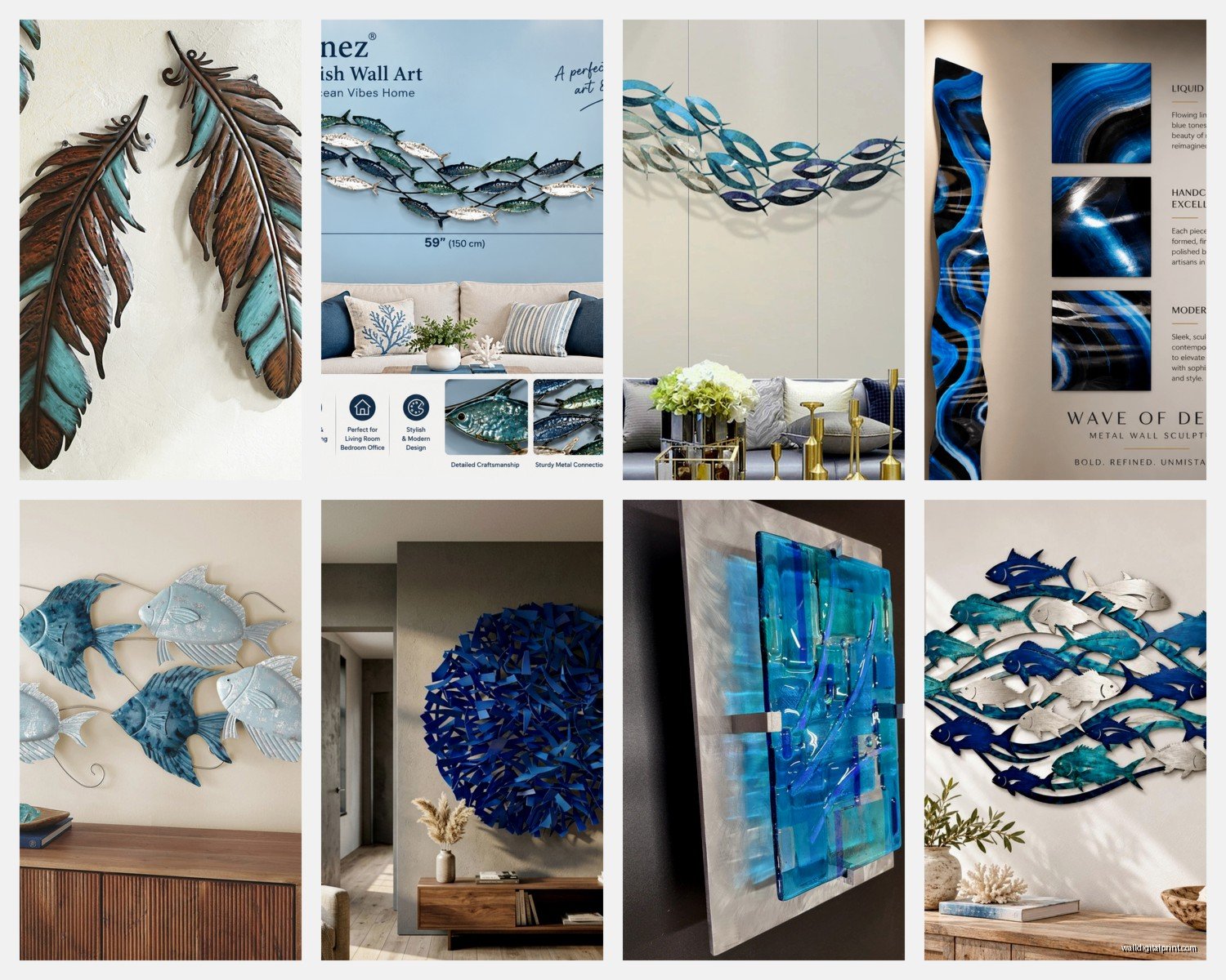
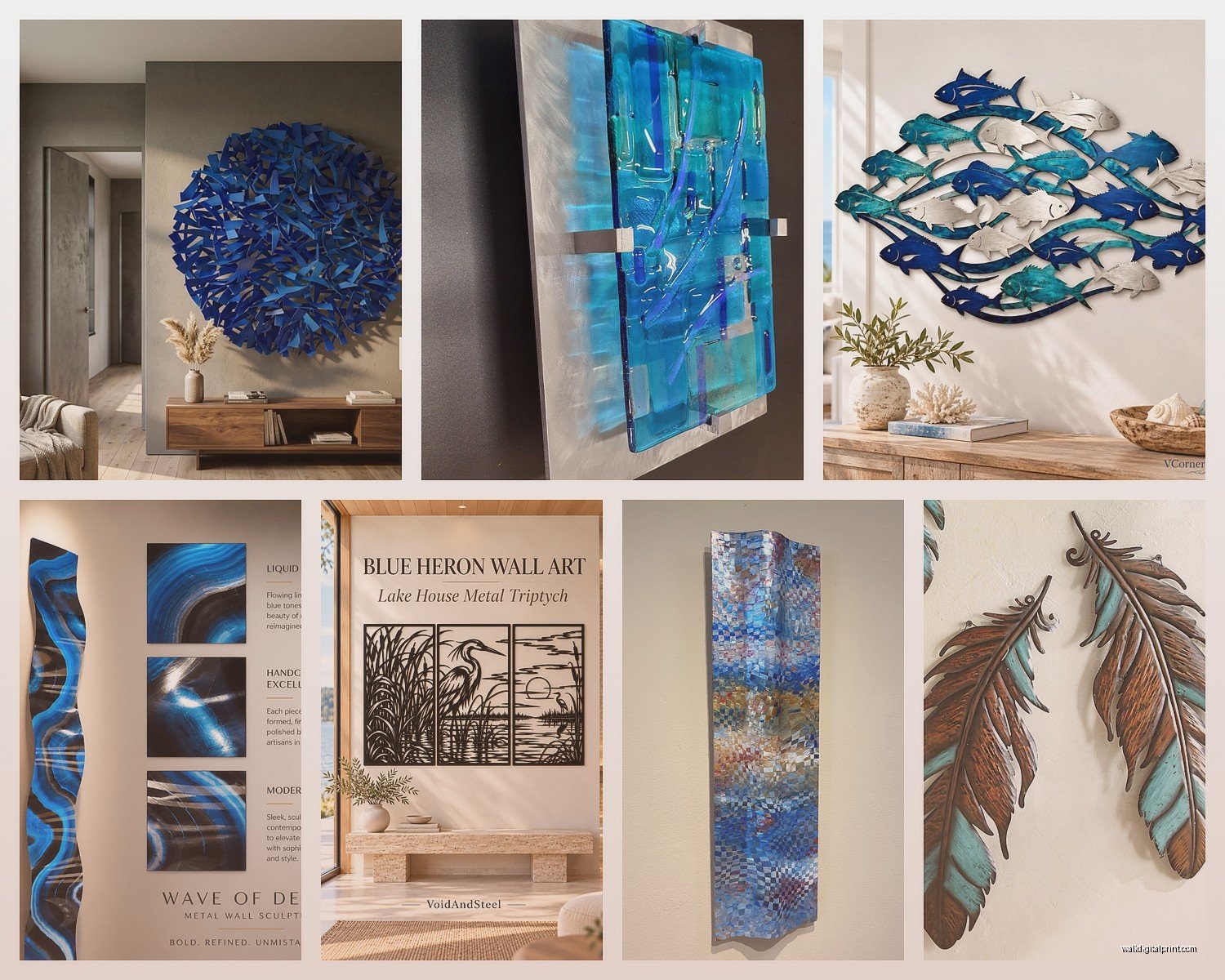
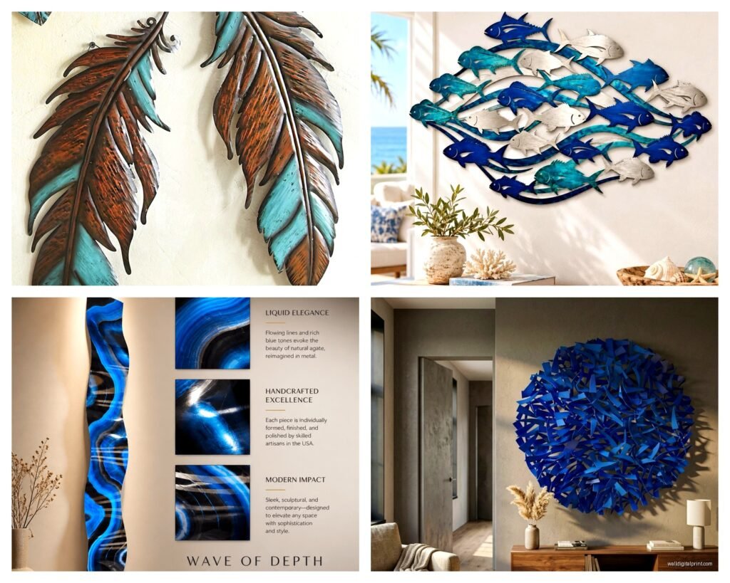
So I’ve been obsessed with blue metal wall art lately and honestly it started because this client wanted something “oceanic but not beach house tacky” and I went down this whole rabbit hole of steel sculptures that look like they belong in a modern gallery but also won’t make your living room feel cold.
First thing you gotta know is that blue metal art comes in like three main finishes and they all hit differently depending on your light. There’s powder-coated blue which is super matte and consistent, then there’s patina blue which has that aged copper vibe with turquoise undertones, and my personal favorite is the heat-treated steel that gets these insane gradients from navy to almost silver. I have a piece in my hallway that’s heat-treated and depending on whether it’s morning or evening it looks completely different.
The Finish Makes or Breaks Everything
Powder coating is gonna be your most affordable option and honestly for a first piece it’s solid. The color stays consistent, doesn’t fade in sunlight, super easy to clean. I wipe mine down with just water and it’s fine. But here’s the thing nobody tells you – powder coat can look flat if you don’t have the right lighting. You need either natural light coming from the side or you need to install a picture light above it because otherwise it just sits there like a blue blob on your wall.
Patina finishes are where things get interesting but also more expensive. This is actual oxidation on copper or copper-alloy steel, so you’re getting greens and blues and sometimes these rust-orange accents. I installed one in a bathroom last month and the humidity actually makes it look better over time. The patina deepens. But if you’re a control freak about things staying exactly how you bought them, this isn’t your move. It’s a living finish.
Heat-treated or torch-fired steel is my jam though. The artist literally uses a blowtorch to create these color zones and every piece is unique. I’ve got one that cost me way too much but I stare at it while drinking coffee every morning so…worth it? The blues range from this pale sky color to deep ocean navy and there’s usually purple or gold undertones in there. The catch is you can’t really clean these aggressively. Just dust them. Any chemical cleaner will mess with the oxide layer.
Size and Scale Without Losing Your Mind
Okay so funny story I bought a piece online that was listed as “large” and it showed up and was basically the size of a dinner plate. Learn from my mistakes. Always check actual dimensions in inches not just small/medium/large descriptions.
For over a sofa you want something that’s about two-thirds the width of your sofa. So if you’ve got a standard 84-inch couch you’re looking at like 56 inches wide minimum. I know that sounds huge but trust me anything smaller just floats there looking lost. Height matters less but I usually go for something between 24-36 inches tall.
Entryway or narrow walls are different. You can go vertical. I have this steel sculpture that’s like 48 inches tall but only 16 inches wide and it works perfectly next to my door. Creates height without taking up visual space horizontally.
And if you’re working with a really big wall like over a bed or a two-story entryway, consider getting multiple pieces instead of one massive one. I did three separate blue metal pieces in different sizes for a client, all with ocean wave themes but different styles. Clustered them together and it looks way more expensive than it was. Plus you can rearrange them if you get bored.
The Weight Thing Nobody Mentions
Metal art is HEAVY. Like heavier than you think. That beautiful 36-inch steel wave sculpture? Probably 15-20 pounds minimum. You cannot just hammer a nail in drywall and hope for the best.
You need wall anchors. I use toggle bolts for anything over 10 pounds and I usually put in two even if the piece only has one hanging point, just to be safe. My neighbor didn’t do this and her metal art literally pulled out of the wall at 2am and scared the hell out of everyone. Her dog still won’t go in that room.
For really heavy pieces like over 30 pounds you’re gonna want to find studs. Use a stud finder, mark them with painter’s tape, and attach a mounting board to the studs first, then hang your art from that. It’s extra work but I’ve never had a piece fall doing it this way.
Ocean Wave Designs That Actually Work
There’s so many wave designs out there and most of them are…bad. Like clearly made in a factory with zero artistic input. What you want is something with actual movement and dimension.
Look for pieces that have layered elements. The best wave sculptures I’ve found have multiple sheets of metal cut and layered so there’s depth. Light hits the front layer different than the back layer and you get shadows and dimension. Flat laser-cut waves are fine for like an office but they don’t have that wow factor.
Abstract waves are usually better than literal ones too. I’ve seen pieces that are trying so hard to look like an actual photograph of a wave and they just end up looking cheesy. The ones that suggest movement with curved lines and flowing shapes read as more sophisticated.
Right now I’m really into geometric ocean art. It’s like…the ocean concept but made from angular geometric shapes instead of flowing curves. Sounds weird but it works especially in modern or industrial spaces. Very different vibe from traditional wave art.
Sky and Cloud Sculptures
Sky-themed metal art is having a moment and I’m here for it. These are usually more abstract than ocean pieces. Lots of circles representing the sun or moon, horizontal lines for horizons, sometimes bird silhouettes.
The blue in sky art tends to be lighter and more varied. You’ll see powder blues, baby blues, mixed with white or silver. These work really well in bedrooms because they’re calming without being boring.
I installed this one piece last week that’s basically concentric circles in different shades of blue metal with some bronze accents and it’s supposed to represent a sunrise over water. Sounds potentially tacky but in person it’s stunning. The client put it in their meditation room and honestly I get it.
Cloud sculptures are trickier. You want something that has movement and air to it, not just blob shapes. Look for pieces where the metal is curved or has cutouts so you can see the wall behind it. That negative space is what makes it feel light and airy instead of heavy.
Mixing Blue Metal with Other Decor
This is where people get nervous but honestly blue metal is super versatile. It works with way more than you’d think.
With wood tones it’s *chef’s kiss* – the warmth of wood plus the coolness of blue metal is just balanced perfection. I have walnut furniture and my blue steel art pieces look incredible against it. Even lighter woods like oak or maple work great.
White walls are the obvious choice but don’t sleep on gray walls. A medium gray with blue metal art creates this really sophisticated monochromatic vibe. I did this in my bedroom and it feels like a boutique hotel.
Beige or tan walls…okay this is hit or miss. You need to make sure your blue has some warmth to it. A powder-coated navy or a patina piece with green undertones will work. Pure cobalt blue on beige can look off.
And wait I forgot to mention – blue metal with brass or gold accents is having a major moment. If your art piece has mixed metals, even better. But you can also just style it with gold picture lights or put it near gold decor objects.
Lighting Your Metal Art Properly
This is gonna sound extra but proper lighting makes a $100 piece look like a $500 piece, I swear.
Picture lights are the easiest solution. You mount a small LED light bar above the piece angled down at like 30 degrees. For metal art you want warm white LEDs (around 3000K) not cool white. Cool white on blue metal just looks harsh and commercial.
Track lighting works if you already have it but you gotta position it right. The light should hit the art from an angle not straight on. Straight light flattens everything. Side lighting or lighting from above creates shadows in the dimensional parts and that’s where the magic happens.
Natural light is free but unpredictable. If you have a window opposite your art, great. If the window is right next to it you might get glare depending on the finish. I have this one patina piece that looks incredible in afternoon sun but kinda dull in morning light, so placement matters.
My cat keeps trying to sleep in front of my entryway piece because the sun hits it and warms up that section of floor, which is…not the intended use but whatever makes him happy.
Where to Actually Buy This Stuff
Etsy is honestly your best bet for unique pieces from actual artists. Search for “metal wall art blue” or “steel ocean sculpture” and filter by your size needs. Read reviews carefully and check if they show photos of the actual product in homes not just the studio shots.
Wayfair and Overstock have options but it’s mostly mass-produced stuff. Fine for a budget but don’t expect heirloom quality. I’ve ordered from both and the pieces are lighter weight metal, sometimes aluminum instead of steel. They work for rentals or if you like changing your decor frequently.
Local metal artists are my favorite source though. Check Instagram for metalworkers in your area. Commission pieces are usually only like 20-30% more than buying ready-made and you get exactly what you want in the exact size you need. Plus you’re supporting actual artists which feels good.
I got a custom piece made last year – sent the artist photos of my space, my color scheme, rough dimensions, and she came back with three design concepts. Went with option two and the final piece is literally perfect for that wall. Cost me about $400 for a 48×30 inch piece which honestly isn’t bad.
Installation Tips That’ll Save Your Walls
Use a level. Like actually use one don’t just eyeball it. Even being off by one degree is noticeable with metal art because the lines are so clean and precise.
Measure twice, drill once. Or in my case measure three times because I’m paranoid. Mark your holes with pencil first, step back and look at the placement from across the room, then commit.
If your piece has a wire hanging system on the back, measure from the top of the frame to where the wire sits when pulled taut. That’s your hanging height. Subtract that measurement from where you want the top of your art to be. Math is annoying but necessary.
For pieces with D-rings or sawtooth hangers, make sure they’re level with each other. Sometimes they get installed slightly off and then your art hangs crooked and it’ll drive you insane.
Command strips work for lightweight pieces under 5 pounds but honestly I don’t trust them for anything valuable. They’re great for testing placement before you commit to drilling though. Stick up your art, live with it for a day, make sure you like it there, then install properly.
Styling Around Your Blue Metal Art
Keep it simple. Metal art is usually a statement piece so you don’t need much else competing with it. I see people put these gorgeous sculptures on walls and then surround them with five other things and it’s just visual chaos.
If you’re putting it over a console table, style the table minimally. Maybe a plant on one side and a small object on the other. Let the art be the focal point.
Books in blue tones nearby can create a nice echo. I have this whole shelf of blue and white book spines near one of my pieces and it feels intentional without being matchy-matchy.
Textiles in complementary colors help tie it together. Blue metal art with cream or white throw pillows, or gray blankets, or even rust-orange accents if your piece has warm undertones.
And honestly sometimes the best styling is nothing. Just the art on a clean wall with good lighting. That’s it. That’s the whole vibe.
Oh and another thing – don’t hang it too high. The center of your art should be at eye level which is usually around 57-60 inches from the floor. I see so many people hang stuff way too high and then you’re craning your neck to look at it.
The main thing is just go for it. I spent like three months deliberating over my first blue metal piece and now I have six and wish I’d started sooner. They age well, they don’t go out of style, and every single person who comes to my place comments on them. Worth the investment.