Wall Art Guide, Wall Art Tutoriels
Chakra Wall Art: Energy Centers Spiritual Healing Decor
Jul
So I’ve been working with chakra wall art for like three years now and honestly it started because this client wanted her meditation room to “feel more energetically aligned” and I was like okay sure, let me figure this out. Turned into this whole thing where I now help people pick chakra art all the time.
First thing you gotta know is that chakra art isn’t just slapping a rainbow on your wall and calling it spiritual. Each energy center has specific colors, symbols, and honestly different vibes that either work in a space or just look like you bought a poster at a college dorm sale.
Understanding the Basic Chakra System for Decor
The seven main chakras run from your root (base of spine) up to your crown (top of head), and each one corresponds to different colors and life aspects. Root is red and about grounding, sacral is orange for creativity, solar plexus is yellow for personal power, heart is green or pink for love, throat is blue for communication, third eye is indigo for intuition, and crown is violet or white for spiritual connection.
When I’m helping someone pick chakra art, I always ask which energy center they’re trying to work with. Like my friend Sarah wanted to boost her confidence for job interviews so we focused on solar plexus yellow pieces for her home office. Made way more sense than just getting a generic all-chakras poster.
Types of Chakra Wall Art That Actually Work
Okay so there’s basically a few categories and some are way better than others depending on your space.
Single Chakra Focus Pieces
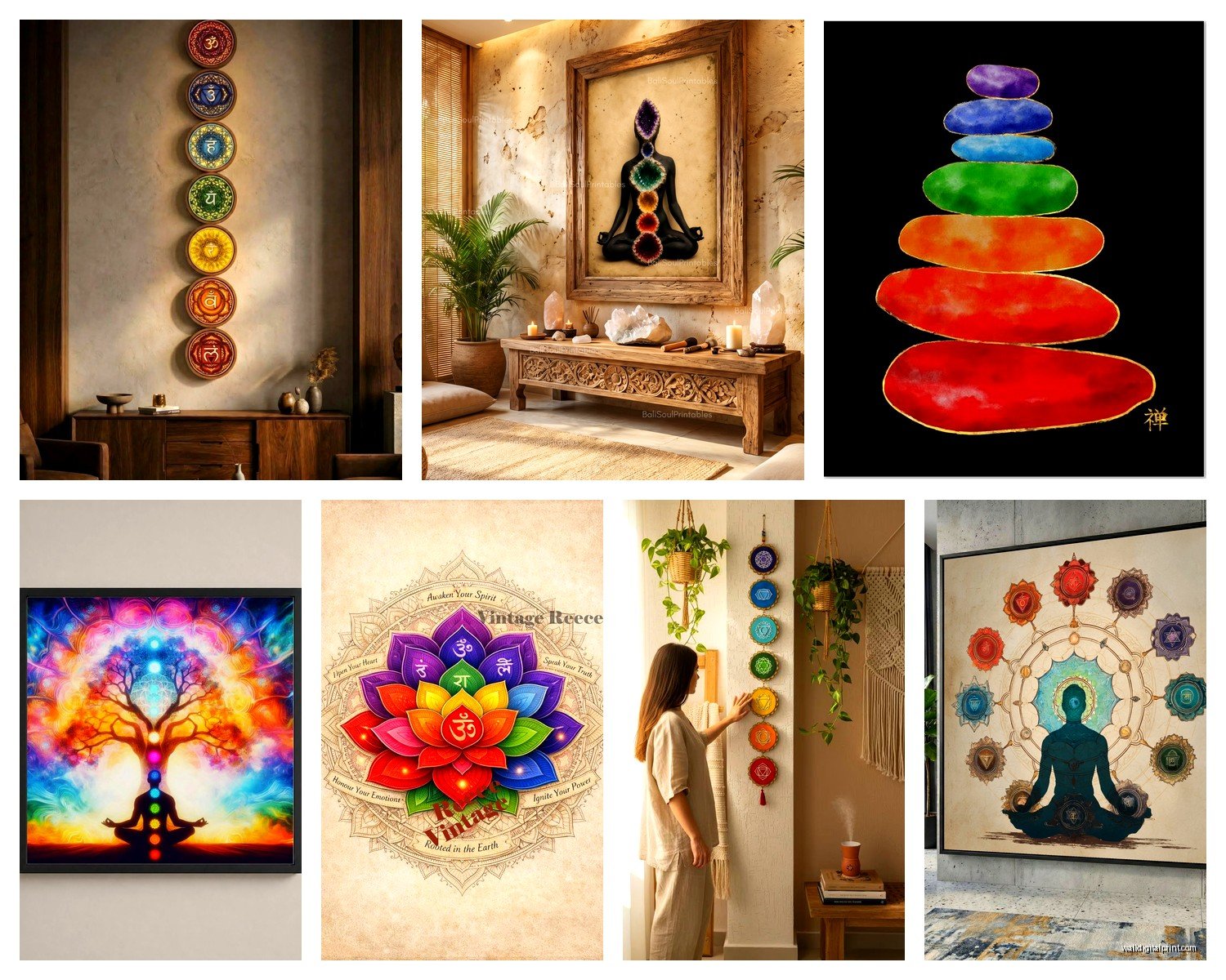
These are my favorite honestly. You pick one energy center and get art that represents just that chakra. Could be abstract art in the right color, could be the actual Sanskrit symbol, could be a mandala design. I have this gorgeous heart chakra piece in my bedroom that’s this soft green with gold leaf accents and it doesn’t scream “I’M SPIRITUAL” to guests but it serves its purpose.
For single chakra pieces, size matters more than you’d think. A tiny 8×10 print of your root chakra symbol isn’t gonna do much energetically or aesthetically. I usually recommend at least 16×20 for a focal point, bigger if you’ve got the wall space.
Seven Chakra Linear Designs
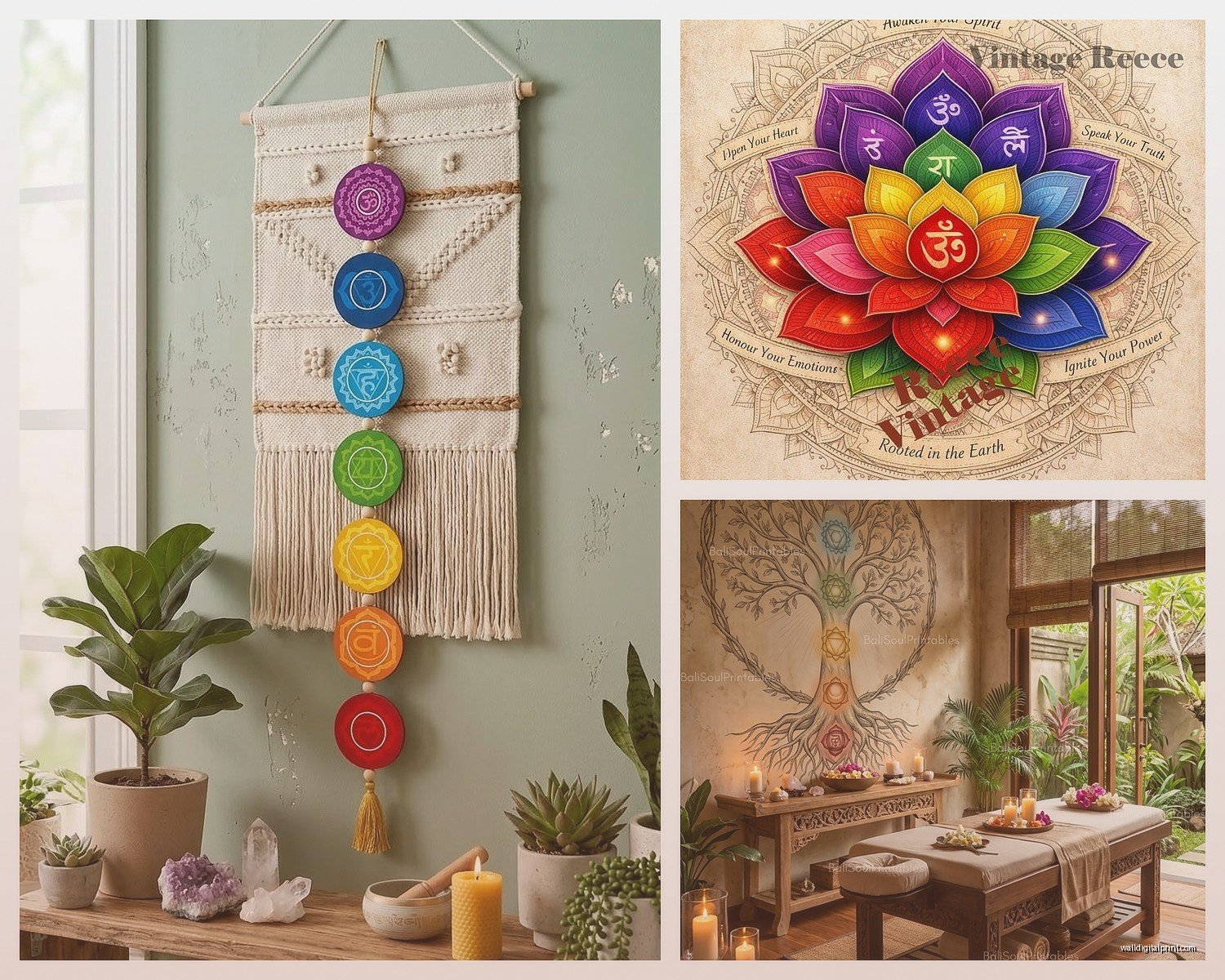
These show all seven chakras in a vertical line, usually as circles or lotus flowers going up. They’re popular because you get the whole system represented, but here’s the thing… they can look really dated if you’re not careful. I’ve seen so many that look like they came from a 1997 yoga studio.
If you’re gonna do this style, look for modern interpretations. Clean lines, minimal design, maybe watercolor instead of those super saturated digital prints. There’s this artist on Etsy I love who does chakra sets with gold foil that actually looks sophisticated.
Abstract Chakra Art
This is where it gets interesting because you can have chakra-aligned art that doesn’t look explicitly spiritual. Think abstract paintings or prints in chakra colors arranged intentionally. I did this in a corporate office once where the CEO wanted “good energy” but couldn’t have obvious spiritual stuff. We did a series of abstract pieces in chakra colors going down the hallway and nobody knew but him.
The trick with abstract is making sure the colors are actually accurate to the chakras. I’ve seen people use like hot pink for root chakra and it’s just… no. Root needs to be deep red, earthy, grounding. Not bubblegum.
Placement Strategies That Make Sense
Okay so this is where people get confused because they think chakra art can just go anywhere. But placement actually matters if you want it to function beyond just looking pretty.
I usually match the chakra to the room’s purpose. Root chakra art works great in entryways, living rooms, anywhere you want people to feel grounded and safe. Sacral chakra (orange) is perfect for creative spaces, dining rooms, or bedrooms because it’s about pleasure and creativity. Solar plexus yellow belongs in home offices or anywhere you need confidence and personal power.
Heart chakra green or pink is obviously great for bedrooms and living spaces where you want love and connection energy. Throat chakra blue works in offices, studios, anywhere you communicate or express yourself. Third eye indigo is perfect for meditation spaces or reading nooks. Crown chakra violet or white I usually save for meditation rooms or above doorways as like a blessing vibe.
My cat keeps trying to sit on my keyboard sorry… anyway, placement.
Height Considerations
Here’s something I figured out by accident when I hung chakra art too low in my own house. The traditional rule is center of artwork at 57-60 inches, but with chakra art I actually think about where that energy center sits on the body. Like root chakra pieces can go lower, closer to furniture. Crown chakra art I’ll hang higher than normal, sometimes even on the ceiling if it’s a meditation space.
This might sound weird but I swear it makes a difference in how the space feels. When I moved my throat chakra piece from low on the wall to higher up, closer to actual throat height when standing, the whole room felt different.
Color Intensity and Room Dynamics
Not all chakra colors work at full saturation in every space. I learned this the hard way with a super bright red root chakra painting in a small bedroom. It was like sleeping in a warning sign.
Root chakra red needs to be either used in small doses or in deeper, earthier tones. Burgundy, terracotta, rust… these work better in living spaces than fire engine red.
Sacral orange can actually handle more brightness but I still prefer peachy or burnt orange tones. Pure traffic cone orange is aggressive.
Solar plexus yellow is tricky because yellow can feel harsh. I go for golden yellows, mustard, champagne tones. Softer.
Heart chakra green is probably the easiest because most greens feel naturally calming. Emerald, sage, forest green… all work. Pink hearts chakra is harder because pink can read really feminine or childish if you’re not careful. Dusty rose, blush, mauve are better than hot pink.
Throat chakra blue works in almost any shade but I love deep teals and navy for sophistication.
Third eye indigo can go almost purple or stay closer to deep blue. Both work but consider your other colors in the room.
Crown chakra violet is where I usually go really light, like lavender or even just white with purple undertones.
Mixing Chakra Art with Regular Decor
You don’t have to make your whole house look like a crystal shop to have chakra art. Actually please don’t do that unless you run a crystal shop.
I mix chakra pieces with regular art all the time. The key is treating the chakra art as part of your color story for the room. If you’ve got a blue throat chakra mandala, your other art can have blue in it too. Create cohesion through color and style rather than making everything spiritual themed.
In my living room I have a root chakra abstract piece next to landscape photography and a vintage mirror. They all work together because the colors coordinate and the frames match. Nobody walks in and thinks “meditation studio” but the energy is there.
Frame Choices Matter
Oh and another thing, frames can make or break chakra art. Those cheap black plastic frames from the craft store make even beautiful chakra art look like dorm room decor. Invest in decent frames.
For traditional chakra symbols and mandalas, I like natural wood frames or even ornate gold/brass if the style fits. For modern abstract chakra art, clean black or white frames work. For bohemian spaces, you can do unframed canvas or even fabric wall hangings.
I have this throat chakra piece that’s a blue mandala and I put it in a weathered gold frame with a white mat. Looks expensive, wasn’t that bad, totally elevated the piece.
DIY vs Buying Chakra Art
Look, I’ve tried making my own chakra art and unless you’re actually artistic, just buy it. I attempted painting a seven chakra piece during lockdown and it looked like a preschool project. Some things are worth paying for.
That said, if you wanna try DIY, printable chakra art from Etsy is a good middle ground. You buy the digital file, print it at a local print shop on nice paper, frame it yourself. Way cheaper than buying finished art and you can control the size.
There’s also chakra art done with crystals or stones arranged in patterns, and that’s actually doable as DIY if you have patience. I made a root chakra piece using red jasper chips glued to canvas in a spiral pattern. Took forever but it turned out decent.
Where to Actually Buy Good Chakra Art
Etsy is my go-to honestly. You can find independent artists doing beautiful work at reasonable prices. Search for “chakra art print” or “chakra wall art” and filter by reviews. I’ve found amazing stuff there.
Society6 and Redbubble have chakra designs that you can get printed on different products including various sizes of prints and canvases. Quality varies by artist but there’s tons of options.
Local metaphysical shops sometimes have chakra art but it’s usually overpriced and limited selection. Worth checking though.
If you want something really custom, commissioning an artist is the way to go but expect to pay several hundred dollars. I had a client commission a huge seven chakra piece for her yoga studio and it was like $800 but absolutely stunning and exactly what she wanted.
Common Mistakes People Make
Biggest mistake is going too literal with the symbols. You don’t need the Sanskrit symbol for every single chakra on your wall. Sometimes the color alone is enough, or an abstract representation.
Another thing is buying really small prints and expecting them to have impact. Chakra art needs presence. Either go big with one piece or do a gallery wall of multiple chakras.
People also forget about lighting. Chakra art with rich colors needs good lighting to show properly. I installed picture lights above my client’s chakra gallery wall and it made such a difference.
Oh and mixing too many metallics. If your chakra art has gold accents, don’t frame it in silver. Keep your metals consistent for a polished look.
Combining Multiple Chakras in One Space
You can definitely have multiple chakra energies in one room but be strategic about it. I usually pick 2-3 chakras max for a single space based on the room’s purpose.
Like in a bedroom you might do heart chakra green and crown chakra lavender for love and spiritual connection. In a home office, solar plexus yellow and throat chakra blue for confidence and communication.
If you’re doing all seven chakras, make sure they’re either in one cohesive piece or arranged in a way that makes visual sense. I did a stairway once with a different chakra on each level going up and it was perfect because it literally moved through the energy centers as you climbed.
Gallery Wall Approach
Gallery walls with mixed chakra art can work but you need a unifying element. Same frame style, same mat color, or a consistent design aesthetic across all pieces. Otherwise it looks chaotic.
I recently did a gallery wall with seven small chakra mandalas all in matching white frames with white mats. The colors were different obviously but the consistent framing made it feel intentional and clean.
You can also do a chakra gallery wall mixed with other meaningful art, photos, or mirrors. Just make sure the chakra pieces are the anchor pieces and arrange everything else around them.
Seasonal Rotation
This might be extra but I actually rotate my chakra art seasonally sometimes. Winter I lean toward root chakra grounding energy, spring I bring in more sacral and heart chakra pieces, summer is solar plexus confidence, fall I go back to root and add some third eye for introspection.
You don’t have to do this but if you like changing your decor seasonally anyway, it’s a cool way to work with different energies throughout the year.
Okay I think that covers most of what I’ve learned from working with chakra art in like dozens of spaces at this point. The main thing is just pick pieces that actually resonate with you and don’t worry too much about doing it “right.” If a piece makes you feel good when you look at it, that’s what matters for your space and your energy.