Wall Art Guide, Wall Art Tutoriels
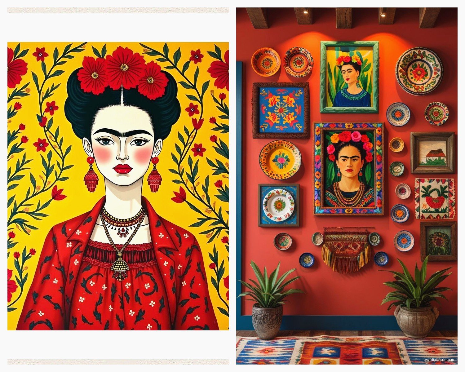
Frida Kahlo Wall Art: Mexican Artist Self-Portrait Decor

Jul
So I’ve been completely obsessed with Frida Kahlo wall art lately and honestly it started because a client wanted to do this whole vibrant Mexican-inspired living room and I went down this rabbit hole of researching everything about her work. Now I have like three pieces in my own apartment because apparently I can’t help myself.
The thing about Frida’s work is it’s SO bold that you really gotta think about where you’re putting it. Like, you can’t just slap a massive self-portrait on any wall and call it a day. I learned this the hard way when I bought this gorgeous print of “The Two Fridas” and it completely overwhelmed my bedroom because the colors were just… too much for where I sleep, you know?
Understanding What Actually Works in Different Spaces
Okay so the self-portraits are obviously the most iconic pieces. The ones with the flower crowns and the dramatic eyebrows and sometimes the monkeys. But here’s what I’ve noticed after placing these in probably fifteen different homes now – the background color matters MORE than the actual portrait sometimes.
If you’ve got a room with lots of neutrals (beige, white, gray walls), you can go big with the really colorful pieces. I’m talking about the ones with those vibrant reds, deep blues, sunny yellows. They become this incredible focal point and everything else just falls into place around them. My friend Sarah has this massive canvas of Frida with a red background in her dining room and it’s literally the first thing everyone talks about when they walk in.
But if your space already has color going on – like maybe you’ve got a terracotta wall or some bold furniture – you might wanna look at the more subdued portraits. There are these beautiful versions with softer backgrounds, more muted tones. They still have that Frida energy but they won’t fight with your existing palette.
Size and Placement (This Gets Tricky)
I always tell people to measure twice, visualize three times. Sounds dramatic but whatever, it works. The classic mistake is going too small. A tiny Frida print on a huge wall just looks sad and lost. She deserves better than that.
For above a sofa, you want something that’s roughly two-thirds the width of the couch. So if you’ve got a 90-inch sofa, aim for around 60 inches of art width. You can do this with one large piece or a grouping – oh and another thing, gallery walls with multiple Frida pieces can be STUNNING but they’re hard to pull off. I usually mix her portraits with other Mexican folk art, maybe some botanical prints or vintage tourism posters.
My living room has a single 40×30 inch canvas above my credenza and it’s perfect. Any smaller and it would’ve disappeared. Any bigger and I couldn’t fit the lamp and the plants I have on that surface because the proportions would feel off.
Bedroom Placement
This is gonna sound weird but I don’t usually recommend the super intense Frida pieces for bedrooms. Like “The Broken Column” or some of her more painful self-portraits – they’re incredible art but maybe not what you wanna see right before sleep? I had “The Wounded Deer” in my bedroom for like two weeks and my dreams got weird.
Go for the flower crown portraits or the ones with her pets. There’s this beautiful series of prints with just her face surrounded by tropical leaves and flowers that work perfectly in bedrooms. Still distinctly Frida but with a calmer energy.
Frame Choices That Don’t Suck
Okay so funny story, I bought this gorgeous Frida print from Etsy and then spent more on the frame than the actual art because I’m apparently incapable of making budget-friendly decisions. But frames really do make or break these pieces.
For traditional oil painting reproductions or really detailed prints, I love a simple black or dark wood frame. Nothing ornate – you want the focus on Frida, not the frame. The black especially makes the colors pop like crazy. I use these thin black metal frames from this framing place downtown and they’re chef’s kiss.
If you’re going for a more bohemian vibe, natural wood frames work beautifully. Light oak or walnut tones complement the earthy elements in a lot of her work. My client with the Mexican-inspired living room? We did three medium-sized Frida prints in these chunky reclaimed wood frames and hung them in a vertical line. So good.
Canvas prints without frames can work too, especially the gallery-wrapped kind where the image continues around the edges. These feel more contemporary and casual. I have one of these in my kitchen actually – it’s Frida with a bunch of fruit and it just leans against the wall on top of my cabinets. Very relaxed vibe.
Matting or No Matting
Usually no mat for Frida pieces, honestly. The work is already so vibrant and contained that adding a white or cream mat just creates distance between you and the art. Unless you’re doing a very formal gallery wall situation, skip it.
Where to Actually Buy Quality Pieces
So I’ve tested this stuff extensively because I’m always sourcing for clients and myself (my cat knocked over one of my prints last month and I had to replace it, thanks Luna).
Etsy is actually amazing for Frida art. Lots of independent artists doing their own interpretations or high-quality reproductions. The quality varies wildly though – always check reviews and look at the photos people post. I usually filter by “ships from” my country to avoid crazy shipping times and customs issues.
Society6 and Redbubble have tons of options and the quality is pretty consistent. They print on demand which means you’re not getting like, museum-quality reproductions, but for $50-150 you get a really nice piece that looks great on the wall. I’ve bought probably five things from Society6 and only one was disappointing (the colors were way more washed out than shown online).
Local art fairs and Mexican markets – if you have access to these, GO. The pieces you find are often unique and supporting actual artists. I found this incredible hand-painted interpretation of Frida at a street market in San Diego and it’s my favorite piece of art I own. Cost me $80 and it looks like it should’ve been ten times that.
For higher-end stuff, art galleries that specialize in Latin American art sometimes have licensed reproductions or original works inspired by Frida. These run into the hundreds or thousands but the quality is obviously next level.
Wait I forgot to mention – avoid those cheap Amazon prints unless you’re doing a temporary space or you’re really on a budget. I tested a few because I was curious and they’re just… flat. The colors look off and they feel plasticky. One client insisted on ordering from Amazon against my advice and ended up returning it and getting something from an actual art seller.
Styling Around Frida Art
This is where it gets fun. Frida’s aesthetic is so strong that you can either lean ALL the way into it or create this interesting contrast with modern minimalism.
Going Full Mexican Folk Art
If you’re committing to the theme, bring in those bold colors from the artwork throughout the room. Terracotta pots, woven textiles with geometric patterns, colorful ceramics, maybe some papel picado if you’re feeling festive. I did a client’s office this way with a massive Frida canvas as the centerpiece and we added these bright pink and orange throw pillows, a vintage serape as a throw blanket, and some painted Talavera pottery on the shelves.
Plants are essential. Frida loved her garden and filling the space with greenery just makes sense. Lots of cacti and succulents obviously, but also tropical plants like monstera and bird of paradise if you’ve got the light for them.
The Contrast Approach
Or you go the opposite direction – very clean, modern space with the Frida art as this punch of color and personality. White walls, mid-century modern furniture, minimal accessories, and then BAM, massive colorful Frida portrait. This actually works incredibly well and keeps the space from feeling too themed or costume-y.
My apartment is mostly this style. Lots of white and natural wood, clean lines, and then my Frida pieces are these explosions of color that keep everything from feeling too sterile. My mom said it looks like “a museum that someone actually lives in” which I think was a compliment?
Mixing Multiple Pieces
If you’re gonna do more than one Frida piece in a space, make sure they’re different enough that it doesn’t look repetitive. I usually recommend varying the sizes and maybe mixing portrait styles.
Like, one large traditional self-portrait as the main piece, then maybe a smaller abstract interpretation or a print of one of her quotes. Or pair a portrait with some botanical prints that echo the flowers in her work.
There’s this thing I do sometimes where I mix vintage photographs of Frida (not paintings, actual photos) with artistic interpretations. Creates this cool timeline effect and adds depth to the story you’re telling on the wall.
What NOT to Do
Don’t do all the same size in a row. Looks too matchy and corporate.
Don’t mix too many different frame styles. Pick one or two frame types and stick with them.
Don’t ignore the rest of your space. I’ve seen people put up gorgeous Frida art and then everything else in the room is like… beige nothing. The art needs support from the rest of your decor to really shine.
Color Palette Considerations
The colors in Frida’s work are pretty specific – those deep reds, cobalt blues, sunny yellows, forest greens, and lots of pink. When you’re decorating around her art, you don’t have to match these colors exactly but you should be aware of them.
I usually pull one or two colors from the artwork and echo them in small doses around the room. Maybe throw pillows in that same shade of blue, or a vase that picks up the red tones. But you don’t want to go overboard – the art should be the main color moment.
Neutrals work beautifully as supporting players. Cream, tan, warm grays, natural wood tones – these all let the Frida pieces shine without competing. My client with the dining room Frida keeps everything else pretty neutral with just pops of the artwork colors in fresh flowers and table linens she switches out.
Lighting Matters More Than You Think
Okay so this is something I didn’t realize until I hung a piece in a room with terrible lighting and it just looked… dull. The vibrancy that made me fall in love with it was completely gone.
If you’re investing in a nice Frida piece, consider picture lights or track lighting that can highlight it. Those battery-operated picture lights from the hardware store work great if you don’t wanna deal with wiring. I put one on my big canvas in the living room and it’s like the art came alive.
Natural light is tricky – you want enough to see the colors but direct sunlight will fade the print over time. I learned this the hard way, RIP to my first Frida print that hung in a sunny spot for two years and lost basically all its red tones. Now I’m paranoid about UV protection glass for anything in a bright room.
Mood and Ambiance
The lighting in the evening changes how these pieces feel too. Warm white bulbs make the colors glow and create this cozy intimate vibe. Cool white light can make things feel more gallery-like and modern. I usually go warm because I’m not running a gallery, I’m trying to live in a space that feels good.
Budget Real Talk
You can totally do Frida wall art on a budget. I’ve found great pieces for under $50 that look way more expensive once they’re framed and on the wall. The key is being patient and shopping around.
DIY prints are an option too – you can buy high-resolution images (make sure they’re legal/licensed) and print them at a local print shop. I did this for a client who wanted a HUGE piece but didn’t have huge money. We found a gorgeous high-res file, printed it at 40×50 inches for like $75, and framed it with a simple black frame. Total cost under $200 and it looks like a thousand-dollar piece.
On the flip side, if you’ve got the budget, investing in original art inspired by Frida or limited edition prints is so worth it. These pieces have actual value and the quality is just different. Plus you’re supporting living artists which feels good.
The thing about decorating with Frida’s work is that it’s never gonna be boring or safe, and honestly that’s the whole point. Her art demands attention and emotion and it’s not for everyone. But if you’re drawn to it, commit to it. Don’t water it down or try to make it subtle because that’s not who she was.
Just start with one piece you really love and build from there – you’ll figure out what works in your space as you live with it. I’m literally watching my TV show right now (rewatching Parks and Rec for the millionth time) and looking at my Frida piece on the wall and it still makes me happy every single time I see it, which I think is the whole point of having art in your home anyway.