Wall Art Guide, Wall Art Tutoriels
Classic Wall Art for Living Room: Timeless Main Space Designs
Sep
So I was reorganizing my gallery wall last weekend and my neighbor knocked asking where I got those botanical prints, which made me realize how many people overthink the whole classic wall art thing for living rooms. Like, you don’t need to recreate the Louvre, you just need stuff that won’t look dated in three years.
The Stuff That Actually Works Every Single Time
Okay so here’s what I’ve learned after styling probably 60+ living rooms and making some spectacular mistakes in my own space. Classic doesn’t mean boring or grandma’s house, it means you’re not gonna cringe at it when the next design trend hits.
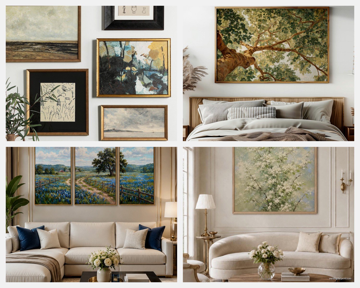
Large-scale landscapes are your safest bet. I’m talking like 40×30 inches minimum for over a sofa. Anything smaller just floats there looking sad and unintentional. I tested this theory by putting a 24×18 print over my client’s sectional and we both just stood there like “…yeah that’s not it.” Went up to a 48×36 and suddenly the whole room made sense.
Black and white photography is having this weird moment where it’s both trendy AND classic, which rarely happens. I’ve got this Ansel Adams print in my living room that I bought in 2015 and it still feels right. The trick is going with actual artistic photos, not like… a random Eiffel Tower shot from Amazon. Look for contrast, composition, something that would work without color.
The Frame Situation Nobody Talks About
This is gonna sound weird but I’ve spent more time agonizing over frames than the actual art sometimes. Classic living rooms need substantial frames, period. Those thin little IKEA frames work for a gallery wall in a hallway but in your main living space they just look cheap.
Wood frames in medium to dark tones are basically foolproof. I usually go with walnut or espresso finishes because they work with both warm and cool color schemes. My living room has gray walls (Benjamin Moore Stonington Gray if you’re curious) and the walnut frames add that warmth that keeps it from feeling like a dentist’s office.
Gold frames are tricky. Like, really tricky. Ornate gold can look amazing but it can also look like you raided your grandmother’s attic. I use them sparingly, maybe one statement piece with a detailed gold frame paired with simpler pieces. Actually just installed a baroque-style gold frame around a modern abstract in a client’s space last month and the contrast is *chef’s kiss*.
Matting Makes or Breaks Everything
White mats are classic for a reason but here’s what nobody tells you… they need to be WIDE. I’m talking 3-4 inches minimum. Those skinny little mats make art look cramped. I learned this the hard way when I framed a series of vintage botanical prints with 1-inch mats and they looked like they were suffocating.
Double matting adds this crazy expensive look for like $20 more. You do an outer mat in cream or off-white and an inner mat that pulls a color from the art. Sounds fancy but any frame shop can do it.
Placement Because Apparently This Isn’t Intuitive
The whole “57 inches from the floor to the center” rule is… fine, I guess? But in living rooms with sofas you gotta think differently. I hang art so the bottom edge sits 8-10 inches above the sofa back. This creates a visual connection without making it look like the art is sitting ON the furniture.
Oh and another thing, if you have high ceilings (lucky you), don’t just center everything on the wall height. You’ll end up with art floating way too high. Keep it in relationship to your furniture and where people’s eyes actually land when they’re sitting down.
What to Actually Put on Your Walls
Classic subjects that I keep coming back to:
- Botanical prints – but make them dramatic, not cutesy
- Architectural drawings or blueprints
- Vintage maps (though these are getting overdone, ngl)
- Abstract art in neutrals with maybe one accent color
- Classical figure drawings or sculptures
- Seascapes or mountain landscapes
- Still life paintings with good composition
I’m currently obsessed with oversized botanical prints. Not the pretty watercolor flowers, but like scientific illustration style. There’s this set I got from an estate sale that shows different fern species in incredible detail and they look expensive and intentional even though I paid $40 for all three.
The Gallery Wall Debate
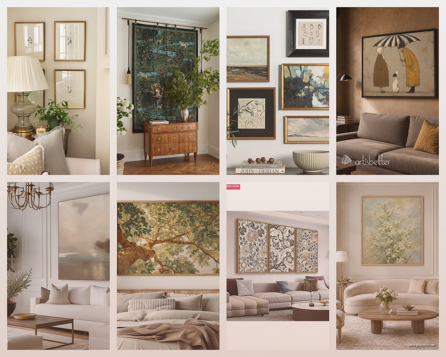
Okay so gallery walls can be classic IF you follow some rules. I did one in my own living room that’s held up for six years now. Here’s what worked:
Keep the frame style consistent. All black, all wood, all gold… whatever. Mixing frame styles in a living room gallery wall usually looks messy unless you really know what you’re doing.
Stick to a color palette. My gallery wall is all black and white images in black frames. Sounds boring but it reads as intentional and collected over time rather than “I bought a set at HomeGoods.”
Use templates. I know, I know, but seriously tape paper templates to your wall first. I’ve patched so many unnecessary holes from clients who just started hammering nails. My cat knocked over my coffee while I was doing this and the stain is still on one of my templates, but whatever, it worked.
Where to Source Stuff That Doesn’t Look Generic
This is where everyone gets stuck. You want classic but not the same print that’s in every Pottery Barn catalog.
Estate sales are genuinely my secret weapon. You find actual vintage art, real frames, stuff with history. Went to one last month and got a signed watercolor from the 1960s for $35. It’s hanging in my entryway and I get compliments every time someone comes over.
Museum shops online sell high-quality prints of classical works. The Met, the Louvre, the Tate… they all have print shops. You’re getting actual good reproductions, not some pixelated download someone’s selling on Etsy.
Minted and Juniper Print Shop both have artists who do more artistic work than the typical print-on-demand places. I’ve ordered from both and the quality is solid.
Antique stores for frames. Buy cheap art in expensive frames, swap out the art. I do this constantly. Found these incredible carved wood frames at an antique mall, they had terrible paintings in them, replaced them with vintage botanical prints and suddenly I had $300-looking art for maybe $80 total.
The DIY Route That Actually Looks Good
You can download public domain classical art and get it printed at a professional print shop. The Rijksmuseum has thousands of high-res images available for free. I printed a Vermeer study on archival paper, got it professionally framed, and it looks like I spent serious money.
Just don’t use your home printer. Please. The quality difference between a $50 inkjet print and a $15 professional print is massive.
Sizing and Scale for Different Wall Situations
Over the sofa: go big or go home. One large piece 40×30 or bigger, or a series of three to five pieces that create one large visual block. I usually do three 20×24 pieces in a horizontal line.
Flanking a fireplace: matching pairs look classic but they gotta be substantial. At least 24×30 each. Smaller looks wimpy next to a fireplace which is already a major focal point.
Awkward narrow walls: vertical pieces, obviously, but I like to do a vertical stack of two or three smaller pieces rather than one tall skinny piece. Creates more visual interest.
What About Color
Classic living rooms can totally have colorful art, you just gotta be smart about it. I lean toward art where the colors are slightly muted or vintage-looking rather than super saturated.
Like, a classical landscape with greens and blues and maybe some rust tones? Perfect. A neon abstract that looks like a highlighter exploded? Probably not giving classic vibes.
One trick I use: pull colors from your art into your pillows or throws. Makes everything feel cohesive. I have this landscape with these beautiful sage greens and dusty blues, and I found velvet pillows in almost the exact same sage. Ties the whole room together without being matchy-matchy.
Lighting Your Art Properly
Nobody thinks about this until the art is up and looks weird. Natural light is great but causes fading, so keep valuable prints out of direct sun. I learned this when a client’s vintage poster faded on one side after a summer of afternoon sun.
Picture lights are classic for a reason. Those brass or bronze picture lights mounted above frames look expensive and intentional. Battery-operated ones exist now so you don’t need to hire an electrician.
Track lighting or recessed lights aimed at your art also work. Just avoid putting art directly across from windows where you’ll get glare.
Common Mistakes I See Literally All the Time
Hanging everything too high. Your living room isn’t a museum, you want art at a human scale.
Going too small. When in doubt, size up. I’ve never had a client say their art was too big, but I’ve definitely had to replace too-small pieces.
Buying sets of matching prints. They usually look generic and hotel-like. If you want multiple pieces, make them relate through color or theme but not identical.
Ignoring the room’s style. Classical art in an ultra-modern minimalist room can work but you gotta commit to the contrast. Half-hearted mixing of styles just looks confused.
Forgetting about the space above. If you have a tall wall, consider how the art relates to the ceiling height. Sometimes you need to add architectural elements or additional pieces higher up.
The Investment Piece Approach
Here’s my actual strategy: buy one really good piece that you love and build around it. I saved up and bought an original abstract from a local artist for my living room. Cost way more than I usually spend but it’s THE piece in that room. Everything else is supporting it.
You don’t need all expensive art. You need one anchor piece that feels special and then fill in with prints, photographs, and less expensive finds that complement it.
Wait I forgot to mention – before you buy anything, live with a printout or a similar piece taped to your wall for a week. I know it sounds extra but I’ve avoided so many wrong purchases this way. What looks amazing in the store might feel totally wrong in your actual space with your actual furniture and light.
Maintaining Classic Art Long-Term
Dust frames regularly. Sounds obvious but dust buildup makes everything look neglected.
Use UV-protective glass for anything valuable or sentimental. Costs more upfront but prevents fading.
Check for sagging mats or loose frames once a year. Humidity changes can warp things over time.
Okay so that’s basically everything I wish someone had told me before I spent years figuring this out through trial and error. Classic wall art really comes down to quality over quantity, proper scale, and choosing subjects that have lasted decades already because they’ll probably last a few more.