Wall Art Guide, Wall Art Tutoriels
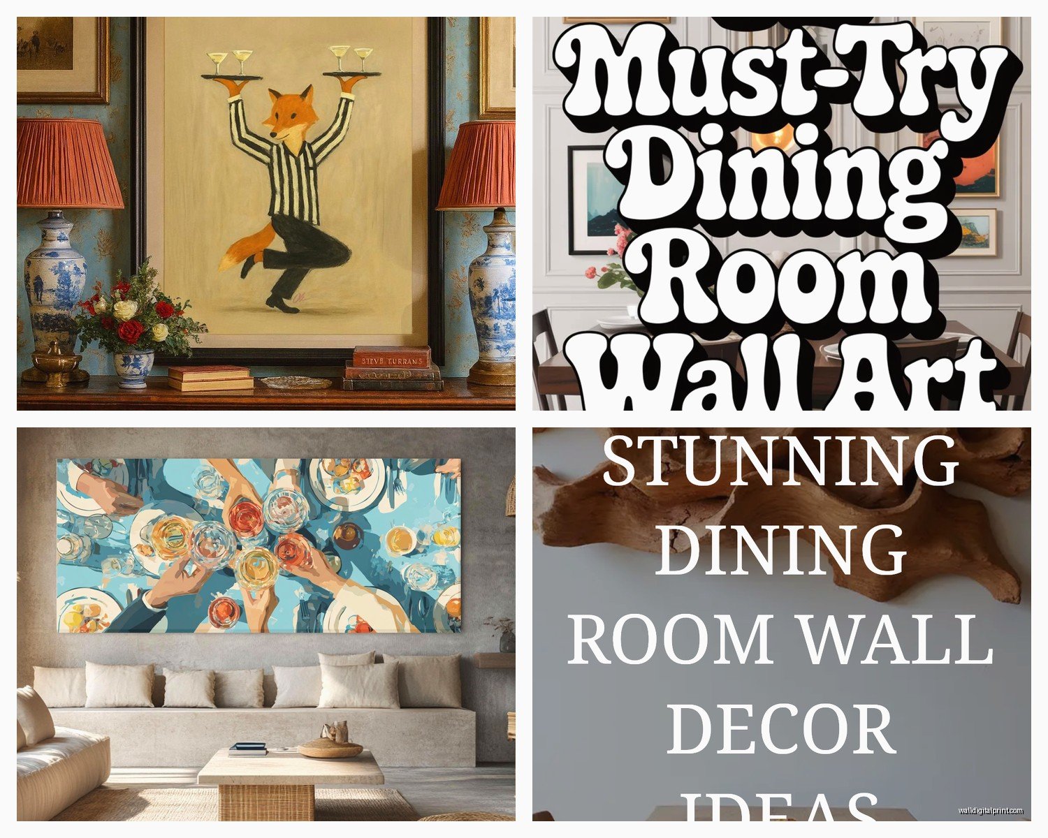
Dining Wall Art: Eating Space Food & Wine Themes
Apr
So I’ve been styling dining rooms for like 15 years now and the food and wine art thing is honestly where most people get it completely wrong. They either go full Tuscan vineyard (which, no offense, feels very 2009) or they slap up some random fork and knife prints from HomeGoods and call it a day.
Let me just tell you what actually works because I literally just finished a project last week where the client had bought these massive canvas prints of wine bottles and they looked… bad. Really bad. We had to start over.
Canvas vs. Framed Prints vs. Metal
Okay so canvas is gonna be your cheapest option but here’s the thing nobody tells you—food and wine imagery on canvas can look weirdly flat unless you go for something with actual texture or brushstrokes. I learned this the hard way with my own dining room honestly. Spent $200 on this gorgeous print of figs and cheese from Etsy and once it arrived as a canvas wrap it just looked like a poster trying too hard.
Framed prints under glass are where it’s at for food photography or vintage wine labels. The glass gives it this depth that makes the colors pop. I usually go with black metal frames or natural wood, depending on if the space is modern or more farmhouse-y. White frames can work but they need to be chunky, not those thin ikea ones.
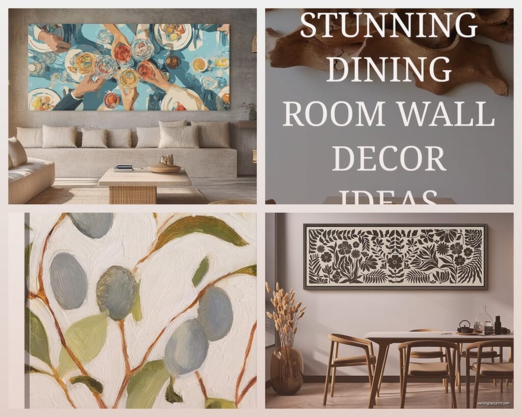
Metal prints are having a moment right now and actually they’re perfect for dining spaces because you can wipe them down. My cat knocked over a glass of red wine at my place (long story, don’t ask) and it splashed on my metal print of olive branches and it just… wiped right off. Can’t do that with canvas or paper.
Size Matters More Than You Think
Everyone goes too small. Like, painfully small. If you have a standard dining wall that’s maybe 10-12 feet wide, you need art that’s AT LEAST 40 inches wide. I know that sounds huge but trust me. When you’ve got a table and chairs and people sitting there, small art just disappears.
I did a consultation last month where someone had four 8×10 prints spaced out on this massive wall and it looked like they were afraid of commitment. We replaced them with one 48×36 piece and suddenly the whole room made sense.
For over a buffet or sideboard, your art should be roughly 2/3 to 3/4 the width of the furniture. This is a actual rule I follow every single time.
Food Photography vs. Illustrated vs. Abstract
Real food photography can be tricky because it needs to be GOOD photography or it looks cheap. Like restaurant menu vibes. But when it’s done well—moody, dark backgrounds, dramatic lighting—it’s stunning. I’m obsessed with those dark and stormy styled food shots right now. Figs, pomegranates, crusty bread, wine in the background.
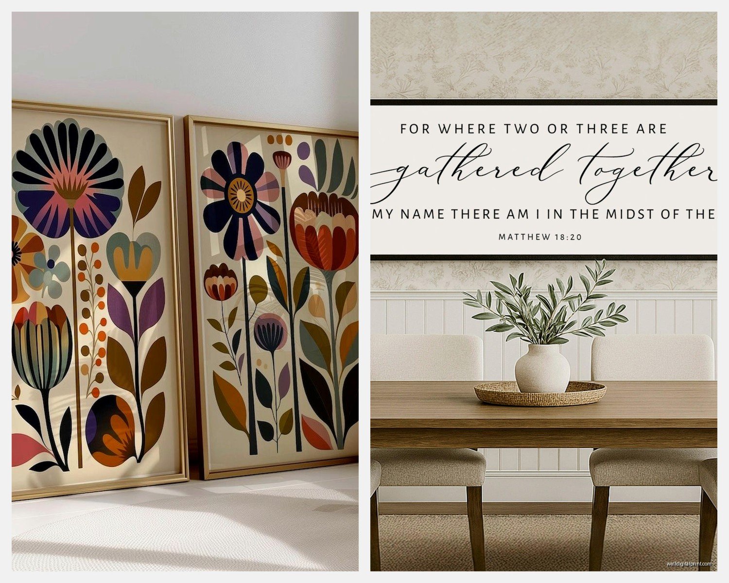
Illustrated or watercolor food art is safer honestly. It reads as more intentional and artsy. Botanical prints of herbs, vintage vegetable charts, those old-school wine region maps. This stuff works in almost any dining space and doesn’t feel too literal.
Abstract pieces that just suggest food or wine through color and shape… okay this is gonna sound weird but these are actually my favorite for dining rooms. A piece with deep burgundy and gold that evokes wine without showing a wine glass. Organic shapes in olive green and cream that feel Mediterranean without being obvious. You get the vibe without it being matchy-matchy.
Where to Actually Buy This Stuff
Etsy is still my go-to for unique prints but you gotta filter hard. Search for “vintage wine label prints” or “botanical food illustration” and then filter by shops that have actual reviews. I’ve found amazing vintage French aperitif posters there for like $15-30 for the digital download, then I print at a local print shop on nice paper.
Minted has good stuff if you want something more curated and you don’t wanna think too hard about it. Their food and drink category is decent, not amazing, but decent.
For original art or higher-end pieces I’m always browsing Saatchi Art. You can find emerging artists doing really cool contemporary food art. Just bought a piece there last month of wine bottles done in this geometric style—paid $400 which isn’t cheap but it’s original and the artist signed it.
oh and another thing, local restaurant supply stores sometimes sell those vintage-look metal signs. The ones that look like old European market signs? Those can be perfect for a more casual dining space. I used three of them in a breakfast nook project and they were like $25 each.
Color Coordination Without Being Boring
You don’t need to match your art to your walls exactly but they should at least be in the same color temperature. Warm walls (beiges, taupes, warm grays) need art with warm undertones. Cool walls need cooler-toned art.
I see people put bright tomato-red food art on cool gray walls and it just clashes in this uncomfortable way. If your walls are cool, go for art with blue-toned reds, or stick to green herbs and white imagery.
My own dining room has this weird greige situation happening and I’ve got three framed prints of olive branches in muted green and gold tones. It’s subtle but it works because everything’s in the same warmth family.
The Gallery Wall Approach
Gallery walls in dining rooms can be amazing or a total disaster, there’s no in between. If you’re gonna do it, you need a theme beyond just “food and wine.”
I did one last year that was all vintage Italian aperitif ads—Campari, Cinzano, Martini & Rossi. All different sizes but the vintage poster style tied them together. Looked incredible.
Another one I did was all black and white food photography—farmers market vegetables, wine barrels, bread. The black and white unified everything even though the subjects were different.
Mix frame styles at your own risk. I usually stick to all the same frame or maybe two complementary styles max. All black frames or all wood or black frames with one or two gold ones as accents.
Stuff That Doesn’t Work (Trust Me)
Those “wine o’clock” or “eat drink be merry” word art pieces… just no. They’re everywhere and they make your dining room look like a HomeGoods exploded. If you want text, go vintage—old wine labels, French market signs, vintage recipe cards framed.
Bright primary colors usually don’t work unless your whole dining room is super colorful and eclectic. Food art needs to feel sophisticated or at least intentional.
3D art like hanging metal grape clusters or decorative plates… be so careful. This can veer into grandma territory real fast. I’m not saying never do it but maybe don’t make it your main art moment.
Lighting Your Art
Nobody thinks about this but it matters. If you have art over a sideboard, put a picture light on it or at least make sure your overhead lighting hits it. I’ve seen gorgeous prints just disappear into shadow because the lighting was wrong.
If you’re doing a gallery wall, consider track lighting or adjustable recessed lights that can angle toward the wall. Makes everything look more intentional and gallery-like.
Seasonal Swaps
wait I forgot to mention this earlier but one thing I do in my own place is swap out one or two pieces seasonally. I have a set of four frames on one wall and I keep three the same year-round (olive branches, wine bottles, herbs) but the fourth one I swap. Summer gets tomatoes or figs, fall gets pomegranates or grape clusters, winter gets something with mulled wine vibes.
It’s an easy way to keep things feeling fresh without redoing your whole wall. Just make sure your frames are all the same size so you can literally just swap the prints.
DIY Options That Don’t Look DIY
If you’re on a budget—and honestly even if you’re not—there are some really good DIY routes. Download vintage botanical prints from the Library of Congress digital collection (they’re free and high-res), print them at Staples or a local print shop on cardstock, frame them in cheap black frames from Michael’s when they’re on sale.
I did this for a client’s breakfast nook and spent maybe $80 total for six framed prints. Looked like we’d spent hundreds.
You can also frame wine labels from bottles you’ve actually drunk, which sounds cheesy but if you do it right—all the same frame style, arranged in a grid, maybe all from one wine region—it can be really personal and cool.
Mixing Food Art with Other Stuff
Your dining room doesn’t have to be ALL food and wine art. That can actually feel too themed, like a restaurant. I usually do maybe 70% food/wine related and 30% other stuff that just goes with the vibe.
Abstract pieces in complementary colors, landscapes from wine regions, still life paintings that aren’t necessarily food but have the same color palette. This keeps it from feeling like a theme restaurant.
In my own space I’ve got the olive branches and wine bottles but also this abstract piece in burgundy and cream that has nothing to do with food but ties the whole wall together.
Specific Recommendations by Style
Okay so if your dining room is modern/contemporary, go for clean photography or abstract pieces. Black and white food photography, geometric interpretations of wine bottles, minimalist line drawings of vegetables.
Traditional spaces can handle vintage wine labels, classical still life paintings, botanical prints in ornate frames. Don’t be afraid of gold frames here.
Farmhouse or rustic needs to avoid being too cutesy. Vintage market signs work, herbs in simple frames, black and white photography of farms or vineyards. Skip the roosters though, I’m begging you.
For eclectic or boho spaces you can actually mix it all up—vintage posters with modern photography with illustrated pieces. Just keep the color palette cohesive.
My client last week had this mid-century modern dining room and we did three large-scale prints of wine bottles in this retro illustration style, all in frames with brass corners. Looked perfect.
The Scale Test
Before you buy anything, do this: tape newspaper or paper bags to your wall in the size you’re considering. Live with it for a few days. Walk past it multiple times. Sit at your dining table and look at it. If it feels too small, go bigger. If it overwhelms the space… well that’s rare honestly, most people go too small.
I’ve been watching The Bear while I work lately and even their restaurant has this figured out—the art is big, it’s intentional, it contributes to the vibe without being literal. That’s what you’re going for.
One more thing—don’t hang your art too high. Center of the piece should be at eye level, which is usually around 57-60 inches from the floor. Unless it’s over furniture, then you want about 6-8 inches between the furniture top and the bottom of the frame.
The whole point is that your dining room should feel intentional and pulled together without looking like you tried too hard or like you’re running a wine bar. Food and wine art works because it’s relevant to the space but it’s gotta be done with some restraint and actual thought about color, scale, and style.