Wall Art Guide, Wall Art Tutoriels
Floral Wall Art: Flower Botanical Garden Prints
Jul
So I’ve been obsessing over floral prints lately and honestly it started because a client wanted to turn her boring hallway into something that felt like a garden but without the maintenance, and I went down this whole rabbit hole of botanical prints that I need to tell you about.
The Whole Vintage vs Modern Thing
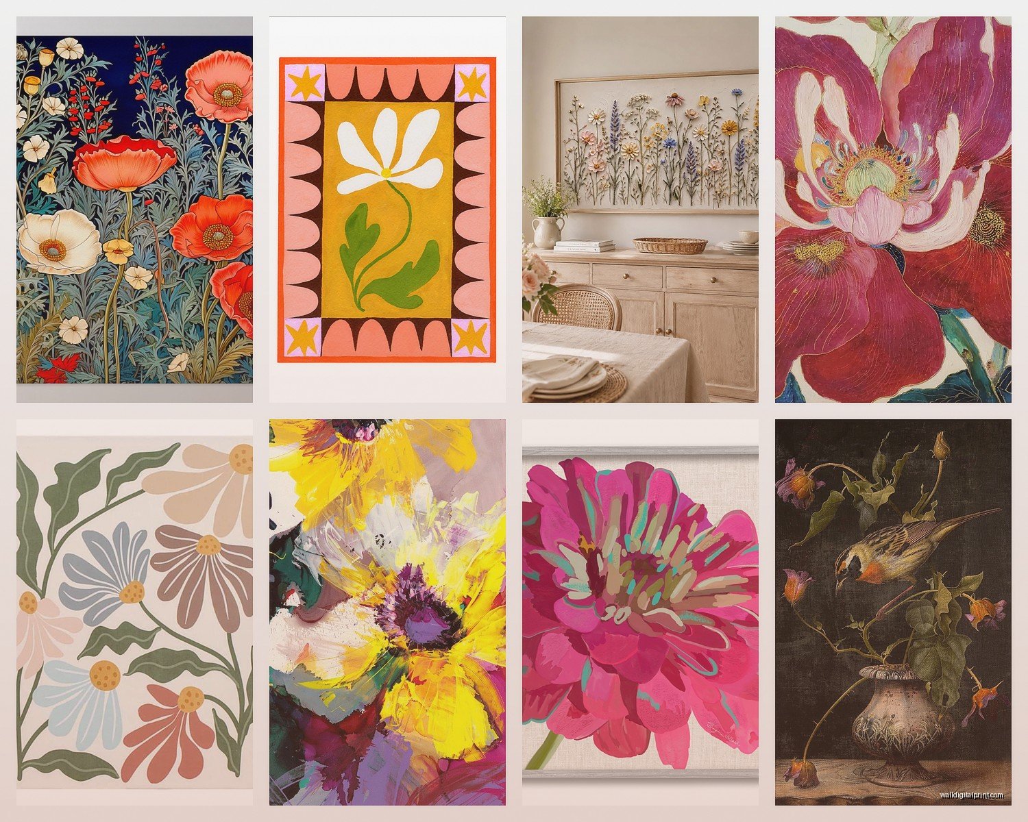
Okay so first thing – you gotta decide if you want that vintage botanical illustration vibe or modern photography prints. They’re totally different moods and I see people mixing them up all the time. The vintage ones, like those old-school botanical drawings from the 1800s, they have this super detailed scientific illustration look. Think like what you’d see in an old plant encyclopedia. They work amazing in traditional spaces or if you’re going for that English cottage library feel.
Modern floral photography is more bold, more color-saturated, and honestly sometimes easier to work with because the colors are more predictable. I spent like three hours last Tuesday comparing prints because my meeting got canceled and I realized the vintage ones photograph really differently than they look in person – the paper texture matters SO much.
Where to Actually Get Good Ones
Etsy is obvious but here’s the thing – you gotta filter through SO much stuff. Search for “vintage botanical print” or “antique floral illustration” and then check if they’re selling actual digital files you can print yourself or physical prints. The digital files are usually way cheaper, like $5-8, and you can print them at whatever size you need. I use a local print shop that does really good paper quality for like $15-30 depending on size.
Society6 and Minted have more curated stuff if you don’t wanna dig. They’re pricier but the quality is consistent. I’ve ordered probably 15 prints from Society6 and only one was weirdly color-off. Their framing options are decent too but overpriced – I’ll get to framing in a sec.
Oh and another thing – museum shops online. The New York Botanical Garden shop, Kew Gardens, even the Met Museum – they have incredible public domain botanical prints that you can download for FREE sometimes. I got this stunning Pierre-Joseph Redouté rose print from the Met’s collection and printed it at 24×36 and it looks like a $300 piece.
Size and Scale Is Where Everyone Messes Up
This is gonna sound weird but I keep a measuring tape in my bag now because I’ve seen too many people buy prints that are way too small. Your wall is bigger than you think. Like, that space above your couch? You probably need at least a 24×36 inch print or a set of three 16x20s minimum.
The rule I use is the art should take up about 2/3 to 3/4 of the furniture width below it. So if your couch is 84 inches, you want your art or art grouping to be around 56-60 inches wide. Nobody does this and then they hang these tiny 11×14 prints above a king bed and it just looks… lost.
For hallways, I actually like going bigger than you’d expect. A series of four 16×20 botanical prints in a narrow hallway makes way more impact than eight tiny 8x10s. I learned this the hard way in my own apartment where I did the small print thing and had to redo it.
The Grouping Strategy
Okay so if you’re doing multiple prints – and honestly this is the best way to do floral botanical stuff – you need a plan. I usually go with:
- Sets of 2, 4, 6, or 9 (even numbers for modern symmetrical looks, odd for more casual)
- Same frame style and color for all pieces – mixing frames with botanicals looks messy
- Keep spacing consistent, like 2-3 inches between frames
- Either all the same size or two sizes max (like four 11x14s with two 8x10s)
The grid layout is foolproof. Four prints in a perfect square, six in two rows of three, whatever. I literally use painter’s tape to map it out on the wall first because I cannot eyeball this stuff to save my life.
There’s also the salon wall approach where you do different sizes but honestly with botanical prints I think that looks too chaotic unless you’re going for a collected-over-time antique vibe. Which can work but it’s harder to pull off.
Color Coordination Without Being Matchy-Matchy
This is where I see people freeze up. You don’t want all pink roses, that’s boring and kinda looks like a teenager’s room (no offense to teenagers). But you also don’t want random colors that fight with your space.
What I do is pick a color family or two. Like if your room has blue and cream tones, look for botanical prints with blue flowers – delphiniums, hydrangeas, morning glories – and maybe some greenish or neutral ones. Or if you have warmer tones, go for prints with coral, peach, yellow, or burgundy flowers.
My current obsession is monochrome botanical prints, either all in sepia tones or black and white. They’re so much easier to work with because they go with literally everything and they feel more sophisticated somehow. Less “I love flowers!” and more “I appreciate botanical art.”
Wait I forgot to mention – check what colors are already in your room’s textiles. If you have a rug with terracotta tones, pulling that into your floral prints makes everything feel intentional instead of random.
Frame Choices Matter More Than You Think
I’m gonna be honest, cheap frames from Target or Amazon look cheap. The glass is too reflective, the matting is usually off-white instead of true white, and they just don’t do your prints justice. But custom framing is like $200+ per piece which is insane.
The middle ground: IKEA frames are actually pretty decent, especially their RIBBA and SILVERHÖJDEN lines. The black RIBBA frames are like $20-40 depending on size and they look way more expensive than they are. I’ve used them in client homes that have six-figure budgets and nobody’s ever called me out on it.
For botanical prints specifically, I almost always use white or cream mats with either black, natural wood, or gold frames. The mat is really important because it gives the print breathing room. Without a mat, botanical prints can feel cramped. I usually do a 2-3 inch mat border.
Gold frames are tricky – they can look amazing with vintage botanicals but they can also read as trying too hard. Thin gold frames work better than chunky ones for a modern space. Natural wood frames in light oak or walnut are the safest choice and they warm up the look.
Glass vs Plexiglass Real Talk
Regular glass: heavier, clearer, can break, shows glare
Plexiglass/acrylic: lighter, won’t shatter, scratches easier, sometimes has a slight color cast
For anything over 24×30, I go with plexiglass because the weight of real glass gets ridiculous. Also if you’re hanging stuff in a kids’ room or anywhere it might get bumped, plexiglass is safer. Museum glass is the fancy option that’s super clear with no glare but it’s $$$ and probably overkill for most situations.
Placement Ideas That Actually Work
Obviously above the couch, above the bed, whatever. But here’s where botanical prints really shine and people don’t think about it:
Dining room – there’s something about floral botanicals that works perfectly in eating spaces, maybe because they feel garden-y and fresh? I did a set of six herb botanicals (basil, thyme, rosemary, etc.) in a client’s breakfast nook and it was *chef’s kiss*
Bathrooms – okay this is gonna sound weird but botanical prints in bathrooms are underrated. They handle humidity fine if they’re under glass and they make the space feel spa-like. I have three fern prints in my own bathroom and everyone comments on them
Home office – better than generic motivational quotes and they add life without being distracting. I like really detailed vintage botanicals for offices because they give you something interesting to look at when you need a mental break
Stairway walls – this is my cat’s favorite place to sit and watch me hang things which is super helpful (sarcasm). But actually a vertical line of botanical prints going up the stairs looks really good and uses that awkward tall wall space
The Printer Quality Thing Nobody Tells You
If you’re printing digital files yourself, this matters. Regular prints from like Walgreens or CVS are gonna look washed out and pixelated if you go big. For anything over 11×14, use a proper print shop or online service.
I use Nations Photo Lab online or a local printer that does giclée printing. Giclée is basically high-quality inkjet printing with archival inks on good paper. It sounds fancy but it’s not that expensive – usually $20-50 depending on size.
Paper choices: matte paper for vintage botanicals (makes them look more authentic), glossy or lustre for modern photography. I pretty much never use glossy for botanicals though, it looks too commercial.
Resolution matters – you want at least 300 DPI for printing. If you’re downloading free images from museums, check the file size. Anything under 2MB probably won’t print well over 8×10.
Seasonal Rotation Is Optional But Fun
Okay so this is extra but I have some clients who swap their botanical prints seasonally. Spring gets cherry blossoms and tulips, summer gets roses and peonies, fall gets dahlias and autumn leaves, winter gets evergreens and hellebores. It’s a lot but if you’re into it, it keeps things fresh.
The easier version is just having two sets – one for warm months and one for cool months. Store the off-season ones in a portfolio case under the bed or in a closet.
My Current Favorite Combinations
Things I’ve done recently that worked really well:
- Six black and white fern prints in identical black frames, grid layout – looked expensive and modern
- Four vintage rose prints in different shades of pink/red, cream mats, gold frames – romantic but not over the top
- Nine small succulent prints in a square grid, natural wood frames – worked great in a minimalist bedroom
- Two large protea prints flanking a window, black frames – dramatic and contemporary
The protea one was interesting because those flowers are so sculptural and weird-looking, they almost don’t read as floral? Really good if you want botanical art but don’t want it to feel traditionally pretty.
What to Avoid Based on My Mistakes
Don’t get prints with visible watermarks or low resolution – seems obvious but I’ve seen it happen
Don’t hang botanicals in direct sunlight – the colors will fade, even with UV-protective glass. Learned this one the hard way with some expensive prints in a client’s sunroom
Don’t mix realistic photography with illustrated botanicals in the same grouping – the styles clash
Don’t go too literal – like if you have actual plants in the room, you don’t need prints of those exact same plants. It’s overkill
Don’t forget to level your frames – get a real level, not the app on your phone. The app is never accurate and you’ll end up with crooked art that’ll bug you forever
Budget Breakdown Real Numbers
If you wanna do this right but not spend a fortune, here’s roughly what I’d budget:
Cheap but good option:
- Digital downloads: $5-8 each, need 4 = $30
- Printing at local shop: $20 each for 16×20 = $80
- IKEA frames with mats: $25 each = $100
- Total: around $210 for four framed prints
Mid-range option:
- Pre-printed art from Society6: $35-50 each = $150-200 for four
- Better frames (still not custom): $50 each = $200
- Total: around $400-450
The expensive route is custom framing everything which gets into thousands real fast, but honestly unless you’re doing museum-quality stuff or have weird sizes, it’s not necessary.
Quick Styling Tips Around the Prints
Once they’re up, you gotta style around them a bit. Not like, matching throw pillows with the exact flowers (please don’t), but pulling colors through.
If your prints have a lot of green, add some actual plants nearby – it reinforces the botanical theme. A small shelf under the prints with a couple potted plants looks intentional.
Books with botanical covers or green spines on a nearby shelf, subtle nod to the theme without being obvious about it.
Keep the wall color relatively neutral – white, cream, light gray, soft sage – so the prints can be the focal point. I tried putting bold floral prints on a dark navy wall once and it was too much competition.
Okay I think that’s everything I’ve learned from doing this way too many times. The main thing is just commit to a style direction and don’t overthink it – botanical prints are pretty forgiving and they make spaces feel finished without being too personal or controversial, which is why I use them so much in staging and client work. They’re like the perfect middle ground between bland and too specific.