Wall Art Guide, Wall Art Tutoriels
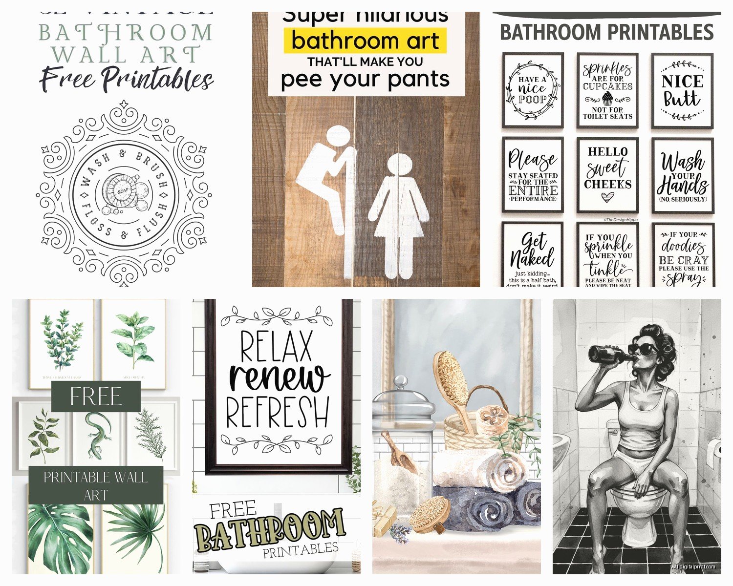
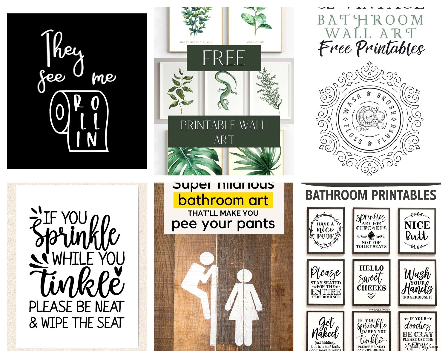
Free Printable Bathroom Wall Art: Bath Space Downloads
Oct
So I’ve been downloading and printing bathroom art for like three years now and honestly it’s the easiest way to make a bathroom look intentional without spending actual money. Last week I redid my powder room and spent zero dollars because I already had the frames.
Where to Actually Find Good Free Printables
Okay so the obvious place is Etsy but here’s the thing – you gotta search “free bathroom printable” not just “bathroom printable” because sellers hide free ones in their shops to get you on their email list. Which is fine, I’m on like 47 email lists now but whatever. I actually found my favorite botanical prints that way from this seller who was promoting a paid collection but had three freebies.
Pinterest is weirdly good but also frustrating because half the links are broken or lead to sites that want your credit card for a “free trial.” I keep a whole board just for bathroom art and I’d say only 60% of the pins actually work when you click through.
The spots I actually use regularly:
- Unsplash and Pexels for high-res photos that you can just print as-is
- Creative Market’s free goods section (updates weekly)
- Printable Crush has a decent free section
- Random blogs from interior designers – they often have subscriber freebies
My cat just knocked over my coffee while I’m writing this so that’s great.
File Types and Quality Stuff You Need to Know
This is gonna sound boring but it matters – you want PDFs or high-res JPEGs. If the file is under 1MB it’s probably gonna print blurry. I learned this the hard way when I printed this gorgeous quote print and it looked pixelated as hell. Like I could see the individual pixels from three feet away.
Look for files that are at least 300 DPI (dots per inch). Most free printables will say this in the description. If they don’t mention it… it’s probably not 300 DPI. The file size should be at least 2-3MB for an 8×10 print.
Standard print sizes you’ll actually find frames for:
- 5×7 (good for gallery walls)
- 8×10 (the most common, easiest to frame)
- 11×14 (statement piece size)
- A4 if you’re using IKEA frames because they’re weird
The Printing Part That Everyone Messes Up
So you can print at home if you have a decent printer but here’s what I’ve figured out – most home printers are terrible with black and white prints. They come out this weird grayish color that looks dingy in a bathroom. Color prints usually turn out better even if you think your printer is good.
I use my home printer for:
- Small prints (5×7 or smaller)
- Things I might want to swap out seasonally
- Testing layouts before I commit to professional printing
For anything I want to keep up for a while, I go to Staples or FedEx Office. It costs like $2-3 per print for an 8×10 on cardstock and the quality is so much better. Cardstock is key because regular printer paper looks cheap and warps if your bathroom gets steamy.
Oh and another thing – if you’re printing something with a white background, get it printed on bright white cardstock not cream. I made that mistake once and the whole print looked yellowed.
What Actually Works in Bathrooms
I’ve tested this in my own bathroom and in like a dozen client bathrooms. Some styles just hit different in a bathroom versus other rooms.
Botanical prints are the obvious choice and yeah they’re kinda basic but they work. Eucalyptus, ferns, palm leaves – anything green and growing vibes well with water and tiles. I have this simple line drawing of a monstera leaf that I’ve literally printed three times for three different bathrooms.
Vintage bathroom ads are unexpectedly great if your space has any vintage elements. There are tons of free public domain images from old soap and perfume advertisements. They add humor without being like… those cringey “wash your hands” signs.
Abstract shapes and line art in black and white photograph really well and don’t compete with your tile patterns. This is what I usually recommend if someone has busy wallpaper or patterned shower curtains.
Typography prints are hit or miss. Inspirational quotes feel dated honestly but simple words in interesting fonts can work. I did “SOAK” in this gorgeous serif font for a client and it looked expensive.
Stuff That Doesn’t Work (Learned This the Hard Way)
Beach photography with bright blues – I thought this would be perfect for a beach house bathroom but it just made the space feel cold. Unless your bathroom gets tons of natural light, skip it.
Anything too detailed gets lost. I printed this intricate mandala once and from normal standing distance it just looked like a blob.
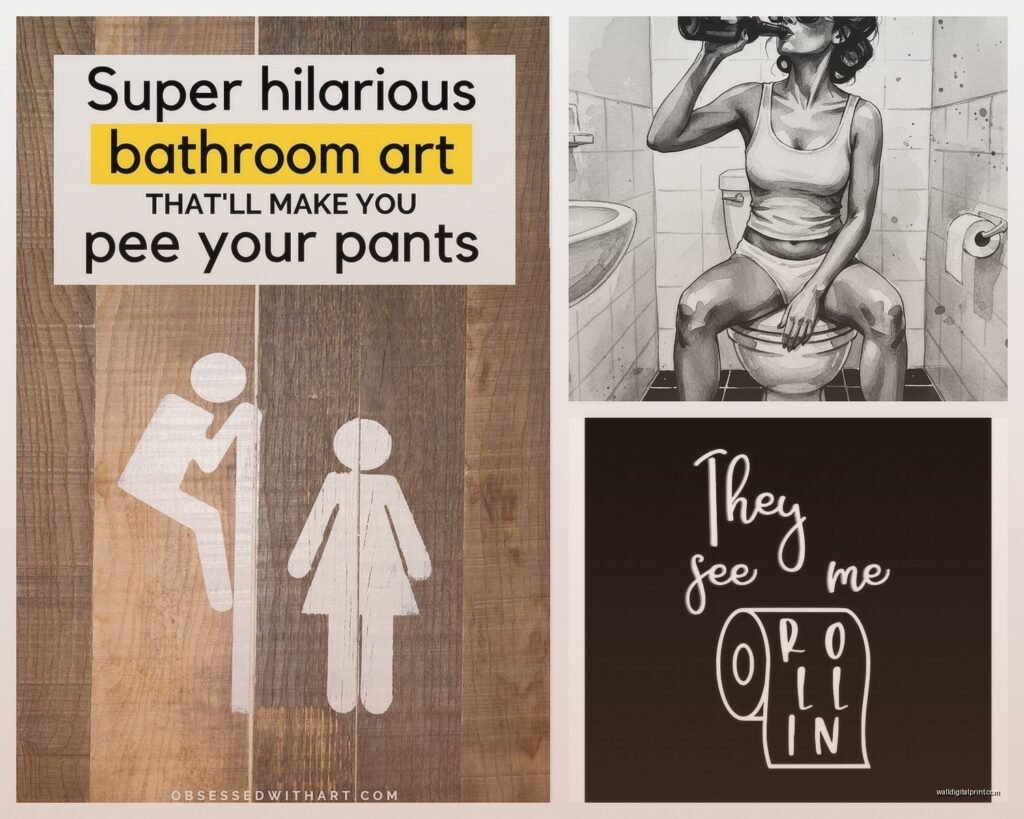
Most memes or funny sayings look cheap in an actual frame on an actual wall. What’s funny on Instagram doesn’t translate. Trust me on this one.
The Frame Situation
Wait I forgot to mention – the frame matters more than the print sometimes. You can print the most beautiful art but if it’s in a warped plastic frame from your college dorm it’s gonna look bad.
Dollar stores have frames but they’re hit or miss. The glass is often not real glass and the backing warps. But I’ve found decent ones at Dollar Tree for smaller prints if I’m doing a big gallery wall where not every frame needs to be perfect.
Target’s frames are pretty good for the price. Their Threshold line is solid and they almost always have sales.
IKEA frames are cheap and modern but you’re locked into A4 or their specific sizes which don’t always match standard print sizes. This is annoying but their RIBBA frames are like $5 and look way more expensive.
Thrift stores for vintage frames if you’re into that. I found these amazing gold baroque frames for $3 each and spray painted them matte black. They’re in my main bathroom with botanical prints and people always ask where I got them.
How to Actually Arrange Multiple Prints
Okay so funny story – I once spent two hours arranging frames on my bathroom floor before hanging anything because I’m paranoid about putting unnecessary holes in walls. My dog thought I was building her an obstacle course.
The layout tricks that actually work:
For above the toilet (the classic spot):
- One large print centered (11×14 or bigger)
- Two 8x10s side by side with like 2-3 inches between them
- Three 5x7s in a row
For that weird narrow wall next to the shower:
- Vertical gallery wall with 3-4 small prints
- One tall vertical print
- Lean a larger frame on a small shelf instead of hanging
The wall across from the mirror (people forget about this wall):
- Asymmetrical arrangement with different sized frames
- One statement piece that you see in the mirror reflection
Use painter’s tape to mark where the frames will go before you commit. Put the tape on the wall in the exact size of your frames and live with it for a day. See what you think.
The Technical Hanging Part
Command strips are controversial but I use them in rentals all the time. The picture hanging strips rated for the weight of your frame plus a little extra. They work fine in bathrooms if you’re not putting them directly in the shower spray zone.
For real walls you own, just use proper picture hangers. The ones with the angled nail that go into drywall. Get the weight rating right – an 8×10 in a glass frame is heavier than you think.
Level app on your phone is free and works perfectly fine. I don’t own an actual level anymore.
Protecting Prints in Humid Spaces
This is gonna sound weird but I’ve never had an issue with prints getting damaged in bathrooms and I live in a humid climate. The key is:
Keep them away from direct water spray obviously. Don’t hang anything in the shower itself unless it’s specifically designed for that.
Use frames with actual glass or plexiglass, not just cardstock in a floating frame situation. The glass protects the print from moisture in the air.
If your bathroom doesn’t have a fan or window and gets super steamy, maybe skip paper art entirely and go for something else. But most normal bathrooms are fine.
I’ve had the same prints in my master bath for two years and they still look perfect. The bathroom gets steamy from showers but we run the fan.
My Current Favorite Free Sources
I’m just gonna list what I’ve actually downloaded recently because this is what’s working right now:
The Casual Free has a whole bathroom category with modern minimalist stuff. Very black and white, very clean lines.
Chicfetti does free printables that are more fun and colorful if that’s your vibe. I used their rainbow print in a kids’ bathroom.
The Spruce has botanical prints that are actually sophisticated, not the basic fern prints everyone has.
Public domain resources like the New York Public Library digital collections – you can find vintage botanical illustrations and old advertisements that are completely free to use.
Oh and Museum websites. The Met, Rijksmuseum, and others have thousands of high-res images you can download free. I printed a vintage Japanese wave print from the Met’s collection and it looks like I spent money on it.
Color Coordinating With Your Bathroom
If you have a neutral bathroom (white, gray, beige), literally anything works. This is the easiest scenario.
If you have colored tiles or a colored vanity, pull one color from that for your prints. Like if you have sage green tiles, find prints with sage green elements.
All black and white prints work in any bathroom ever. This is my default recommendation when people are stressed about coordinating.
Metallic frames (gold, brass, chrome) should match your faucet finish if you want it to look intentional. Or don’t match them if you want it to look collected over time. Both work depending on your style.
Seasonal Swapping
Some people think I’m weird for this but I swap my bathroom art seasonally. It takes ten minutes and makes the space feel fresh. I keep a folder on my computer labeled “bathroom prints” with options organized by season.
Spring: florals and botanicals in lighter colors
Summer: I actually keep the same spring ones up usually
Fall: darker botanicals, vintage ads, moody photography
Winter: black and white geometric prints, simple line art
You don’t have to do this but if you get bored easily like I do it’s a free way to change things up.
Sizing Mistakes I See All The Time
Prints that are too small for the wall. If you’re putting something above the toilet, it should be at least two-thirds the width of the toilet tank. A tiny 5×7 centered above a toilet looks lost.
Gallery walls with too much space between frames. Keep it tight – like 2-3 inches max between frames. More than that and it stops looking like a curated collection.
Hanging things too high. The center of your print should be at eye level, which is usually around 57-60 inches from the floor. In bathrooms you can go slightly lower since people are often sitting.
I’m realizing this is getting long but there’s actually more to say about printing techniques and specific design styles… but honestly you can figure most of this out by just trying stuff. Download a few free prints, get them printed at Staples on cardstock, grab some cheap frames, and see what works in your space. The whole point of free printables is that you can experiment without commitment.
The bathroom in my rental has had probably fifteen different art configurations over the past year and each one taught me something new about what works. Just start somewhere and adjust as you go.