Wall Art Guide, Wall Art Tutoriels
Hallway Wall Art: Corridor Passage Entry Gallery Display

Nov
So I’ve been staging hallways for like forever now and honestly the wall art situation is where most people completely mess up. Like they’ll spend thousands on their living room gallery wall and then just… forget the hallway exists? Which is wild because everyone walks through it multiple times a day.
Okay so first thing – measure the actual wall space you’re working with. I know this sounds obvious but last month I watched someone try to hang this massive 48×36 piece in a hallway that was maybe 40 inches wide and it was just… no. You need breathing room. Generally I tell people to leave at least 6-8 inches of wall space on either side of your art. The hallway should guide you through, not feel like you’re squeezing past stuff.
Height is where it gets tricky because hallways are literally designed for movement, not stopping to admire art. The standard “57 inches on center” rule that everyone parrots? Sometimes works, sometimes doesn’t. In hallways I actually go slightly lower, more like 54-55 inches, because you’re usually walking past quickly and a lower sightline just feels more natural. But if you’ve got cathedral ceilings or a really tall corridor, ignore me completely.
Oh and another thing – lighting is gonna make or break this whole situation. I spent three hours once trying to figure out why this gorgeous series of botanical prints looked completely dead in my client’s hallway and it was literally just because there was ONE overhead light fixture creating this horrible shadow situation. If your hallway is dark (and most are), you gotta either add picture lights or those battery-operated puck lights. The battery ones from museums are actually pretty decent now, not like five years ago when they were all garbage.
For narrow hallways under 42 inches wide, stick with smaller pieces or a single vertical line of art. I’m talking 16×20 max, maybe 20×24 if you’re feeling bold. Multiple smaller pieces in a vertical arrangement actually makes the space feel taller which is good because narrow hallways can feel like you’re walking through a tube.
Wait I forgot to mention – the type of art matters SO much based on your hallway’s purpose. Like is this the main entry hallway where guests first come in? That’s prime real estate for something that reflects your personality or sets a vibe. I usually go bolder here. Photography, abstract pieces, even a statement mirror (which technically isn’t art but whatever, it works).
But if it’s the hallway leading to bedrooms? I tend to go quieter. Family photos, softer colors, maybe a cohesive series. My neighbor did this thing with vintage maps of places they’ve traveled and it’s actually really cool – gives people something to look at if they’re waiting for the bathroom or whatever.
This is gonna sound weird but… think about what you’re holding when you walk through that hallway. If it’s the hallway from your garage to kitchen and you’re constantly carrying groceries, maybe don’t hang delicate glass-framed pieces at elbow height? I learned this the hard way with my own house. Now that section has metal prints that can take a beating.
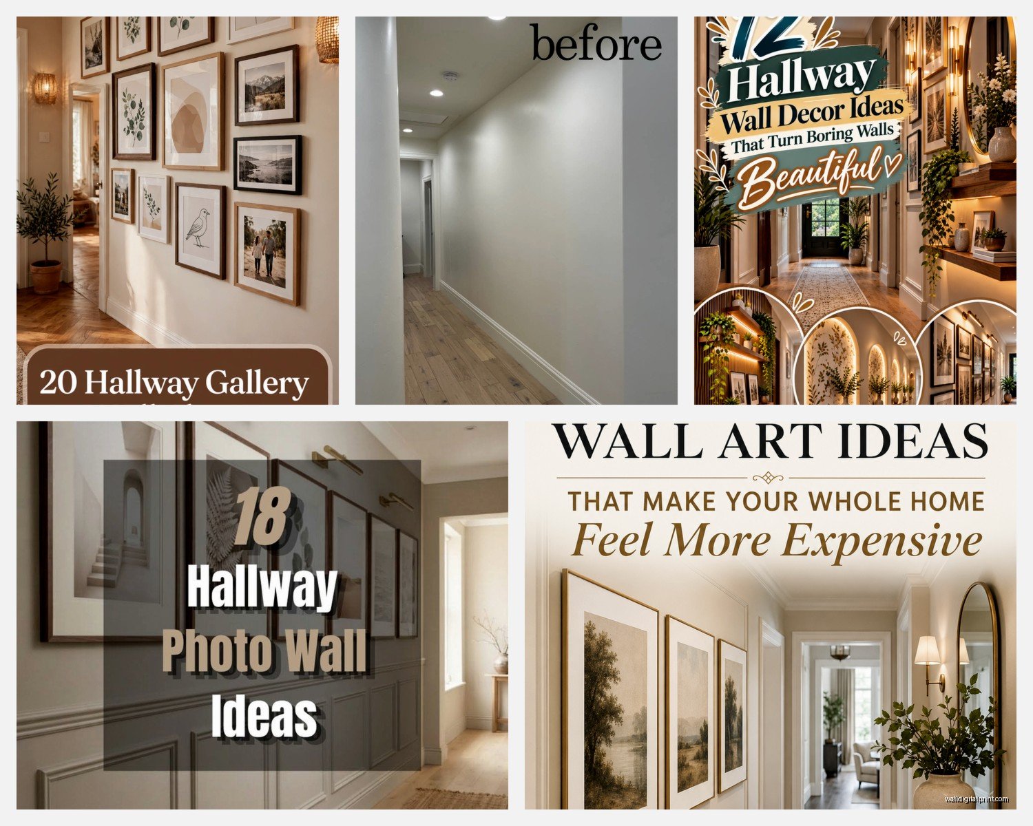
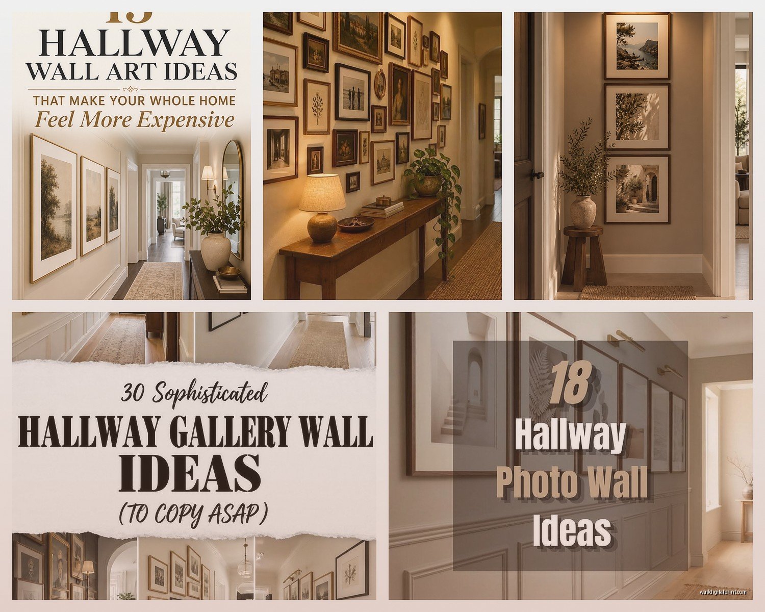
Gallery walls in hallways are their own beast. The mistake everyone makes is trying to do that perfectly curated “collected over time” look but making it too complicated. In a hallway you’re literally moving past it, so too many small pieces just reads as visual clutter. I stick with one of three approaches:
The grid – same size frames, consistent spacing, super clean. This works great in modern or minimalist spaces. I usually do 3-4 across and however many down depending on wall length. Spacing should be 2-3 inches between frames, consistent throughout.
The salon style – different sizes but a clear boundary. Like imagine an invisible rectangle and nothing goes outside it. This takes more planning but looks really collected and intentional. Just make sure you’ve got at least one anchor piece that’s bigger than the rest.
The single line – frames of varying sizes all hung on the same horizontal center line. Easiest to execute and honestly looks good in almost any hallway. The rhythm of walking past different sized frames is just… *chef’s kiss*.
Oh and if you’re doing family photos, please for the love of everything don’t do all different frame colors and styles unless you’re specifically going for that eclectic grandma’s house vibe (which, no judgment, can actually work). Stick with all black, all white, all wood, or all brass. Your hallway will thank you.
Framing choices – I’m obsessed with those thin metal frames right now, like the ones from Framebridge or even the cheap ones from Amazon work fine. They feel modern without trying too hard. But in older homes or traditional spaces, they can look weirdly out of place. I did a Victorian hallway last year and we went with ornate gold frames and it was absolutely the right call.
For renters or people who don’t wanna put a million holes in the wall, picture rails are actually making a comeback. You install one rail at the top of the wall and hang everything from wires. Looks very European gallery, works especially well in long hallways. My cat keeps trying to climb the wires though so… pet considerations I guess.
Let me tell you about scale because this is where people really struggle. A common hallway is about 3-4 feet wide. If you’re hanging one statement piece, it should probably be around 24-30 inches wide. Bigger than that and it’ll overwhelm the space. Smaller and it looks like you just stuck something there as an afterthought.
But if you’ve got a really long hallway – like 15+ feet – one piece is gonna look lonely. This is where a series shines. Three to five pieces of the same size and style, evenly spaced. I recently did this with black and white photography prints, five 16x20s spaced about 18 inches apart, and it created this really nice rhythm as you walked down the hall.
Okay so funny story – I was watching this home renovation show while trying to figure out a client’s awkward L-shaped hallway situation, and the designer did this corner wrap thing that actually worked? Basically you continue the gallery from one wall around the corner to the next wall. It sounds like it would be weird but it creates this continuous visual flow. Just make sure the corner pieces relate to each other somehow.
The corner where two hallway walls meet is also a good spot for a tall vertical piece or a narrow console table with art above it. Breaks up the monotony if you’ve got a long stretch.
Material choices – this matters more than people think. High-traffic hallways near entries? Skip the paper prints under glass because moisture and temperature changes will warp them eventually. Go with canvas, metal prints, or acrylic face mounts. They’re more durable and honestly easier to clean.
I’m really into those wood-mounted prints right now, the ones where the photo is printed directly onto wood planks. They have this casual, lived-in vibe that works great in hallways because they don’t feel too precious. Plus no glass to break if someone bumps into them.
Command strips versus nails – look, I know the internet loves command strips but for hallways where there’s vibration from doors closing and people walking, I’ve had mixed results. Anything over 5 pounds, I’m using proper picture hanging hardware. Get the ones rated for your wall type (drywall, plaster, whatever) and use anchors if you’re not hitting studs.
This is probably obvious but avoid anything too personal or potentially awkward in hallways that lead to guest bathrooms. Like your boudoir photos or whatever should probably go in your private bedroom hallway, not where dinner guests are gonna see them on their way to pee.
Theme-wise, I’ve seen successful hallways with: all vintage botanical prints, all family photos in matching frames, all abstract art in the same color palette, all black and white photography, travel photos from one specific trip, kids artwork in uniform frames (actually super cute), vintage posters, a collection of plates or other 3D objects.
What doesn’t usually work: random unrelated stuff with no connecting thread, too many different colors fighting for attention, pieces that are all different sizes with no clear arrangement logic.
Color theory moment – if your hallway walls are white or light neutral, you’ve got freedom to do whatever. But if you’ve got colored walls, your art needs to either complement or deliberately contrast. I did a navy hallway with brass-framed botanical prints and cream mats – *so* good. But I’ve also seen bold colored walls with monochromatic black and white photo series that worked perfectly.
Don’t sleep on textile art for hallways either. Woven wall hangings, tapestries, even vintage quilts hung as art. They add texture and actually help with acoustics if your hallway is echo-y. Just make sure they’re secured well because they’re usually heavier than they look.
The practical stuff nobody tells you – dust accumulates like crazy on hallway art because of air flow. If you’re doing open frames or anything with texture, you’re gonna be dusting it regularly. This is why I often recommend glass-fronted frames for hallways even though they’re less trendy right now.
Alright last thing because I gotta go walk my dog – don’t forget about the end of the hallway. If your hallway dead-ends at a wall, that’s premium real estate for a statement piece. It’s literally what you see as you approach, so make it count. This is where I’d put something larger, bolder, more interesting. It gives the hallway a destination instead of just being a pass-through space.
Spacing between multiple pieces should be consistent – I usually do 3-4 inches for a more formal look, 2-3 inches for contemporary. Measure and mark everything before you start hammering. Trust me on this. I’ve redone too many hallways because someone just eyeballed it and everything ended up crooked.