Wall Art Guide, Wall Art Tutoriels
House Wall Art: Architectural Home & Building Designs
Jun
So I’ve been completely obsessed with architectural wall art lately and honestly it started because I had this massive blank wall in my hallway that was just mocking me every single day. Like you know that feeling when you walk past something 47 times and it just bugs you? Yeah, that.
Why Architectural Prints Actually Work Better Than You’d Think
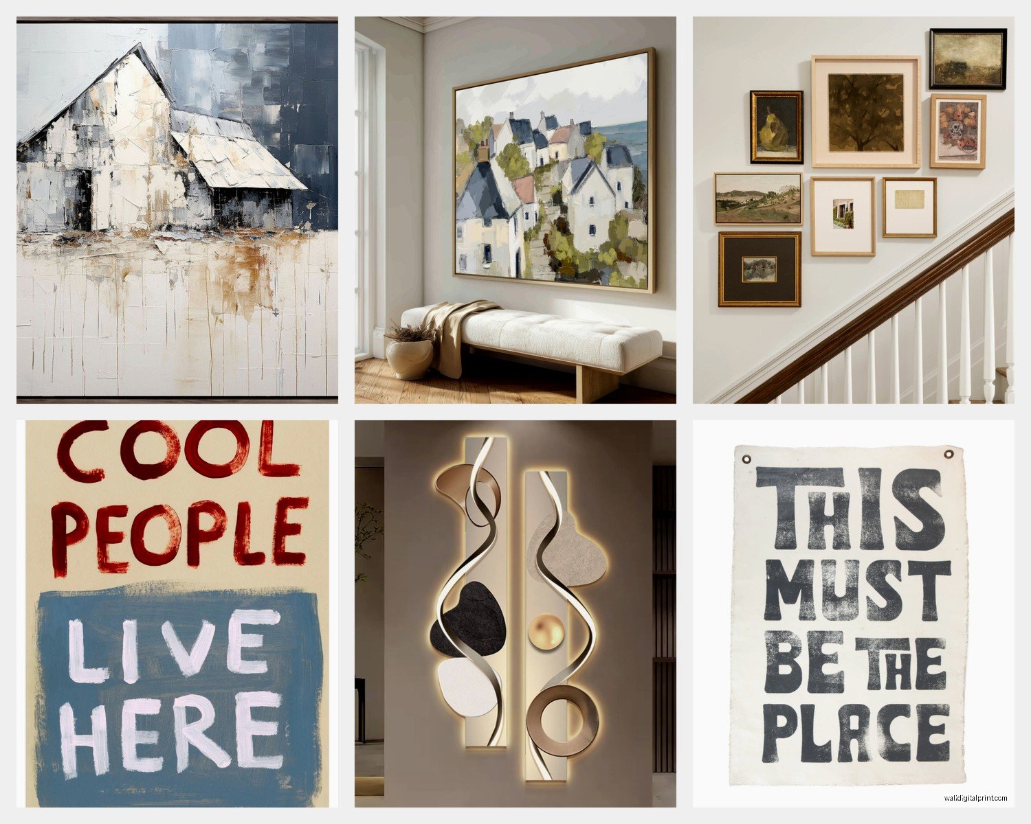
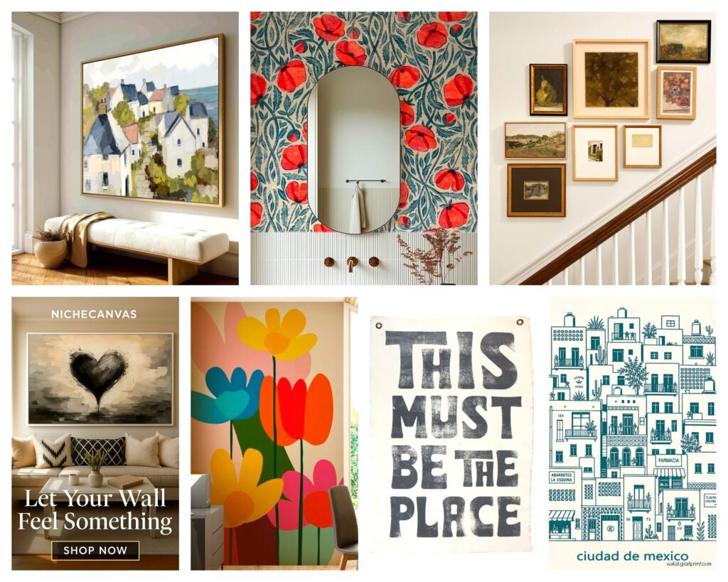
Okay so here’s the thing about house and building designs as wall art – they’re weirdly versatile in a way that like, florals or abstract stuff just isn’t sometimes. I tested this theory in three different client spaces last month and every single one worked, which never happens. You can go super modern with blueprint-style line drawings or get all romantic with vintage architectural sketches of European buildings and somehow both feel right depending on what you pair them with.
The trick I’ve figured out is that buildings have inherent structure (obviously lol) so they automatically bring order to a space even when everything else is kinda chaotic. My own living room is proof – I’ve got plants everywhere, books stacked on the coffee table, my cat’s toys scattered around, but those three framed architectural elevations above my couch make it look intentional instead of messy.
Finding the Right Style Without Losing Your Mind
This is gonna sound weird but I actually keep a Pinterest board that’s just “buildings that don’t make me want to fall asleep” because so much architectural art is just… boring? Like yes, a technical drawing of a warehouse is architecturally significant but do I want to stare at it while eating breakfast? No.
Here’s what I’ve found actually works:
- Blueprint-style white lines on blue or black backgrounds – these are chef’s kiss for modern or industrial spaces
- Vintage brownstone or townhouse illustrations – perfect for that collected-over-time vibe
- Minimalist line drawings of famous buildings – think one continuous line forming the Eiffel Tower or something
- Watercolor architectural sketches – adds softness if your space feels too hard-edged
- Black and white photography of interesting facades – works literally everywhere
I spent like two hours last Tuesday (my morning client canceled so naturally I went down a rabbit hole) comparing different print styles on Etsy and honestly the shops that show the prints in actual room settings are the only ones worth your time. You need to see scale.
The Scale Thing Nobody Talks About
Oh and another thing – size matters SO much with architectural art and everyone gets this wrong initially. A tiny 8×10 print of a building just looks sad unless you’re doing a gallery wall situation. Buildings are big, your art should reflect that.
For a single statement piece above a sofa or bed, you want at least 24×36 inches, maybe even 30×40 if your wall can handle it. I learned this the hard way when I ordered what I thought was a large print of a Victorian house and it arrived looking like a postage stamp on my wall. Had to order a second one in the right size and now I have a random small print in my office that doesn’t really go with anything but whatever.
Mixing Different Architectural Styles
So you’d think mixing like, a modern glass building with a medieval cathedral would look insane but actually if you keep the frame style consistent and the color palette similar, it totally works? I did this in a client’s home office – we had five different prints ranging from Art Deco skyscrapers to rustic Italian villas, all in black frames with white mats, all black and white images. Looked cohesive even though the buildings themselves were from completely different eras and continents.
The key is picking one element to be your through-line:
- All the same color treatment (all black and white, or all sepia, or all blueprint-blue)
- Same frame style and color
- Similar artistic medium (all photographs, or all line drawings, or all watercolors)
You only need one of those three to be consistent, not all of them. That’s the secret literally no one tells you.
Where to Actually Buy This Stuff
Okay so I’m gonna be real with you – I’ve ordered from probably 20 different places in the past year and here’s what I’ve learned.
Etsy is honestly your best bet for unique architectural prints. Search for “architectural line drawing” or “vintage house illustration” or “blueprint art” and you’ll find tons. The nice thing is most are digital downloads so you can print them at whatever size you need. Just make sure the resolution is at least 300 DPI if you’re going bigger than 16×20.
Wait I forgot to mention – if you’re doing digital downloads, you gotta find a good local print shop. I use a place near me that does large format printing and the quality is SO much better than like, printing at Staples or whatever. They can print on actual photo paper or even fine art paper which makes a huge difference.
For photography of real buildings, I really like Desenio and The Poster Club – they have good quality prints and lots of architectural photography that doesn’t look stock-photo-ish. A bit pricey but the paper quality is noticeably better than cheaper options.
Society6 and Redbubble are hit or miss. Some artists on there are incredible, others are just stealing images from Google. Check the artist’s other work to make sure it’s legit.
The Framing Situation
This is where it gets expensive if you’re not careful. Custom framing is like $200+ per piece which adds up real fast when you’re doing multiple prints.
Here’s what I actually do: I buy standard size prints (16×20, 18×24, 24×36) so I can use ready-made frames from IKEA or Frame Destination or even Amazon. The IKEA Ribba frames are honestly perfectly fine for most situations. Their Silverhojden frames are better if you want something slightly more substantial.
If you have a weird size print that you’re in love with, check if your local craft store does framing sales. Michael’s and Hobby Lobby both do 50% off framing sales pretty regularly and suddenly custom framing becomes almost reasonable.
Making It Look Intentional Not Random
So the difference between “I hung some art” and “this looks like it belongs here” is usually just about 3 inches of spacing and whether things are level. Sounds obvious but you’d be surprised how many people eyeball it and wonder why it looks off.
For a gallery wall of architectural prints, I map everything out on the floor first. Take painter’s tape and mark the perimeter of each frame on your floor in the exact layout you want, then step back and look at it. Sounds excessive but I’ve done this probably 30 times now and it saves so much wall damage from rehinging things.
My general rules that actually work:
- Keep 2-3 inches between frames in a gallery wall
- The center of your art should be at eye level, which is usually 57-60 inches from the floor
- For art above furniture, leave 6-8 inches between the furniture top and bottom of frame
- Odd numbers look better than even numbers for groupings
Oh and use a level. Like an actual level. Not the app on your phone. I know this seems old school but phone apps are weirdly inaccurate and you’ll end up with something that’s just slightly off and it’ll bother you forever.
Color Schemes That Don’t Fail
This is gonna sound boring but black and white architectural prints work in literally any space. I’ve used them in colorful maximalist rooms, minimalist Scandinavian spaces, traditional homes, modern apartments – always works.
If you want color though, here’s what I’ve figured out: match the art colors to accent colors already in your space, not your wall color. So if you have a gray room with navy pillows and brass accents, look for architectural prints with navy or warm gold tones in them.
Watercolor architectural sketches are great for adding soft color. I found this artist on Etsy who does European buildings in really muted watercolors – lots of soft pinks, grays, sage greens – and they add color without being loud about it.
Blueprint-style prints (white lines on dark blue) are perfect if you have a lot of warm wood tones in your space because that blue cools everything down nicely. I used these in a client’s home library that had built-in oak shelving and it balanced everything out.
The Matting Decision
Okay so mats are one of those things where sometimes they’re necessary and sometimes they’re just wasting space. Large prints (24×36 and up) usually don’t need mats – they have enough presence on their own. Smaller prints almost always look better with mats because it gives them more visual weight.
White mats are safe and classic. Cream or off-white mats look more expensive somehow? Black mats are dramatic and work really well with colorful or light-colored art. I rarely use colored mats for architectural art because it usually competes with the image.
Specific Rooms and What Works Where
Living room is pretty much anything goes. I tend to do larger statement pieces or curated gallery walls here. Blueprint-style prints of mid-century homes look amazing in modern living rooms. Vintage architectural sketches work great in traditional spaces.
Bedrooms I usually go softer – watercolor architectural sketches, gentle line drawings, black and white photography of romantic buildings like Parisian apartments or Italian villas. You don’t want anything too intense where you sleep.
Home offices are perfect for technical architectural drawings, blueprints, elevation views. Makes the space feel professional but still interesting. I have three framed blueprints of famous modernist houses in my office and people always comment on them during video calls.
Hallways are actually my favorite place for architectural art because you’re walking past them so you can do more detail-heavy pieces that reward closer looking. I did a whole gallery wall of doorway and window details from different architectural periods in a client’s hallway and it’s probably my favorite thing I’ve done this year.
Common Mistakes I See All The Time
Hanging things too high. I swear everyone’s first instinct is to hang art way higher than it should be. Remember that 57-60 inch center height rule.
Buying art that’s too small for the space. It’s better to have one large piece than three tiny ones floating on a big wall.
Not considering the orientation of your wall. Horizontal walls (like above a sofa) need horizontal art or a horizontal arrangement. Vertical walls (like in a narrow hallway) need vertical pieces.
Mixing too many frame colors. Pick one or two max. I usually do all black or all natural wood or black with one brass frame as an accent.
my cat just knocked over my water bottle so gonna wrap this up but last thing – don’t overthink it too much
Quick Shopping List for Getting Started
If you’re starting from scratch and want to do an architectural art thing, here’s literally what I’d buy:
- Three 18×24 architectural prints from Etsy in a consistent style (budget around $30-60 for digital downloads)
- Three matching frames – IKEA Ribba or Knoppang frames work great (around $15-25 each)
- A proper level from the hardware store
- Command strips or proper picture hanging hardware depending on your wall type
- Painter’s tape for mapping layout
That whole setup is maybe $150-200 and will completely transform a blank wall. You can always add more later once you figure out what you like.
The thing about architectural art is it doesn’t go out of style the way trendy art does. Buildings have been around forever and line drawings of buildings will still look good in 10 years. It’s kind of a safe investment that way.