Wall Art Guide, Wall Art Tutoriels
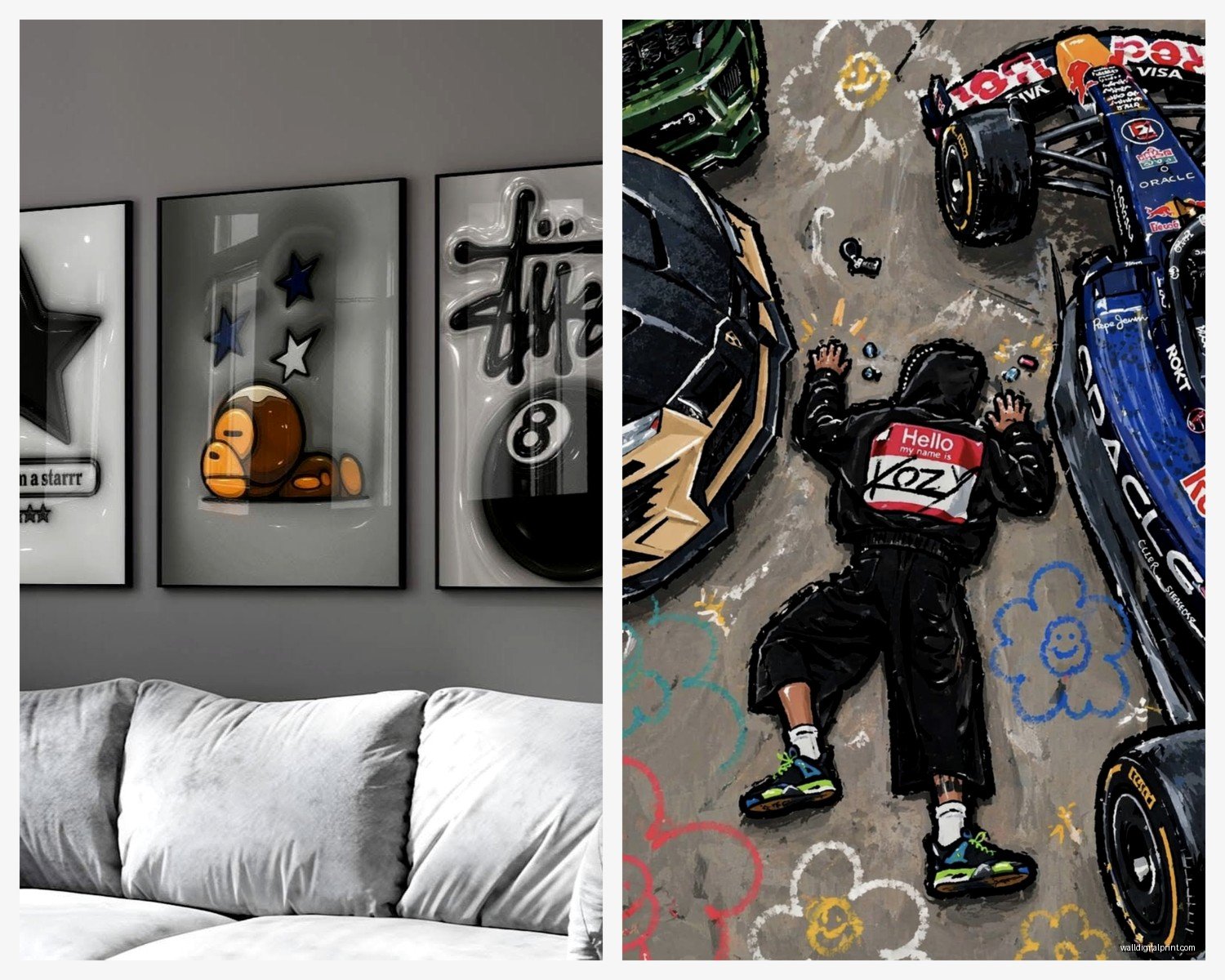
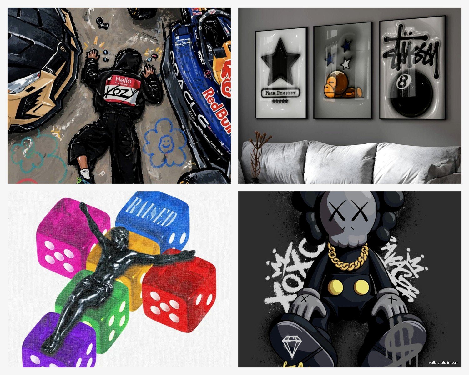
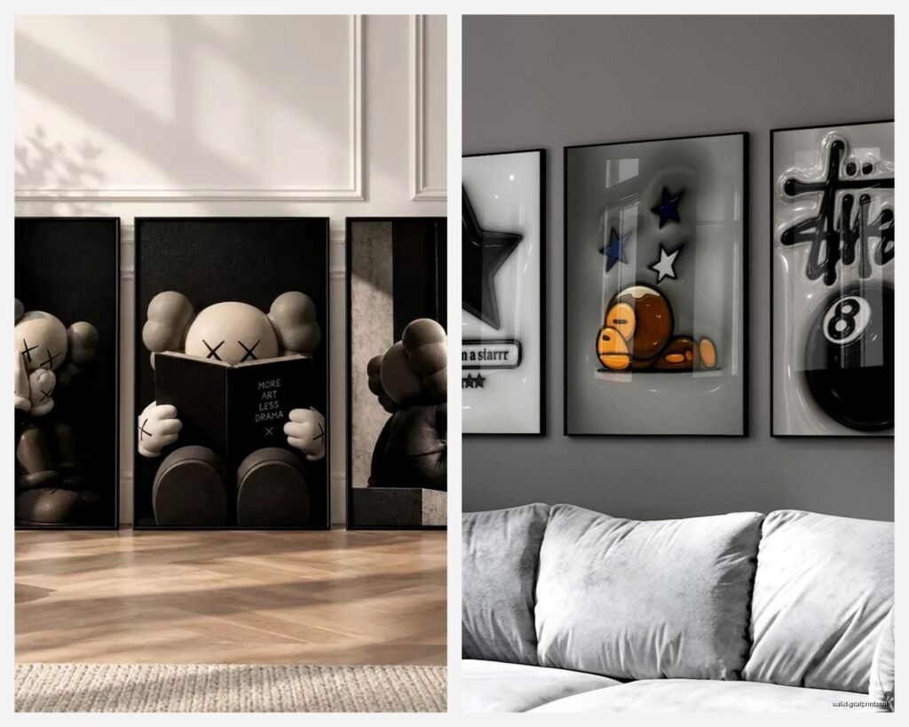
Hype Wall Art: Trendy Viral Social Media Popular Designs
Oct
So I’ve been basically living and breathing hype wall art for the past year because clients keep asking about it and honestly, my own apartment needed a refresh after seeing the same pieces for three years straight.
The thing with viral wall art is it moves FAST. Like what’s trending on TikTok this month is gonna look dated in six months, but there are ways to ride the wave without your walls looking like a 2019 time capsule.
What Actually Counts as Hype Wall Art Right Now
Okay so the stuff that’s genuinely popular right now isn’t what you’d think. Everyone assumes it’s those motivational quote prints but those peaked like two years ago. What I’m seeing everywhere – and I mean client requests, Pinterest saves, Instagram posts – is way more specific.
Abstract line art but not the minimalist black and white stuff from 2020. We’re talking colorful, chaotic, almost graffiti-style line work. Think faces that aren’t quite finished, overlapping profiles, that sort of thing. There’s this artist on Instagram my friend showed me (I was watching Succession at the time and totally distracted so I forgot to save it) but their work looks like continuous line drawings that got drunk and wandered around the canvas.
Retro 70s revival which sounds contradictory to “hype” but trust me it’s massive. Burnt orange sunbursts, geometric mushrooms, those wavy rainbow prints. The algorithm loves this stuff because it photographs well with warm lighting.
Maximalist gallery walls where you basically throw any concept of coordination out the window and just… layer everything. Vintage posters over modern prints over embroidery hoops over small mirrors. It shouldn’t work but when you see it done right on social media it gets insane engagement.
Neon signs and LED art – yeah I know these are pricey but even the fake ones (printed neon effects) are trending. Custom text ones especially. My client last month wanted “chaotic good” in her office and honestly it photographs so well for her Zoom backgrounds.
Where to Actually Find This Stuff Without Spending Your Whole Paycheck
This is gonna sound weird but some of my best finds have been on Etsy, not from the big name sellers but from artists with like 47 sales who are just making cool stuff. You gotta dig though. Search terms matter – don’t search “wall art” search “abstract face line art print” or “70s geometric poster” or whatever specific vibe you want.
Society6 and Redbubble are obvious choices and yeah they’re kinda oversaturated but the thing is they KNOW what’s trending because their algorithm literally tracks it. Sort by “popular this week” and you’ll see what’s getting traction. I found this wavy checkered print there that’s been in three different client projects because it works with everything.
Wait I forgot to mention – Amazon actually has a whole section of print-on-demand wall art now and it’s… not terrible? The quality is hit or miss but for trendy pieces you might swap out in a year anyway, spending $25 instead of $150 makes sense. Just read reviews with photos because some of them look amazing online and arrive looking like they were printed on notebook paper.
Desenio if you want that Scandinavian curated look that still feels current. They update their collections constantly based on what’s trending.
For the LED/neon stuff, AliExpress has dupes of everything but shipping takes forever. If you need it faster, Amazon again, or there’s this site called YellowPop that does custom neon signs and they’re actually decent quality.
The Instagram Shop Method
Okay so this is how I find like 60% of my current sources now. I scroll Instagram, see a room setup I like, click on the tagged products if they have them, or if not I literally DM and ask where the art is from. People LOVE talking about their sources. Half the time they’ll link you to the exact Etsy shop.
Also – and this feels sneaky but it works – search hashtags like #amazonhomefinds or #targetstyle because influencers are constantly posting their wall art finds and you can usually screenshot and reverse image search if they don’t link it.
How to Not Look Like You Just Copied a Pinterest Board
Here’s where everyone messes up. They see a viral gallery wall, buy the exact same prints, arrange them the exact same way, and wonder why it feels… off.
The trick is taking the VIBE not the exact execution. If you love those abstract face prints, don’t buy the same five everyone has. Find similar ones from different artists. Mix orientations – not everything needs to be vertical.
I learned this the hard way when I put together a client’s bedroom and used all the “safe” trending pieces and she was like “it looks like a catalog” and she wasn’t wrong. So we kept three of the prints and swapped two for weird vintage finds from a flea market and suddenly it had personality.
Personalization hacks:
- Mix viral prints with personal photos in matching frames – the cohesive frames make it look intentional
- Get custom text prints with inside jokes or weird phrases, not the generic “good vibes only” stuff
- Layer different textures – flat print next to a woven piece next to something in a shadow box
- Use unconventional frames or no frames at all for some pieces
My dog literally just knocked over my water on a stack of frame samples so that’s fun, but anyway –
The Actual Process of Choosing What Works
You gotta start with your space not with what’s trending. I know that sounds backwards for a guide about hype art but hear me out.
Take a photo of your wall in natural light. Open it on your phone. Now when you’re scrolling through options, you can screenshot potential prints and literally visualize them in your space. There are apps for this (I use one called WallApp sometimes) but honestly just holding your phone up with the screenshot works fine.
Color coordination matters even with trendy stuff. If your room is all cool grays and blues, that viral burnt orange 70s print might not work no matter how many likes it has. Unless you’re going for maximum contrast which… can work but it’s risky.
Size is where everyone screws up. That print that looks huge on someone’s Instagram is probably 24×36 but their wall is massive. Your wall might need 16×20 or you might need to go bigger with 40×60. Measure your wall space, use painters tape to map out dimensions before you buy.
Gallery Wall Math
If you’re doing the maximalist gallery wall thing that’s so popular right now, here’s what actually works:
Start with your largest piece (usually 16×20 or 18×24) as an anchor. Place it off-center, not dead middle. Then build around it with smaller pieces. Odd numbers look better – groups of 3, 5, 7.
The spacing between frames should be consistent – I use 2-3 inches usually. Lay everything out on the floor first and take a photo from above. This has saved me so many nail holes in walls.
Trends That Are Coming vs Going Out
Okay so based on what I’m seeing in design previews and what’s starting to bubble up on TikTok:
Coming in hot:
- Dopamine decor (bright, chaotic, maximalist colors)
- Y2K revival (think chrome effects, butterfly motifs, that early 2000s aesthetic)
- Oversized text prints with weird fonts
- Mixed media looks – combining prints with 3D elements
- Anything that looks good on a phone camera for content creation
On the way out:
- Minimal black and white line drawings (they’re still fine but not “hype” anymore)
- Generic motivational quotes in script fonts
- Eucalyptus prints (we’re SO over botanical prints)
- Perfectly symmetrical gallery walls
- Farmhouse-style word art
The eucalyptus thing is personal bias maybe but I’ve seen SO many and I’m tired.
Budget Breakdown for Different Approaches
If you’re doing this on like $100 total:
Mix 2-3 printed downloads from Etsy ($15-30) that you print at Staples or wherever, one Amazon frame set ($30-40), and maybe one unique piece from a thrift store ($10-20). Use the rest for Command strips and maybe one “investment” piece that’s actually from an independent artist.
$300 budget:
You can get a decent mix of quality prints from Society6 or proper Etsy sellers, better frames from Target or West Elm when they have sales, and maybe one small LED sign or neon print.
$500+:
This is where you can get custom work, original pieces from emerging artists, high-quality framing, or those viral LED signs people keep DMing me about.
The Print Quality Thing Nobody Talks About
So here’s something I learned after a print arrived looking muddy and terrible – resolution matters. If you’re buying digital downloads to print yourself, you need 300 DPI minimum. Check the file size – anything under 10MB for a large print is probably gonna look pixelated.
For print-on-demand services, look for ones that specify they use giclée printing or archival inks. It costs a bit more but won’t fade when light hits it.
Also paper quality – matte vs glossy makes a huge difference in how it photographs for social media if that matters to you. Matte generally looks more expensive and doesn’t have glare issues.
Making Trendy Art Work Long-Term
The smart move is to mix investment pieces with trendy ones. Like your gallery wall can have two or three viral prints you swap out every year, but anchor it with pieces you actually love that aren’t trend-dependent.
I do this thing where I keep a “rotation” box of prints and switch them out seasonally or when I’m bored. It’s way cheaper than redecorating your whole wall and keeps things feeling fresh.
Frames are where you invest if you’re gonna invest anywhere. Good quality matching frames elevate even cheap prints. IKEA RIBBA frames are like $10-15 and genuinely look fine for most applications.
Common Mistakes I See Constantly
Hanging things too high. The center of your art should be at eye level which is like 57-60 inches from the floor. Not above the couch back, not touching the ceiling.
Buying everything at once from one place so it all matches TOO much. The viral gallery walls that pop have variety in sources.
Forgetting about lighting. Even amazing art looks flat with bad lighting. If you’re investing in hype pieces, get a picture light or at least position near a window.
Not considering the rest of the room. That neon sign might be cool but if it clashes with your bedding and rug, it’s gonna feel off.
Oh and another thing – people forget that trendy doesn’t mean it has to be expensive or complicated. Sometimes the most viral setups are just well-executed simple ideas. That one TikTok room with just five black frames in a grid with abstract prints? Probably cost $150 total but got millions of views because it was clean and the photography was good.
How to Actually Hang This Stuff
Command strips for anything under 5 pounds, they won’t damage walls and you can move things around. The velcro ones are better than the regular strips for prints.
For heavier frames or LED signs, you gotta use proper anchors. Drywall anchors if you can’t hit a stud. This seems obvious but I’ve had three clients try to hang heavy stuff with just nails and then wonder why it fell.
Level app on your phone works fine, you don’t need to buy an actual level unless you’re doing a big gallery wall.
The trick for gallery walls is to cut paper templates of each frame size, tape them up, adjust until it looks right, then nail through the paper where the hanger should go. Remove paper, hang frames. This method has saved me so much frustration.
For LED signs you usually need to plan for the cord situation. Those battery operated ones are easier but the light isn’t as good. If you’re doing plug-in, make sure you have an outlet nearby or get creative with cord covers.
Okay so that’s basically everything I’ve figured out through way too many late nights scrolling Instagram and actually testing this stuff in real spaces. The main thing is don’t overthink it – trends are meant to be fun and temporary so if you end up hating something in six months just swap it out. That’s literally the whole point of hype art, it’s supposed to evolve with what’s current.