Wall Art Guide, Wall Art Tutoriels
Inspirational Wall Art for Office: Workplace Motivation
Apr
So I’ve been going through this whole inspirational wall art thing for offices lately and honestly? It’s trickier than you’d think because there’s SO much garbage out there that just screams “live laugh love” energy but for corporate spaces, you know?
What Actually Works vs What Looks Cheesy
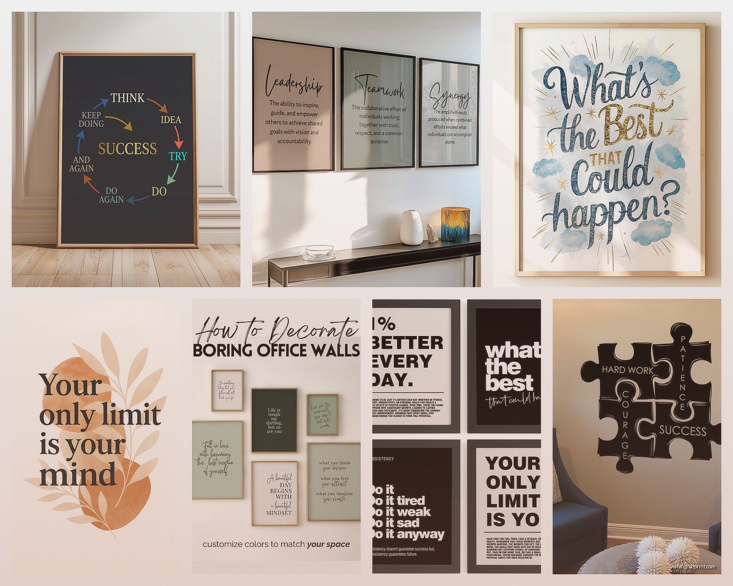
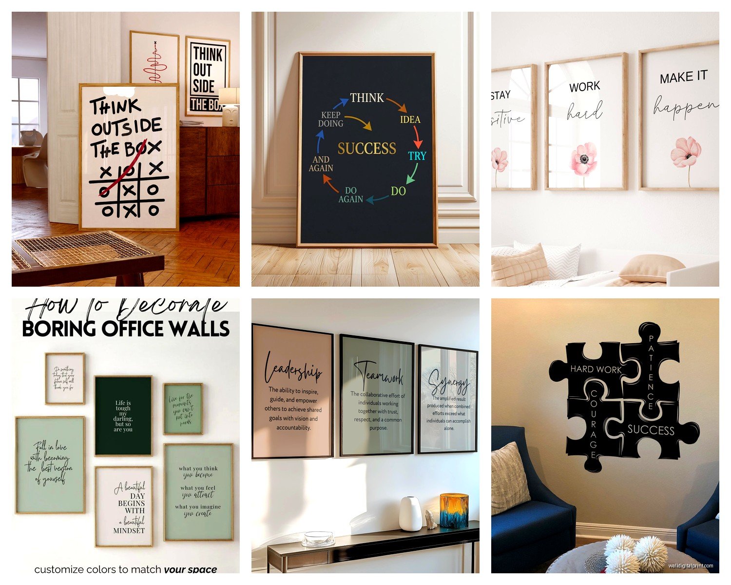
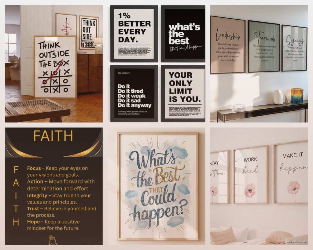
Okay so first thing – you gotta avoid anything that looks like it came from a 2014 Pinterest board. I made this mistake with a client’s startup office last year and we had to redo the whole thing because the motivational quotes were so cringey that employees literally started making memes about them. Not the vibe we were going for.
The stuff that actually works is way more subtle. Think typography that’s more design-focused than message-focused. Like instead of “HUSTLE HARDER” in some aggressive font, you want something like a simple geometric print that happens to have a word or phrase integrated into the design. I’ve been using a lot of Bauhaus-inspired pieces lately – clean lines, interesting compositions, and if there’s text it feels intentional rather than preachy.
Material Choices That Don’t Look Cheap
Canvas prints are everywhere but here’s the thing – most of them are terrible quality. The fabric stretches weird over time and the colors fade if there’s any natural light. I learned this the hard way in my own office where I had this beautiful abstract piece that turned into a washed-out mess within like eight months.
What I use now:
- Framed giclée prints on archival paper – sounds fancy but they’re not that expensive if you skip the custom framing route
- Metal prints for modern offices – these are actually super durable and the colors stay vibrant forever basically
- Acrylic prints when you want something that feels high-end without the high-end price
- Wood prints for that trendy rustic-meets-modern thing but only if your office doesn’t already have a ton of wood everywhere
I’ve been testing different materials in my studio space and the metal prints are honestly winning. They’re lightweight, easy to clean (important for offices), and they have this depth to them that regular prints just don’t have. Got one from a place called Fracture and another from Metal Prints Plus and honestly couldn’t tell you which is which at this point.
Size Matters More Than You Think
This is gonna sound obvious but people constantly get this wrong – small art in big spaces looks pathetic. I walked into a conference room once where they had these tiny 8×10 motivational prints on a massive wall and it looked like they gave up halfway through decorating.
The formula I use is pretty simple: measure your wall space and the art should take up roughly two-thirds to three-quarters of the available width. So if you’ve got a 6-foot wide wall section, you’re looking at art that’s around 48-54 inches wide. You can do this with one large piece or a gallery wall situation but the total visual weight needs to fill that space.
For individual offices: 24×36 inches works for most spaces behind desks. For reception areas or conference rooms: go big or go home, like 40×60 inches minimum.
Oh and another thing – height placement. The center of the artwork should be at eye level which is roughly 57-60 inches from the floor. I see so many offices where art is hung way too high like they’re trying to decorate the ceiling.
What Messages Don’t Make People Roll Their Eyes
My dog just knocked over my coffee but anyway – the messaging is where most people screw this up completely. Nobody wants to stare at “SYNERGY” or “TEAMWORK MAKES THE DREAM WORK” for eight hours a day.
What actually resonates:
- Abstract concepts presented visually rather than literally – like a geometric representation of growth or connection
- Single powerful words in sophisticated typography: “Create,” “Think,” “Build” – but styled in a way that feels artistic not corporate
- Historical quotes from actual interesting people, not generic motivational speaker stuff
- Industry-specific imagery that celebrates the actual work – architectural blueprints for design firms, vintage maps for travel companies, that kind of thing
- Nature photography with no text at all because sometimes you just need to look at something peaceful
I’ve got this one piece in my workspace that’s just the word “Focus” but it’s done in this fragmented style where the letters are breaking apart and reforming and honestly it’s way more thought-provoking than any “you miss 100% of the shots you don’t take” poster could ever be.
Color Psychology Without Getting Too Woo-Woo About It
Okay so there’s actual research about colors affecting productivity and mood but also it’s not magic. Blue tones generally help with focus and calm – good for high-stress environments. I used a series of navy and teal abstract prints in a law office and the feedback was that the space felt less chaotic.
Warm colors like orange and yellow can boost creativity and energy but they can also be overwhelming if you go too saturated. I tend to use them as accent colors in the art rather than the dominant palette.
Green is having a moment and for good reason – it’s easy on the eyes and has that whole nature/growth association. Works great in pretty much any office environment.
What I avoid: aggressive reds (too stimulating for most work environments), stark black and white unless the office aesthetic is very specifically minimalist, and anything too pastel because it reads as trying too hard to be calming.
Combining Multiple Pieces
Gallery walls are popular but they’re also easy to mess up. I spent like three hours last week planning one for a tech startup and here’s what I figured out through trial and error:
Keep a consistent element – either the frame style, the color palette, or the theme. You can’t have everything be different or it looks like you just bought whatever was on sale.
Use paper templates first. Seriously, trace your frames on kraft paper, tape them to the wall, live with it for a few days. I cannot tell you how many times this has saved me from making permanent holes in the wrong places.
The spacing between frames should be consistent – I use 2-3 inches between pieces. Closer than that feels cluttered, farther apart and they don’t read as a cohesive collection.
Where to Actually Buy This Stuff
Society6 and Redbubble are fine for less formal offices but the quality is hit or miss. I’ve had good experiences with both but also some prints that looked weirdly pixelated in person.
For better quality:
- Minted – higher price point but the paper quality is noticeably better
- Artfully Walls – good for more artistic pieces, they work with actual artists
- 20×200 – limited edition prints at different price points, some really unique stuff
- Etsy for custom work or vintage finds but you gotta be careful with seller ratings
If you’ve got budget: commission something. I worked with a local artist to create a custom piece for a client’s office that incorporated elements of their brand without being logo-heavy and it became like the centerpiece of their whole space. Cost about $800 but it’s a conversation starter in every meeting.
Installation Tips Nobody Tells You
Command strips work for lightweight frames but they will fail eventually, usually at the most inconvenient time possible. I’ve had pieces crash down in the middle of client meetings and it’s not cute.
For anything over 10 pounds, use actual picture hanging hardware. D-rings and wire for medium weight, french cleats for heavy pieces or anything in a high-traffic area where you don’t want it falling on someone.
Brick or concrete walls? You’re gonna need a masonry bit and wall anchors. Don’t try to hammer a regular nail into concrete, I watched someone do this once and it was painful.
wait I forgot to mention – if you’re in a rental office situation, check your lease about wall modifications. Some places are weird about holes.
Maintenance and Longevity
Dust your art. I know this sounds basic but glass and acrylic collect dust like crazy and it makes everything look dingy. Microfiber cloth, no cleaning products unless it’s actually glass and you’re using proper glass cleaner.
Direct sunlight will fade basically everything over time. If you’ve got big windows, either use UV-protective glass or accept that you might need to replace prints every few years. Or just position them on walls that don’t get direct sun – seems obvious but people don’t think about it.
For high-traffic areas, acrylic or metal prints hold up way better than paper-based art. I’ve got metal prints in reception areas that still look perfect after three years of people brushing past them, touching them accidentally, etc.
Rotating Collections
This is gonna sound extra but if you have the storage space, rotating art seasonally or yearly keeps the office feeling fresh. I do this in my own workspace – have like three different sets of prints that I swap out. Takes maybe 20 minutes and suddenly the room feels completely different.
Some offices do rotating employee art shows which is cool if you have creative staff but can also be awkward if someone’s art is… not great. Proceed with caution on that one.
Budget Breakdown for Different Office Sizes
For a single office or small workspace: $200-500 can get you 2-3 quality pieces that look professional. Don’t spread yourself too thin trying to cover every wall.
Medium office (3-5 rooms): you’re looking at around $800-1500 if you’re strategic about it. Mix some affordable prints with one or two statement pieces.
Large office or full floor: honestly depends so much on the space but I’d budget at least $3000-5000 to do it properly. This is where working with someone who knows what they’re doing saves you money in the long run because mistakes get expensive at scale.
The cheapest option that doesn’t look cheap: high-quality digital downloads that you print yourself at a local print shop, then frame with simple black or white frames from IKEA. I’ve done this for budget-conscious clients and if you choose the right images, nobody can tell you didn’t spend a fortune.
Common Mistakes I See Constantly
Matching the art too literally to the brand colors. Like if your logo is blue and orange, you don’t need blue and orange art everywhere. It’s too much. Pull in neutrals, use the brand colors as accents.
Ignoring the ceiling height. Standard 8-foot ceilings need different proportions than 12-foot ceilings. Tall and narrow works better in spaces with high ceilings, wider pieces for standard heights.
Buying everything from the same collection or series. It ends up looking like a hotel lobby. Mix sources, styles, time periods.
Hanging everything the same day you get it. Live with pieces leaning against walls for a bit, see how the light hits them at different times of day. I’ve completely changed placement plans after seeing how afternoon sun created glare on certain pieces.
Anyway, that’s basically everything I’ve learned from doing this for the past few years. The main thing is just don’t overthink it to the point where you end up with blank walls because you couldn’t decide. Blank walls are more depressing than imperfect art choices, and you can always switch things out later.