Wall Art Guide, Wall Art Tutoriels
Motivational Wall Art for Office: Productivity Quotes
Apr
So I’ve been setting up office spaces with motivational wall art for like three years now and honestly the whole productivity quote thing can go really wrong or really right depending on what you pick and how you mount it.
The Materials That Actually Work
Okay so first thing – forget those paper posters from college. They curl, they fade, and honestly they make your office look like a dorm room which is not the vibe when you’re trying to be productive.
The materials I actually recommend are gonna sound boring but they work. Canvas prints are my go-to for most clients because they’re lightweight, don’t need glass (which creates glare on video calls btw), and you can get them in literally any size. I use ones that are at least 1.5 inches thick on the stretcher bars because the thin ones look cheap and kinda sad hanging there.
Metal prints though… okay so I discovered these last year when my dog knocked over a framed glass piece in my own office and I was SO over dealing with glass. Metal prints are aluminum sheets with the image basically dyed into the surface. They’re sleek, modern, and the colors pop in this way that makes quotes actually feel energetic instead of like your guidance counselor’s office. They work best for minimalist designs – think black text on white background or vice versa. The reflective quality adds this subtle dimension that’s hard to explain until you see it in person.
Acrylic prints are the fancy option. More expensive but if you want that high-end gallery look, this is it. The quote sits behind a glossy acrylic layer and it just looks… expensive? Like you invested in your space. I use these for executive offices or when someone’s office is also their video background for client calls.
Wood Prints and When They’re Not Annoying
Wood prints can either look amazing or like you bought something from a craft fair in 2014, there’s no in between. The key is the wood grain – you want it visible but not overwhelming. I learned this the hard way when I ordered a “motivational” piece for a law office and the wood grain was so prominent you could barely read “Success is built daily” or whatever it said.
Look for birch or maple with a light stain. The quote should be laser-engraved or UV printed directly on the wood. Those vinyl decal things that people stick on wood? They peel. I’ve seen it happen after like six months near a sunny window.
Size Actually Matters More Than You Think
This is gonna sound weirdly specific but I have a formula now. For a standard office wall (we’re talking the wall behind your desk or across from where you sit), you want your art piece to be roughly two-thirds to three-quarters the width of the furniture below it. So if you have a 60-inch desk, you’re looking at 40-48 inches of art width.
Too small and it looks like you just… gave up? Like you meant to decorate but got distracted. Too big and it’s overwhelming, especially with text that you’re supposed to read and internalize every day.
For cubicle spaces or smaller offices, I usually do 16×20 or 20×24 inches. Anything bigger starts feeling like the walls are closing in, which is the opposite of motivating.
The Multi-Panel Thing Everyone Gets Wrong
Okay so triptychs – those three-panel sets – can look really cool with quotes split across them. But here’s what nobody tells you: the spacing between panels matters MORE than the panels themselves. I space them 2-3 inches apart, never more. I’ve seen people hang them like 6 inches apart and it just reads as three separate pieces, not one cohesive quote.
Also if you’re doing a quote split across multiple panels, make sure it’s not split mid-word. I once saw “BELIEVE IN YOUR-” “SELF” and I’m still bothered by it.
Framing Options That Don’t Look Corporate-Depressing
Most office art ends up in black frames because it’s “safe” but honestly black frames just disappear into most office walls. Unless your walls are bright white, consider warm wood tones – walnut or natural oak. They add warmth without being distracting.
Floating frames (where there’s a gap between the art and the frame) work really well for quotes because they add this modern edge. The shadow creates depth which keeps text-based art from looking flat.
Metal frames in brass or matte black are my current obsession for contemporary offices. They’re thin – like half an inch – so the focus stays on the quote but they add just enough structure. I pair these with white matting for contrast.
Wait I forgot to mention – if you’re mounting in a frame with glass, get non-glare glass. Regular glass turns your motivational quote into a mirror during certain times of day and you’ll just see your own tired face reflected back which is… not motivating.
The Actual Quotes That Work vs The Ones That Don’t
Here’s where I get opinionated. Most productivity quotes are either too vague (“Dream big!”) or too aggressive (“Hustle harder!”). After watching what actually resonates with people who stare at these daily, I’ve noticed patterns.
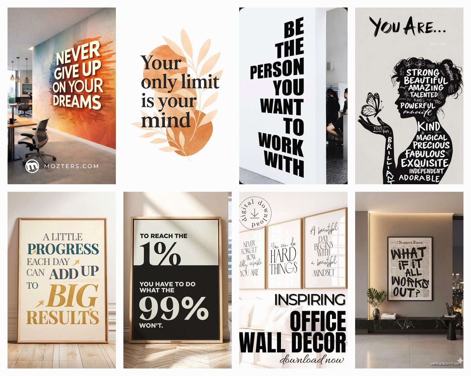
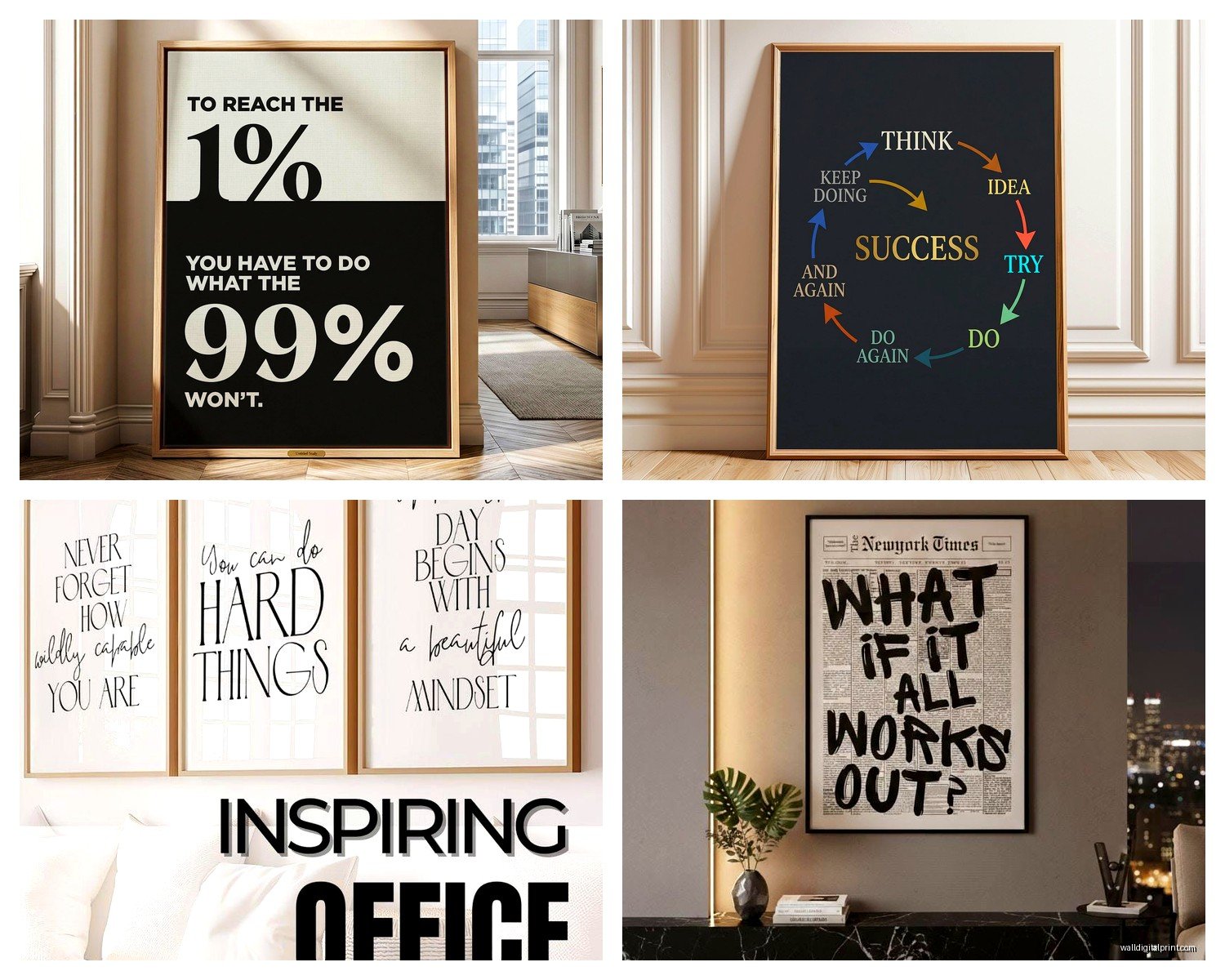
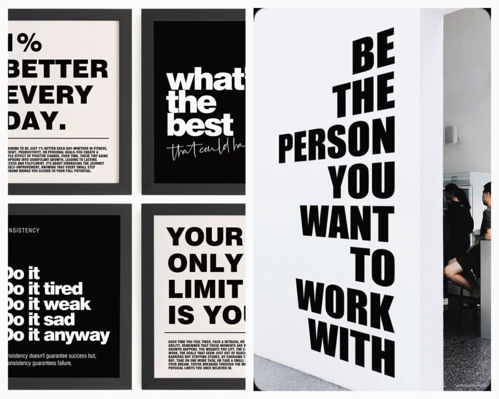
Short quotes – like 5-7 words max – have staying power. “Done is better than perfect” still hits after seeing it for the hundredth time. “The only way to do great work is to love what you do” becomes wallpaper you stop seeing after a week.
Action-oriented language works better than aspirational fluff. “Start before you’re ready” gives you something to DO. “Believe in yourself” is just… okay thanks, super helpful.
I also tell clients to avoid anything with “grind” or “hustle” in it unless that genuinely matches their work philosophy because those can start feeling oppressive when you’re already stressed. Your wall art shouldn’t make you feel guilty for taking lunch.
Font Choices That Don’t Make Me Cringe
Oh man the fonts. So many bad font choices in motivational art.
Sans serif fonts – clean, modern, easy to read – work for 90% of office spaces. I like Helvetica, Futura, or Montserrat. They’re straightforward and don’t distract from the actual message.
Script fonts can work but they gotta be restrained. A subtle script for part of the quote with the rest in sans serif creates visual interest. All script makes it hard to read and looks like a Pinterest board threw up on your wall.
Avoid: anything that looks like a ransom note (multiple fonts mixed randomly), overly distressed/grunge fonts that are hard to read, and Comic Sans obviously but I shouldn’t even have to say that.
The text should be large enough to read from your desk chair. If you have to squint, it’s not functional anymore.
Color Psychology But Make It Actually Useful
I spent way too much time researching this when I was binge-watching some documentary series about design… anyway, colors genuinely affect your mental state in an office.
Blue is calming and associated with productivity – it’s why every tech company uses it. Blue quotes work well for high-stress jobs or when you need focus. I use navy or deep teal rather than bright blue which can feel cold.
Black and white is classic and works in literally any office. It’s my default when I don’t know someone’s style. Clean, professional, doesn’t clash with anything.
Warm colors like burnt orange or deep red can be energizing but use them as accents, not the whole piece. Maybe the key word in your quote is orange while the rest is black.
Green is underrated for offices – it’s associated with growth and balance. Sage or forest green quotes feel fresh without being distracting.
Yellow sounds like it would be energizing but it can actually cause eye strain if it’s too bright. If you’re doing yellow, go for a muted mustard tone.
Installation Methods That Won’t Destroy Your Walls
Okay so mounting this stuff – I’ve learned from SO many mistakes here.
For canvas prints under 5 pounds, Command strips actually work fine despite what people say. I use four strips on a medium-sized canvas, one in each corner. The trick is to let them bond to the wall for like an hour before hanging the art. Everyone rushes this step and then their art falls at 3am and scares the crap out of them.
For anything heavier or metal/acrylic prints, you need proper wall anchors. I use these toggle bolt anchors that expand behind the drywall – way more secure than those plastic ribbed anchors that just pull out eventually.
French cleats are my favorite for larger pieces or if you think you might want to move things around. It’s a mounting system where one piece attaches to the wall and one to your art, and they hook together. Super secure and you can slide the art left or right to get it perfectly positioned.
The Level Tool You Actually Need
Get a small level – like 9 inches. Those apps on your phone are not accurate enough and you WILL hang something crooked. I keep one in my car because I got tired of trying to eyeball things. There’s nothing that makes an office look more amateur than a crooked motivational quote hanging there judging you at a weird angle.
Also measure from the ceiling down, not the floor up. Floors are rarely level but ceilings usually are, so you get better alignment.
Placement Strategies That Actually Make Sense
Behind your desk is the obvious spot but honestly? That’s for other people to see on Zoom calls. If YOU want to benefit from a motivational quote, put it where you’ll actually look at it.
Across from your desk at eye level when you’re seated – this is the sweet spot. You see it when you look up from your computer, during those moments when you’re thinking or stuck.
Next to your monitor but not too close – about 12-18 inches away. Close enough to be in your peripheral vision but not competing with your screen.
Some of my clients put small quotes on the wall they face when they first walk in. It sets the tone before they even sit down. I like this for quotes about intention or starting fresh.
Mixing Motivational Art With Other Office Decor
Don’t make your whole office a motivation poster factory. One or two key pieces mixed with other art creates a more sophisticated look. I usually do one motivational piece and then add abstract art or photography to balance it out.
The motivational piece should be the focal point though. If you’re gonna have productivity quotes, commit to making them prominent. Don’t hide them between your degree frames and family photos where they just become clutter.
Spacing between pieces should be 3-6 inches generally. Too close and it looks crowded, too far and they don’t feel related.
Maintenance Nobody Talks About
Dust your art like once a month. Seriously. Dusty motivational quotes are depressing. A microfiber cloth works for most surfaces.
Canvas can be gently vacuumed with a brush attachment if it gets really dusty. Metal and acrylic can be cleaned with glass cleaner but spray the cloth, not the art directly.
If you have art near a window, UV protection matters. Either get UV-protective glass/acrylic or accept that colors will fade over a few years and plan to replace it. I’ve seen vibrant quotes turn into sad pastel versions of themselves after two years in direct sunlight.
Budget Real Talk
You can get decent canvas prints for like $30-60 in medium sizes from online print shops. I’ve used CanvasDiscount and the quality is solid for the price. Metal prints run $80-150 depending on size. Acrylic is gonna be $150+ for anything substantial.
Custom pieces from independent artists on Etsy or Society6 range wildly – $40 to $300+. You’re paying for unique designs though, not just generic quotes.
Frame costs add up fast. A good quality frame can cost as much as the print itself. I usually tell clients to budget 1.5x the cost of the print when factoring in framing.
If you’re doing multiple offices or a whole workspace, buy in sets – many retailers offer discounts for multiple pieces. I saved a client like $200 ordering six pieces at once instead of individually.
Honestly though? Start with one really good piece rather than three mediocre ones. Better to have one quote that genuinely motivates you than a wall full of stuff you stop seeing after a week. Your office art should work for you, not just fill space because you felt like you should have something there.