Wall Art Guide, Wall Art Tutoriels
Jazz Wall Art: Music Genre Blues Saxophone Instrument
Jul
So I’ve been working with jazz wall art for like three years now and honestly it’s one of those things that can either look super sophisticated or totally cheesy depending on how you approach it. Let me just dump everything I know because I literally just finished installing some saxophone pieces in a client’s study last week.
The Whole Vibe Thing with Jazz Art
Okay so first thing – jazz art isn’t just for music rooms anymore. I’ve put blues and saxophone pieces in living rooms, bedrooms, even a really modern kitchen once (that was weird but it worked). The key is understanding that you’re not decorating with “music” you’re decorating with mood and movement and honestly a bit of nostalgia even if you weren’t alive during the jazz era.
The saxophone instrument specifically has this amazing curved shape that creates natural flow in a room. Like, my dog knocked over a vase yesterday and I was cleaning it up and realized the saxophone print I’d hung above that console table actually drew your eye away from the awkward corner where the wall meets at a weird angle. That curvy silhouette is doing actual work in your space.
What Actually Works vs What Looks Like a TGI Fridays
Real talk – there’s SO much jazz art out there that looks like it belongs in a chain restaurant. Here’s what I’ve learned separates the good from the tacky:
Color Palettes That Don’t Scream
The best jazz pieces I’ve worked with stick to:
– Deep blues with gold or brass accents (classic for a reason)
– Black and white with one accent color – usually a muted gold or deep red
– Sepia tones if you’re going vintage photography route
– Jewel tones like emerald or burgundy but used sparingly
What doesn’t work: those pieces with like electric purple and hot pink and lime green all together trying to be “vibrant jazz energy” or whatever. It just reads as dated 90s decor.
Size Actually Matters Way More Than You Think
I made this mistake in my own apartment – bought this gorgeous print of a saxophone player but it was too small for the wall. Looked like a postcard someone forgot to take down.
For above a sofa or bed: you want something at least 40-50 inches wide or a gallery wall that spans that width
For a narrow wall or hallway: tall vertical pieces work better – think 24×36 or 20×60 inches
Small spaces like bathrooms or nooks: 16×20 or 20×20 is your sweet spot
Oh and another thing – leave like 6-8 inches between the top of your furniture and the bottom of the frame. I see people hang stuff way too high all the time and it floats awkwardly.
Types of Jazz Art That Don’t Suck
Abstract Saxophone Pieces
These are my go-to for clients who want jazz vibes but live in modern or minimalist spaces. You get the instrument shape but it’s broken down into geometric forms or watercolor washes. I found this amazing piece on Etsy last month that was just the bell of a saxophone in brushed gold leaf texture against navy – so good and it was only like $120 framed.
The abstract route lets you keep your space feeling current while still nodding to the music theme. Works especially well in offices or dens where you don’t want things too literal.
Vintage Concert Posters and Photography
If you’re going this direction gotta be careful about authenticity vibes. Real vintage posters are expensive and hard to find but reproductions can look amazing if they’re done right. Look for:
– Aged paper texture (but not overdone)
– Real concert dates and venues
– Quality printing that doesn’t look pixelated
I have a client who collects actual vintage Blue Note album covers and frames them – that’s probably the coolest jazz wall I’ve ever styled. The typography alone from that era is just *chef’s kiss*.
Silhouette and Shadow Work
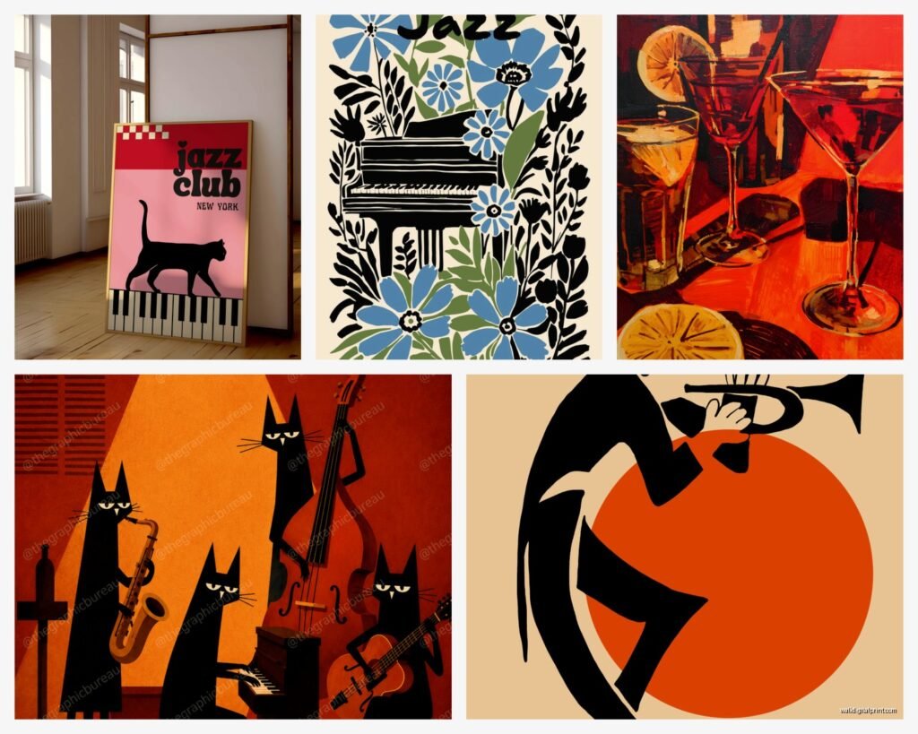
This is gonna sound weird but some of the most impactful jazz pieces I’ve used are simple black silhouettes. Musician playing saxophone against a solid color background or even just white. Super clean, works in literally any decor style, and you can find them at every price point.
There’s this metal wall sculpture thing – it’s a jazz trio silhouette cut from black metal – I’ve used it in three different homes and it always gets compliments. I think it’s like $80 on Wayfair or something.
Text-Based Jazz Art
Lyrics, song titles, famous jazz quotes… these can be hit or miss. The ones that work have really strong typography and don’t try too hard. I saw one that just said “BLUE NOTE” in this amazing vintage font and it was perfect. The ones that have like cursive script saying “Jazz is the sound of freedom” or whatever make me cringe a little.
Where to Actually Buy This Stuff
Okay so I’ve ordered from everywhere at this point:
Etsy – Best for unique prints and custom work. Search “jazz art print” or “saxophone illustration” and filter by your color scheme. Most sellers offer different sizes. Usually $30-150 for prints.
Society6 – Good for modern interpretations. Their framing options are decent and they have sales constantly. Wait I forgot to mention – they do canvas, metal prints, everything.
Art.com/AllPosters – Massive selection of licensed reproductions. This is where I go when I need something specific like Miles Davis or a particular album cover.
West Elm and CB2 – When clients have bigger budgets. Their jazz pieces are usually $200-600 but the quality is there and they’re already framed nicely.
Local art fairs and jazz festivals – Honestly some of my favorite finds. You meet the artist, the work is original, and you get actual texture and brushstrokes.
The Frame Situation
Don’t sleep on framing – it changes everything. Jazz art specifically looks best in:
Black frames for modern spaces – thin profile, clean lines
Brass or gold frames for traditional or eclectic rooms – but go for matte gold not shiny
Natural wood for Scandinavian or minimalist vibes – light oak or walnut
No frame at all if you’re doing canvas – but make sure the edges are finished properly
I usually spend about 40% of the art budget on framing. A $50 print in a $200 custom frame looks way better than a $200 print in a cheap frame. Just is what it is.
Gallery Wall Strategy
If you’re doing multiple pieces here’s my formula that actually works:
Start with one anchor piece (biggest one, usually 24×36 or larger)
Add 4-6 smaller pieces around it in varying sizes
Mix orientations – some horizontal some vertical
Keep frames consistent OR go all different but keep the color palette tight
Lay everything out on the floor first and take a photo – way easier than guessing on the wall
I did a jazz gallery wall in a stairwell last month with like nine different pieces – saxophone photos, vintage posters, abstract stuff – and spent two hours arranging them on the landing floor before hanging anything. My cat kept walking through and messing it up but whatever, it was worth it.
Rooms Where Jazz Art Actually Makes Sense
Home offices and studies – Creates sophistication without being stuffy. The creative energy of jazz helps with the vibe when you’re working.
Living rooms – Over the sofa or on a feature wall. Works especially well if you have a bar cart or record player setup nearby.
Bedrooms – More subtle pieces here. Maybe a blue-toned saxophone print or abstract musical notes. Keep it calming not energetic.
Music rooms obviously – But don’t go overboard. I see people cover every wall and it becomes too much.
Dining rooms – Underrated spot for jazz art. That whole dinner party sophisticated conversation vibe pairs perfectly.
Mixing Jazz Art with Other Stuff
You don’t need an all-jazz wall. Actually it’s better if you don’t. I usually mix jazz pieces with:
– Black and white photography
– Abstract art in complementary colors
– Mirrors (especially brass or gold ones)
– Floating shelves with books and plants
– Other music-related stuff but different eras
The goal is making it look like you collected these pieces over time not that you went to HomeGoods and bought the “jazz collection” all at once.
Lighting Makes or Breaks It
Okay so funny story – I hung this gorgeous vintage saxophone photo for a client and she hated it. Turns out it was just the lighting. We added a picture light above it and suddenly it was her favorite thing in the room.
For jazz art specifically:
– Picture lights work great for vintage pieces – adds to that gallery feel
– Avoid direct sunlight which will fade prints over time
– In dim rooms use lighter colored mats or frames to help the piece pop
– Track lighting aimed at your art wall creates drama
Budget Real Talk
You can do this at any price point honestly:
Under $100 – Etsy prints, Ikea frames, maybe a poster from Amazon. Totally doable and can still look good.
$100-300 – Better quality prints, decent framing from Framebridge or similar, Society6 framed options.
$300-800 – Custom framing, larger pieces, maybe an original from a local artist.
$800+ – Original paintings, limited edition prints, designer frames, vintage collectibles.
I’ve done amazing jazz walls at every level. The expensive stuff isn’t automatically better – it’s about choosing the right pieces for your space and framing them properly.
Common Mistakes People Make
Hanging stuff too high – bottom of frame should be about 57 inches from floor (gallery standard)
Choosing art based on “matching” instead of actual artistic merit
Going too literal – like you don’t need a saxophone AND musical notes AND “JAZZ” in text
Buying without measuring – I can’t tell you how many returns I’ve processed because people don’t measure their walls
Ignoring the rest of the room – your art should work with your furniture colors and style
Wait I forgot to mention – if you’re renting and can’t put holes everywhere, those Command picture hanging strips actually work pretty well for lighter frames. Just follow the weight limits.
The Actual Installation Part
Use a level. Seriously just use a level.
Painter’s tape to mark your layout before hammering anything
For heavy pieces over 20 pounds use wall anchors not just nails
Measure twice drill once (or hammer once whatever)
Have someone help you with large pieces – trying to level a 40-inch frame by yourself is gonna end badly
I keep a whole kit in my car – level, tape measure, picture hanging wire, various hooks and anchors, pencil. Makes life so much easier than running to the hardware store mid-project.
Jazz wall art is one of those things that seems intimidating but once you understand the principles it’s actually pretty straightforward. Just avoid the really literal cheesy stuff, pay attention to scale, and make sure your frames don’t look cheap. The saxophone shape itself is so visually interesting that even a simple silhouette can totally transform a space.