Wall Art Guide, Wall Art Tutoriels
Kitchen Wall Art: Cooking Space Food & Wine Decor
Nov
So I just spent like three hours reorganizing my client’s kitchen wall art yesterday and honestly, the whole process reminded me why this space is actually the trickiest to decorate. Like, you’ve got steam, grease, lighting that’s either fluorescent nightmare or moody pendant situation, and somehow you’re supposed to make it look intentional?
The Grease Factor Nobody Talks About
Okay first thing – and I learned this the hard way after watching a gorgeous vintage wine poster literally curl off the wall near my stove – you gotta think about placement before style. Anything within like 4 feet of your cooktop is gonna get hit with cooking spray residue no matter how careful you think you are. My dog once licked a frame I took down from above the stove and I was mortified at how much buildup there was.
Glass-covered frames are your friend here. Not because they look fancier but because you can actually wipe them down. I use those RIBBA frames from IKEA for high-grease zones and just hit them with glass cleaner every couple weeks. The cheap plastic ones get cloudy over time which is annoying but also they’re like $5 so whatever.
For the area right behind or beside the stove, I usually skip art entirely and go with open shelving for pretty oils and vinegars. But if you’re determined to put something there, get it professionally sealed or use metal signs. Those vintage French bistro metal prints hold up way better than canvas.
What Actually Works Style-Wise
Here’s where everyone gets weird and thinks they need like, tomato prints and wine bottles and pasta illustrations. And look, if that’s your vibe, cool. But I’ve found the kitchens that feel most pulled-together either go super literal OR completely unexpected.
The literal route would be:
- Vintage food advertisements (I’m obsessed with old chocolate and coffee ads right now)
- Botanical prints of herbs and vegetables
- Wine region maps or vineyard illustrations
- Antique cooking utensil diagrams
- Typography prints with recipes or food quotes
The unexpected route is more like:
- Abstract art in colors that match your backsplash
- Black and white photography that has nothing to do with food
- Landscape paintings
- Geometric patterns
- Literally whatever you love from other rooms
I did a kitchen last month where we hung this massive abstract piece that was all burnt orange and cream, and it was originally for their bedroom but the dimensions were wrong. Threw it in the kitchen and suddenly the whole space felt like an actual room instead of just a cooking zone.
Size and Scale Stuff
This is gonna sound weird but I measure everything twice now because I once hung a gallery wall in my own kitchen and had to redo it three times. The viewing distance in kitchens is different than living rooms – you’re standing closer, moving around more, and the sightlines are broken up by cabinets and appliances.
For a single statement piece, I go bigger than feels comfortable. Like if you think you need a 16×20, get the 24×36. The wall space above cabinets or between windows eats up visual weight differently than a blank living room wall.
Gallery walls in kitchens need tighter spacing than usual. I keep frames about 2 inches apart instead of the typical 3-4 inches. It reads better when you’re grabbing coffee at 6am and not really focusing on it.
Oh and another thing – vertical arrangements work better than horizontal in most kitchens because of how the cabinet boxes break up the wall space. Two or three frames stacked vertically beside the fridge or at the end of a cabinet run just looks more intentional.
My Actual Favorite Sources
Okay so I’m gonna list where I actually buy this stuff instead of just saying “find what speaks to you” or whatever:
Etsy is obvious but specifically search for “printable kitchen art” and then get it printed at a local print shop. Way cheaper than buying the physical print plus shipping. I use a place called Printique online when I can’t get to my local spot.
Thrift stores for vintage stuff but you gotta reframe everything. Those old frames are usually damaged or ugly. I hit up estate sales specifically for old cooking pamphlets and advertisements that I can frame.
Society6 has some cool stuff if you filter by artist rather than browsing their main kitchen category. The kitchen category is very… obvious tomato print energy.
Minted for when clients have actual budgets. Their food photography series is really good.
Juniper Print Shop does these gorgeous vintage-style botanical prints that don’t feel too farmhouse-y.
Wait I forgot to mention – Desenio is this Swedish site with really affordable modern prints. Shipping takes forever but the price point is insane for the quality.
The Wine Decor Situation
Everyone wants wine stuff in their kitchen and I get it. But can we please retire the “wine improves with age, I improve with wine” wooden signs? Please?
If you want wine decor that doesn’t feel like TJ Maxx clearance section:
- Actual vintage wine crate panels mounted as art
- Framed wine labels from bottles you’ve actually enjoyed
- Maps of wine regions that look like real maps, not cartoon-y illustrations
- Black and white photography of vineyards
- Old wine advertisement posters (French ones from the 1920s-40s are chef’s kiss)
I worked with this couple who saved labels from their honeymoon wine tour and we created this whole gallery wall of them in matching black frames. It was personal and actually told a story instead of just being generically wine-themed.
Dealing With Weird Kitchen Layouts
Okay so funny story – I was watching The Bear the other night (so good but so stressful) and kept noticing how restaurant kitchens obviously have zero art, and it made me think about how residential kitchens have these awkward zones that aren’t really wall space but also aren’t not wall space?
Like that area above the cabinets if they don’t go to the ceiling. Technically you could put art up there but it’s gonna collect dust and grease and you’ll never change it out. I usually do faux greenery or leave it empty unless the client is really insistent.
The space above the sink is prime real estate but tricky with windows. If you’ve got a window, frame the window with two smaller pieces on either side rather than trying to compete with it.
Corner walls are annoying. I either wrap a gallery wall around the corner or I put a single large piece on the biggest wall and ignore the return wall completely.
That random wall at the end of an island or peninsula? Perfect for a tall vertical piece or a small shelf with a framed print and a plant.
Lighting Considerations That Actually Matter
Your art is gonna look completely different in kitchen lighting versus natural light versus evening ambient light. I always check placements at different times of day now because I’ve had situations where something looked amazing at 2pm and completely washed out under the overhead lights at dinner time.
If you’ve got under-cabinet lighting, anything on the backsplash area gets lit really harshly. Go for simpler designs there – detailed prints get lost or look weird with that direct lighting.
For walls that don’t get much natural light, I avoid anything too dark or moody. Sounds obvious but I’ve made this mistake. A gorgeous dark botanical print that looks incredible in a bright living room will just disappear on a north-facing kitchen wall.
Practical Hanging Tips
Command strips work for lightweight stuff but they will fail eventually in kitchens because of humidity and temperature changes. I’ve had multiple 3am texts from clients about art falling. Just use actual picture hangers.
For tile backsplashes, those 3M adhesive hooks designed for bathrooms work surprisingly well for smaller frames. But test in an inconspicuous spot first because some tile finishes don’t play nice with adhesives.
Level everything. I know everyone says this but in kitchens it’s so obvious when things are crooked because you’ve got all these horizontal lines from counters and cabinets and shelves. I use a laser level now because I got tired of the bubble ones.
Budget Breakdown Reality Check
You can do a full kitchen art refresh for like $100 if you go the printable route. Five prints at $8 each on Etsy, five basic frames from IKEA at $10 each, done. It won’t look custom or unique but it’ll look intentional.
Mid-range is more like $300-500 where you’re mixing some original pieces from Minted or Society6 with vintage finds and maybe one nicer frame.
High-end clients I work with might spend $1000+ but they’re getting original art or commissioned pieces or really nice framing jobs.
The biggest waste of money is buying those pre-made “kitchen art sets” from HomeGoods or whatever. They’re fine but you can create something way more personal for the same price.
Maintenance and Rotation
This is something I never thought about until I started actually living with kitchen art long-term. You’re gonna want to switch things out way more often than in other rooms because you see it so much. Like, I’m in my kitchen multiple times a day every single day, so I get tired of the same print pretty quickly.
I keep a rotation of prints and swap them seasonally. Winter gets moodier stuff, summer gets brighter. It’s not that deep but it keeps the space feeling fresh without spending money.
Clean your frames every month if they’re near cooking zones. Just make it part of your kitchen cleaning routine otherwise it builds up and gets gross.
What I’d Skip Entirely
Chalkboard anything unless you’re actually gonna use it weekly. They just collect dust and look dated when empty.
Live laugh love variations. I mean, obviously.
Anything too trendy – like those “kitchen hours: always open” signs that were everywhere three years ago. Go classic or go personal, skip the middle trend zone.
Fake vintage signs that are trying too hard. You can spot the real vintage stuff versus the manufactured distressed look pretty easily.
Canvas prints of food photography that looks like stock images. If you’re doing food photography, make it artistic or personal. Those generic pasta-in-a-bowl prints feel very 2010.
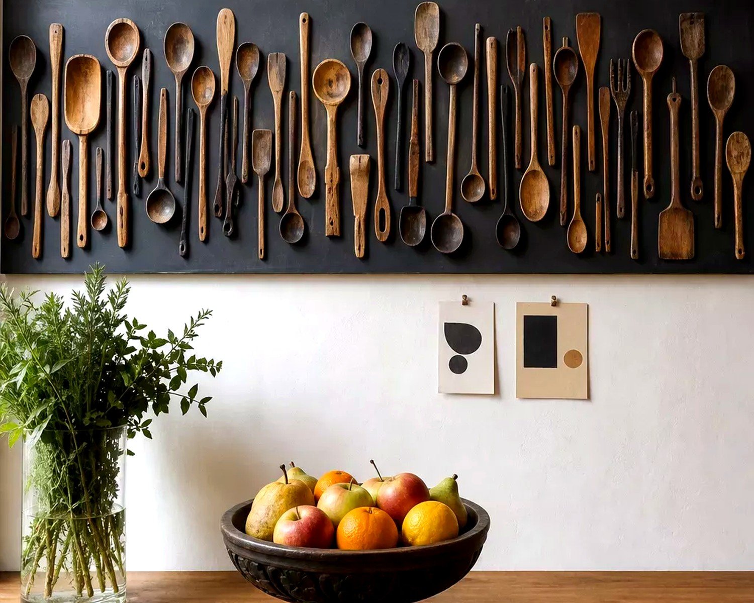
oh and those wooden spoon and fork wall hangings. Just… no.
The whole point is making your kitchen feel like a space you actually want to be in, not just checking a decorating box. I’ve got this tiny print of a lemon botanical that I found at an estate sale for $3, and it makes me happier than the expensive abstract piece in my living room. That’s the stuff you’re looking for – things that make the 10pm snack run feel a little less mundane, you know?