
Wall Art Guide, Wall Art Tutoriels
Large Black and White Wall Art for Living Room: Oversized Monochrome
Oct
So I’ve been obsessing over black and white wall art lately and honestly it’s become kind of a problem because I keep rearranging my entire apartment just to test different pieces. My cat judges me every time I drag the ladder out but whatever.
Why Oversized Actually Matters More Than You Think
The thing about going big with monochrome art is that it’s not just about filling space. Like, I had this client last month who bought three medium-sized pieces thinking they’d save money, and we ended up returning all of them because they just looked… apologetic? That’s the only word I can think of. When you commit to black and white, you gotta commit to the scale too. I’m talking at least 40×60 inches for a standard living room wall, and honestly 60×80 feels better if you’ve got the space.
The Actual Styles That Work (Tested These Myself)
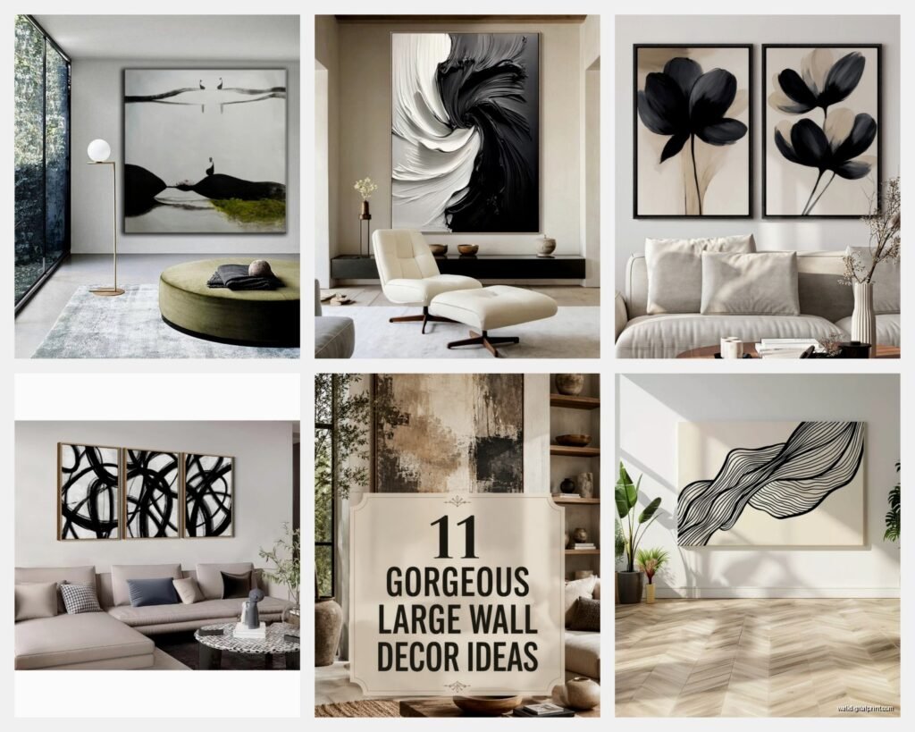
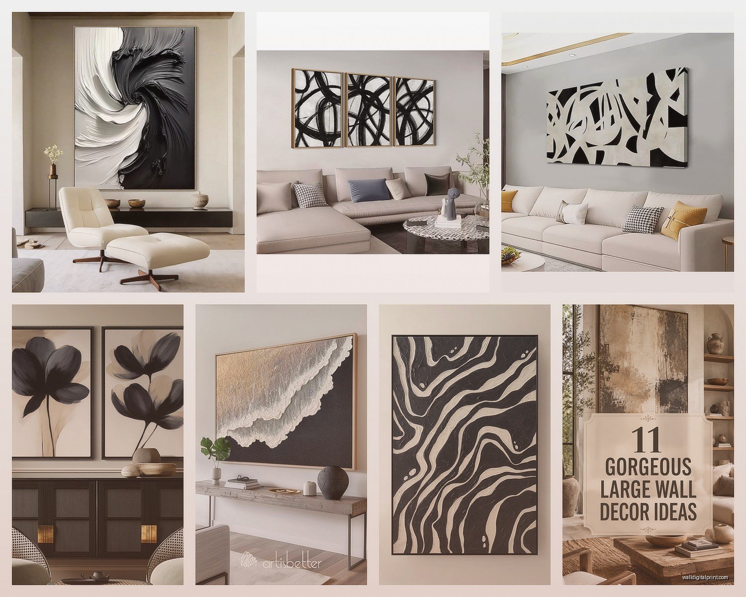
Abstract Brushstrokes
These are probably my favorite right now. The big sweeping gestural marks that look like someone just went absolutely wild with paint. I hung one above my sofa that’s basically just three massive black brushstrokes on white canvas and people always ask about it. The movement keeps it from feeling too stark, which is the trap you can fall into with monochrome. Look for pieces where the brushwork is visible, not just printed and flat. You want texture or at least the appearance of it.
Line Drawings
Okay so these can go either really sophisticated or really dorm-room fast. The difference is the line weight and composition. I saw this one piece last week that was just a single continuous line forming a face, super minimal, and it was stunning. But then you’ve got the basic geometric stuff that feels like it came from a college apartment circa 2015. If you’re going this route, look for asymmetry and varying line thickness. The ones that are too perfect and uniform read as generic.
Photography Prints
Architecture shots, landscapes, portraits. Black and white photography can be absolutely incredible at large scale. I curated a show last year that was all oversized monochrome photography and holy crap the impact. The key here is making sure the resolution is actually good enough for the size you’re printing. You can’t just blow up a regular photo to 5 feet and expect it not to look pixelated. Ask about DPI if you’re getting custom prints, you want at least 150-300 for large format.
Botanical/Nature Prints
Ferns, leaves, flowers in stark black and white. These work really well if your living room has a lot of natural light because they kind of bridge that indoor-outdoor thing without being too literal about it. I have a massive palm frond print in my bedroom and it’s probably the thing I get the most compliments on, which is funny because it was one of my cheaper pieces.
Where to Actually Buy This Stuff
Let me break this down by budget because that’s what everyone actually wants to know.
Budget-Friendly (Under $200)
Desenio has been my go-to for affordable large prints. Their quality is surprisingly good for the price. I’ve ordered probably fifteen pieces from them at this point. The paper stock is decent, the printing is clean, and they have a huge selection of monochrome stuff. Shipping takes a minute if you’re in the US though.
Etsy is obvious but I’m gonna mention it anyway. Filter by sellers who offer instant downloads if you want to print locally, which sometimes gives you more size control. I found this artist who does these incredible abstract ink pieces and I got a 50×70 printed at my local print shop for like $120 total. Just make sure you’re reading reviews about print quality.
Society6 and Redbubble let independent artists sell their work and you can choose your size. Quality varies by artist but I’ve had good luck. Just avoid the super trendy stuff that’s gonna feel dated in six months.
Mid-Range ($200-$600)
Minted is where I go when I need something that feels more curated. Their limited edition art prints are actually limited, and the quality is noticeably better than budget options. They also have good framing options which… we’ll get to that nightmare in a second.
Artfully Walls has a rental program which sounds weird but it’s actually perfect for people who like to change things up. You can test a piece before committing.
Local galleries and art fairs honestly sometimes have better prices than you’d think, especially for emerging artists. I got this massive charcoal drawing from a local artist for $400 and it’s genuinely one of my favorite pieces. Plus you’re supporting actual artists which feels good.
Investment ($600+)
If you’re spending this much, you want original work or very limited edition prints. Saatchi Art, Artsy, and working directly with artists. I’m not gonna pretend I buy a lot in this range but when I do, it’s usually something I’m obsessed with and have thought about for weeks.
The Framing Situation (This Gets Complicated)
Okay so this is where things get expensive fast if you’re not careful. A custom frame for a 60×80 piece can easily cost $500-800. Which is insane. Here’s what I’ve learned:
Framebridge is my secret weapon for large pieces. Their pricing is way more reasonable than custom frame shops and the quality is solid. You ship them your art and they frame it and ship it back. I’ve used them probably ten times now.
For floating frames (where the art appears to float within the frame), American Frame has good DIY options that are actually doable. I assembled one while watching The White Lotus and it took maybe 45 minutes.
Canvas pieces often look fine unframed, which saves you a ton of money. Just make sure the edges are finished properly. Gallery-wrapped canvas with the image continuing around the sides is what you want.
Black frames are obvious and safe. White frames feel more gallery-like. Natural wood frames can work but they introduce color which defeats the monochrome thing unless that’s what you want. I usually stick with black for monochrome art because it just feels cleaner.
Actually Hanging This Monster
So you’ve got your massive piece of art and now you need to get it on the wall without destroying anything. Here’s the real talk:
Use proper anchors. Like, don’t mess around with those little picture hanging nails for something that weighs 20+ pounds. I use heavy-duty wall anchors rated for at least double the weight of the piece. For drywall, toggle bolts are your friend.
The whole “hang it at eye level” thing is technically 57-60 inches from the floor to the center of the artwork but honestly in a living room where people are sitting most of the time, you can go a bit lower. I usually do 54-56 inches to center.
Get a level. Sounds obvious but I cannot tell you how many times I’ve hung something, stepped back, and realized it’s tilted. My neighbor came over last week while I was adjusting this piece for literally the fourth time and was like “are you okay” and honestly valid question.
Styling Around It
The beauty of oversized monochrome art is that it becomes the focal point, so you don’t need much else on that wall. In fact, adding too much around it makes everything feel cluttered.
I usually keep the furniture simple. Let the art be the statement. If you’ve got a bold colorful sofa, black and white art actually grounds it really nicely. If your whole room is neutral, the monochrome art adds that graphic punch without introducing color.
Plants look incredible with black and white art. The green pops like crazy against the monochrome. I’ve got a fiddle leaf fig next to my oversized abstract piece and the contrast is *chef’s kiss*.
Lighting matters more than you think. If you can get a picture light or even just position a floor lamp to highlight the piece, it makes a huge difference. I installed those battery-operated LED picture lights on two of my pieces and it completely changed how they look at night.
What About Multiple Pieces?
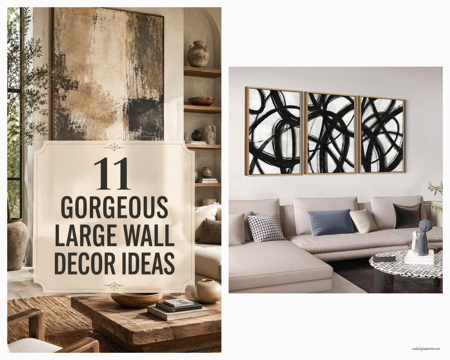
You can do a diptych or triptych situation but honestly I think one large piece usually has more impact than multiple smaller ones trying to fill the same space. If you do go with multiple pieces, keep them in the same style and make sure the spacing between them is consistent. I use 2-3 inches between panels.
Common Mistakes I See All the Time
Buying art that’s too small for the wall. This is the number one thing. People get scared of going big and then it just looks sad and lost on a huge wall.
Hanging it too high. Your art shouldn’t be floating near the ceiling. It should relate to the furniture and the human scale of the room.
Choosing art because it matches your throw pillows. I mean, do what you want, but art should be something you actually connect with, not just a coordinating accessory.
Not considering the room’s natural light. Some pieces look completely different in bright light versus low light. If possible, try to see how the piece looks in similar lighting to your space.
Going too literal. Like, if you have a modern minimalist space, you probably don’t need the black and white photograph of a city skyline. It’s been done. Look for something with more personality.
Caring for Your Art
Keep it out of direct sunlight if possible because even black and white prints can fade over time. UV-protective glass helps if you’re framing.
Dust it occasionally with a soft dry cloth. For canvas pieces, you can very gently vacuum with a soft brush attachment if you’re careful.
If it’s an original or expensive print, consider getting it insured under your renters or homeowners policy. I learned this the hard way when my apartment building had a pipe leak and I almost lost a piece I’d saved up for.
My Current Favorites
I’ve been really into abstract expressionist-style pieces lately. The kind that look like they could’ve been created by Franz Kline or Robert Motherwell. Big bold black marks on white. There’s something about the energy in those pieces that just works in a living space.
Also really loving oversized botanical studies that feel scientific and precise. Like vintage botanical illustration but massive. There’s this one with a single monstera leaf that I’m obsessing over but it’s sold out everywhere and it’s driving me crazy.
Oh and another thing, black and white portraits can be stunning at large scale but they’re tricky because they can feel really intense. I have a client who has this massive portrait in their living room and it’s incredible but also you’re very aware of being watched by this giant face all the time which isn’t everyone’s vibe.
The nice thing about monochrome is that you can mix styles more easily than you can with colorful art. My living room has an abstract piece and a photographic landscape piece and they work together because the palette is consistent.
Anyway I could talk about this forever but hopefully this helps you figure out what you actually want. The main thing is to go bigger than you think you should and choose something you genuinely like, not just what you think you’re supposed to have in a living room.
