Wall Art Guide, Wall Art Tutoriels
Wall Art Stickers for Hallway: Removable Corridor Decals
Oct
So I’ve been obsessing over hallway wall stickers lately because honestly, hallways are the most neglected spaces and I kept walking past mine thinking “this is depressing” and then my neighbor asked me about them last week and I realized I’ve actually tested like a dozen different types by now.
Why Removable Stickers Actually Work Better Than You Think
Okay so first thing, removable doesn’t mean cheap or flimsy. I thought that too until I put some botanical ones up in a rental property I was staging and they looked… actually sophisticated? The key is the material quality. You want vinyl that’s thick enough to not wrinkle but flexible enough to work around corners if your hallway has any architectural details.
The adhesive thing is huge though. I learned this the hard way when I used some random Amazon ones that pulled paint off when I removed them after three months. Look for “fabric-backed vinyl” or ones that specifically say they use a low-tack adhesive. The good ones use something similar to what car wrap people use, which sounds weird but makes sense when you think about it.
What Actually Looks Good in a Hallway vs What You Think Will Look Good
Here’s where I messed up initially and maybe you will too. I bought these massive tree decals thinking they’d make a statement and they just… overwhelmed everything. Hallways are usually narrow and you’re moving through them, not sitting and contemplating them like a living room.
What works better:
- Repeating patterns that create rhythm as you walk
- Vertical designs that draw the eye up and make low ceilings feel higher
- Small clustered elements rather than one giant focal point
- Geometric shapes that play with perspective
I did this one hallway with scattered gold dots in varying sizes and it looked way more expensive than the $35 I spent. The trick was placement, not the stickers themselves.
The Actual Installation Process Nobody Tells You About
So everyone says “just peel and stick” but that’s gonna lead to bubbles and crooked nonsense. Here’s what I do now after ruining two sets:
Get a level. I know, obvious, but I skipped this step thinking I could eyeball it and my supposedly straight line of birds was tilting downward like they were crash landing. Use painter’s tape to mark your layout first. Seriously, take 20 minutes and tape out where everything goes.
Clean your walls with rubbing alcohol, not just a damp cloth. Dust and oils mess with adhesion more than you’d think. I was watching The Great British Baking Show while doing this last time and got distracted… ended up having to redo a section because I missed cleaning one spot.
The squeegee is not optional. You can use a credit card in a pinch but a proper squeegee makes such a difference. Start from the center and work outward. If you get a bubble, peel back just that section and reapply, don’t try to push the bubble to the edge because it won’t work and you’ll just stretch the vinyl.
Temperature Matters More Than Anyone Mentions
This is gonna sound weird but don’t install these when it’s cold. The adhesive needs warmth to activate properly. I tried doing some in February in a drafty hallway and they started peeling within a week. If your hallway is cold, run a space heater for like 30 minutes before you start. Yeah, it seems excessive but it works.
Style Categories That Actually Exist
The options are kinda overwhelming so here’s how I break them down:
Botanical/Nature Stuff: Leaves, branches, flowers. These work great if your hallway connects to outdoor-facing rooms because it creates flow. I used eucalyptus branches in a client’s space and it made the whole entry feel more expensive. Avoid anything too literal though, like a full tree scene, it reads juvenile.
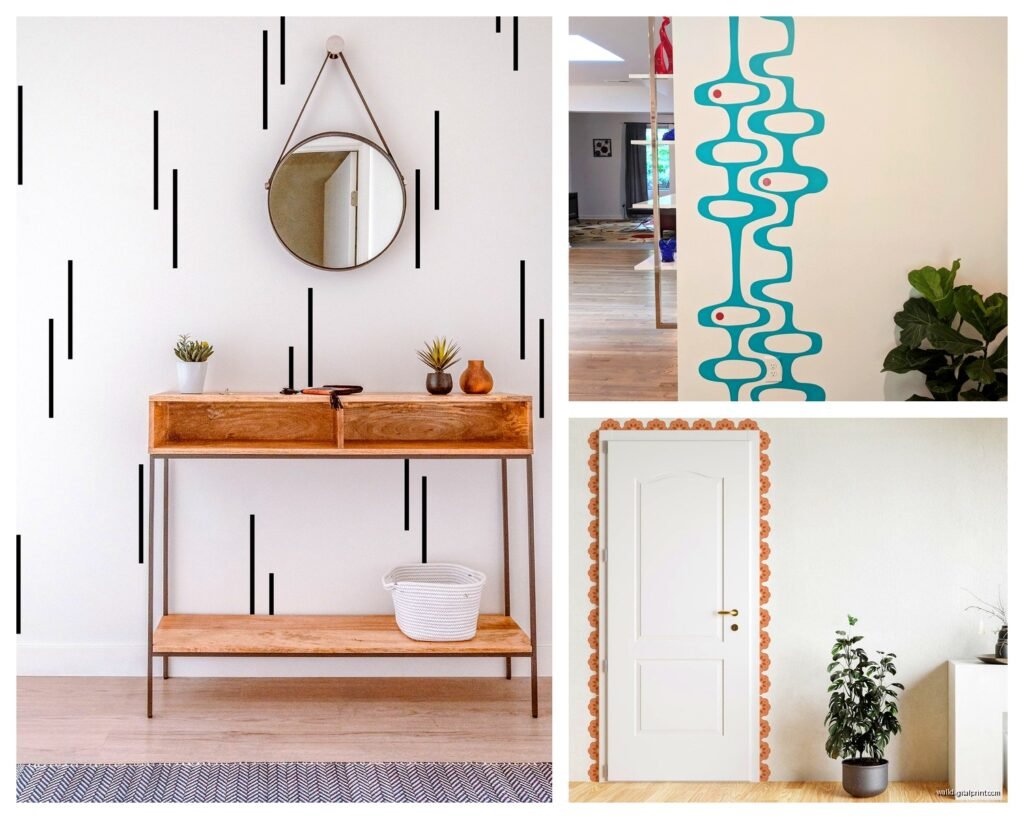
Geometric Patterns: Lines, circles, hexagons, whatever. These are my go-to for modern spaces. You can create really custom looks by mixing different sets. I combined copper triangles with black lines once and it looked like I’d hired someone to do custom painting.
Typography/Quotes: Okay so I’m generally against word art but in hallways it can work if you choose something unexpected. Skip the “Live Laugh Love” energy and go for something architectural, like street names or coordinates that mean something to you.
Abstract/Artistic: Watercolor effects, brush strokes, splatter patterns. These add color without being too literal. Good for when you want visual interest but don’t want a “theme.”
The Color Situation
White or light gray walls are easiest obviously, but I’ve done darker walls too and it’s just about contrast. On a navy wall, white or metallic stickers pop really well. On white walls, I actually prefer mid-tone colors over black because black can be harsh in a narrow space.
Metallics are having a moment and honestly they’re worth it. Rose gold, copper, silver, they catch light as you walk past and add dimension. I have some copper geometric ones in my own hallway and depending on the time of day they look completely different.
Mixing Colors Without Looking Like a Kindergarten
Stick to two colors max, three if one is metallic. I learned this after creating what I called “whimsical” and my friend called “chaotic.” Choose colors that already exist in adjacent rooms so the hallway feels like a transition, not a random insert.
Where to Actually Buy Them
I’ve ordered from everywhere at this point. Etsy has the most unique designs but shipping times are unpredictable and quality varies wildly. Read reviews that include photos. Amazon is hit or miss, lots of the same designs from different sellers, but Prime shipping is clutch when you need something fast.
Target has surprisingly decent options now, especially their Opalhouse line. The quality is consistent even if the designs are a bit safe. Wayfair has a huge selection but their photos are sometimes misleading about size, so check dimensions carefully.
Specialty sites like WallPops or RoomMates are pricier but the quality is noticeably better. The vinyl is thicker, colors are more saturated, and they actually remove cleanly. Worth it if it’s a space you care about long-term.
Sizing Issues Everyone Has
Measure your wall height and width before you shop. Seems basic but I can’t tell you how many times I’ve bought something that was either comically small or way too large. Most product descriptions list the size of the full sheet, not the individual elements, which is confusing.
For standard 8-foot ceilings, I usually work with decals that are between 24-48 inches tall for vertical designs. For horizontal patterns running the length of the hallway, 12-18 inch elements repeated work better than fewer large pieces.
oh and another thing, consider your baseboards and crown molding. Leave at least 4-6 inches of blank space near these architectural elements or it looks crowded and makes removal trickier.
The Removal Process When You’re Over It
Okay so I just did this last month when I got tired of my hallway look. Warm the vinyl first with a hair dryer, not kidding. It softens the adhesive and everything peels off way easier. Start at a corner and pull slowly at a 45-degree angle. If you yank it straight back, you risk tearing the vinyl or pulling paint.
Sometimes there’s residue left behind. Goo Gone works but test it on an inconspicuous spot first because it can mess with some paint finishes. I usually use more rubbing alcohol on a cloth, it takes longer but it’s safer.
The good quality ones I mentioned earlier? They came off my walls after 8 months completely clean. The cheap ones left a sticky mess that took me like an hour to clean off. That price difference suddenly made sense.
Creative Applications Beyond Just Sticking Them On
I’ve started getting weirder with placement. Put some on the ceiling of a really tall hallway once and it created this unexpected moment when you looked up. Used small ones to frame light switches or outlets, making them feel intentional instead of like interruptions in the wall.
You can also use them on doors in the hallway. I did constellation stickers on all the bedroom doors in a house with kids and it helped them remember which room was theirs plus it looked cute without being babyish.
Wait I forgot to mention, you can layer them. Like put a large subtle pattern down first, then add smaller contrasting elements on top. Creates depth that flat stickers usually don’t have. Just make sure the bottom layer is really well adhered before you add anything on top.
Lighting Considerations
If your hallway is dark, this matters more. Light-colored stickers can brighten things up but they need enough ambient light to show up. I added some under-cabinet style LED strips at the baseboard level in one hallway and it made the white botanical stickers glow, looked really cool at night.
Dark stickers in dark hallways just disappear, learned that one the hard way. If you’re set on dark designs, make sure you have adequate lighting or they’re pointless.
Maintenance Reality Check
These aren’t zero maintenance. Dust sticks to the edges over time, especially textured vinyl. I use a microfiber cloth every couple weeks to wipe them down. Don’t use cleaning sprays directly on them, the chemicals can break down the adhesive or discolor the vinyl.
If an edge starts peeling, deal with it immediately. Once air gets under there, it spreads fast. I keep a tiny bit of the backing paper from installation and if I get a peeling edge, I smooth it back down with a squeegee while it’s slightly warm.
My cat has jumped at the wall stickers exactly zero times which surprised me because I thought they’d be irresistible to her, but my friend’s dog scratched hers off at nose-level so… pets are unpredictable.
Common Mistakes I See All The Time
Going too theme-y. Like all butterflies or all nautical or whatever. It gets old fast and feels dated quickly. Mix it up or keep it abstract enough that it doesn’t scream a specific trend.
Ignoring the rest of the hallway. If you have art or photos, the stickers should complement, not compete. I usually do stickers on one wall and keep the opposite wall for framed stuff, or vice versa.
Thinking bigger is better. It’s usually not, especially in narrow spaces. Multiple smaller elements create more interest than one giant decal that dominates.
Not planning for furniture. If you have a console table or bench in your hallway, factor that into your design. Don’t put stickers where they’ll be blocked or worse, where moving furniture will damage them.
The biggest thing is just starting with less than you think you need. You can always add more but removing pieces from a set you’ve already installed is annoying and can leave gaps in the design that look weird.