Wall Art Guide, Wall Art Tutoriels
Long Thin Horizontal Wall Art: Slim Panoramic Designs
May
So I’ve been obsessing over these long thin horizontal pieces lately because honestly, they solve SO many weird wall problems that regular art just…doesn’t. Like, you know that space above your couch that’s too wide for one normal frame but looks dumb with three separate pieces? Yeah, that’s where these come in.
The Actual Measurements That Work
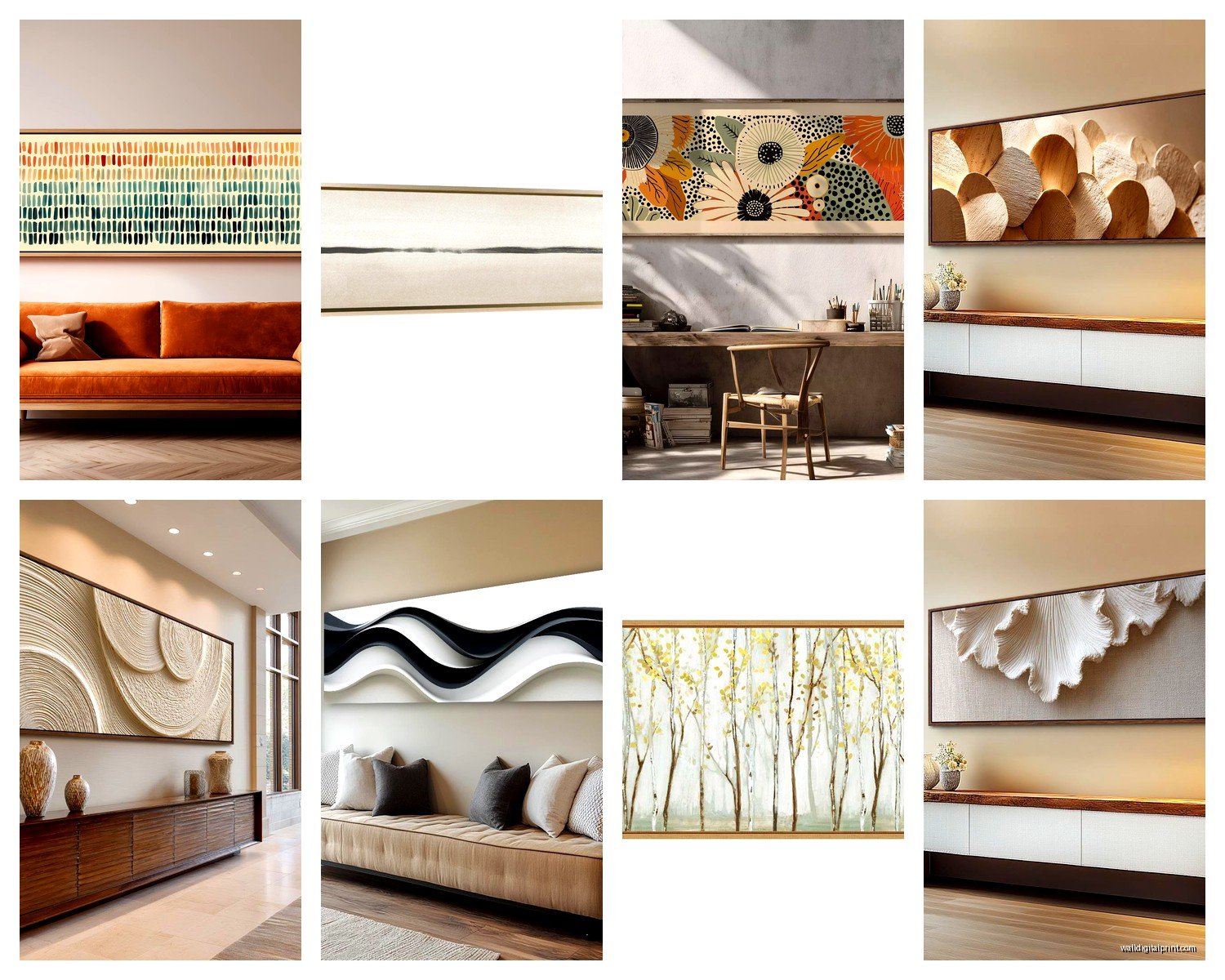
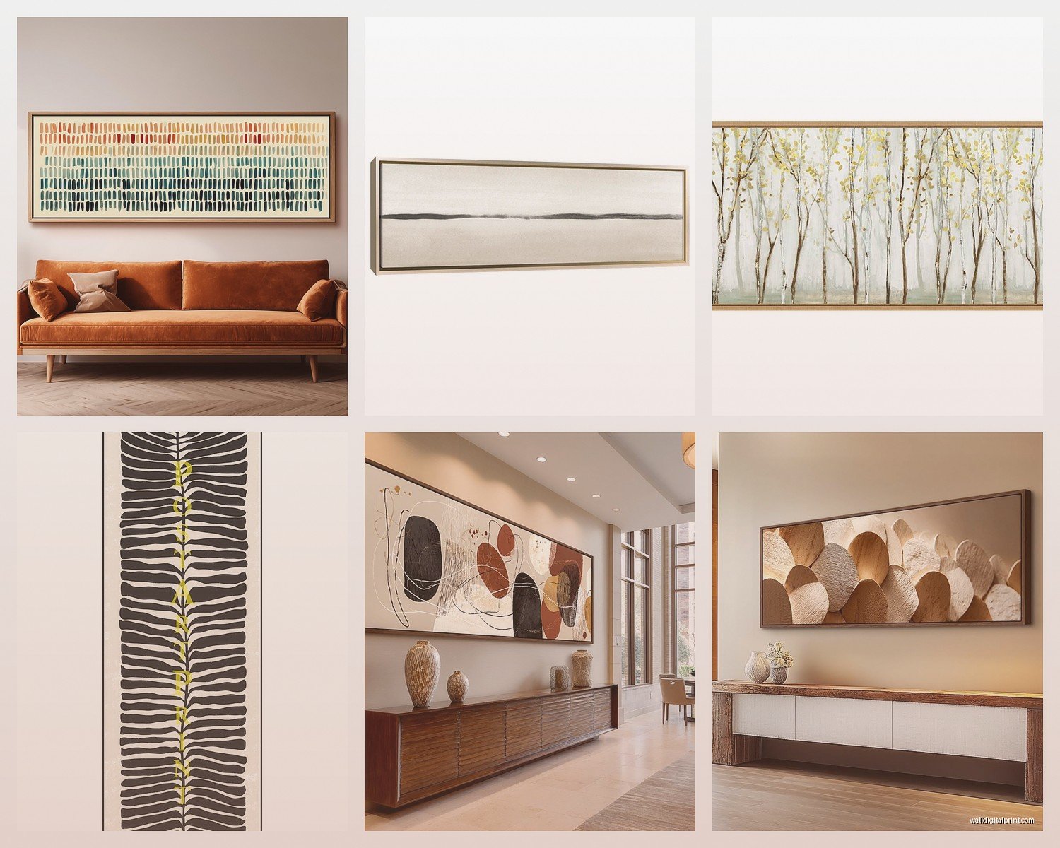
Okay so here’s what I figured out after hanging like fifteen of these in various spaces. The sweet spot is usually 48-72 inches wide by 12-18 inches tall. Anything narrower than 10 inches starts looking like a decorative shelf you forgot to install, and wider than 20 inches kinda defeats the whole “slim panoramic” vibe you’re going for.
I messed this up in my own living room first – bought this gorgeous 60×24 inch piece thinking it would work above my console table, but it was too chunky. Ended up moving it to the bedroom and getting a proper 60×12 inch replacement. The thinner one just…breathed better if that makes sense.
Where These Actually Work Best
Above sofas and beds – this is the obvious one but there’s a trick to it. You want the art to span about two-thirds to three-quarters of your furniture width. So if your couch is 84 inches, you’re looking at something around 56-63 inches wide. I usually go a bit wider rather than narrower because narrow looks timid.
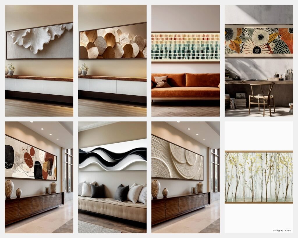
Hallways – oh man, hallways are where these things shine. I’ve got this 8-foot hallway that used to have three separate frames and it looked so choppy. Swapped it for two 36-inch panoramic pieces with more space between them and suddenly the whole hallway feels intentional instead of like a doctor’s office waiting room.
Above doorways and windows – this is gonna sound weird but if you’ve got those awkward gaps above door frames or between the top of a window and the ceiling, a slim horizontal piece can make the whole wall feel taller. Just gotta make sure it’s not wider than the door/window frame itself or it looks off-balance.
Stairway walls – the ascending diagonal wall situation. Regular square art fights against the angle but horizontal pieces kinda flow with it. I did three 24×8 inch pieces going up a staircase last month and my client literally texted me a photo every day for a week because she was so happy with it.
The Kitchen Situation
Between upper cabinets or on that weird wall space next to the fridge – slim horizontals work here but you gotta think about grease and moisture. I always recommend glass-fronted frames in kitchens, not canvas. Learned that one the hard way when my own kitchen canvas started looking dingy after like six months of cooking.
What Actually Looks Good In This Format
Not everything translates well to a panoramic shape, which seems obvious but I see people trying to force it constantly.
Landscapes – duh, right? But specifically horizons, coastlines, mountain ranges. That stretched-out perspective is literally what this format was made for. I’ve got this black and white beach scene that’s 60×15 inches and the way it captures that endless ocean feeling…yeah, it works.
Cityscapes and skylines – especially if you can find ones that show the whole span of a city. I found this panoramic view of the Chicago skyline that’s only 10 inches tall but 72 inches wide and it’s basically perfect for that long narrow wall space.
Abstract horizontal compositions – color field paintings, geometric patterns that repeat horizontally, anything with strong horizontal movement. I’m weirdly into these mineral vein patterns right now, like agate slices but stretched out. They read almost like modern calligraphy from a distance.
Typography and quotes – but only if the text actually fits the shape naturally. Don’t buy something where they’ve just stretched out words to fill space because it looks desperate. Short impactful phrases work best.
What DOESN’T work: portraits (unless you’re doing like five faces in a row which can be cool but is very specific), anything with a central focal point that gets lost in the width, busy patterns that need more vertical space to make sense.
The Hanging Height Thing Nobody Gets Right
Standard gallery height is 57-60 inches to the center of the artwork, but with these slim horizontals, I actually go slightly higher – more like 60-63 inches to center. Because they’re so thin, hanging them at standard height can make them feel like they’re sliding down the wall.
Above furniture though, totally different rules. You want 6-8 inches of space between the top of your furniture and the bottom of the frame. Not 4 inches, not 12 inches – that specific 6-8 inch range just looks right. I’ve measured this so many times and that’s consistently the sweet spot.
Oh and another thing – if you’re hanging multiple slim pieces in a row, keep them level with each other obviously, but space them 3-4 inches apart. Closer than that and they read as one broken piece, farther and they look disconnected.
Framing Options That Don’t Suck
Okay so framing these can be tricky because custom framing gets expensive FAST at these dimensions. Here’s what I actually do:
Floating frames – these are the ones where the canvas or print appears to float inside the frame with a gap all around. For slim horizontals, this adds visual weight without making the whole thing look chunky. I use these probably 60% of the time.
Simple wood frames – thin profile, like 0.5-1 inch width max. Anything thicker overwhelms the slim proportions. Natural wood or black are safest but I’ve been into that warm walnut tone lately.
Metal frames – especially in brass or matte black. The thin metal profile works perfectly with the horizontal emphasis. Just make sure the metal is substantial enough that the frame doesn’t warp under the weight if it’s a longer piece.
Frameless mounting – canvas wraps or prints mounted to boards. This can look really clean and modern but you need the right wall and the right image. Doesn’t work in traditional spaces.
The DIY Route
If you’re crafty (I’m barely crafty but I’ve done this), you can buy standard size frames and have prints made to fit. Like, get three 24×8 inch frames and hang them as a panoramic series. It’s cheaper than one custom 72×8 inch frame and sometimes looks better because you get those intentional breaks in the composition.
Where To Actually Buy These
So I spent an entire afternoon comparing options when my client canceled last month and here’s what I found:
Society6 and Redbubble – huge selection, lots of independent artists, and they offer these sizes. Quality is decent but not gallery-level. Good for rentals or if you change your decor frequently. Prices usually $80-200 depending on size.
Minted – better quality, more curated selection. Their panoramic prints are really nice and the framing options are solid. Expect $150-400.
Etsy – this is hit or miss but you can find some unique stuff, especially if you search for “panoramic canvas” or “horizontal wall art.” I found this person who does custom watercolor landscapes in panoramic format and they’re gorgeous. Just read reviews carefully because quality varies wildly.
West Elm and CB2 – overpriced but sometimes they have exactly the right thing in exactly the right size. I wait for sales. Their slim abstract pieces are usually pretty safe choices.
Local art fairs and photographers – honestly some of the best panoramic pieces I’ve found have been from local photographers who already shoot in this format. They get it in a way that people trying to force regular images into panoramic don’t.
The Color and Style Matching Part
This is where people get paralyzed so let me just…simplify it.
If your room is neutral (grays, whites, beiges), you can go bold with the art OR stay neutral – both work. I usually go bold because why not add some life, but sometimes a black and white or sepia panoramic photo is exactly right.
If your room already has color, pull one accent color from the space and make sure it appears in the art. Doesn’t have to be the dominant color in the piece, just present somewhere. This makes everything feel cohesive without being matchy-matchy which is boring.
For style matching – modern rooms can handle almost anything, traditional rooms need either classic landscapes or black and white photography (color abstracts usually look wrong), and eclectic spaces are where you can get really playful with unexpected panoramic subjects.
The Multi-Panel Question
Should you do one long piece or multiple panels that create a panoramic effect? Honestly depends on your commitment level and wall situation.
One piece is easier to hang, easier to move, and creates a cleaner look. But it’s also harder to find in the exact right size and can be more expensive.
Multiple panels (diptych or triptych) give you flexibility – you can adjust spacing, you can separate them later, and they’re often easier to transport. But you gotta hang them perfectly level and evenly spaced or it looks messy. I use a laser level for this because eyeballing it always fails.
What I Actually Have In My Own Place
Since you asked (or even if you didn’t) – I’ve got a 66×14 inch black and white photograph of a foggy forest above my bed. It’s literally just trees disappearing into mist but the horizontal format makes it feel endless and calm. Cost me $240 from a local photographer and I think about that purchase maybe twice a year when I notice it again and remember I love it.
In my hallway, two 36×12 inch abstract pieces with rust and navy colors that I got from…I think West Elm on sale? They were like $90 each. Nothing special but they fill the space and don’t make me angry when I look at them, which is really all you can ask for in hallway art.
My living room has this whole situation where I tried a 72×16 inch cityscape print but my cat knocked it down twice (long story involving a climbing incident) so now it’s leaning against the wall on my console table which actually looks kinda good? Unintentional styling win.
Common Mistakes I Keep Seeing
Going too small – people get nervous and buy art that’s way too small for their wall. It floats there looking sad and insignificant. When in doubt, go bigger.
Hanging too low – already mentioned this but it’s such a common problem. These pieces need to sit higher than you think.
Choosing images with the wrong orientation – like trying to use a vertical-focused image in a horizontal format and it just looks squished and weird.
Forgetting about lighting – slim horizontal pieces can disappear on a wall if the lighting is wrong. Make sure you’ve got decent ambient light or add a picture light above it.
Matching the frame to the furniture too exactly – this looks staged and catalog-y. It’s okay if your black frame doesn’t perfectly match your black coffee table. Actually it’s better.
wait I forgot to mention the bathroom thing – these work great above bathtubs if you’ve got the wall space. Something calming and horizontal while you’re soaking. Just again, make sure it’s properly sealed/framed if there’s moisture.
The whole point of these slim panoramic pieces is that they work WITH your architecture instead of fighting against it. They emphasize horizontal lines, make spaces feel wider, and fill those awkward spots that regular art can’t handle. You just gotta commit to the proportions and not try to force it where it doesn’t belong.