Wall Art Guide, Wall Art Tutoriels
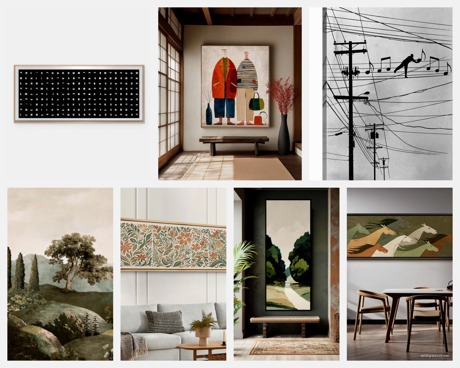
Long Wall Art: Horizontal Pieces for Narrow Spaces
May
So I just finished hanging this massive 60×20 inch abstract piece in my hallway and honestly it completely changed the whole vibe, which is why I’m excited to talk about this because narrow spaces are SO tricky and most people just give up and leave them blank.
The thing with long horizontal art is that it actually works better than anything else in those awkward spaces. Like, you know those hallways that are basically just walls facing each other? Or that weird stretch above your sofa that’s too long for a normal square painting but too narrow for a gallery wall? That’s where these pieces shine.
Why Horizontal Makes Sense (Even Though It Seems Obvious)
Okay so this is gonna sound basic but horizontal art literally follows your eye movement. We scan rooms left to right naturally, and a long piece guides that instead of fighting it. I had a client once who insisted on putting three vertical pieces in her 12-foot hallway and it just… chopped everything up visually. We switched to two horizontal pieces and suddenly the space felt twice as wide.
The ideal ratio I’ve found is like 2:1 or 3:1 (width to height). So if you’re looking at something that’s 48 inches wide, you want it around 16-24 inches tall. That keeps it dramatic without overwhelming a narrow space.
Measuring Your Space (Do This First I’m Serious)
I cannot tell you how many times I’ve bought art without measuring properly. Just last month I ordered this beautiful landscape piece for above my couch and it arrived and was literally 6 inches too wide for the wall space between my windows. Had to return it, whole thing was annoying.
Here’s what you actually need to measure:
- The full width of your wall (obviously)
- Distance from floor to ceiling or to where other furniture ends
- Any obstacles like light switches, outlets, vents – I once hung a piece that covered a thermostat and had to move it
- The sight line from where people usually stand or walk
For narrow hallways, your art should be roughly 2/3 to 3/4 the width of the wall space. So if you have a 6-foot wide hallway, you’re looking at 48-54 inches of art width. Smaller than that and it looks floaty and weird.
What Actually Works in Different Narrow Spaces
Hallways
These are the most common problem areas. The mistake everyone makes is hanging multiple small pieces trying to create interest. But in a narrow hallway, that just creates visual clutter.
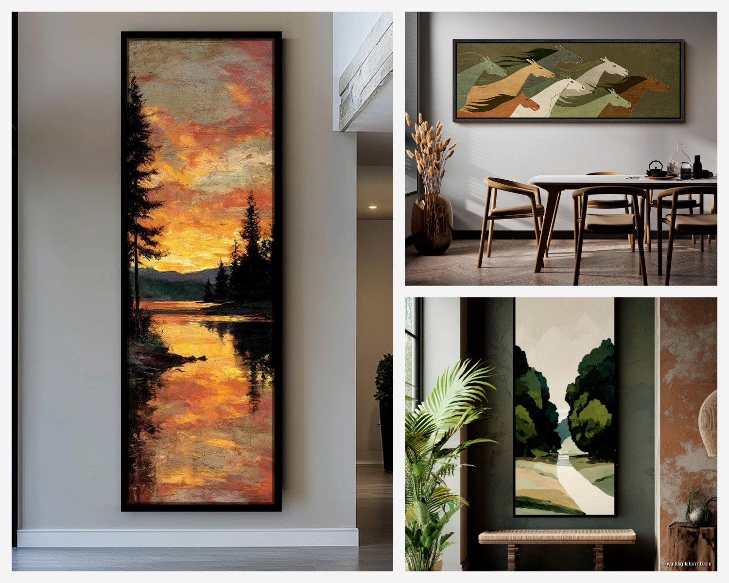
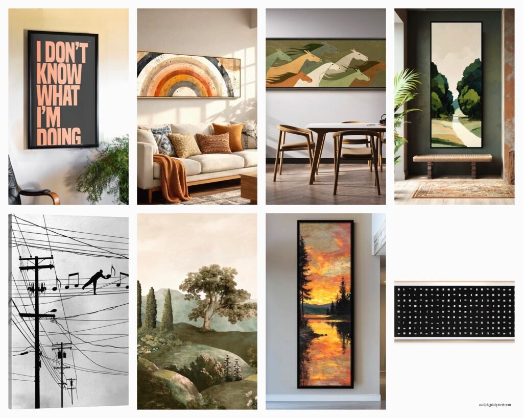
One long horizontal piece or two at most is the move. I have a 10-foot hallway in my apartment and I use one 72×24 inch photograph of a coastline. It makes the whole space feel intentional instead of like an afterthought.
The height matters here too – you want the center of your art at about 57-60 inches from the floor. That’s standard gallery height and it works because it’s average eye level. In hallways especially, people are walking past, not sitting, so keep that in mind.
Above Sofas and Beds
This is where I see the most confusion. Your horizontal piece should be about 2/3 the width of your furniture. So a standard sofa is around 84 inches – you want art that’s 50-60 inches wide.
I recently did a bedroom where we hung a 48×16 inch abstract piece above a queen bed and it was perfect. Anything taller would’ve felt too heavy, anything shorter would’ve looked stubby.
Oh and leave 6-8 inches of space between your furniture and the bottom of the frame. Not more, not less. More looks disconnected, less feels cramped.
Dining Rooms with Long Tables
Okay this is one of my favorite applications. A long dining table basically demands horizontal art on the wall behind it or on a long wall adjacent to it. The parallel lines create this really satisfying visual rhythm.
I worked on a dining room last year where we used a 70×20 inch piece of botanical art above a credenza that sat behind their 8-person table. The piece echoed the table length without competing with it. The whole room felt cohesive in a way it hadn’t before.
Types of Art That Work Best
Not all art translates well to horizontal formats. Some things just look stretched and weird.
Landscapes and Seascapes – Obviously these are made for horizontal orientation. Coastal scenes, mountain ranges, horizons – they all work beautifully. I’m personally obsessed with minimal seascapes right now, just water and sky with a thin horizon line.
Abstract Pieces – These are probably the most versatile. Color fields, geometric designs, expressionist work – it all scales well horizontally. Just make sure the composition actually uses the full width. Some abstract pieces are basically square compositions stretched out and they look unbalanced.
Panoramic Photography – Cities, nature, architecture. There’s something about a wide photographic view that makes narrow spaces feel more expansive. I have a black and white panorama of Paris rooftops in my office and everyone comments on it.
Botanical Prints – Long horizontal arrangements of leaves, flowers, or branches. These work especially well in transitional spaces because they add life without being too demanding visually.
What doesn’t work as well: portraits (obviously), most figurative work unless it’s specifically composed horizontally, and busy patterns that need more vertical space to breathe.
Color Considerations That Actually Matter
This is where it gets interesting. In a narrow space, your art color can either make the room feel wider or more cramped.
Lighter colors and cooler tones (blues, greens, grays) tend to recede visually, which makes your wall feel farther away. That’s usually what you want in a narrow space. I used a pale blue and white abstract piece in a narrow powder room and it genuinely makes the room feel less claustrophobic.
Warm colors (reds, oranges, yellows) come forward visually. That can work if you’re trying to create coziness, but in a genuinely narrow space it might make things feel tighter.
My cat just jumped on my keyboard sorry – anyway, the trick is matching your art to your wall color strategically. If you have dark walls in a narrow space (which can actually work), go for art with lighter elements to create contrast and visual interest. All dark everything makes narrow spaces feel like caves.
The Matting Question
Wide mats on horizontal pieces can look really sophisticated, but they also add to your overall dimensions. If you’re tight on space, consider a thin frame with no mat or a very minimal mat. I’ve been loving the floating frame look lately where the art sits in a shallow frame with a small gap around it – super modern and doesn’t add bulk.
Hanging Methods for Heavy Horizontal Pieces
Okay so this is important because long pieces are often heavy and you’re dealing with more weight distributed across a wider span.
For pieces up to about 40 inches wide, a single wire hanger and hook usually works fine. But once you get past that, you need two hanging points. I learned this the hard way when a 60-inch piece I hung on a single wire went tilted after two weeks and I had to patch the wall.
Two D-rings on the back of the frame, positioned about 1/3 in from each edge, with two corresponding wall hooks. This is the most secure method.
French cleats if you’re dealing with really heavy pieces (over 30 pounds). These are those interlocking wooden or metal strips – one attaches to the wall, one to the frame. They’re incredibly secure and make leveling easy.
For drywall, you absolutely need wall anchors unless you’re hitting studs. Those little plastic anchors from the hardware store? They’re not enough for anything substantial. Get the metal toggle bolts or the threaded anchors that actually expand behind the drywall.
Lighting Makes or Breaks This
Natural light is great but most narrow spaces don’t have much of it. That’s where picture lights or wall sconces come in.
I installed simple LED picture lights above two horizontal pieces in my hallway and the difference is dramatic. The art goes from being barely noticeable to being an actual focal point. You want warm white LEDs, around 2700-3000K, so the light doesn’t look too harsh or clinical.
If you can’t hardwire lights (rental problems, I get it), there are battery-operated and plug-in options now that don’t look terrible. I’ve been testing this one from a brand I can’t remember the name of but it’s on Amazon and works surprisingly well.
Budget Options That Don’t Look Cheap
Not everyone wants to drop $500 on a single piece of art, and honestly you don’t have to.
Print on demand sites – Places like Minted or Artfully Walls have huge horizontal prints. Quality varies but I’ve gotten some good stuff. The trick is ordering the largest size you can afford because small prints in large frames look obviously cheap.
Frame your own – Get an oversized frame from somewhere like IKEA (their BJÖRKSTA frames come in long sizes) and print your own art. I did this with a high-res photo I took on vacation and it cost like $80 total for a 55×20 inch piece.
Textile art – Vintage rugs or tapestries hung horizontally can be stunning and you find them at estate sales for nothing. I got a Turkish kilim fragment for $40 and had it mounted on a canvas backing. Looks way more expensive than it was.
DIY abstract – Okay hear me out on this. A long canvas, some acrylic paint, and honestly you can create something that works. Abstract horizontal pieces are forgiving. I made one for my guest room when I was between projects and everyone assumes I bought it at a gallery.
Common Mistakes I See Constantly
Hanging multiple small horizontal pieces in a row trying to cover a long wall – this almost never looks intentional. Either go with one substantial piece or create an actual gallery wall with varied sizes.
Hanging the art too high – I mentioned this before but it’s such a common problem. Your instinct is often to hang things higher than they should be.
Choosing art that’s too small for the space – When in doubt, go bigger. Small art in a large narrow space just emphasizes the emptiness.
Ignoring the sight lines – In a hallway, you see the art from an angle as you approach, not just straight on. Make sure it still looks good from multiple viewpoints.
Styling Around Your Horizontal Piece
This is where you can really make the art feel integrated into your space instead of just stuck on a wall.
If you’re working with a console table or credenza below your art, style it minimally. A couple of objects max – maybe a table lamp and a small plant or sculpture. The horizontal line of the furniture plus the horizontal art creates a strong visual relationship that too much clutter ruins.
In hallways, consider adding a narrow console table or floating shelf below your art if space allows. Even just 10-12 inches deep gives you a place for keys and mail while anchoring the art visually.
Wall color matters too. I painted the wall behind one horizontal piece in my living room a shade darker than the surrounding walls (just that one wall) and it created this subtle frame effect that makes the art pop without actual framing.
When to Use Multiple Horizontal Pieces
Sometimes one piece isn’t enough or doesn’t work for your specific wall. Using two or three horizontal pieces can work if you follow some rules.
Stack them vertically with consistent spacing between – I like about 3-4 inches of space. This creates a column of horizontal lines which is visually interesting without being chaotic.
Or hang them in a horizontal row but only if you have a really long wall – like 14+ feet – and you’re using identical or coordinating pieces. Even then, this is tricky. I’ve done it successfully maybe twice and I’ve been styling interiors for years.
The pieces should relate to each other somehow – similar color palette, same frame style, complementary subjects. Random unrelated horizontal pieces just look like you couldn’t decide.
Real Talk About What’s Trending
Right now I’m seeing a lot of requests for minimal line art in horizontal formats. Simple continuous line drawings of faces, figures, or abstract shapes. They work really well in modern spaces and they’re not too expensive.
Also those midcentury-style horizontal abstract pieces with organic shapes and muted colors – very popular. Think Matisse cutouts but more abstract.
Oversized black and white photography is still going strong, especially architectural or nature shots.
What’s kinda fading out is the really busy geometric patterns and the super literal landscape paintings that look like they belong in a hotel lobby. Not that you can’t use those, they’re just not what I’m seeing people gravitate toward anymore.
Look, at the end of the day, the best horizontal art for your narrow space is something you actually like looking at every day. All these guidelines help but if you find a piece that makes you happy and it’s roughly the right size, just go for it. You can always move it later if it doesn’t work – I’ve definitely done that more times than I wanna admit.