Wall Art Guide, Wall Art Tutoriels
Multi Piece Wall Art: Several-Panel Coordinated Sets
Oct
So I’ve been installing multi-piece wall art in homes for like six years now and honestly it’s one of those things that looks SO good when done right but can go sideways really fast if you don’t know what you’re doing.
The Spacing Thing Everyone Gets Wrong
Okay first thing, the spacing between panels. Most people either put them way too far apart or so close they look like they’re gonna merge into one piece. The sweet spot is usually 2-3 inches between each panel. I learned this the hard way after hanging a gorgeous ocean triptych in my own living room with like 6 inches between each piece and my sister came over and was like “why are they so far apart” and I couldn’t unsee it.
For smaller pieces (think 12×16 or under), stick to 2 inches. For those big statement pieces that are like 24×36 per panel, you can go up to 3-4 inches. I use painter’s tape to mark where each piece goes before I hammer a single nail because moving things around leaves holes and my landlord already hates me.
Measuring Without Losing Your Mind
Here’s what I do and it actually works. Get a roll of craft paper or even newspaper and tape it together to make a template the size of your whole arrangement. Lay it on the floor, arrange your panels on top with the spacing you want, trace around them with a marker. Then tape that whole paper template to your wall. You can move it around, see if it’s too high or too low, and when it’s perfect, mark through the paper where your nails need to go.
My cat destroyed my paper template last month while I was working on a client project and I had to start over but honestly it saved me because I realized I had the whole thing positioned too far to the left anyway.
Height Placement That Actually Makes Sense
The center of your entire arrangement should be at eye level, which is roughly 57-60 inches from the floor. This is the gallery standard and it genuinely looks best. But here’s where it gets tricky with multi-panel sets, you gotta measure the center of the WHOLE arrangement, not each individual piece.
So if you have three panels that are each 20 inches tall and you’re spacing them 2 inches apart, your total height is still 20 inches but you need to figure out where the vertical center of that single row falls. If you’re doing a stacked arrangement like 2 panels on top and 2 on bottom, you measure the entire thing top to bottom including the gap.
I use this formula that sounds complicated but isn’t really:
- Measure total height of arrangement
- Divide by 2 to get the center point
- Add that number to 57 inches
- That’s where your top edge should start
Wait I forgot to mention, if you’re hanging above a sofa or console table, ignore that 57 inch rule. You want the bottom of your arrangement to be 6-8 inches above the furniture. This one’s non-negotiable or it’ll look like it’s floating away.
Coordinated Sets vs Random Pieces
Okay so there’s actual coordinated sets where you buy them together and they’re designed to work as one image or theme, and then there’s the thing where people try to make their own multi-panel look with random art. The pre-coordinated sets are obviously easier but sometimes they’re kinda generic looking? Like I see the same sunset beach five-panel set in every HomeGoods.
If you’re going the coordinated route, make sure they’re actually meant to be hung together. Some sets have one large central panel with smaller flanking pieces, others are all equal sizes. The asymmetrical ones are trickier to hang but can look more interesting.
Making Your Own Multi-Panel Arrangement
This is gonna sound weird but I’ve had better luck making my own arrangements with pieces that share a color palette rather than trying to match themes exactly. Like three different abstract pieces that all have navy blue and gold in them will look more cohesive than three beach photos that are slightly different styles.
Things that need to match:
- Frame style (all black, all wood, all white, whatever)
- Frame width (mixing thin and chunky frames looks messy)
- At least two colors that appear in all pieces
- Similar visual weight (don’t mix a super busy detailed piece with a minimalist one)
I did a project last year where we used five black and white photography prints in identical black frames, all different subjects but the monochrome made them feel like a set. Looked expensive, cost like $200 total.
Layout Configurations That Work
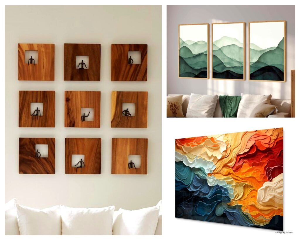
The classic triptych (three panels in a row) is popular for a reason, it just works. But there are other arrangements worth trying.
Grid layout is four or six pieces arranged in a perfect rectangle. Super clean, very modern. Works best when all panels are identical sizes. I love this for above a bed or a long console table.
Asymmetrical arrangements are where you mix different sizes but keep them aligned along one edge. So like two large squares on the left, three smaller rectangles stacked on the right. These take more planning but look really custom.
Staggered horizontal means the panels are at different heights but still in a row. Creates movement and works great in hallways or narrow spaces. You keep them aligned at the center line usually.
Oh and another thing, the five-panel sets with one large center piece and progressively smaller pieces on each side? Those are called pentagon arrangements apparently (I just learned that last week) and they work really well above king beds or long sofas.
Hardware Situation
Do NOT use those stick-on strips for anything over like 5 pounds per panel. I’ve seen so many pieces crash down and it’s heartbreaking. For multi-panel sets you’re usually dealing with decent weight multiplied by several pieces.
For drywall:
- Picture hanging hooks rated for the weight (check the back of the frame for how heavy it is)
- Anchors if each panel is over 10 pounds
- A level because your eyes will lie to you
For studs, just use regular screws and you’re golden. I have a stud finder that’s also a level and it’s the best $25 I’ve spent.
Pro tip that saved me multiple times: hang the center piece first, then work outward. With a triptych, hang the middle one, then the left, then the right. For grids, start with the top left and go across, then down. This way if your measurements are slightly off, you can adjust as you go.
The Canvas vs Framed Debate
Canvas panels (the kind with the painted edges that don’t need frames) are lighter and easier to hang but they can look cheap depending on the quality. If you’re buying online, make sure they’re at least 1.5 inches thick or they’ll look flat and sad on the wall.
Framed prints look more polished but are heavier and more expensive. The frames also need to be identical which sometimes means buying them separately and that’s a whole thing.
I’ve been watching this show where they flip houses and they always use those cheap thin canvas prints and it drives me crazy because they look fine in photos but terrible in person.
Where to Actually Buy These
Wayfair has a huge selection and you can filter by size, color, room type, all that. Returns are pretty easy if it looks different than expected. I’d say 60% of my client projects use something from Wayfair.
Etsy for unique stuff, especially if you want something less mass-produced. Search for “multi panel art” or “split canvas” and filter by your color scheme. Takes longer to ship usually but worth it for the originality.
Society6 and Redbubble let you print artwork in multi-panel formats which is cool if you find a design you love. Quality is hit or miss though, read the reviews.
Homegoods/TJ Maxx/Marshalls for in-person shopping where you can see the actual quality. Selection is random but prices are good. I found an amazing three-panel abstract set at Marshalls for $79 that looked way more expensive.
Amazon obviously has everything but the photos are often super misleading about size and color. Always check the measurements and read reviews with photos.
Common Mistakes I See Constantly
Hanging them too high. Like way too high. They should be in your line of sight when standing, not up near the ceiling.
Not considering the furniture scale. A tiny three-panel set above a huge sectional looks ridiculous. Your art arrangement should be roughly 2/3 to 3/4 the width of the furniture below it.
Mixing too many colors. Even if you love color, multi-panel arrangements work best with a limited palette. Three main colors max.
Forgetting about the light switch. I’ve had to rearrange so many layouts because someone didn’t account for where the light switch falls.
Using different brands/sets that don’t actually coordinate. Just because two sets are both “blue and gray abstract” doesn’t mean they’ll look good together.
Styling Around Multi-Panel Art
Keep the rest of the wall pretty clear. Multi-panel art is already a lot visually, so don’t crowd it with other stuff. Maybe a small plant on the console below but that’s it.
Your throw pillows or other decor should pull colors from the art. This makes the whole room feel intentional. I usually grab one accent color from the artwork and repeat it in like three places around the room.
Lighting matters more than people think. If you have recessed lights, angle them toward the art. Or get some picture lights if you’re fancy. The shadows between panels can actually add to the effect if lit properly.
Okay so one more thing, if you’re renting and worried about holes, there are these systems with rails that mount at the ceiling and cables that hang down. The art hangs from the cables and you can adjust heights without new holes. They’re kinda pricey but I’ve used them in rentals where the deposit was gonna be huge and it was worth it.
The biggest thing honestly is just committing to a plan and actually measuring properly. I see so many people eyeball it and then wonder why it looks off. Take the extra 20 minutes to measure and mark everything, you’ll be so much happier with the result and you won’t have a wall full of holes to patch later.